
 Web Front-end
CSS Tutorial
Cleverly use CSS3 filters to create text flash switching animation effects!
Web Front-end
CSS Tutorial
Cleverly use CSS3 filters to create text flash switching animation effects!
Cleverly use CSS3 filters to create text flash switching animation effects!

This article will show you how to use CSS3 filters to achieve a high-end text flash switching animation effect. I hope it will be helpful to everyone!

I accidentally saw such an interesting text flash animation today:
If this type of text flash switching effect is used properly, it can better attract the user's attention. [Recommended learning: css video tutorial]
Of course, today I am not trying to use CSS to achieve the above effects. In the process of trying, I found another type that can use CSS to realize text flash animation very easily, using blur() filter and contrast() The fusion effect produced by the filter is similar to this:

This technique has also been mentioned in many articles, and will be briefly described in this article.
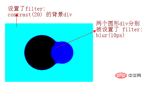
blur filter mixing contrast filter produces a fusion effect
The focus of this article, The fusion effect produced by adding a blur filter and a contrast filter. Take out the two filters separately. Their functions are:
filter: blur(): Set a Gaussian blur effect to the image.filter: contrast(): Adjust the contrast of the image.
However, when they "fused" together, a wonderful fusion phenomenon occurred.
Let’s take a look at a simple example first:

CodePen Demo -- filter mix between blur and contrast
https: //codepen.io/Chokcoco/pen/QqWBqV
Look carefully at the process of the intersection of the two circles. When the edges are in contact, a boundary fusion effect will be produced. Use the contrast filter to The blurred edges of Gaussian blur are removed, and Gaussian blur is used to achieve the fusion effect.
The implementation of the above effects is based on two points:
The graphics are animated on the canvas background set to
filter: contrast()The animated graphic is set
filter: blur()( The parent element of the animated graphic needs to be setfilter: contrast( )canvas)
Of course, the background color is not necessarily white. We slightly modify the above Demo. The simple diagram is as follows:
Use the blur/contrast filter to switch text
Using the above techniques, we can achieve the fusion effect of text, like this:

CodePen Demo -- word animation | word filter
https://codepen.io/Chokcoco/pen/jLjNRj
This way , using this technique, we can cleverly conceive the animation:
Multiple texts appear in sequence (use
animation-delayfor control processing)Make sure that when the previous text disappears, the next text appears
Superimpose the above filter
The core code is as follows:
<div class="g-container">
  <div class="word">iPhone</div>
  <div class="word">13</div>
  <div class="word">Pro</div>
  <div class="word">强得很!</div>
</div>
@import url('https://fonts.googleapis.com/css2?family=Montserrat&display=swap');

$speed: 8s;
$wordCount: 4;

.g-container {
    position: relative;
    width: 100vw;
    height: 100vh;
    background: #000;
    font-family: 'Montserrat', sans-serif;
    color: #fff;
    font-size: 120px;
    filter: contrast(15);
}
.word {
    position: absolute;
    top: 50%;
    left: 50%;
    transform: translate(-50%, -50%);
    animation: change $speed infinite ease-in-out;

    @for $i from 0 to $wordCount {
        &:nth-child(#{$i + 1}) {
            animation-delay: ($speed / ($wordCount + 1) * $i) - $speed;
        }
    }
}

@keyframes change {
    0%,
    5%,
    100% {
        filter: blur(0px);
        opacity: 1;
    }
    50%,
    80% {
        filter: blur(80px);
        opacity: 0;
    }
}The entire code needs to focus on the @keyframes change animation. We add this animation to the text in sequence (that is, using animation -delay adds a delay in sequence) to achieve the effect of displaying the next text in the process of the previous text disappearing.
The above .g-container adds such a code-- filter: contrast(15). If this sentence is removed, the effect is as follows:

Add this key code - filter: contrast(15), the whole effect is as shown in the picture at the beginning:

CodePen Demo -- Pure CSS to achieve text fusion flash switching effect
https://codepen.io/Chokcoco/pen/xxLjdmz
Two core key points of the entire animation:
Uses
blurfilter blendingcontrastfilters to produce fusion effectsIn the process of the previous text disappearing, the next text is displayed to create the effect that the currently displayed text is evolved from the previous text
Thus, you can control the number of text through HTML, change the $speed representing the animation duration and the $wordCount of the number of text in the SASS variable, and finally @keyframes The parameters in change are constantly adjusted to optimize the effect you want. Various text flash effects have evolved.
Finally
Okay, this article ends here, I hope this article will be helpful to you:)
Original address: https: //segmentfault.com/a/1190000040965698
Author: chokcoco
(Learning video sharing: Getting started with web front-end)
The above is the detailed content of Cleverly use CSS3 filters to create text flash switching animation effects!. For more information, please follow other related articles on the PHP Chinese website!

Hot AI Tools

Undresser.AI Undress
AI-powered app for creating realistic nude photos

AI Clothes Remover
Online AI tool for removing clothes from photos.

Undress AI Tool
Undress images for free

Clothoff.io
AI clothes remover

Video Face Swap
Swap faces in any video effortlessly with our completely free AI face swap tool!

Hot Article
Hot Tools

Notepad++7.3.1
Easy-to-use and free code editor

SublimeText3 Chinese version
Chinese version, very easy to use

Zend Studio 13.0.1
Powerful PHP integrated development environment

Dreamweaver CS6
Visual web development tools

SublimeText3 Mac version
God-level code editing software (SublimeText3)
Hot Topics


 How to achieve wave effect with pure CSS3? (code example)
Jun 28, 2022 pm 01:39 PM
How to achieve wave effect with pure CSS3? (code example)
Jun 28, 2022 pm 01:39 PM
How to achieve wave effect with pure CSS3? This article will introduce to you how to use SVG and CSS animation to create wave effects. I hope it will be helpful to you!
 C++ Image Processing Practice Guide: Implementing Image Special Effects and Filters
Nov 27, 2023 am 11:40 AM
C++ Image Processing Practice Guide: Implementing Image Special Effects and Filters
Nov 27, 2023 am 11:40 AM
In the fields of computer science and image processing, C++ has always been one of the most commonly used programming languages. Image processing is one of the important subfields of computer vision, including image analysis, processing and recognition. This article will introduce some basic concepts and techniques in C++ image processing, and provide some sample codes for implementing image special effects and filters to help readers better understand and practice C++ image processing. 1. Basics of C++ image processing 1.1 Commonly used image file formats In image processing, we usually need to use various image file formats, including
 Use CSS skillfully to realize various strange-shaped buttons (with code)
Jul 19, 2022 am 11:28 AM
Use CSS skillfully to realize various strange-shaped buttons (with code)
Jul 19, 2022 am 11:28 AM
This article will show you how to use CSS to easily realize various weird-shaped buttons that appear frequently. I hope it will be helpful to you!
 How to hide elements in css without taking up space
Jun 01, 2022 pm 07:15 PM
How to hide elements in css without taking up space
Jun 01, 2022 pm 07:15 PM
Two methods: 1. Using the display attribute, just add the "display:none;" style to the element. 2. Use the position and top attributes to set the absolute positioning of the element to hide the element. Just add the "position:absolute;top:-9999px;" style to the element.
 How to implement lace borders in css3
Sep 16, 2022 pm 07:11 PM
How to implement lace borders in css3
Sep 16, 2022 pm 07:11 PM
In CSS, you can use the border-image attribute to achieve a lace border. The border-image attribute can use images to create borders, that is, add a background image to the border. You only need to specify the background image as a lace style; the syntax "border-image: url (image path) offsets the image border width inward. Whether outset is repeated;".
 How to enlarge the image by clicking the mouse in css3
Apr 25, 2022 pm 04:52 PM
How to enlarge the image by clicking the mouse in css3
Apr 25, 2022 pm 04:52 PM
Implementation method: 1. Use the ":active" selector to select the state of the mouse click on the picture; 2. Use the transform attribute and scale() function to achieve the picture magnification effect, the syntax "img:active {transform: scale(x-axis magnification, y Axis magnification);}".
 It turns out that text carousel and image carousel can also be realized using pure CSS!
Jun 10, 2022 pm 01:00 PM
It turns out that text carousel and image carousel can also be realized using pure CSS!
Jun 10, 2022 pm 01:00 PM
How to create text carousel and image carousel? The first thing everyone thinks of is whether to use js. In fact, text carousel and image carousel can also be realized using pure CSS. Let’s take a look at the implementation method. I hope it will be helpful to everyone!
 Find another way! See how to use CSS filters to create rounded corners and wavy effects
Oct 18, 2022 pm 08:21 PM
Find another way! See how to use CSS filters to create rounded corners and wavy effects
Oct 18, 2022 pm 08:21 PM
This article will take you through a different approach and talk about how to use CSS filters to create rounded corners, and how to use rounded corners to achieve a wave effect. I hope it will be helpful to you!
