 Web Front-end
 CSS Tutorial
 Let's talk about how to use CSS to achieve a more three-dimensional shadow effect than ordinary shadows!
Let's talk about how to use CSS to achieve a more three-dimensional shadow effect than ordinary shadows!
How to use CSS to achieve a more three-dimensional shadow effect? The following article will talk about the advanced CSS shadows and introduce how to use CSS to achieve three-dimensional shadow effects. I hope it will be helpful to everyone!

#The existence of CSS shadow makes objects look more three-dimensional. [Recommended learning: css video tutorial]
However, on top of the simplest use of shadows, we can achieve more interesting and more three-dimensional shadow effects.
CSS Shadow Basics
In CSS, there are three properties that can implement shadows on the surface:
- box-shadow - box shadow
- text-shadow - text shadow
- filter: drop-shaodw() - shadow within the filter
Not much about their basic syntax and usage Description, you can complete this part on MDN first and post a few pictures for a quick review:
box-shadow - Box shadow:

text- shadow - Text shadow:

filter: drop-shaodw() - Shadow within the filter:

Basic The above three shadows are similar. What needs to be noted is:
-
box-shadowalso differentiates between inner shadows, which are described using the keywordinset; -
box-shadowOne more shadow diffusion radius parameter.
Long projection
As mentioned above, the three-dimensional shadow of text can be achieved through multi-layer shadow superposition. It can also be used on containers such as divs. Of course, there is another interesting method here. Suppose we have a rectangular element and want to add a long shadow to it, like the following:
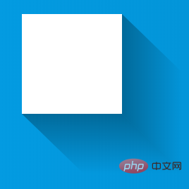
To generate this kind of long shadow, the multi-layer shadow just mentioned can be added , and then use the two pseudo-elements of the element. In fact, the above picture is like this:
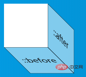
The key point is that we use transform on the two pseudo-elements : skew() Transformation and background color change from solid color to transparent color achieve the effect of long shadow:
CodePen Demo -- Linear gradient simulates long shadow
https://codepen.io/Chokcoco/pen/qJvVGy
Stereoscopic Projection
Okay, let’s continue. The next topic is Stereoscopic Projection.
This statement is very strange. The purpose of shadows is to make the original elements look more three-dimensional. So what kind of three-dimensional method is the so-called three-dimensional projection here?
The so-called stereoscopic projection here does not necessarily use box-shadow, text-shadow or drop-shadow, but We use other elements or attributes to simulate the element's shadow. The purpose of this is to break through some of the positioning limitations of box-shadow elements. Make the position, size, and blur of the shadow more flexible.
OK, let’s take a look at such an element. We hope to make it more three-dimensional by customizing the position of the shadow:

div above It just uses a very shallow box-shadow, which seems to have nothing to do with the three-dimensional. Next, we use the pseudo element of the div to generate a shape similar to the corner shape of the original Lets talk about how to use CSS to achieve a more three-dimensional shadow effect than ordinary shadows!, and then use Shift the transform, it might look like this:

OK. Finally, apply some blur effect (filter or box-shadow is acceptable) to the element generated with pseudo elements, and it will look like this: You can achieve a three-dimensional effect where the corners look like they have been torn apart:

The code is very simple, the pseudo-CSS code is as follows:
div {
    position: relative;
    width: 600px;
    height: 100px;
    background: hsl(48, 100%, 50%);
    border-radius: 20px;
}

div::before {
    content: "";
    position: absolute;
    top: 50%;
    left: 5%;
    right: 5%;
    bottom: 0;
    border-radius: 10px;
    background: hsl(48, 100%, 20%);
    transform: translate(0, -15%) rotate(-4deg);
    transform-origin: center center;
    box-shadow: 0 0 20px 15px hsl(48, 100%, 20%);
}So to summarize :
- 立体投影的关键点在于利于伪元素生成一个大小与父元素相近的元素,然后对其进行 rotate 以及定位到合适位置,再赋于阴影操作
- 颜色的运用也很重要,阴影的颜色通常比本身颜色要更深,这里使用 hsl 表示颜色更容易操作,l 控制颜色的明暗度
还有其他很多场景,都可以用类似的技巧实现:
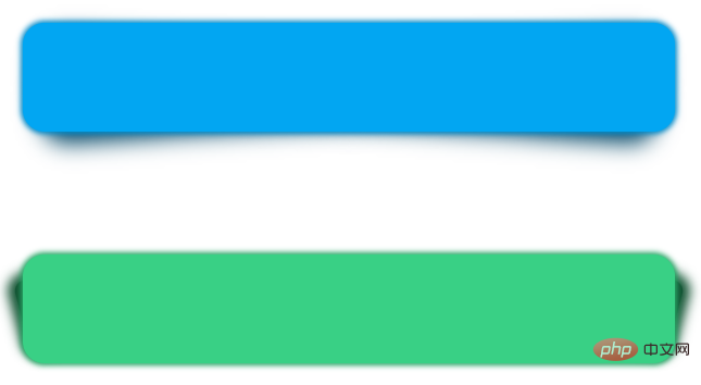
详细完整的代码,你可以戳这里:CodePen Demo -- 立体投影
https://codepen.io/Chokcoco/pen/LgdRKE?editors=1100
浮雕阴影
还有一类立体效果的阴影就是浮雕阴影,它的本质还是 box-shadow 和 text-shadow,只是需要控制好颜色的配合以及内外阴影的一起使用。核心就是 2 点:
背景色与内容(文本或者盒子颜色)一致
使用两个相反的方向,使用两组对比明显的颜色值,来实现凹凸效果。
首先,我们来看一个文字版的浮雕效果。
先实现一个凸起的效果,我们需要实现一个背景色和文字色一样的文字:
<div>浮雕阴影</div>
body {
    background: #999;
}
div {
    color: #999;
}效果如下,由于背景色和文字色的颜色一样,所以我们什么都看不到。

不过没事,我们给文字添加一个 1px x、y 方向的黑色阴影:
div {
    color: #999;
    text-shadow: 1px 1px 1px #000;
}效果如下:

有点感觉了,再反向,也就是 -1px x、y 方向添加一个黑色相对,也就白色的阴影:
div {
    color: #999;
    text-shadow:
        1px 1px 1px #000,
        -1px -1px 1px #fff;
}效果如下,这样我们就得到了一个凸起质感的浮雕阴影:

如果我们把颜色对调一下呢?
div {
    color: #999;
    text-shadow:
        1px 1px 1px #fff,
        -1px -1px 1px #000;
}就能很轻松的得到凹下质感的浮雕阴影:

上述 DEMO 的完整代码:CodePen Demo - Embossed Shadow
https://codepen.io/Chokcoco/pen/yLPmMXM
新拟态风格阴影
我们将运用在文字上的技巧,扩展延伸到容器上,就能得到最近比较火的拟态风格阴影,其原理也是大同小异。
两个阴影,使用两个相反的方向,使用两组对比明显的颜色值,来实现凹凸效果。与文字不同的是,这里的凹效果,我们需要使用盒子的内阴影实现。
<div>浮雕阴影</div>
<div>浮雕阴影</div>
div {
    width: 120px;
    height: 120px;
    background: #e9ecef;
    color: #333;
    box-shadow:
        7px 7px 12px rgba(0, 0, 0, .4),
        -7px -7px 12px rgba(255, 255, 255, .9);
}

div:nth-child(2) {
    box-shadow:
        inset -7px -7px 12px rgba(255, 255, 255, .9),
        inset 7px 7px 12px rgba(0, 0, 0, .4);
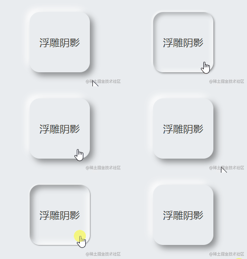
}这样,就可以得到拟态风格的按钮,如下图所示,左凸右凹:

再通过一个简单的过渡,就可以实现整个点击的交互:
div {
    transition: .2s all;
    box-shadow:
        7px 7px 12px rgba(0, 0, 0, .4),
        -7px -7px 12px rgba(255, 255, 255, .9),
        inset 0 0 0x rgba(255, 255, 255, .9),
        inset 0 0 0 rgba(0, 0, 0, .4);

    &:active {
        box-shadow:
            0 0 0 rgba(0, 0, 0, .4),
            0 0 0 rgba(255, 255, 255, .9),
            inset -7px -7px 12px rgba(255, 255, 255, .9),
            inset 7px 7px 12px rgba(0, 0, 0, .4);
    }
}看看效果:
文字立体投影 / 文字长阴影
上面的立体效果在文字上就完全不适用了,所以对待文字的立体阴影效果,还需要另辟蹊径。
正常而言,我们使用 text-shadow 来生成文字阴影,像这样:
<div> Txt Shadow</div>
-----
div {
    text-shadow: 6px 6px 3px hsla(14, 100%, 30%, 1);
}
嗯,挺好的,就是不够立体。那么要做到立体文字阴影,最常见的方法就是使用多层文字阴影叠加。
Tips:和box-shadow一样,text-shadow是可以叠加多层的!但是对于单个元素而言,drop-shadow的话就只能是一层。
好,上面的文字,我们试着叠加个 50 层文字阴影试一下。额,50 层手写,其实很快的~
好吧,手写真的太慢了,还容易出错,所以这里我们需要借助一下 SASS/LESS 帮忙,写一个生成 50 层阴影的 function 就好,我们每向右和向下偏移 1px,生成一层 text-shadow:
@function makeLongShadow($color) {
    $val: 0px 0px $color;

    @for $i from 1 through 50 {
        $val: #{$val}, #{$i}px #{$i}px #{$color};
    }

    @return $val;
}

div {
    text-shadow: makeLongShadow(hsl(14, 100%, 30%));
}上面的 SCSS 代码。经过编译后,就会生成如下 CSS:
div {
      text-shadow: 0px 0px #992400, 1px 1px #992400, 2px 2px #992400, 3px 3px #992400, 4px 4px #992400, 5px 5px #992400, 6px 6px #992400, 7px 7px #992400, 8px 8px #992400, 9px 9px #992400, 10px 10px #992400, 11px 11px #992400, 12px 12px #992400, 13px 13px #992400, 14px 14px #992400, 15px 15px #992400, 16px 16px #992400, 17px 17px #992400, 18px 18px #992400, 19px 19px #992400, 20px 20px #992400, 21px 21px #992400, 22px 22px #992400, 23px 23px #992400, 24px 24px #992400, 25px 25px #992400, 26px 26px #992400, 27px 27px #992400, 28px 28px #992400, 29px 29px #992400, 30px 30px #992400, 31px 31px #992400, 32px 32px #992400, 33px 33px #992400, 34px 34px #992400, 35px 35px #992400, 36px 36px #992400, 37px 37px #992400, 38px 38px #992400, 39px 39px #992400, 40px 40px #992400, 41px 41px #992400, 42px 42px #992400, 43px 43px #992400, 44px 44px #992400, 45px 45px #992400, 46px 46px #992400, 47px 47px #992400, 48px 48px #992400, 49px 49px #992400, 50px 50px #992400;
}看看效果:

额,很不错,很立体。但是,就是丑,而且说不上来的奇怪。
问题出在哪里呢,阴影其实是存在明暗度和透明度的变化的,所以,对于渐进的每一层文字阴影,明暗度和透明度应该都是不断变化的。这个需求,SASS 可以很好的实现,下面是两个 SASS 颜色函数:
-
fade-out改变颜色的透明度,让颜色更加透明 -
desaturate改变颜色的饱和度值,让颜色更少的饱和
关于 SASS 颜色函数,可以看看这里:Sass基础—颜色函数
我们使用上面两个 SASS 颜色函数修改一下我们的 CSS 代码,主要是修改上面的 makeLongShadow function 函数:
@function makelongrightshadow($color) {
    $val: 0px 0px $color;

    @for $i from 1 through 50 {
        $color: fade-out(desaturate($color, 1%), .02);
        $val: #{$val}, #{$i}px #{$i}px #{$color};
    }

    @return $val;
}好,看看最终效果:

嗯,大功告成,这次顺眼了很多~
详细完整的代码,你可以戳这里:CodePen Demo -- 立体文字阴影
https://codepen.io/Chokcoco/pen/JmgNNa
当然,使用 CSS 生成立体文字阴影的方法还有很多,下面再贴出一例,使用了透明色叠加底色的多重线性渐变实现的文字立体阴影,感兴趣的同学可以去看看具体实现:

详细完整的代码,你可以戳这里:CodePen Demo -- 线性渐变配合阴影实现条纹立体阴影条纹字
https://codepen.io/Chokcoco/pen/XxQJEB?editors=1100
(学习视频分享:web前端入门)
The above is the detailed content of Let's talk about how to use CSS to achieve a more three-dimensional shadow effect than ordinary shadows!. For more information, please follow other related articles on the PHP Chinese website!

Hot AI Tools

Undresser.AI Undress
AI-powered app for creating realistic nude photos

AI Clothes Remover
Online AI tool for removing clothes from photos.

Undress AI Tool
Undress images for free

Clothoff.io
AI clothes remover

Video Face Swap
Swap faces in any video effortlessly with our completely free AI face swap tool!

Hot Article

Hot Tools

Notepad++7.3.1
Easy-to-use and free code editor

SublimeText3 Chinese version
Chinese version, very easy to use

Zend Studio 13.0.1
Powerful PHP integrated development environment

Dreamweaver CS6
Visual web development tools

SublimeText3 Mac version
God-level code editing software (SublimeText3)

Hot Topics
 1387
1387
 52
52
 How to use bootstrap in vue
Apr 07, 2025 pm 11:33 PM
Using Bootstrap in Vue.js is divided into five steps: Install Bootstrap. Import Bootstrap in main.js. Use the Bootstrap component directly in the template. Optional: Custom style. Optional: Use plug-ins.
 The Roles of HTML, CSS, and JavaScript: Core Responsibilities
Apr 08, 2025 pm 07:05 PM
HTML defines the web structure, CSS is responsible for style and layout, and JavaScript gives dynamic interaction. The three perform their duties in web development and jointly build a colorful website.
 How to write split lines on bootstrap
Apr 07, 2025 pm 03:12 PM
There are two ways to create a Bootstrap split line: using the tag, which creates a horizontal split line. Use the CSS border property to create custom style split lines.
 Understanding HTML, CSS, and JavaScript: A Beginner's Guide
Apr 12, 2025 am 12:02 AM
WebdevelopmentreliesonHTML,CSS,andJavaScript:1)HTMLstructurescontent,2)CSSstylesit,and3)JavaScriptaddsinteractivity,formingthebasisofmodernwebexperiences.
 How to resize bootstrap
Apr 07, 2025 pm 03:18 PM
To adjust the size of elements in Bootstrap, you can use the dimension class, which includes: adjusting width: .col-, .w-, .mw-adjust height: .h-, .min-h-, .max-h-
 How to use bootstrap button
Apr 07, 2025 pm 03:09 PM
How to use the Bootstrap button? Introduce Bootstrap CSS to create button elements and add Bootstrap button class to add button text
 How to set up the framework for bootstrap
Apr 07, 2025 pm 03:27 PM
To set up the Bootstrap framework, you need to follow these steps: 1. Reference the Bootstrap file via CDN; 2. Download and host the file on your own server; 3. Include the Bootstrap file in HTML; 4. Compile Sass/Less as needed; 5. Import a custom file (optional). Once setup is complete, you can use Bootstrap's grid systems, components, and styles to create responsive websites and applications.
 How to insert pictures on bootstrap
Apr 07, 2025 pm 03:30 PM
There are several ways to insert images in Bootstrap: insert images directly, using the HTML img tag. With the Bootstrap image component, you can provide responsive images and more styles. Set the image size, use the img-fluid class to make the image adaptable. Set the border, using the img-bordered class. Set the rounded corners and use the img-rounded class. Set the shadow, use the shadow class. Resize and position the image, using CSS style. Using the background image, use the background-image CSS property.


