In CSS3, BFC's Chinese meaning is "Block Formatting Context", which is part of the visual CSS rendering of the Web page. It is the area where the layout process of the block box occurs, and where floating elements interact with other elements. Area. To put it simply, BFC is an isolated and independent container on the page. The sub-elements inside the container will not affect the elements outside. The functions of BFC: 1. Solve the problem of margin folding; 2. The BFC area will not overlap with the floating element area, and can create a two-column layout commonly used in CSS; 3. Clear the float inside the element.

The operating environment of this tutorial: Windows 7 system, CSS3&&HTML5 version, Dell G3 computer.
Official definition: BFC (Block Formatting Context) block formatting context, is the visual CSS of the Web page The part of rendering that is the area where the layout process of the block box occurs and where floated elements interact with other elements.
Speaking in human terms: BFC is an isolated independent container on the page. The sub-elements inside the container will not affect the elements outside. We often use BFC, but we just don’t know it is BFC.
The commonly used methods are as follows:
none, specify float as left or right to create BFC) position of the element is absolute or fixed)Look, do you often use the attributes listed above in your code? You have turned on BFC without knowing it, but you don’t know it is BFC.
1. Solve the problem of margin folding
Margin collapsing will only occur between block-level elements belonging to the same BFC.
html:
<div class="div1"></div>
<div class="div2"></div>
css:
.div1 {
  width: 100px;
  height: 100px;
  background-color: green;
  margin-bottom: 10px;
}

.div2 {
  width: 100px;
  height: 100px;
  background-color: red;
  margin-top: 20px;
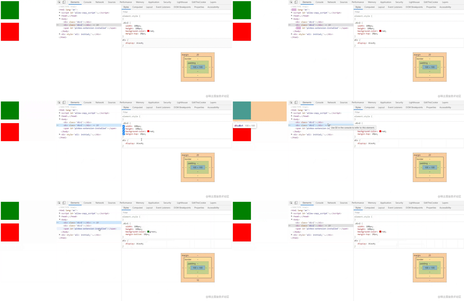
}Set the margin-bottom of the first div to 10px and the margin-top of the second div to 20px. We You can see that the final margin of the two boxes is 20px, which is the larger of the two. This is the problem of overlapping margins.

In order to solve this problem, we can make these two divs belong to different BFCs, or just put one of the divs in the BFC. The reason is: BFC is an isolated independent container on the page, and the elements inside the container will not affect the outside world.
html:
<div class="wrapper">
  <div class="div1"></div>
</div>
<div class="div2"></div>
css:
.wrapper{
  /* 开启BFC */
  overflow: hidden;
}

.div1 {
  width: 100px;
  height: 100px;
  background-color: green;
  margin-bottom: 10px;
}

.div2 {
  width: 100px;
  height: 100px;
  background-color: red;
  margin-top: 20px;
}The current code can solve the problem of overlapping margins! But note that in our case, although BFC can be created by specifying the position attribute as absolute and fixed, or specifying float as left or right, this element will be removed from the current document flow, does not occupy page space, and can be combined with Other elements overlap. As a result, the lower div will cover the upper div.
2. Make a two-column layout
The BFC area will not overlap with the floating element area.
We can use this feature to create the two-column layout commonly used in CSS (fixed width on the left and adaptive width on the right).
HTML:
<div class="left"></div>
<div class="right"></div>
CSS:
.left {
  width: 200px;
  height: 100px;
  background-color: green;
  float: left;
}

.right {
  height: 100px;
  background-color: red;
  overflow: hidden; /* 创建BFC */
}The effect is as shown in the picture:

Another case:
html:
<div class="father">
  <div class="left"></div>
  <div class="right">
    哈哈哈哈哈哈啊啊啊啊啊啊啊啊啊啊啊啊啊啊啊啊啊啊啊啊啊啊啊啊啊
  </div>
</div>css:
.father {
  width: 200px;
  border: 5px solid blue;
}

.left {
  width: 50px;
  height: 50px;
  background-color: green;
  float: left;
}

.right {
  height: 100px;
  background-color: red;
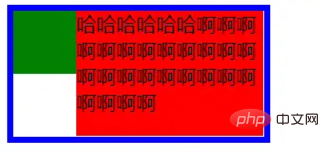
}When only one box is set to float in the parent element and the other is not floating, it will cause the second box to be in the first The bottom part of the box is partially covered (but the text will not be covered).
The effect is as shown:
Set BFC for the second element:
 .right {
   height: 100px;
   background-color: red;
   overflow: hidden;
}The effect is as shown:

3、清除元素内部的浮动
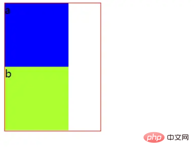
这里清除浮动的意思并不是清除你设置的元素的浮动属性,而是清除设置了浮动属性之后给别的元素带来的影响。例如我们给子元素设置浮动,那么父元素的高度就撑不开了。
BFC有一个特性:计算BFC的高度时,浮动元素也参与计算,利用这个特性可以清除浮动。
html:
<div class="div1">
  <div class="son1">a</div>
  <div class="son2">b</div>
</div>
css:
.div1 {
  width: 150px;
  border: 1px solid red;

  /*使用BFC来清除浮动*/
  overflow: hidden;
}

.son1, .son2 {
  width: 100px;
  height: 100px;
  background-color: blue;
  float: left;
}

.son2 {
  background-color: greenyellow;
}
(学习视频分享:web前端入门)
The above is the detailed content of What is bfc in css3. For more information, please follow other related articles on the PHP Chinese website!