
 Web Front-end
CSS Tutorial
Detailed explanation of css positioning--relative positioning, absolute positioning and fixed positioning
Web Front-end
CSS Tutorial
Detailed explanation of css positioning--relative positioning, absolute positioning and fixed positioning
Detailed explanation of css positioning--relative positioning, absolute positioning and fixed positioning

This article brings you relevant knowledge about css, which mainly introduces issues related to relative positioning, absolute positioning and fixed positioning of css. The position attribute in css, position has Four values: relative (relative positioning), absolute (absolute positioning), static (static positioning) and fixed (fixed positioning). Use top, left, bottom, right to adjust the position of the element. Let’s take a look at it together. I hope it will be useful to everyone. helpful.
(Learning video sharing: css video tutorial, html video tutorial)
1. What is position?
The position attribute in css has four values: relative (relative positioning), absolute (absolute positioning), static (static positioning) and fixed (fixed positioning), through top, left, bottom, right To adjust the position of the element
2. The role of each attribute value
| Attribute value | Function | Remarks |
|---|---|---|
| relative | Relative positioning | Reference element itself |
| absolute | Absolute positioning | Refer to the nearest ancestor element |
| static | Static positioning | Basic positioning regulations |
| fixed | Fixed positioning | Reference browser window |
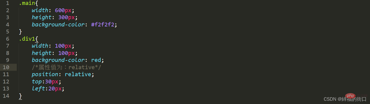
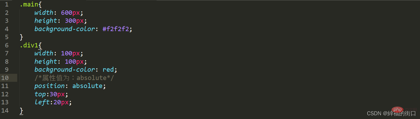
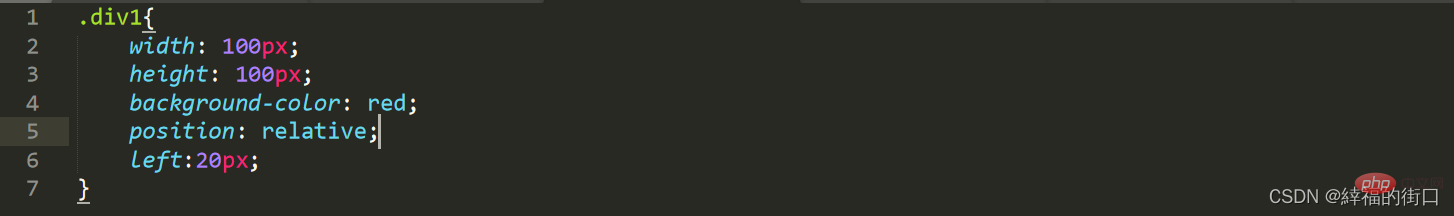
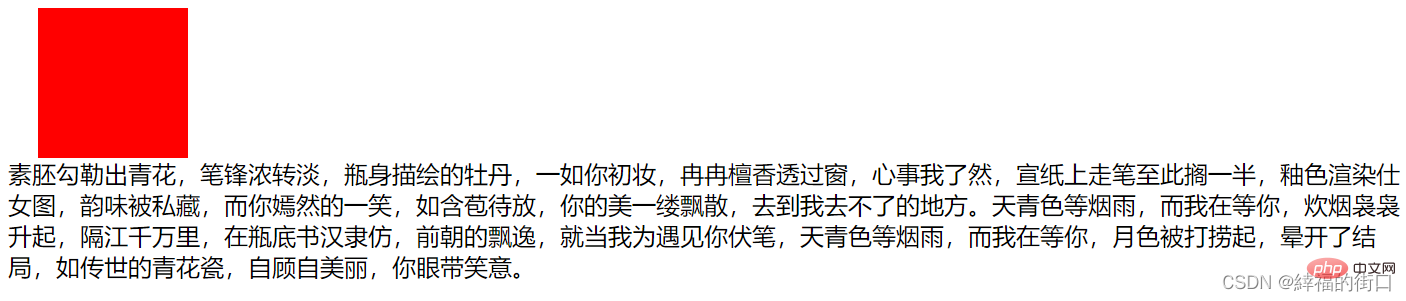
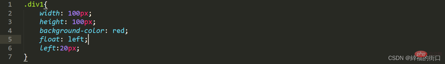
1. Relative positioning
The offset element of relative positioning refers to the element itself and will not cause the element to break away from the document flow. The space occupied by the initial position of the element will be retained
html Code:
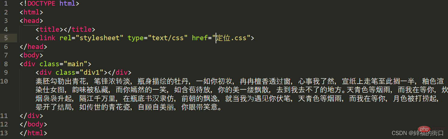
css code:
Web page effect:
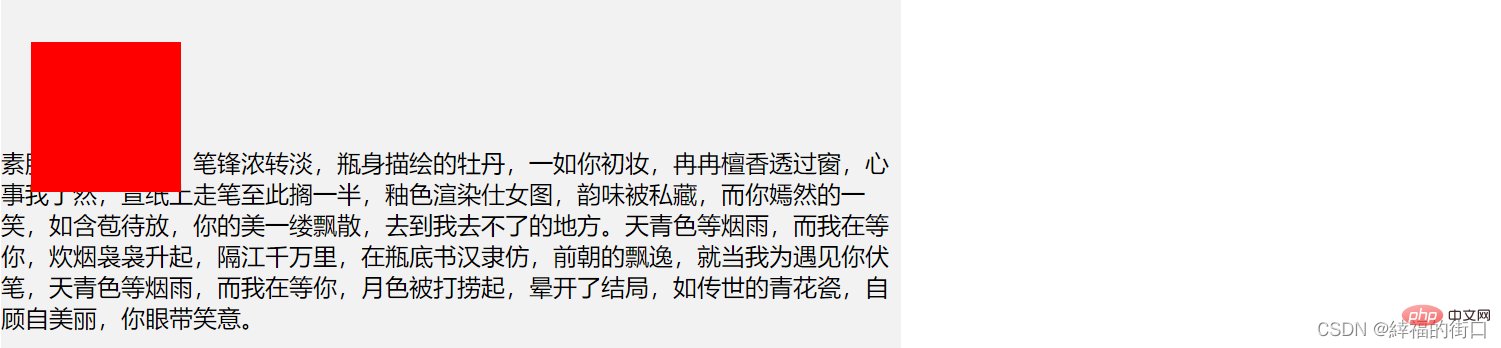
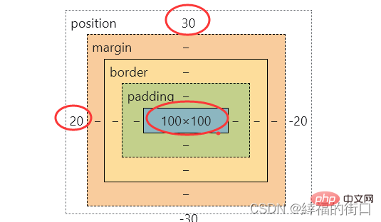
It can be seen that relative positioning is relative to the element itself, which is 30px from the top and 20px from the left, and does not break away from the document flow
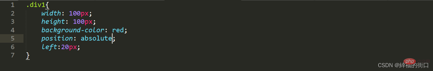
2. Absolute positioning
Absolute positioning is relative For the positioned nearest ancestor element, if the nearest ancestor element is not positioned, its position is relative to the original containing block (body)
css code:
Web page effect: 
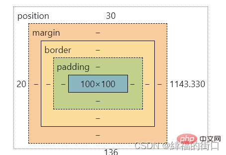
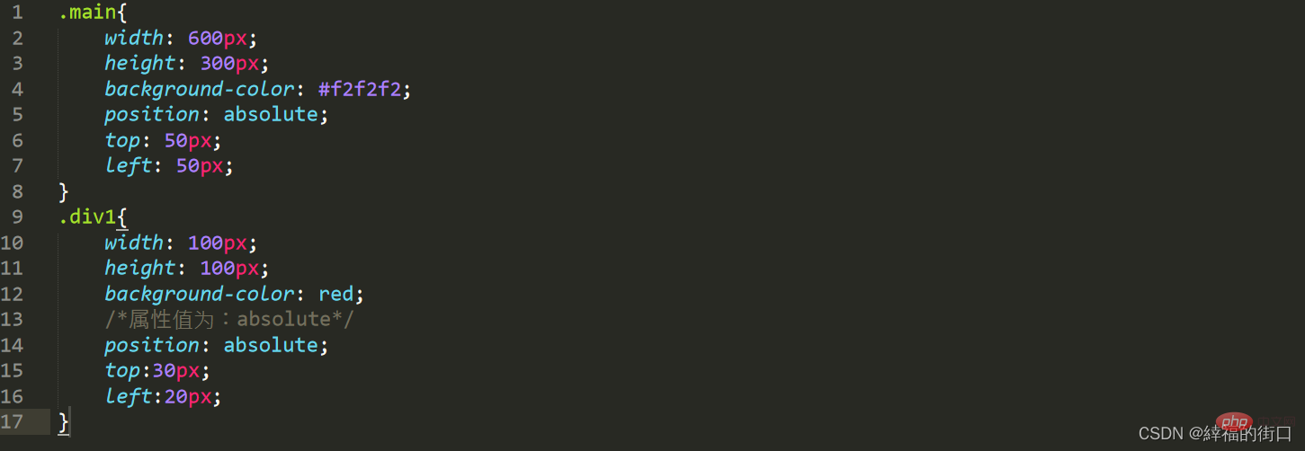
You can see that absolute positioning is out of the document flow. Since the parent element is not positioned, it is based on the initial containing block ( body) to position, now position the parent element of the element
css code:
Web page effect:
After the parent element is positioned here, the element is positioned based on the parent element
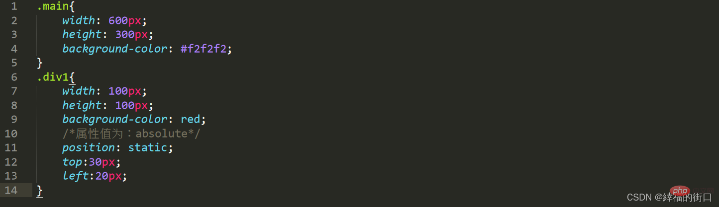
3. Static positioning
There is no special setting, it does not break away from the document flow, and it follows the basic Positioning stipulations cannot be hierarchical through z-index
css code:
Web page effect:

You can see The position of the red block has not changed. You can know that static (static, default attribute) is usually not used. The position value is generally the default
4. Fixed positioning
Fixed positioning is relative to the browser Window, separated from the document flow, using fixed elements will not scroll with the scrolling of the window
html code:
css code:
Web page effect (fixed positioning is not set) ): 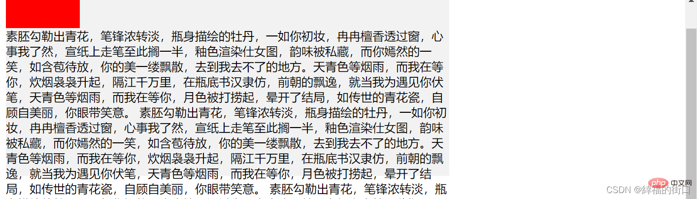
Web page effect (set fixed positioning) 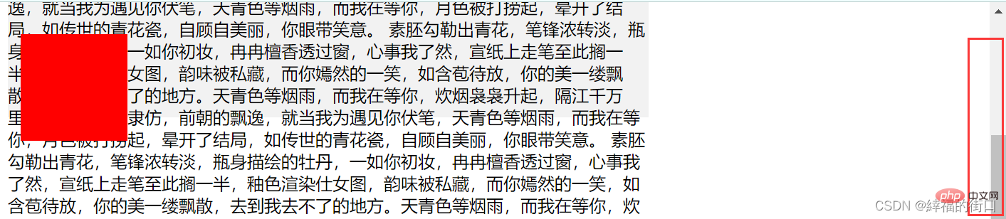
It can be seen that after fixed positioning, even if the window is scrolled, the position of the red block remains unchanged
3. Relative and absolute positioning
Use three color blocks to distinguish relative positioning and absolute positioning
When no positioning is performed, the default web page effect:

1. Relative positioning
css code:
Web page effect:
You can see Relative positioning has the same effect as default positioning
2. Absolute positioning
css code:
Web page effect:
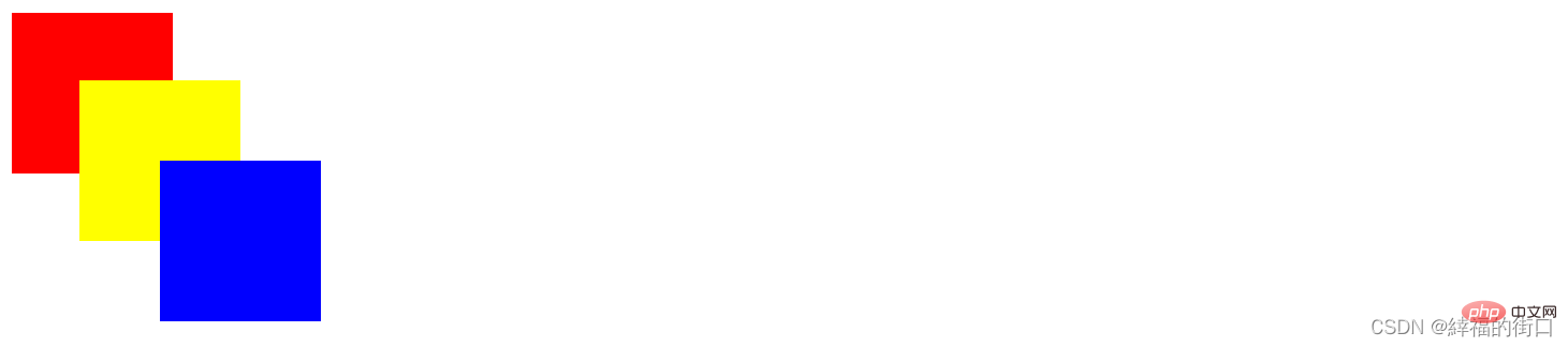
Here the red, yellow, and blue blocks are displayed overlappingly, that is, they are separated from the document flow
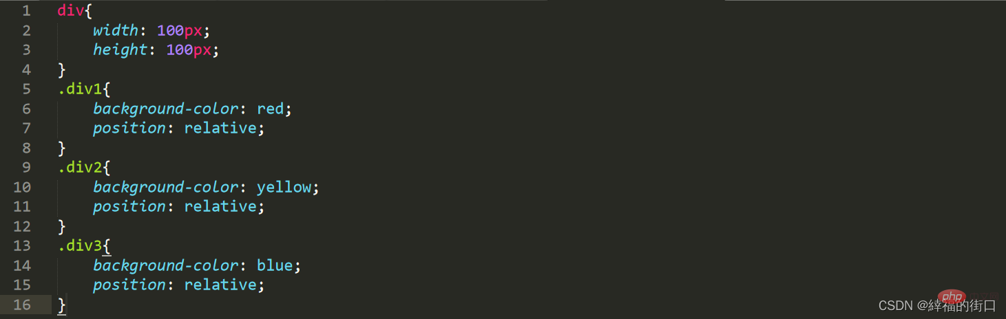
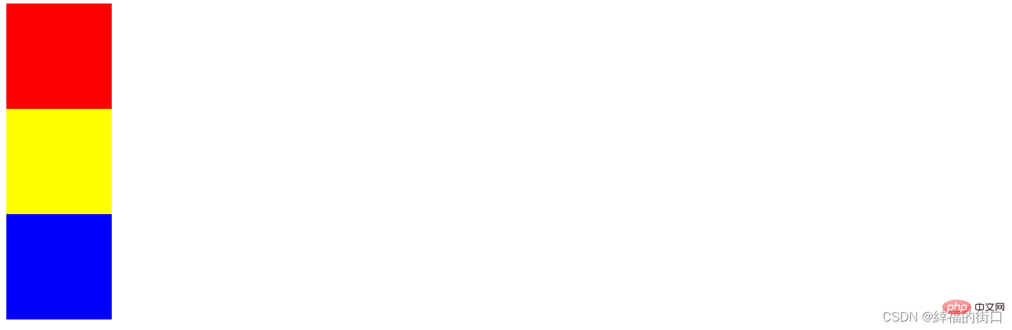
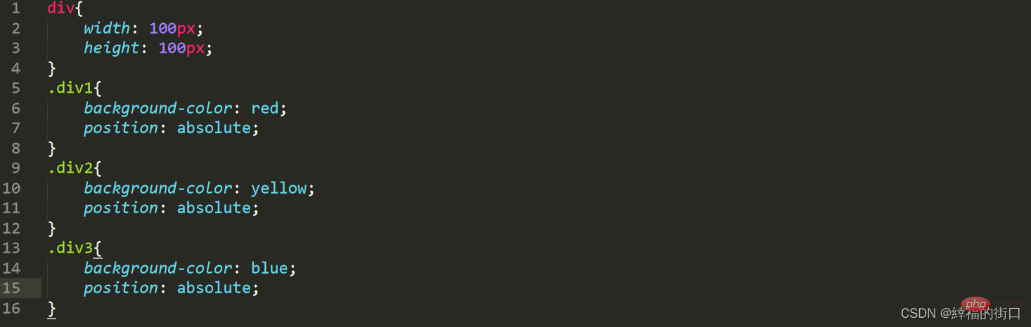
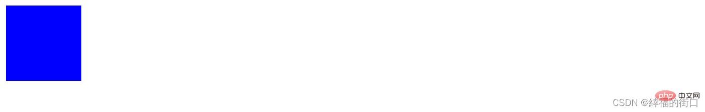
3. Relative positioning and absolute positioning
In order to make the effect more obvious, the red, yellow, and blue blocks are displayed here. The yellow and blue color blocks are offset to a certain extent
(1) Relative positioning
css code: 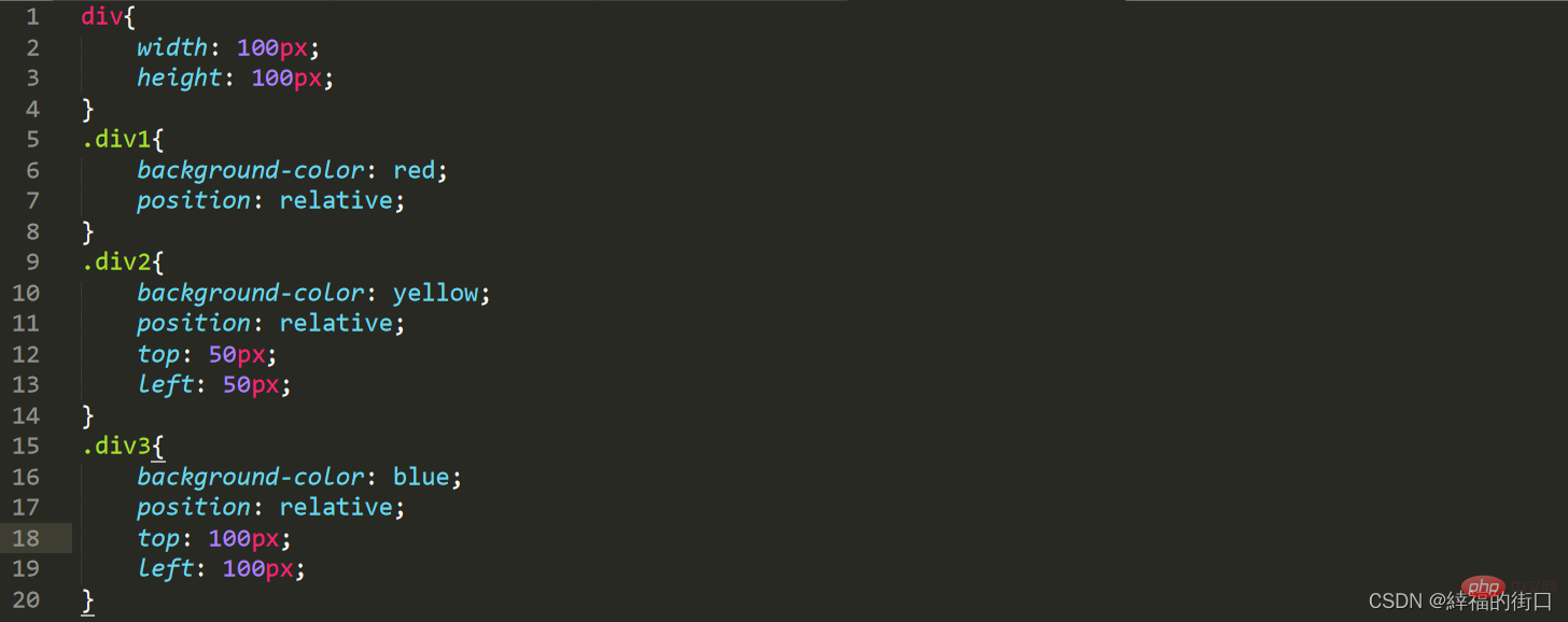
Web page effect: 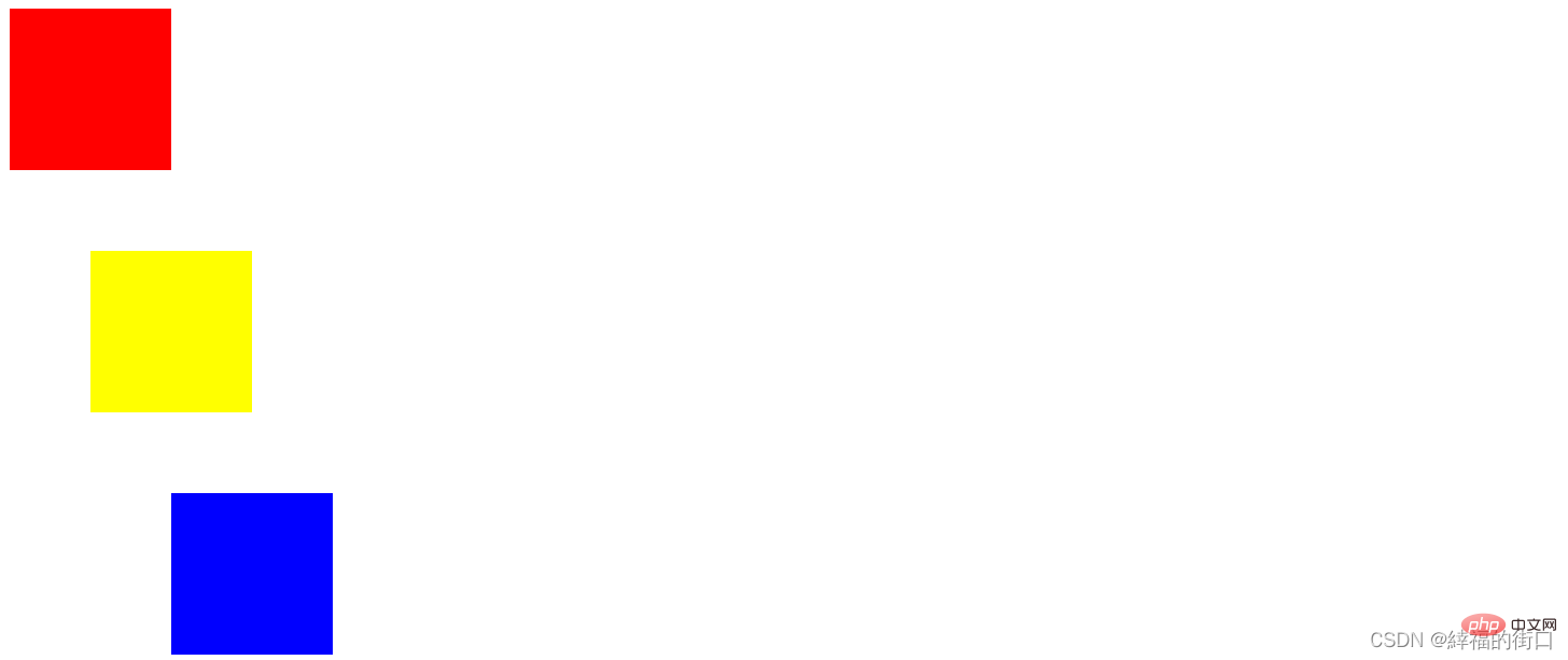
(2) Absolute positioning
css code:
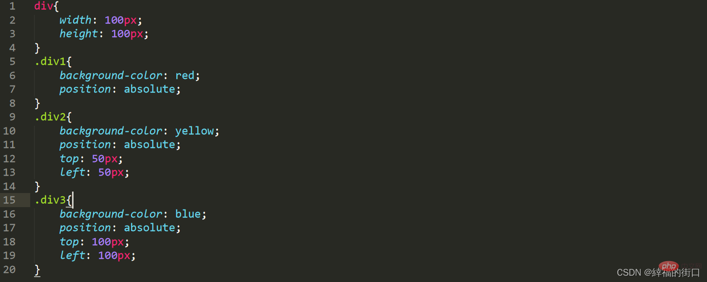
Web page effect:
4. Relative, absolute positioning and floating
Absolute positioning and floating are both separated Document flow
1. Relative positioning
css code:
Web page effect:
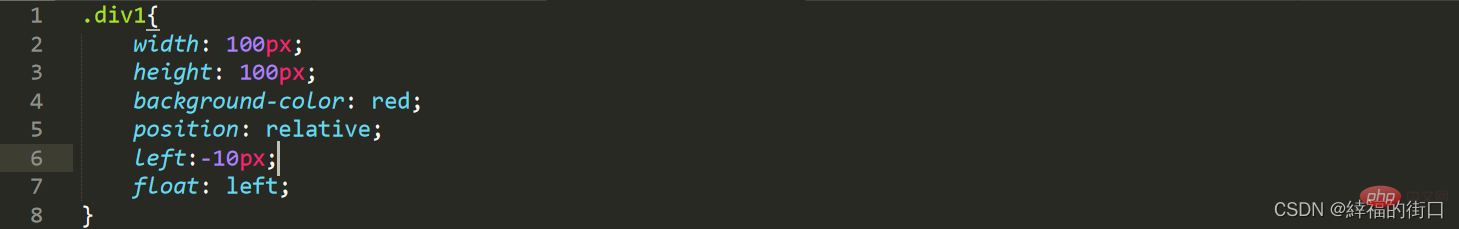
2. Absolute positioning
css code:
Web page effect: 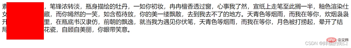
3. Floating
css code:
Web page effect: 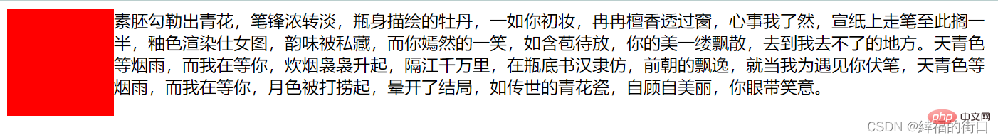
You can see that the float surrounds the red color block for the text, but the distance between the text and the red color block is too large Close, cannot set margin
4, relative positioning and floating
css code:
Web page effect: 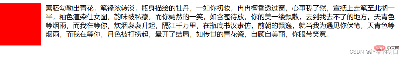
The combination of relative positioning and floating can set the margin between the text and the red color block
5. Absolute positioning and floating
css code:
Web page effect: 
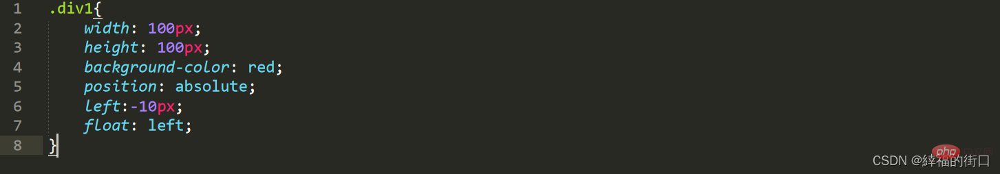
5. Use of z-index
If you want to display the red color block on top of the yellow color block in the following color block, you can use z -index
css code:
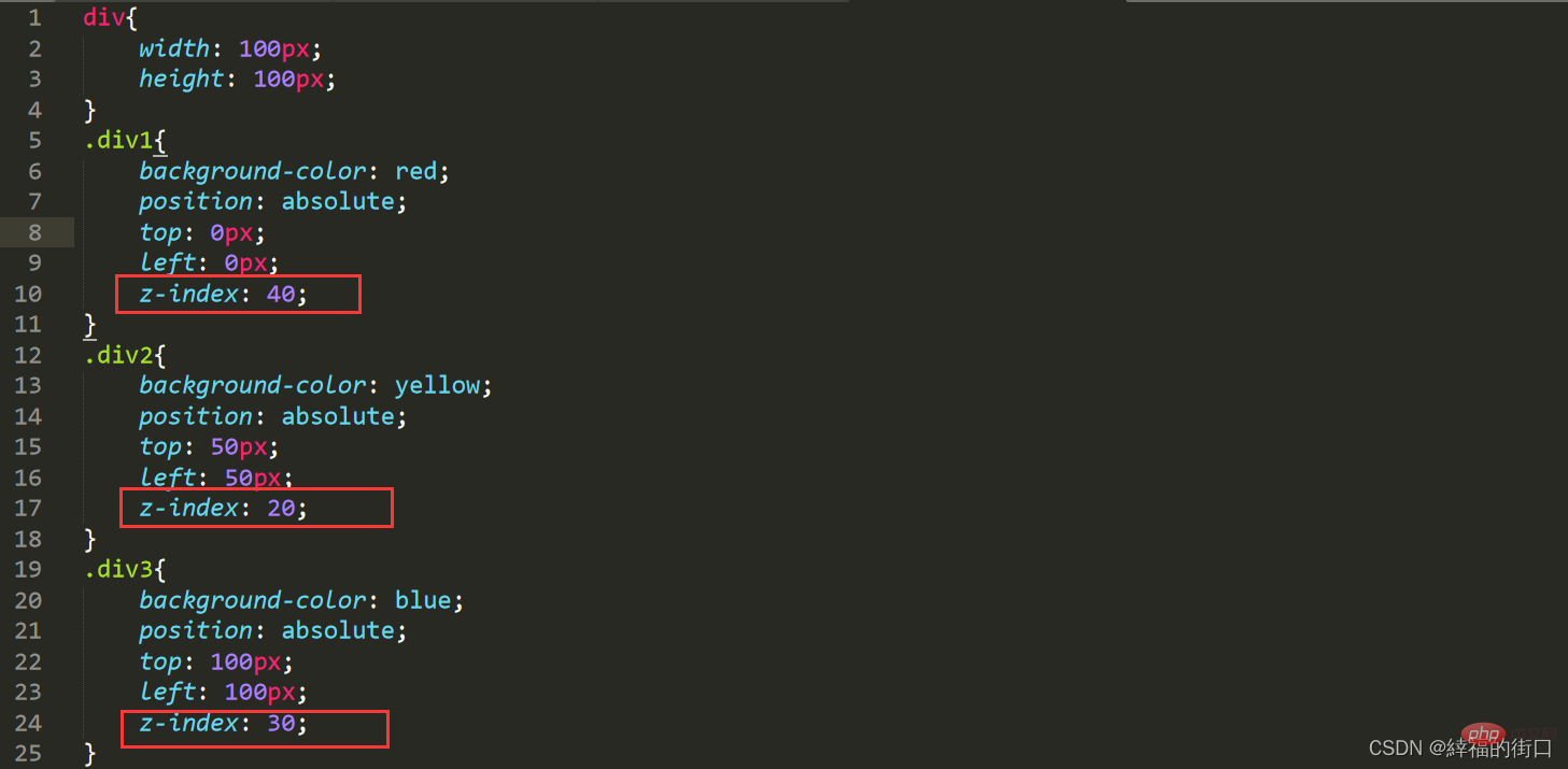
Web page effect:
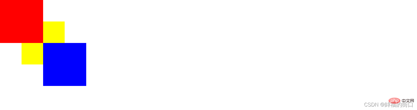
You can see that the red color block is displayed in red Above the color block, the z-index values here are 40, 20, and 30. In fact, the web page sometimes has more than these, maybe hundreds. This is just for convenience of display.
(Learning video sharing: css video tutorial, html video tutorial)
The above is the detailed content of Detailed explanation of css positioning--relative positioning, absolute positioning and fixed positioning. For more information, please follow other related articles on the PHP Chinese website!

Hot AI Tools

Undresser.AI Undress
AI-powered app for creating realistic nude photos

AI Clothes Remover
Online AI tool for removing clothes from photos.

Undress AI Tool
Undress images for free

Clothoff.io
AI clothes remover

AI Hentai Generator
Generate AI Hentai for free.

Hot Article
Hot Tools

Notepad++7.3.1
Easy-to-use and free code editor

SublimeText3 Chinese version
Chinese version, very easy to use

Zend Studio 13.0.1
Powerful PHP integrated development environment

Dreamweaver CS6
Visual web development tools

SublimeText3 Mac version
God-level code editing software (SublimeText3)
Hot Topics
 1378
1378
 52
52

 How to write split lines on bootstrap
Apr 07, 2025 pm 03:12 PM
How to write split lines on bootstrap
Apr 07, 2025 pm 03:12 PM
There are two ways to create a Bootstrap split line: using the tag, which creates a horizontal split line. Use the CSS border property to create custom style split lines.
 How to insert pictures on bootstrap
Apr 07, 2025 pm 03:30 PM
How to insert pictures on bootstrap
Apr 07, 2025 pm 03:30 PM
There are several ways to insert images in Bootstrap: insert images directly, using the HTML img tag. With the Bootstrap image component, you can provide responsive images and more styles. Set the image size, use the img-fluid class to make the image adaptable. Set the border, using the img-bordered class. Set the rounded corners and use the img-rounded class. Set the shadow, use the shadow class. Resize and position the image, using CSS style. Using the background image, use the background-image CSS property.
 How to resize bootstrap
Apr 07, 2025 pm 03:18 PM
How to resize bootstrap
Apr 07, 2025 pm 03:18 PM
To adjust the size of elements in Bootstrap, you can use the dimension class, which includes: adjusting width: .col-, .w-, .mw-adjust height: .h-, .min-h-, .max-h-
 The Roles of HTML, CSS, and JavaScript: Core Responsibilities
Apr 08, 2025 pm 07:05 PM
The Roles of HTML, CSS, and JavaScript: Core Responsibilities
Apr 08, 2025 pm 07:05 PM
HTML defines the web structure, CSS is responsible for style and layout, and JavaScript gives dynamic interaction. The three perform their duties in web development and jointly build a colorful website.
 How to set up the framework for bootstrap
Apr 07, 2025 pm 03:27 PM
How to set up the framework for bootstrap
Apr 07, 2025 pm 03:27 PM
To set up the Bootstrap framework, you need to follow these steps: 1. Reference the Bootstrap file via CDN; 2. Download and host the file on your own server; 3. Include the Bootstrap file in HTML; 4. Compile Sass/Less as needed; 5. Import a custom file (optional). Once setup is complete, you can use Bootstrap's grid systems, components, and styles to create responsive websites and applications.
 How to use bootstrap in vue
Apr 07, 2025 pm 11:33 PM
How to use bootstrap in vue
Apr 07, 2025 pm 11:33 PM
Using Bootstrap in Vue.js is divided into five steps: Install Bootstrap. Import Bootstrap in main.js. Use the Bootstrap component directly in the template. Optional: Custom style. Optional: Use plug-ins.
 How to use bootstrap button
Apr 07, 2025 pm 03:09 PM
How to use bootstrap button
Apr 07, 2025 pm 03:09 PM
How to use the Bootstrap button? Introduce Bootstrap CSS to create button elements and add Bootstrap button class to add button text
 How to view the date of bootstrap
Apr 07, 2025 pm 03:03 PM
How to view the date of bootstrap
Apr 07, 2025 pm 03:03 PM
Answer: You can use the date picker component of Bootstrap to view dates in the page. Steps: Introduce the Bootstrap framework. Create a date selector input box in HTML. Bootstrap will automatically add styles to the selector. Use JavaScript to get the selected date.
