

Summary of the use of CSS standard box model and floating

This article brings you relevant knowledge about css, which mainly introduces the issues related to the box model and floating. The essence of web page layout is to place the box model through css layout. Then put the required elements in the appropriate position. Let’s take a look at it. I hope it will be helpful to everyone.
(Learning video sharing: css video tutorial, html video tutorial)
Box model
The essence of web page layout is to place the box model in the appropriate position through css layout, and then add the required elements
1. Box Model
Box Model It consists of element content, inner margin, outer margin, and border
Standard box model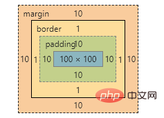
2. Box border (border)
border : border-width || border-style || border-color
| Attribute | Function |
|---|---|
| Define the border Thickness, unit px | |
| Definition of border style | |
| Definition Border color |
Border style
##none: No border- solid: Solid border
- dashed:dotted border
- dotted:dotted border
- Separately set the style of one side of the border
border-top-style:样式; border-top-width:宽度;border-top-color:颜色;border-top:宽度 样式 颜色;
And so on
By
cellspacing=0The cell distance is 0, but the distance between two cells Overlapping borders will make the borders thicker. Use the css attribute <div class="code" style="position:relative; padding:0px; margin:0px;"><pre class="brush:php;toolbar:false">table{border-collapse:collapse}</pre><div class="contentsignin">Copy after login</div></div> to merge the borders without making them thicker.
border-radius:length;/*length 可以数字也可以百分比*/
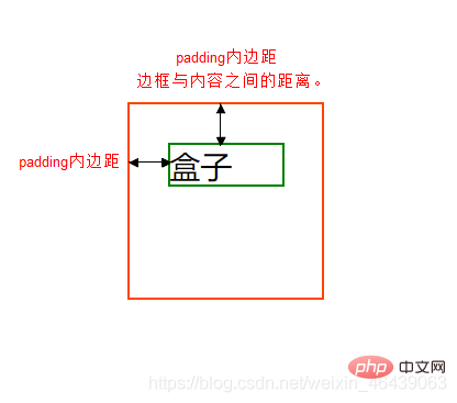
3. Padding
The spacing between the border and the content
| Function | |
|---|---|
| Left padding | |
| Padding-right | |
| Padding-top | |
| Lower padding |
| Meaning | |
|---|---|
| padding: top, bottom, left and right padding | |
| padding: up, down, left and right | |
| padding: up, left, right, down | |
| padding: top right, bottom left (clockwise) |
- Width
-
Element Height = content height padding border (Height is the content height)
Height -
Element Width = content width padding border (Width is the content width)
The actual size of the box = the width and height of the content padding border
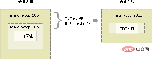
4. Margin (margin)
The margin is the control between the box and the box Distance
| Function | |
|---|---|
| Left margin | |
| Right margin | |
| Top margin | |
| Bottom margin |
| 值 | 描述 |
|---|---|
| h-shadow | 必需,水平阴影,负值在左边 |
| v-shadow | 必需,垂直阴影,负值在下 |
| blur | 可选,模糊距离 |
| spread | 可选,阴影尺寸 |
| color | 可选,阴影颜色 |
| inset | 可选,内阴影 |
注意
水平垂直阴影必须,其余可以省略,外阴影(outset)默认不写
p {
	box-shadow:0 15px 20px rgba(0,0,0,.5)
}浮动
1. 浮动是什么
css布局的三种机制
1. 普通
- 块级元素独占一行,由上到下排列
- 行内元素从左到右依次排列,父元素换行
2. 浮动
使得盒子浮动起来。让多个块级盒子一行展示
3. 定位
将盒子定位于浏览器中的某一位置
2. 浮动使用
通过浮动可以使得多个p水平排列一行,且之间没有空白缝隙,实现左右对齐,最早使用于图片,实现文字环绕效果
选择器 {float: 值;}| 属性值 | 描述 |
|---|---|
| none | 不浮动(默认) |
| left | 元素向左浮动 |
| right | 元素向右浮动 |
注意
浮动托标使用浮动后,元素会脱离标准流,后续的标准流会移动至浮动盒子底下,浮动元素会“漂浮”
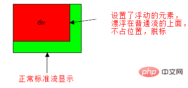
浮动会改变 元素display属性,任何元素都可以浮动,浮动元素相互紧靠,父级宽度装不下时,多出盒子调至下一行
浮动与标准流搭配
给浮动元素添加一个标准流父亲,在子元素使用浮动,从而较少对其他标准流的影响
3. 浮动与其他盒子关系
浮动元素与父盒子关系
子盒子会与父盒子对齐,但不会与边框重叠,也不会超过父盒子的内边距
浮动元素与兄弟盒子关系
浮动元素只会影响当前以及后面的标准流盒子
如果一个盒子里面有多个子盒子,如果其中一个盒子浮动了,其他兄弟也应该浮动。防止引起问题
4.清除浮动
很多子元素浮动后,父元素很难直接给出高度,最后父级盒子高度为0,对于以后的标准流盒子会有影响,对于标准流,子盒子会撑开盒子,而浮动不会。
清除就是为了消除浮动布局对于后续排版影响,主要是解决父元素高度为0的问题
选择器 {clear: 属性值;}| 属性值 | 描述 |
|---|---|
| left | 不允许左侧有浮动元素(消除左侧浮动影响) |
| right | 不允许右侧有浮动元素(消除右侧浮动影响) |
| both | 同时清除左右浮动元素 |
额外标签法
是W3C推荐的做法是通过在浮动元素末尾添加一个空的标签例如 <p></p>,或则其他标签br等亦可。
优点: 通俗易懂,书写方便
- 缺点: 添加许多无意义的标签,结构化较差。
父级添加overflow属性
overflow : hidden|auto|scroll
缺点: 内容增多时候容易造成不会自动换行导致内容被隐藏掉,无法显示需要溢出的元素。
使用after为元素清除浮动
:after方式是额外标签升级方式
.clearfix:after{
	content:""; display:block;height: 0;clear:both; visibility: hidden;
}

.clearfix {*zoom: 1;}
- 优点: 符合闭合浮动思想 结构语义化正确
- 缺点: 由于IE6-7不支持:after,使用 zoom:1触发 hasLayout。
双伪元素
.clearfix:before,.clearfix:after {
  content:"";
  display:table;
}
.clearfix:after {
 clear:both;
}
.clearfix {
  *zoom:1;
}The above is the detailed content of Summary of the use of CSS standard box model and floating. For more information, please follow other related articles on the PHP Chinese website!

Hot AI Tools

Undresser.AI Undress
AI-powered app for creating realistic nude photos

AI Clothes Remover
Online AI tool for removing clothes from photos.

Undress AI Tool
Undress images for free

Clothoff.io
AI clothes remover

AI Hentai Generator
Generate AI Hentai for free.

Hot Article
Hot Tools

Notepad++7.3.1
Easy-to-use and free code editor

SublimeText3 Chinese version
Chinese version, very easy to use

Zend Studio 13.0.1
Powerful PHP integrated development environment

Dreamweaver CS6
Visual web development tools

SublimeText3 Mac version
God-level code editing software (SublimeText3)
Hot Topics
 1377
1377
 52
52

 How to insert pictures on bootstrap
Apr 07, 2025 pm 03:30 PM
How to insert pictures on bootstrap
Apr 07, 2025 pm 03:30 PM
There are several ways to insert images in Bootstrap: insert images directly, using the HTML img tag. With the Bootstrap image component, you can provide responsive images and more styles. Set the image size, use the img-fluid class to make the image adaptable. Set the border, using the img-bordered class. Set the rounded corners and use the img-rounded class. Set the shadow, use the shadow class. Resize and position the image, using CSS style. Using the background image, use the background-image CSS property.
 How to resize bootstrap
Apr 07, 2025 pm 03:18 PM
How to resize bootstrap
Apr 07, 2025 pm 03:18 PM
To adjust the size of elements in Bootstrap, you can use the dimension class, which includes: adjusting width: .col-, .w-, .mw-adjust height: .h-, .min-h-, .max-h-
 How to use bootstrap button
Apr 07, 2025 pm 03:09 PM
How to use bootstrap button
Apr 07, 2025 pm 03:09 PM
How to use the Bootstrap button? Introduce Bootstrap CSS to create button elements and add Bootstrap button class to add button text
 How to set up the framework for bootstrap
Apr 07, 2025 pm 03:27 PM
How to set up the framework for bootstrap
Apr 07, 2025 pm 03:27 PM
To set up the Bootstrap framework, you need to follow these steps: 1. Reference the Bootstrap file via CDN; 2. Download and host the file on your own server; 3. Include the Bootstrap file in HTML; 4. Compile Sass/Less as needed; 5. Import a custom file (optional). Once setup is complete, you can use Bootstrap's grid systems, components, and styles to create responsive websites and applications.
 How to write split lines on bootstrap
Apr 07, 2025 pm 03:12 PM
How to write split lines on bootstrap
Apr 07, 2025 pm 03:12 PM
There are two ways to create a Bootstrap split line: using the tag, which creates a horizontal split line. Use the CSS border property to create custom style split lines.
 The Roles of HTML, CSS, and JavaScript: Core Responsibilities
Apr 08, 2025 pm 07:05 PM
The Roles of HTML, CSS, and JavaScript: Core Responsibilities
Apr 08, 2025 pm 07:05 PM
HTML defines the web structure, CSS is responsible for style and layout, and JavaScript gives dynamic interaction. The three perform their duties in web development and jointly build a colorful website.
 How to view the date of bootstrap
Apr 07, 2025 pm 03:03 PM
How to view the date of bootstrap
Apr 07, 2025 pm 03:03 PM
Answer: You can use the date picker component of Bootstrap to view dates in the page. Steps: Introduce the Bootstrap framework. Create a date selector input box in HTML. Bootstrap will automatically add styles to the selector. Use JavaScript to get the selected date.
 How to use bootstrap in vue
Apr 07, 2025 pm 11:33 PM
How to use bootstrap in vue
Apr 07, 2025 pm 11:33 PM
Using Bootstrap in Vue.js is divided into five steps: Install Bootstrap. Import Bootstrap in main.js. Use the Bootstrap component directly in the template. Optional: Custom style. Optional: Use plug-ins.
