
 Web Front-end
CSS Tutorial
Let's talk about the relationship between CSS box size, inner and outer margins and borders
Web Front-end
CSS Tutorial
Let's talk about the relationship between CSS box size, inner and outer margins and borders
Let's talk about the relationship between CSS box size, inner and outer margins and borders

This article brings you relevant knowledge about css. It introduces to you the related issues about the relationship between box size and inner and outer margins and borders. The three key points of css learning are css boxes. Model, floating, positioning, let’s take a look at it together, I hope it will be helpful to everyone.

(Learning video sharing: css video tutorial, html video tutorial)
3-11 Box The relationship between size and inner and outer margins and borders
Box model (CSS focus)
Three key points in css learning: css box model, floating, positioning
Theme ideas: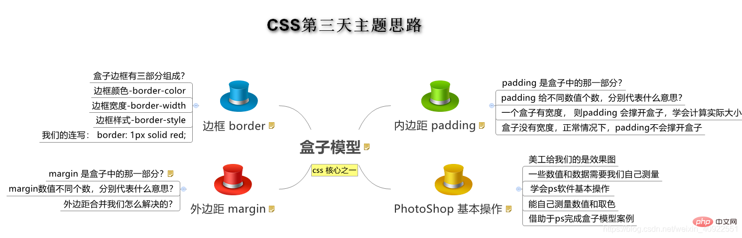
Objective:
- Understanding:
- Can tell the four parts of the box model
- Can tell the contents The role of margins and the impact on boxes
- Can tell what the different values of padding settings represent respectively
- Can tell the two conditions required for center alignment of block-level boxes
- Can tell the solution to merging margins
- Application:
- Can use the border composite writing method to add borders to elements
- Can calculate boxes The actual size
- Can utilize the box model layout module case
2. Box Model
-
The so-called box model:
- treats the layout element in the HTML page as a rectangular box, which is a container that holds content.
- The box model consists of the element's content, border, padding, and margin.
- The text, pictures and other elements in the box are the content area
- The thickness of the box becomes the border of the box
- The distance between the box content and the border is the inner margin (similar to the unit Cellpadding of cells)
- The distance between boxes is the margin (similar to cellspacing of cells)
Standard box model
3. Box border
- Syntax:
1 |
|
| Attribute | Function |
|---|---|
- Border style:
- none: If there is no border, the width of all borders is ignored (default value)
- solid: The border is a single solid line (the most commonly used )
- dashed: The border is a dotted line
- dotted: The border is a dotted line
1
border : border-width || border-style || border-color
Copy after loginCopy after login
For example:
1 |
|
1 |
|
3.3 表格的细线边框
通过表格的
cellspacing="0",将单元格与单元格之间的距离设置为0,但是两个单元格之间的边框会出现重叠,从而使边框变粗
-
通过css属性:
1
table{ border-collapse:collapse; }Copy after login- collapse 单词是合并的意思
- border-collapse:collapse; 表示相邻边框合并在一起。
1 2 3 4 5 6 7 8 9 10 11 12 13 |
|
4. 内边距(padding)
4.1 内边距:
padding属性用于设置内边距。 是指 边框与内容之间的距离。
4.2 设置
| border- bottom -color:color; | border-left-color:color; | border-right-color:color; | |
| border-bottom:width style color; | border-left:width style color; | border-right:width style color; |
| 属性 | 作用 |
|---|---|
| padding-left | 左内边距 |
| padding-right | 右内边距 |
| padding-top | 上内边距 |
| padding-bottom | 下内边距 |
当我们给盒子指定padding值之后, 发生了2件事情:
内容和边框 有了距离,添加了内边距。
盒子会变大了。
注意: 后面跟几个数值表示的意思是不一样的。
我们分开写有点麻烦,我们可以不可以简写呢?
| 值的个数 | 表达意思 |
|---|---|
| 1个值 | padding:上下左右内边距; |
| 2个值 | padding: 上下内边距 左右内边距 ; |
| 3个值 | padding:上内边距 左右内边距 下内边距; |
| 4个值 | padding: 上内边距 右内边距 下内边距 左内边距 ; |
练一练:
请写出如下内边距:
- 要求盒子有一个左边内边距是 5像素
- 要求简写的形式写出 一个盒子上下是 25像素 左右是15像素。
- 要求简写的形式写出 一个盒子 上内边距是 12像素 下内边距是 0 左内边距是 25像素 右内边距是 10像素
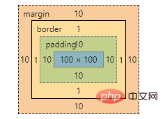
4.4 内盒尺寸计算(元素实际大小)
- 盒子的实际的大小 = 内容的宽度和高度 + 内边距 + 边框
4.5 内边距产生的问题
-
问题
会撑大原来的盒子
-
解决:
通过给设置了宽高的盒子,减去相应的内边距的值,维持盒子原有的大小
练一练
- 一个盒子宽度为100, padding为 10, 边框为5像素,问这个盒子实际的宽度的是()
-
130
100 + 20 + 10
- 关于根据下列代码计算 盒子宽高下列说法正确的是()
1 2 3 4 5 6 7 8 9 10 11 12 13 14 15 |
|
- 宽度为352px 高度为306px
w 200 + 150 + 2 = 352
h 200 + 100 + 6 = 306
4.6 padding不影响盒子大小情况
如果没有给一个盒子指定宽度, 此时,如果给这个盒子指定padding, 则不会撑开盒子。
5. 外边距(margin)
5.1 外边距
margin属性用于设置外边距。 margin就是控制盒子和盒子之间的距离
5.2 设置:
| 属性 | 作用 |
|---|---|
| margin-left | 左外边距 |
| margin-right | 右外边距 |
| margin-top | 上外边距 |
| margin-bottom | 下外边距 |
margin值的简写 (复合写法)代表意思 跟 padding 完全相同。
5.3 块级盒子水平居中
- 可以让一个块级盒子实现水平居中必须:
- 盒子必须指定了宽度(width)
- 然后就给左右的外边距都设置为auto,
实际工作中常用这种方式进行网页布局,示例代码如下:
1 |
|
常见的写法,以下下三种都可以。
- margin-left: auto; margin-right: auto;
- margin: auto;
- margin: 0 auto;
5.4 文字居中和盒子居中区别
盒子内的文字水平居中是 text-align: center, 而且还可以让 行内元素和行内块居中对齐
块级盒子水平居中 左右margin 改为 auto
1 |
|
5.5 插入图片和背景图片区别
插入图片 我们用的最多 比如产品展示类 移动位置只能靠盒模型 padding margin
背景图片我们一般用于小图标背景 或者 超大背景图片 背景图片 只能通过 background-position
1 2 3 4 5 6 7 8 9 10 11 12 13 14 |
|
5.6 清除元素的默认内外边距(重要)
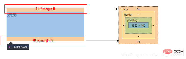
为了更灵活方便地控制网页中的元素,制作网页时,我们需要将元素的默认内外边距清除
代码:
1 2 3 |
|
注意:
- 行内元素为了照顾兼容性, 尽量只设置左右内外边距, 不要设置上下内外边距。
5.7 外边距合并
使用margin定义块元素的垂直外边距时,可能会出现外边距的合并。
(1). 相邻块元素垂直外边距的合并
- 当上下相邻的两个块元素相遇时,如果上面的元素有下外边距margin-bottom
- 下面的元素有上外边距margin-top,则他们之间的垂直间距不是margin-bottom与margin-top之和
-
取两个值中的较大者这种现象被称为相邻块元素垂直外边距的合并(也称外边距塌陷)。

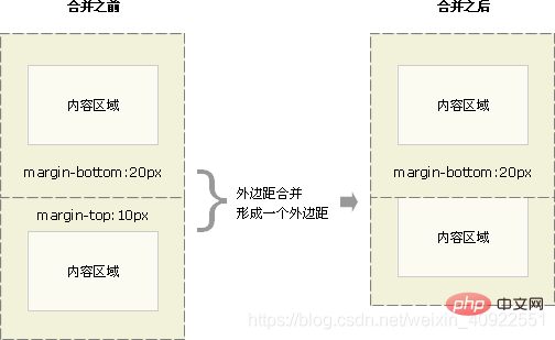
解决方案:尽量给只给一个盒子添加margin值。
(2). 嵌套块元素垂直外边距的合并(塌陷)
- 对于两个嵌套关系的块元素,如果父元素没有上内边距及边框
- 父元素的上外边距会与子元素的上外边距发生合并
- 合并后的外边距为两者中的较大者
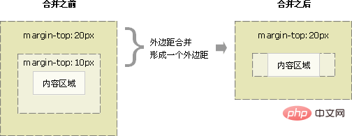
解决方案:
- 可以为父元素定义上边框。
- 可以为父元素定义上内边距
- 可以为父元素添加overflow:hidden。
还有其他方法,比如浮动、固定、绝对定位的盒子不会有问题,后面咱们再总结。。。
6. 盒子模型布局稳定性
-
学习完盒子模型,内边距和外边距,什么情况下用内边距,什么情况下用外边距?
- 大部分情况下是可以混用的。 就是说,你用内边距也可以,用外边距也可以。 你觉得哪个方便,就用哪个。
我们根据稳定性来分,建议如下:
按照 优先使用 宽度 (width) 其次 使用内边距(padding) 再次 外边距(margin)。
1 |
|
- 原因:
- margin 会有外边距合并 还有 ie6下面margin 加倍的bug(讨厌)所以最后使用。
- padding 会影响盒子大小, 需要进行加减计算(麻烦) 其次使用。
- width 没有问题(嗨皮)我们经常使用宽度剩余法 高度剩余法来做。
去掉列表默认的样式
无序和有序列表前面默认的列表样式,在不同浏览器显示效果不一样,而且也比较难看,所以,我们一般上来就直接去掉这些列表样式就行了。 代码如下
1 |
|
今日总结

拓展@
以下我们讲的CSS3部分新属性, 但是我们遵循的原则是,以下内容,不会影响我们页面布局, 只是样式更好看了而已。
1.圆角边框(CSS3)

- 语法:
1 |
|
其中每一个值可以为 数值或百分比的形式。
-
技巧: 让一个正方形 变成圆圈
1
border-radius: 50%;Copy after login
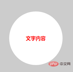
- 以上效果图矩形的圆角, 就不要用 百分比了,因为百分比会是表示高度和宽度的一半。
- 而我们这里矩形就只用 用 高度的一半就好了。精确单位。
2. 盒子阴影(CSS3)
- 语法:
1 |
|
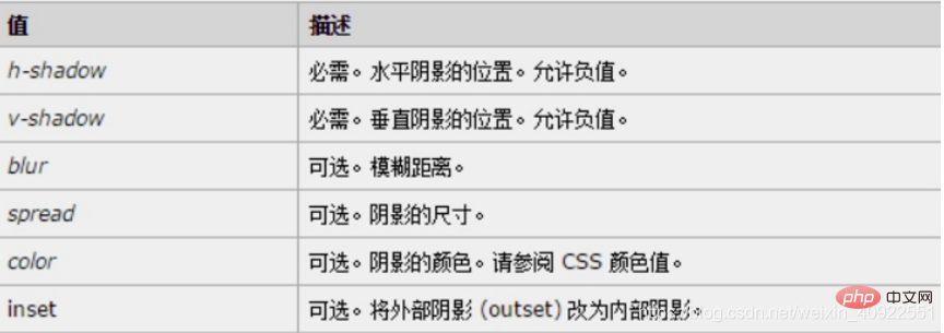
- 前两个属性是必须写的。其余的可以省略。
- 外阴影 (outset) 是默认的 但是不能写 想要内阴影可以写 inset
1 2 3 4 5 6 7 8 |
|
CSS书写规范
开始就形成良好的书写规范,是你专业的开始。
空格规范
【强制】 选择器 与 { 之间必须包含空格。
示例:
1 |
|
【强制】 属性名 与之后的 : 之间不允许包含空格, : 与 属性值 之间必须包含空格。
示例:
1 |
|
选择器规范
【强制】 并集选择器,每个选择器声明必须独占一行。
示例:
1 2 3 4 5 6 7 8 9 10 11 12 |
|
【建议】 一般情况情况下,选择器的嵌套层级应不大于 3 级,位置靠后的限定条件应尽可能精确。
示例:
1 2 3 4 5 6 7 |
|
属性规范
【强制】 属性定义必须另起一行。
示例:
1 2 3 |
|
【强制】 属性定义后必须以分号结尾。
示例:
1 2 3 |
|
The above is the detailed content of Let's talk about the relationship between CSS box size, inner and outer margins and borders. For more information, please follow other related articles on the PHP Chinese website!
Hot AI Tools

Undresser.AI Undress
AI-powered app for creating realistic nude photos

AI Clothes Remover
Online AI tool for removing clothes from photos.

Undress AI Tool
Undress images for free

Clothoff.io
AI clothes remover

Video Face Swap
Swap faces in any video effortlessly with our completely free AI face swap tool!
Hot Article
Hot Tools

Notepad++7.3.1
Easy-to-use and free code editor

SublimeText3 Chinese version
Chinese version, very easy to use

Zend Studio 13.0.1
Powerful PHP integrated development environment

Dreamweaver CS6
Visual web development tools

SublimeText3 Mac version
God-level code editing software (SublimeText3)
Hot Topics


 How to use bootstrap in vue
Apr 07, 2025 pm 11:33 PM
How to use bootstrap in vue
Apr 07, 2025 pm 11:33 PM
Using Bootstrap in Vue.js is divided into five steps: Install Bootstrap. Import Bootstrap in main.js. Use the Bootstrap component directly in the template. Optional: Custom style. Optional: Use plug-ins.
 The Roles of HTML, CSS, and JavaScript: Core Responsibilities
Apr 08, 2025 pm 07:05 PM
The Roles of HTML, CSS, and JavaScript: Core Responsibilities
Apr 08, 2025 pm 07:05 PM
HTML defines the web structure, CSS is responsible for style and layout, and JavaScript gives dynamic interaction. The three perform their duties in web development and jointly build a colorful website.
 How to write split lines on bootstrap
Apr 07, 2025 pm 03:12 PM
How to write split lines on bootstrap
Apr 07, 2025 pm 03:12 PM
There are two ways to create a Bootstrap split line: using the tag, which creates a horizontal split line. Use the CSS border property to create custom style split lines.
 Understanding HTML, CSS, and JavaScript: A Beginner's Guide
Apr 12, 2025 am 12:02 AM
Understanding HTML, CSS, and JavaScript: A Beginner's Guide
Apr 12, 2025 am 12:02 AM
WebdevelopmentreliesonHTML,CSS,andJavaScript:1)HTMLstructurescontent,2)CSSstylesit,and3)JavaScriptaddsinteractivity,formingthebasisofmodernwebexperiences.
 How to insert pictures on bootstrap
Apr 07, 2025 pm 03:30 PM
How to insert pictures on bootstrap
Apr 07, 2025 pm 03:30 PM
There are several ways to insert images in Bootstrap: insert images directly, using the HTML img tag. With the Bootstrap image component, you can provide responsive images and more styles. Set the image size, use the img-fluid class to make the image adaptable. Set the border, using the img-bordered class. Set the rounded corners and use the img-rounded class. Set the shadow, use the shadow class. Resize and position the image, using CSS style. Using the background image, use the background-image CSS property.
 How to set up the framework for bootstrap
Apr 07, 2025 pm 03:27 PM
How to set up the framework for bootstrap
Apr 07, 2025 pm 03:27 PM
To set up the Bootstrap framework, you need to follow these steps: 1. Reference the Bootstrap file via CDN; 2. Download and host the file on your own server; 3. Include the Bootstrap file in HTML; 4. Compile Sass/Less as needed; 5. Import a custom file (optional). Once setup is complete, you can use Bootstrap's grid systems, components, and styles to create responsive websites and applications.
 How to use bootstrap button
Apr 07, 2025 pm 03:09 PM
How to use bootstrap button
Apr 07, 2025 pm 03:09 PM
How to use the Bootstrap button? Introduce Bootstrap CSS to create button elements and add Bootstrap button class to add button text
 How to resize bootstrap
Apr 07, 2025 pm 03:18 PM
How to resize bootstrap
Apr 07, 2025 pm 03:18 PM
To adjust the size of elements in Bootstrap, you can use the dimension class, which includes: adjusting width: .col-, .w-, .mw-adjust height: .h-, .min-h-, .max-h-
