Introducing the CSS box model and box-sizing properties
This article brings you relevant knowledge about css, which mainly introduces the css box model and related issues of the box-sizing attribute. The box-sizing attribute defines how to calculate the total size of an element. The width and total height mainly set whether padding and borders need to be added. Let’s take a look at them together. I hope it will be helpful to everyone.

(Learning video sharing: css video tutorial, html video tutorial)
Box model definition and Category
CSS basic box model is a module of the CSS specification. It defines a rectangular box, including their respective padding and margin
, and based on Visual formatting models to generate elements, lay them out, arrange them, and lay them out. Often literally translated as box model, box model or box model.
Box models have the following classifications:
- Standard definition:
- Standard box model
- Weird mode box model
- Element type
- Block-level box
- Inline box
- Inline block
Standard definition Division
1. Standard box model
Widthwidth = Content width (content) padding border margin
The content width is only content. If you set the width of an element to 100px, then the content area of this element will be 100px wide, and any borders and padding## The width of # will be added to the width of the last drawn element.
width = Content width(content padding border) margin
content, border, padding. If an element's width is set to 100px, then this 100px will include its border and padding , the actual width of the content area is the value of width minus (border padding). In most cases, this makes it easier to set the width and height of an element.
box-sizing attribute has the following two attribute values.
- width (width) padding (padding) border (border) ) = Actual width of element
- height(height) padding(padding) border(border) = Actual height of element ##1. content -box
Default value, uses
standard box model. .contentBox {
box-sizing: content-box;
width: 350px;
border: 10px solid black;
padding: 0 10px;}
.
 2. border-box
Use
weird mode box model. .borderBox {
box-sizing: border-box;
width: 350px;
border: 10px solid black;
padding: 0 10px;}
.

The example is as follows: <!DOCTYPE html>
<html>
<head>
<meta charset="utf-8">
<title>123</title>
<style>
div.container {
width: 100%;
border: 2px solid black;
}
div.box {
box-sizing: border-box;
width: 50%;
border: 5px solid red;
float: left;
}
</style>
</head>
<body>
<div class="container">
<div class="box">这个 div 占据了左边部分</div>
<div class="box">这个 div 占据了右边部分</div>
<div style="clear:both;"></div>
</div>
</body>
</html>

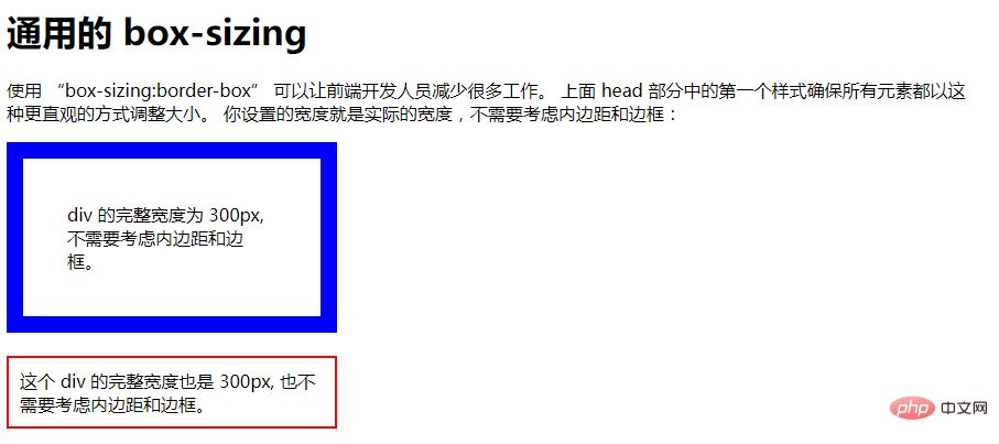
Example 2: <!DOCTYPE html>
<html>
<head>
<style>
* {
box-sizing: border-box;
}
#example1 {
width: 300px;
padding: 40px;
border: 15px solid blue;
}
#example2 {
width: 300px;
padding: 10px;
border: 2px solid red;
}
</style>
</head>
<body>
<h1 id="通用的-nbsp-box-sizing">通用的 box-sizing</h1>
<p>使用 “box-sizing:border-box” 可以让前端开发人员减少很多工作。 上面 head 部分中的第一个样式确保所有元素都以这种更直观的方式调整大小。
你设置的宽度就是实际的宽度,不需要考虑内边距和边框:</p>
<div id="example1">div 的完整宽度为 300px, 不需要考虑内边距和边框。</div>
<br>
<div id="example2">这个 div 的完整宽度也是 300px, 也不需要考虑内边距和边框。</div>
</body>
</html>
 Element type division
1. Block-level box
A block box defined as a block will exhibit the following behavior:
The box can occupy all available space of the parent container- Each box will wrap width
- and
heightproperties can workBy defaulth1- h6 - ,
p,p,sectionare all inblockstatus 2. Linked boxes
An inline box defined as inline will exhibit the following behavior:
- 盒子不会产生换行
width和height属性将不起作用- 默认情况下用做链接的
a元素、span、em以及strong都处于inline状态
3. 特殊的行内块
如果不希望一个项切换到新行,但希望它可以设定宽度和高度,此时我们可以将该元素设置为inline-block。
4. 元素类型切换
display属性值 | |
|---|---|
| 块级盒子 | block |
| 内联盒子 | inline |
| 行内块 | inline-block |
4. 盒模型属性设置
1. margin和padding
- 1个值:四个方向
- 2个值:上下、左右
- 3个值:上、左右、下
- 4个值:上、右、下、左
2. border值
border: 10px double red;
10px、双实线、红色边框。
The above is the detailed content of Introducing the CSS box model and box-sizing properties. For more information, please follow other related articles on the PHP Chinese website!

Hot AI Tools

Undresser.AI Undress
AI-powered app for creating realistic nude photos

AI Clothes Remover
Online AI tool for removing clothes from photos.

Undress AI Tool
Undress images for free

Clothoff.io
AI clothes remover

Video Face Swap
Swap faces in any video effortlessly with our completely free AI face swap tool!

Hot Article

Hot Tools

Notepad++7.3.1
Easy-to-use and free code editor

SublimeText3 Chinese version
Chinese version, very easy to use

Zend Studio 13.0.1
Powerful PHP integrated development environment

Dreamweaver CS6
Visual web development tools

SublimeText3 Mac version
God-level code editing software (SublimeText3)

Hot Topics
 1392
1392
 52
52
 How to use bootstrap in vue
Apr 07, 2025 pm 11:33 PM
Using Bootstrap in Vue.js is divided into five steps: Install Bootstrap. Import Bootstrap in main.js. Use the Bootstrap component directly in the template. Optional: Custom style. Optional: Use plug-ins.
 The Roles of HTML, CSS, and JavaScript: Core Responsibilities
Apr 08, 2025 pm 07:05 PM
HTML defines the web structure, CSS is responsible for style and layout, and JavaScript gives dynamic interaction. The three perform their duties in web development and jointly build a colorful website.
 How to write split lines on bootstrap
Apr 07, 2025 pm 03:12 PM
There are two ways to create a Bootstrap split line: using the tag, which creates a horizontal split line. Use the CSS border property to create custom style split lines.
 Understanding HTML, CSS, and JavaScript: A Beginner's Guide
Apr 12, 2025 am 12:02 AM
WebdevelopmentreliesonHTML,CSS,andJavaScript:1)HTMLstructurescontent,2)CSSstylesit,and3)JavaScriptaddsinteractivity,formingthebasisofmodernwebexperiences.
 How to use bootstrap button
Apr 07, 2025 pm 03:09 PM
How to use the Bootstrap button? Introduce Bootstrap CSS to create button elements and add Bootstrap button class to add button text
 How to resize bootstrap
Apr 07, 2025 pm 03:18 PM
To adjust the size of elements in Bootstrap, you can use the dimension class, which includes: adjusting width: .col-, .w-, .mw-adjust height: .h-, .min-h-, .max-h-
 How to set up the framework for bootstrap
Apr 07, 2025 pm 03:27 PM
To set up the Bootstrap framework, you need to follow these steps: 1. Reference the Bootstrap file via CDN; 2. Download and host the file on your own server; 3. Include the Bootstrap file in HTML; 4. Compile Sass/Less as needed; 5. Import a custom file (optional). Once setup is complete, you can use Bootstrap's grid systems, components, and styles to create responsive websites and applications.
 How to insert pictures on bootstrap
Apr 07, 2025 pm 03:30 PM
There are several ways to insert images in Bootstrap: insert images directly, using the HTML img tag. With the Bootstrap image component, you can provide responsive images and more styles. Set the image size, use the img-fluid class to make the image adaptable. Set the border, using the img-bordered class. Set the rounded corners and use the img-rounded class. Set the shadow, use the shadow class. Resize and position the image, using CSS style. Using the background image, use the background-image CSS property.


