CSS telescopic box layout (summary sharing)
This article brings you relevant knowledge about css, which mainly introduces issues related to CSS telescopic box layout. An element sets the CSS attribute display:flex or display:inline-flex. , the element becomes a scalable container. Let’s take a look at it. I hope it will be helpful to everyone.

(Learning video sharing: css video tutorial, html video tutorial)
Telescopic Box layout
1 Flex container and flex items
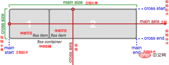
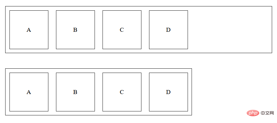
Flexible container: An element sets CSS propertiesdisplay:flex or display:inline-flex, the element becomes a flex container.
Scaling project: The child elements of the scaling container are the scaling projects.
Features of scalable projects:
- The scalable projects will be arranged horizontally in the scalable container by default.
- The scalable project can set the width, height, inner and outer margins, and there will be no margin collapse. It will not break away from the document flow and is scalable.
- An element can be a flex item and a flex container at the same time.
2 Set the spindle direction and line wrapping method
Spindle: Flexible items are arranged along the spindle, the default spindle direction It's from left to right.
Side axis: The axis perpendicular to the main axis is called the side axis, and the direction of the side axis changes with the direction of the main axis.
Set the main axis direction
Give the CSS property to the flex container flex-direction You can set the main axis direction, the value is as follows:
row				水平从左到右,默认值
row-reverse		水平从右到左
column			垂直从上到下
column-reverse	垂直从下到上
Set the line wrap method
Give the CSS property of the flex container flex-wrap You can set the line wrap method of the flex item in the main axis direction. The value of the property is as follows:
nowrap			默认值,不换行
wrap			自动换行
wrap-reverse	自动换行,行翻转
Set the main axis direction and line wrapping method at the same time
flex-flow is a composite property of flex-directrion and flex-wrap. You can set the main axis direction and line wrapping method at the same time. Line break mode.
flex-flow You can set 1 value or 2 values (there is no order requirement between the two values).
3 Set the alignment of the flex items on the main axis
Set the justify-content attribute to the flex container to set the flex items on the main axis The alignment of No line breaks on top)
Set the align-items
attribute to the scalable container. The attribute values are as follows:
flex-start			默认值,主轴起始对齐
flex-end			主轴结束对齐
center				居中
space-between		两端没有空隙,中间有空隙
space-around		两端空隙是中间空隙的一半
space-enenly		两端空隙与中间空隙相等
Copy after login
Multiple main axis lines (scaling The item wraps on the main axis)
flex-start 默认值,主轴起始对齐 flex-end 主轴结束对齐 center 居中 space-between 两端没有空隙,中间有空隙 space-around 两端空隙是中间空隙的一半 space-enenly 两端空隙与中间空隙相等
Easily set the align-content
attribute for scaling. The attribute value is as follows:
stretch			默认值,伸缩项目在侧轴方向的长度(高度)在侧轴方向拉伸(不设置在侧轴方向的长度,才会生效)
flex-start		侧轴起点对齐
flex-end		侧轴终点对齐
center			居中对齐
baseline		文本基线对齐
Copy after login
Summary: stretch 默认值,伸缩项目在侧轴方向的长度(高度)在侧轴方向拉伸(不设置在侧轴方向的长度,才会生效) flex-start 侧轴起点对齐 flex-end 侧轴终点对齐 center 居中对齐 baseline 文本基线对齐
align-content actually sets how to align multiple main axes.
The align-items property will work regardless of one main axis line or multiple main axis lines; but align-content only works for multiple main axis lines.
The base length of the flex project on the main axis flex-basis
- 5 The scalability of the flex project
flex-basis Specifies the length to set the length of the flex item on the main axis.
If flex-basis is not set, the length of the flex item on the main axis depends on the set width or height.Expansion ratio flex-grow
The specified number represents the expansion ratio. The default value of this property is 0. The prerequisite for the expansion of the scalable project: The scalable container has sufficient length upward in the main axis direction.When a scalable project is expanded, only the expansion ratio of the scalable project is considered.
Shrink ratio flex-shrink
The specified number represents the shrinkage ratio. The default value of this property is 1. The prerequisite for the shrinkage of the scalable project: The length of the scalable container is insufficient in the main axis direction.When shrinking a telescopic item, you must consider both the shrinkage ratio and the original length of the shrinkable item on the main axis.
flex composite attribute
Set the expansion ratio, contraction ratio, and main axis reference length at the same time. The setting rules are as follows:strecch 默认值 flex-start 侧轴起点对齐 flex-end 侧轴终点对齐 center 居中对齐 space-between 两端没有空隙,中间有空隙 space-around 两端空隙是中间空隙的一半 space-enenly 两端空隙与中间空隙相等
flex: grow shrink basis;flex: 0 1 auto; /* 扩展比率是0,收缩比率是1,基准值是auto */
6 Telescopic items Sorting
Use the order attribute to set the sorting of scalable items. The value is a number. The smaller the number, the higher the sorting is. It can be a negative value. The default value is 0.flex: 1; /* flex: 1 1 0; */flex: auto; /* flex: 1 1 auto; */flex: none; /* flex: 0 0 auto 不伸不缩*/flex: 0 auto; /* flex: 0 1 auto */
7 Set the alignment of the flex item on the side axis individually
Set properties for the flex itemalign-self
You can set the flex item individually The alignment of items on the cross axis. The value of the attribute is consistent with align-items.
8 Summary of CSS properties related to the flex box
Attributes set to the flex container
| CSS Attribute name | Meaning | Value |
|---|---|---|
| Set the scaling container | flex: Block-level scalable container. **inline-flex:** Inline flex container. |
|
| Set the main axis direction | row: Default value, horizontally from left to right. row-reverse: Horizontally from right to left. column: Vertically from top to bottom. **column-reverse:**Vertical from bottom to top |
|
| Set the line wrapping method | nowrap : Default value, no line breaks. wrap: Automatically wrap lines. wrap-reverse: Automatically wrap and flip lines. |
|
| Set the main axis direction and line wrapping method at the same time | The values of flex-dierection and flex-wrap | |
| Set the alignment of flex items on the main axis | flex-start: Alignment of the main axis starting point. flex-end: Alignment of main axis end point. center: Center alignment. space-between: There is no space at both ends and there is space in the middle. **space-around:**The spaces at both ends are half of the space in the middle. **space-evenly:** The spaces at both ends are consistent with the space in the middle. |
|
| Set the alignment of stretch items on the cross axis (applies to a main axis line) | stretch: Default value, stretch on the cross axis. flex-start: Align the starting point of the cross axis. flex-end: Alignment of cross axis end point. center: Center alignment. baseline: Baseline alignment. |
|
| Set the alignment of flex items on the side axis (applicable to multiple main axis lines) | stretch: Default value, stretch on the cross axis. flex-start: Align the starting point of the cross axis. flex-end: Alignment of cross axis end point. center: Center alignment. space-between: There is no space at both ends and there is space in the middle. **space-around:**The spaces at both ends are half of the space in the middle. **space-evenly:** The spaces at both ends are consistent with the space in the middle. |
Attributes set to the scalable project
| Meaning | Value | |
|---|---|---|
| Expansion ratio | Number, the default value is 0 | |
| Shrink ratio | Number, the default value is 1 | |
| The reference length on the main axis | Specify the length, the default value is auto | |
| Composite attribute, and set grow shrink basis | grow shrink basis | |
| The order of shrinking items | Number, the default value is 0 | |
| Separately set the alignment of flex items on the cross axis | **auto: **Default value, according to the settings of the flex container. |
stretch: Default value, stretches on the cross axis. flex-start: Align the starting point of the cross axis. flex-end: Alignment of cross axis end point. center: Center alignment. baseline: Baseline alignment. |
The above is the detailed content of CSS telescopic box layout (summary sharing). For more information, please follow other related articles on the PHP Chinese website!

Hot AI Tools

Undresser.AI Undress
AI-powered app for creating realistic nude photos

AI Clothes Remover
Online AI tool for removing clothes from photos.

Undress AI Tool
Undress images for free

Clothoff.io
AI clothes remover

AI Hentai Generator
Generate AI Hentai for free.

Hot Article

Hot Tools

Notepad++7.3.1
Easy-to-use and free code editor

SublimeText3 Chinese version
Chinese version, very easy to use

Zend Studio 13.0.1
Powerful PHP integrated development environment

Dreamweaver CS6
Visual web development tools

SublimeText3 Mac version
God-level code editing software (SublimeText3)

Hot Topics
 1378
1378
 52
52
 How to write split lines on bootstrap
Apr 07, 2025 pm 03:12 PM
There are two ways to create a Bootstrap split line: using the tag, which creates a horizontal split line. Use the CSS border property to create custom style split lines.
 How to use bootstrap in vue
Apr 07, 2025 pm 11:33 PM
Using Bootstrap in Vue.js is divided into five steps: Install Bootstrap. Import Bootstrap in main.js. Use the Bootstrap component directly in the template. Optional: Custom style. Optional: Use plug-ins.
 The Roles of HTML, CSS, and JavaScript: Core Responsibilities
Apr 08, 2025 pm 07:05 PM
HTML defines the web structure, CSS is responsible for style and layout, and JavaScript gives dynamic interaction. The three perform their duties in web development and jointly build a colorful website.
 How to insert pictures on bootstrap
Apr 07, 2025 pm 03:30 PM
There are several ways to insert images in Bootstrap: insert images directly, using the HTML img tag. With the Bootstrap image component, you can provide responsive images and more styles. Set the image size, use the img-fluid class to make the image adaptable. Set the border, using the img-bordered class. Set the rounded corners and use the img-rounded class. Set the shadow, use the shadow class. Resize and position the image, using CSS style. Using the background image, use the background-image CSS property.
 How to resize bootstrap
Apr 07, 2025 pm 03:18 PM
To adjust the size of elements in Bootstrap, you can use the dimension class, which includes: adjusting width: .col-, .w-, .mw-adjust height: .h-, .min-h-, .max-h-
 How to set up the framework for bootstrap
Apr 07, 2025 pm 03:27 PM
To set up the Bootstrap framework, you need to follow these steps: 1. Reference the Bootstrap file via CDN; 2. Download and host the file on your own server; 3. Include the Bootstrap file in HTML; 4. Compile Sass/Less as needed; 5. Import a custom file (optional). Once setup is complete, you can use Bootstrap's grid systems, components, and styles to create responsive websites and applications.
 How to use bootstrap button
Apr 07, 2025 pm 03:09 PM
How to use the Bootstrap button? Introduce Bootstrap CSS to create button elements and add Bootstrap button class to add button text
 How to view the date of bootstrap
Apr 07, 2025 pm 03:03 PM
Answer: You can use the date picker component of Bootstrap to view dates in the page. Steps: Introduce the Bootstrap framework. Create a date selector input box in HTML. Bootstrap will automatically add styles to the selector. Use JavaScript to get the selected date.


