 Web Front-end
 CSS Tutorial
 Summary of radial gradient knowledge points of css background gradient properties
Summary of radial gradient knowledge points of css background gradient properties
This article brings you relevant knowledge about css, which mainly introduces the related issues of radial gradient. Radial gradient can be understood as a gradient with a radius value, that is, the final The effect is no longer a gradient along a straight axis. The final effect is a circle or oval. Let’s take a look at it. I hope it will be helpful to everyone.

(Learning video sharing: css video tutorial, html video tutorial)
Radial gradient can It is understood that with the gradient of the radius value, the final effect is no longer a gradient along a linear axis. The final effect is a circle or oval. As shown in the figure below, it is a radial gradient effect.
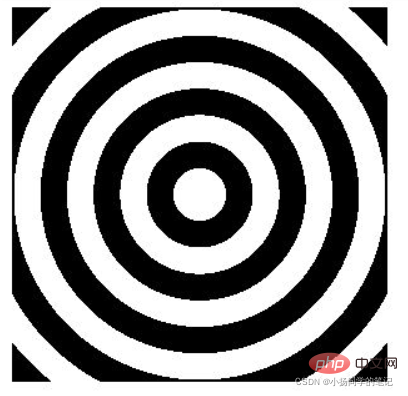
Radial gradient is achieved by using the radial-gradient() method in background. Its syntax structure is similar to linear-gradient, that is, linear gradient. You can also customize the direction value and color value. Because it is radial, you can also set the radius value to achieve size changes
General syntax structure:
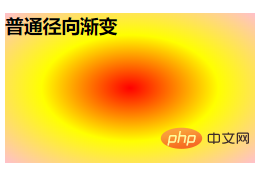
background:radial-gradient(red,yellow,pink)

/*这个语法中,只在radial-gradient方法中添加了颜色值 所以其它的参数全部采取默认
方向 采取的默认值是中心的位置 (这里的方向不是指渐变的方向 而是圆心的位置)
形状 采取的默认值是ellipse(椭圆形) 这里只有两个参数 ellipse(椭圆形)和circle(圆形) 默认ellipse
因为是径向渐变 所以颜色的展示是从里到外 如上所示 表示圆心中间显示的是红色 然后往外拓展分别是黄色 粉色
*/
As shown below, it is the final rendering
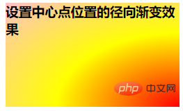
The grammatical structure of customizing the center position of the circle:
background: radial-gradient(at right bottom,red,yellow,pink)

/*使用 at 来定义最终的圆心位置 at后面可以接代表方向的关键字 也可以使用百分值
默认是先设置水平方向的位置 然后是垂直方向 这里就表示将圆心的位置定义在右下角
颜色从里到外依次为 red yellow pink
*/
The final rendering is as follows As shown
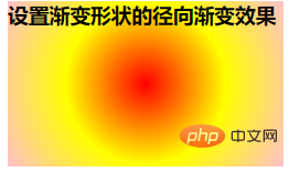
The syntax of the radial gradient of the center position of the custom shape
background: radial-gradient(circle at 50% 50%, red,yellow,pink)
/*这里表示的就是创建一个圆形 且该圆形的圆心位于水平方向50% 垂直方向50%的位置 即居中
颜色从里到外拓展依次为 red yellow pink
*/
The final rendering is as follows
Radial gradient effect with custom radial size
background: radial-gradient(150px 110px at 50% 50%,red,yellow,pink)
/*这里表示定义了一个水平半径为150px 垂直半径为110px 圆心的位置在水平方向50% 垂直方向50% 即居中
颜色从里到外拓展依次为 red yellow pink
*/
The final rendering is as follows
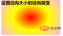
Note : When writing, please note that the color values are separated by commas. Custom shapes, custom radial sizes and color values are also separated by commas. Before using the gradient effect, you must first define a container to define the container. The width and height will make the effect appear
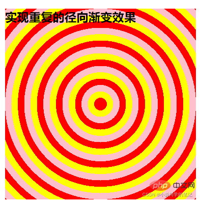
## The above four are simple radial gradient effects. In addition to this, there are also more complex repeated radial gradients. Effect. Implemented through the repeating-radial-gradient() methodUsing this method to achieve a repeating radial gradient effect is similar to the syntax of the ordinary radial gradient effect above, except that it adds the end value of the color on the original basis. Setting, that is, setting how much space the specified element occupies in this containerFor example:width: 300px; height: 300px; background: repeating-radial-gradient(circle at 50% 50%, red,red 10px,yellow 10px,yellow 20px,pink 20px,pink 30px); /*该语法使用repeating-radial-gradient方法 表示创建一个重复的径向渐变 这个重复的径向渐变的形状是圆形 圆心的位置在水平方向50% 垂直方向50%的地方 设置了三种颜色 red yellow pink 这三种颜色所占空间都是10px 其中红色为三种颜色中第一个呈现的颜色 黄色为第二呈现 粉色为第三呈现 因为设置了容器的大小 所以当所有颜色值都使用完之后 仍然没有填满整个容器的话 就会自动返回到第一个颜色值 以此循环 直到填满整个容器 */
width: 300px;
height: 300px;
border-radius: 50%;
background: repeating-radial-gradient(circle at 50% 50%,red, red 10px,yellow 10px, yellow 20px,pink 20px,pink 30px);

/*如上所示 在之前的基础上定义了容器的形状 使用border-radius的方法创建了一个圆形*/
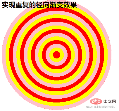
Note: If you want to achieve a repeated radial gradient effect, you must define the size and shape of the container, and the color and the space occupied by the color must also be adjusted according to the actual situation. The setting order of color values is the final setting of the final display effect. In the definition, it is from left to right, and in the final effect, it is from inside to outside.
Radial Radial gradients are defined by their center point, edge shape outline and position, and color stops.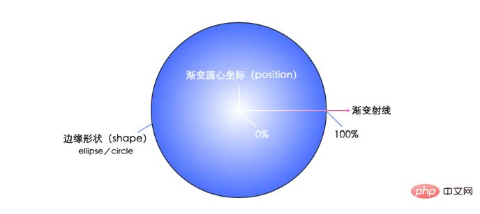

background: radial-gradient( [ circle || <length> ] [ at <position> ]? ,| [ ellipse || [<length> | <percentage> ]{2}] [ at <position> ]? ,| [ [ circle | ellipse ] || <extent-keyword> ] [ at <position> ]? ,| at <position> ,<color-stop> [ , <color-stop> ]+ )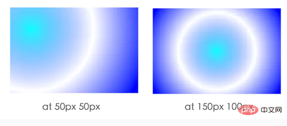
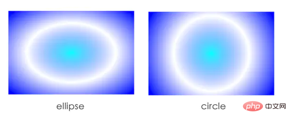
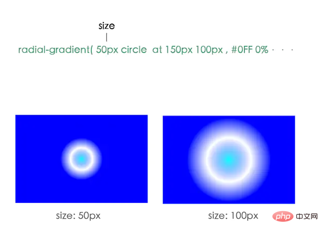
size: The size of the gradient.
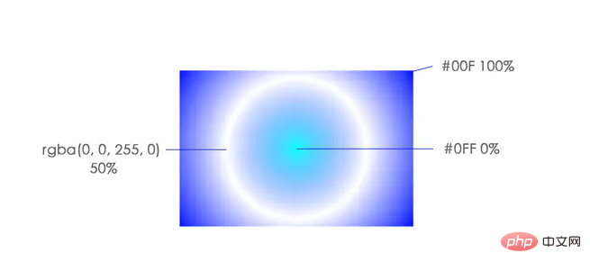
#color-stop: Represents a fixed color value at a certain position. The
extent-keyword: keyword is used to describe the specific location of the edge outline. The following are keyword constants:
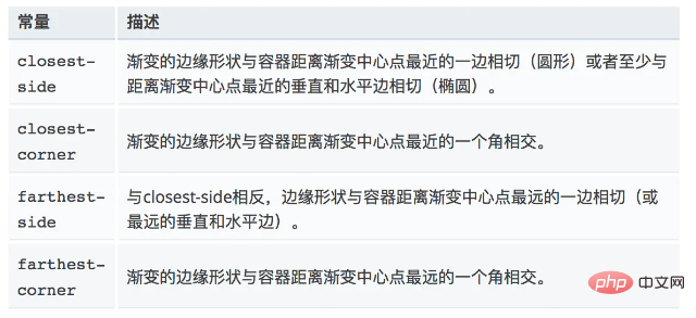

(Learning video sharing: css video tutorial, html video Tutorial)
The above is the detailed content of Summary of radial gradient knowledge points of css background gradient properties. For more information, please follow other related articles on the PHP Chinese website!

Hot AI Tools

Undresser.AI Undress
AI-powered app for creating realistic nude photos

AI Clothes Remover
Online AI tool for removing clothes from photos.

Undress AI Tool
Undress images for free

Clothoff.io
AI clothes remover

AI Hentai Generator
Generate AI Hentai for free.

Hot Article

Hot Tools

Notepad++7.3.1
Easy-to-use and free code editor

SublimeText3 Chinese version
Chinese version, very easy to use

Zend Studio 13.0.1
Powerful PHP integrated development environment

Dreamweaver CS6
Visual web development tools

SublimeText3 Mac version
God-level code editing software (SublimeText3)

Hot Topics
 How to isolate styles in components in vue
May 09, 2024 pm 03:57 PM
Style isolation in Vue components can be achieved in four ways: Use scoped styles to create isolated scopes. Use CSS Modules to generate CSS files with unique class names. Organize class names using BEM conventions to maintain modularity and reusability. In rare cases, it is possible to inject styles directly into the component, but this is not recommended.
 How to register for Bitstamp exchange pro? Is it safe? Is it formal?
Aug 13, 2024 pm 06:36 PM
How to register BitstampPro? Visit the BitstampPro website. Fill in your personal information and email address. Create a password and accept the terms. Verify email address. Is BitstampPro safe? Authentication required. Enforce the use of two-factor authentication. Most assets are stored in cold storage. Use HTTPS to encrypt communication. Conduct regular security audits. Is BitstampPro legitimate? Registered in Luxembourg. Regulated by the Luxembourg Financial Supervisory Committee. Comply with anti-money laundering and know-your-customer regulations.
 How to implement the custom table function of clicking to add data in dcat admin?
Apr 01, 2025 am 07:09 AM
How to implement the table function of custom click to add data in dcatadmin (laravel-admin) When using dcat...
 What is the format of the source file?
May 09, 2024 pm 10:51 PM
Source files are uncompiled files containing original code or data, and their formats vary between programming languages and applications. Common formats include text files (.txt, .csv), programming languages (such as .py, .java), markup languages (such as .html, .css), image files (such as .png, .jpg), video files (such as .mp4, .avi), and other formats such as JSON (.json), PDF (.pdf), Word document (.doc), etc.
 The latest ranking list of virtual currency trading platform APP (inventory of top 10 virtual currency trading platforms)
Mar 04, 2025 pm 03:51 PM
This article lists the top ten leading cryptocurrency exchanges in the world, including OKX, Binance, Gate.io, Huobi, Kraken, Coinbase, KuCoin, Crypto.com, Bitfinex and Bitstamp. With their strong technical strength, rich product lines, strict compliance operations and innovative ecological construction, these exchanges have taken the lead in the global cryptocurrency market. The article will introduce their special functions, technical architecture, security measures, compliance qualifications and ecosystem construction respectively, providing reference for investors to choose a suitable trading platform.
 What does z-index mean?
May 09, 2024 pm 11:21 PM
z-index is a CSS property that controls the order in which elements overlap on the page, similar to the order in which paper is stacked. Here's how it works: Every element has a default z-index value of 0. Elements with higher z-index values will overwrite elements with lower z-index values. z-index can be used to create floating elements, control the order of overlapping elements, and create three-dimensional effects. When using, you need to consider things such as avoiding overuse, using negative values, and paying attention to browser compatibility.
 Share the top ten official website addresses of the world's formal virtual currency trading software in 2025
Feb 15, 2025 pm 04:42 PM
With the development of the cryptocurrency market, formal virtual currency trading software has become the focus of investors' attention. In the fierce competition, some trading platforms stand out and provide safe and reliable services. According to industry research and comprehensive rankings, this article will list the top ten best virtual currency trading software in the world in 2025 and provide its official website address. These platforms have been strictly reviewed and are designed to provide users with excellent trading experience and investment guarantees.
 What exactly is Bitstamp exchange like? Is Bitstamp exchange safe?
Aug 16, 2024 pm 06:02 PM
The Bitstamp exchange is known for its security and reliability, boasting the following features: Cold Storage and Multi-Signature: Most funds are stored offline, requiring multiple authorizations to approve transactions. Compliance and Regulation: Regulated by the Luxembourg Financial Regulatory Commission and compliant with anti-money laundering and KYC regulations. Network security measures: including DDoS protection, SSL encryption and regular security audits. Insurance and Fund Protection: Theft or loss is insured by Lloyd's of London and has a backup fund to protect user funds. Customer support and response: 24/7 customer support, right on the matter


