
Corporate website design is also very particular. For example, the direction of the layout is very important. So what is a reasonable layout method for corporate website design?
##The content of the website page is appropriately loose
When designing a website page, its effect not only needs to be consistent with the theme style of the website, but also in terms of layout. It needs to be kept loose and organized, simple and elegant. The page content layout must not be too crowded, and you must be brave enough to leave blank spaces where they should be. Only in this way can the website page have better aesthetics, and the website content can be displayed to the user more clearly and intuitively. At the same time, the user can maintain a relaxed and happy mood when browsing the website content, so as to browse the website content more completely. Otherwise, it will only cause the website content to be too compact and messy, causing users to lose interest in browsing.
# Website page Layout shows personality
# #Although a very cool website style can give users a very strong visual impact and thus be attracted to it. However, if you do this, the theme style of the website will easily affect the content, causing certain obstacles for users to browse the content, thus producing the effect of overshadowing the content. And a cool website theme style will inevitably require more elements to create, which will make the website more complex and slow down the loading speed of the website. In this way, when users visit the website, the website may not open for a long time, or the website may not open after entering the website. Can't tell the direction. A concise and clear website can be opened quickly and allows users to quickly find the content they need.
##In view of the Internet environment, we must adhere to practical and open rules to realize enterprise informatization. From an overall perspective, many websites will not choose responsive design when they first create a website. The reason is also more in line with the environment. Due to many reasons such as slow website speed and insufficient 4G penetration, it takes a long time to browse a responsive website on a mobile phone. According to the three-second rule, if customers cannot open a website within three seconds, they will choose closure. Many websites today are basically designed separately for mobile and computer to adapt to browsing on different devices.
Company websites should avoid too many fancy designs, as too many tricks will make customers confused. A concise and clear web page will increase the user experience and allow customers to find the content they need smoothly. Usually Internet companies can create website columns, add product lists, and make a website with clear navigation. Customize the page according to the characteristics of the enterprise to meet the needs of web page beautification. These reasonable layouts and clear structures comply with the inclusion rules of major search engines, allowing more users to find the company. Establish an Internet platform that meets product needs, provide customers with multiple functions, and save website building costs. At this time, the website has a management backend based on the web interface, and the company can independently update the content on the website, saving the operating costs of the corporate website and improving Information update and dissemination efficiency. [Recommended: css video tutorial]
## Six common layout methods for corporate websites
##1. The layout of large frames within small frames
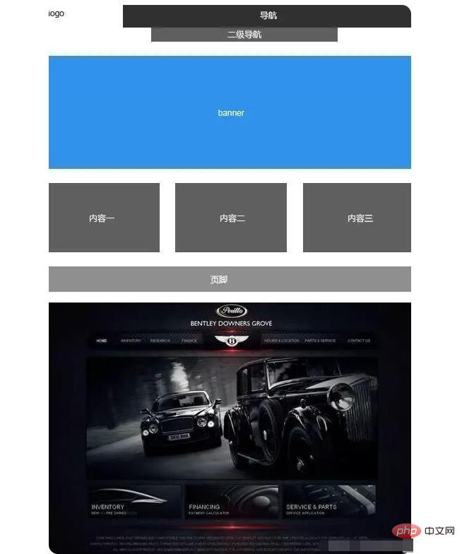
##This layout makes the eyes no longer Restricted by the box, compared to the above layout, it naturally has a more atmospheric and open feel. In addition, the main visual part can be processed flexibly. It can be expanded upward to the top position of the logo and navigation, or downward to the content area. This layout method is also a very common layout method.
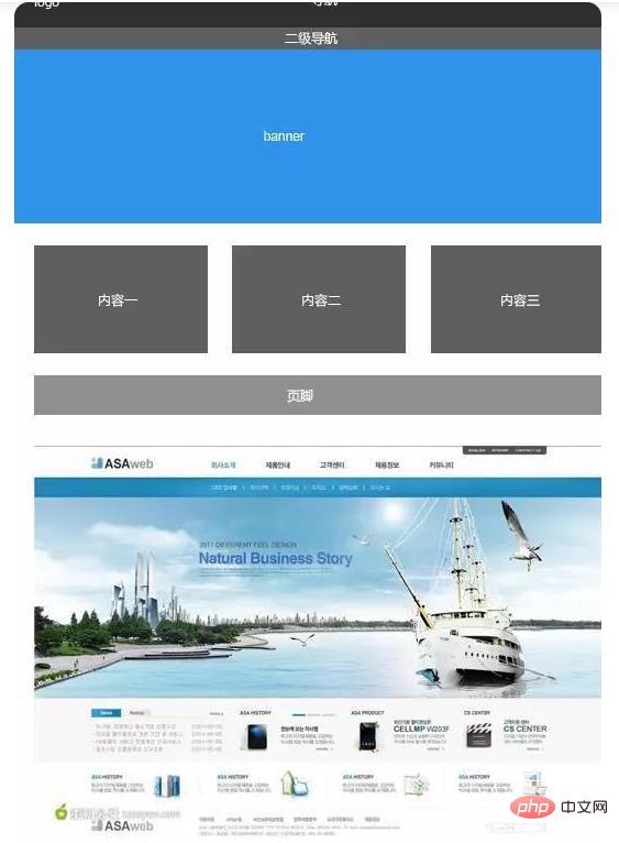
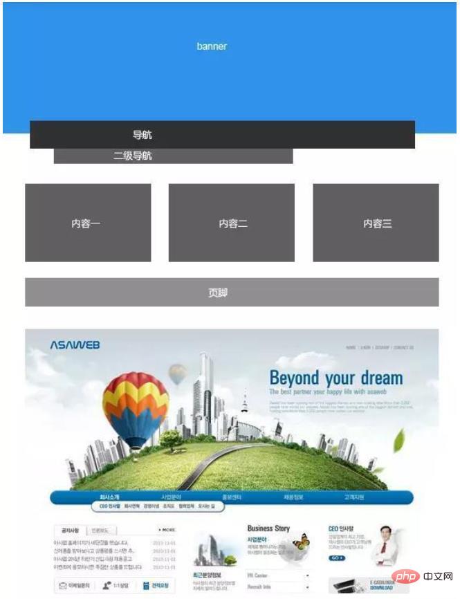
#Although this Not many, but you can see it from time to time. The advantage of placing the navigation below the banner is that it can make up for the shortcomings of truncation of design materials in the banner, making the design look complete and natural. Therefore, the layout method is affected by many factors, including not only the space occupied by the information content, but also the materials you have on hand.
 #
#4. Left, center and right layout
This layout method is not common, but it is a very fresh layout method. If you are tired of horizontally divided designs, try This layout might not be a bad choice.
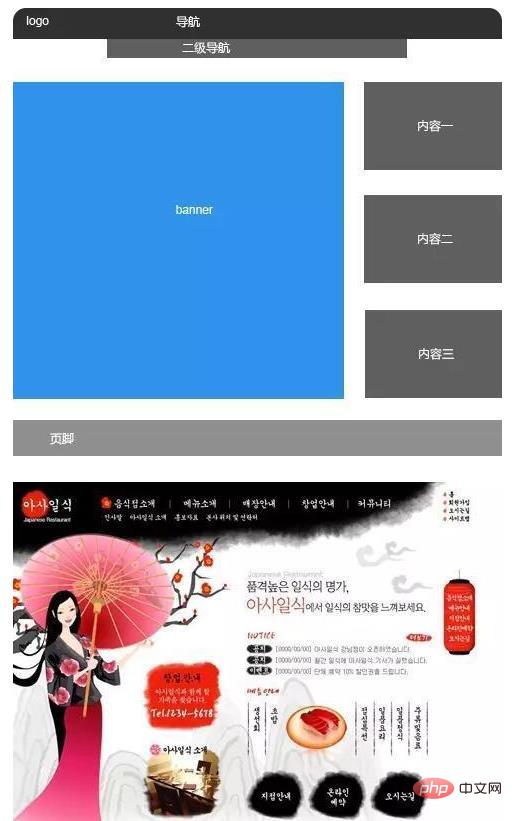
#5. Surround layout
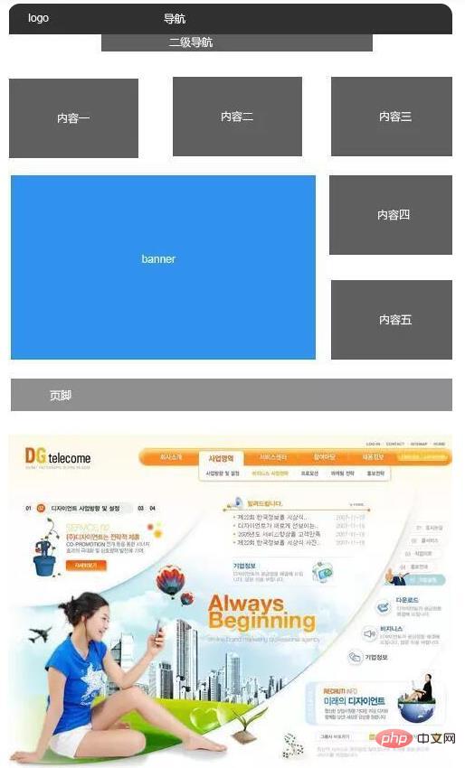
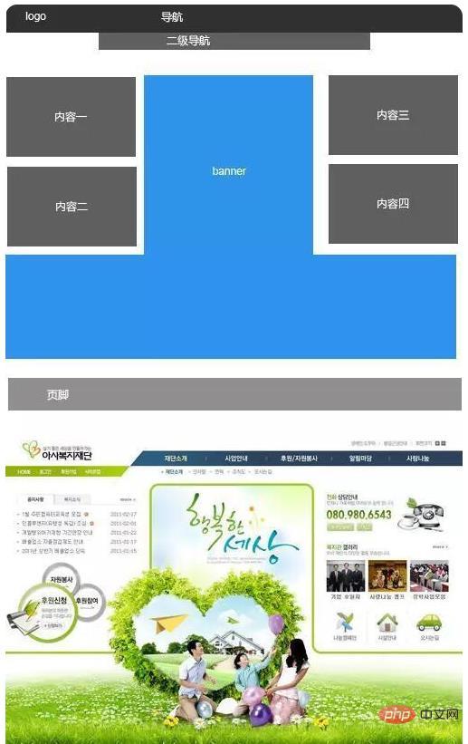
#This kind of layout is suitable for enterprise websites It is difficult to see, not used much, and the banner area is relatively large, so it can be used as a layout option.
The above is the detailed content of Let's talk about the page layout of corporate websites!. For more information, please follow other related articles on the PHP Chinese website!