This article will share with you a tip on using a CSS custom counter, and talk about how to use it to achieve long-press like accumulation animation. I hope it will be helpful to everyone!

[Recommended learning: css video tutorial]
In a certain APP, if you press and hold to like, something like this will appear. The fancy animation is as follows

This animation consists of two parts. For the implementation of this random expression, you can refer to this article by cocoSkillfully use transition to implement short video APP Like animation

is relatively similar, so I won’t repeat it here. What we want to implement here is this constantly changing digital animation, as demonstrated below

Observe carefully, there are mainly the following interactions
Let’s see how to implement it
Using pseudo elements can make HTML concise and flexible enough. For example, the HTML is as follows
<button>长按点赞</button>
Use pseudo elements to implement prompt copywriting and simply modify it
.like{
  position: relative;
}
.like::after{
  position: absolute;
  bottom: 100%;
  width: max-content;
  font-size: 2rem;
  font-style: italic;
  font-weight: bolder;
  background-image: linear-gradient(#FFCF02, #FF7352);
  -webkit-background-clip: text;
  -webkit-text-fill-color: transparent;
  content:'x10';
}The effect is as follows

Then, we need to hide this prompt by default and only appear when pressed
.like::after{
  /**/
  transform: translateY(100%);
  opacity: 0;
  visibility: hidden;
  transition: .3s;
}
.like:active::after{
  visibility: visible;
  opacity: 1;
  transform: translateY(0);
}In this way, it is easy to realize that it will appear upwards when pressed , the animation that restores when you lift it

However, this kind of animation looks uncomfortable. So, how to change the rollback animation when you lift it? It's very simple. Set the upward transition animation on :active, and add a delay to ensure that the displacement animation is restored after the element disappears.
Regarding this animation technique, you can Refer to my previous article CSS routine to achieve button click animation
.like::after{
  /**/
  transform: translateY(100%);
  opacity: 0;
  visibility: hidden;
  transition: .3s .3s, 0s .6s transform; /*默认情况下没有transform*/
}
.like:active::after{
  visibility: visible;
  opacity: 1;
  transform: translateY(0);
  transition: .3s;
}The effect is as follows

Are you still using timers? CSS can also implement electronic clock and animation synthesis tips! CSS to achieve dynamic countdown effectIn the past, changing the number may require creating multiple labels, and then changing the displacement to achieve
<div>
    <span>1</span>
  <span>2</span>
  <span>3</span>
  <span>4</span>
  <span>5</span>
  <span>...</span>
</div>
can't be used in pseudo-elements.
But now there is a simpler way to achieve it, that is CSS @property. What is this for? To put it simply, you can customize attributes. In this example,can make numbers transition and animate like colors. , you may not understand, just look at the example
Let’s go through CSS first Variables render numbers to the page. Here you need to use countersIf you are interested, you can refer to this article:Tips: How to display CSS var variable values with the content attributeIn order to facilitate testing, the prompt is first set to visible. The effect is as follows.like::after{ /**/ --t:0; counter-reset: time var(--t); content: counter(time); }Copy after login

--t to 999
@keyframes count {
    to {
        --t: 999
    }
}
.like::after{
  /**/
  --t:0;
  counter-reset: time var(--t);
  content: counter(time);
  animation: count 100s steps(999) forwards;
}
然而并没有什么动画,其实是需要等100s以后才会直接变成999。然后最重要的一步来了,加上以下自定义属性
@property --t {
    syntax: '<integer>';
    inherits: false;
    initial-value: 0;
}</integer>对的,仅仅添加这一小段 CSS,动画就出来了

是不是很神奇?可以这么理解,通过@property定义后,这个变量--t本身可以单独设置动画了,就像颜色变化一样。
然后,我们要实现只有按下的时候才会出现动画,可以默认将动画暂停,按下的时候才运行
.like::after{
  /**/
  --t:0;
  counter-reset: time var(--t);
  content: counter(time);
  animation: count 100s steps(999) forwards;
  animation-play-state: paused; /*默认暂停*/
}

.like:active::after{
  /**/
  animation-play-state: running; /*按下运行*/
}现在看看效果吧

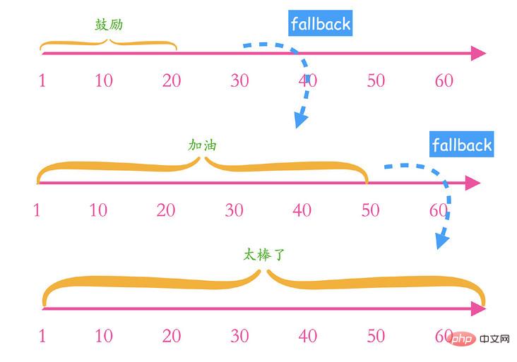
提示在数字不断累积的过程中有一个阶段性的变化,如下
0~20:鼓励!
20~50:加油!!
50~:太棒了!!!
那么,如何根据 CSS 变量来自动映射不同的提示呢?这里可以用到自定义计数器,比如,我们先自定义一个计数器
@counter-style 鼓励 {
  system: cyclic;
  symbols: '鼓励!';
  range: 1 20;
}这样定义了一个名为“鼓励”的计数器,简单解释一下,system,表示计算系统,这里为cyclic,表示循环使用开发者提供的一套字符,字符由symbos定义。然后symbos表示计算符号,也就是具体展示的字符,这里指定为鼓励!就行了。然后有个range属性,表示计数器的范围,这里指定为1 20。示意如下

这部分自定义计数器内容比较复杂,也比较新,有兴趣的可以参考张鑫旭的这篇文章:CSS @counter-style规则详细介绍
然后将这个自定义的计数器也通过伪元素渲染出来
.like::after{
  content: counter(time)  counter(time, 鼓励);
}下面看下效果

可以看到,当计数在1~20范围内,渲染的是自定义字符“鼓励!”,当超过这个范围后,又变成了普通的数字,因此我们需要做一个“回退”处理,也就是在这个区间外的规则,CSS 计数器也提供了这样的能力,名为fallback,实现就是这样
@counter-style 鼓励 {
  system: cyclic;
  symbols: '鼓励!';
  range: 1 20;
  fallback: 加油
}
@counter-style 加油 {
  system: cyclic;
  symbols: '加油!!';
  range: 21 50;
  fallback: 太棒了
}
@counter-style 太棒了 {
  system: cyclic;
  symbols: '太棒了!!!';
  range: 51 infinite;
}相信应该比较好理解,当计数器range超出时,就会按照fallback的计数规则继续执行,可以无限嵌套,上面可以稍微简化一下,区间可以更加灵活一点,比如加油的区间,进入到这个计数器,起点肯定已经超过了20,所以可以把起点也改为0,简化后如下
@counter-style 鼓励 {
  system: cyclic;
  symbols: '鼓励!';
  range: 0 20;
  fallback: 加油
}
@counter-style 加油 {
  system: cyclic;
  symbols: '加油!!';
  range: 0 50; /*进入到这个计数器,起点肯定已经超过了20*/
  fallback: 太棒了
}
@counter-style 太棒了 {
  system: cyclic;
  symbols: '太棒了!!!';
}示意如下

这样就得到了文章开头的演示效果

完整代码可以访问:
https://codepen.io/xboxyan/pen/gOeEMwP
https://code.juejin.cn/pen/7133856833428520963
https://xboxyan.gitee.io/demo/CSS_add_num_animation.html
以上就是全部内容了,还不错的动画小技巧,你学会了吗?下面总结一下
鼠标按下和抬起的过渡动画通常是相反的,不过可以通过在按下时设置transition来改变抬起的动画
The continuous accumulation of numbers can be achieved with the help of @property, which can make CSS variables transition or animate like colors
The counter can Let CSS variables be rendered to pseudo elements
animation-play-stateYou can achieve the effect of pressing to start animation and raising to pause animation
Customized counters allow certain characters to be rendered within the specified counting range
To implement phase changes in counting, you can use fallback to fallback. You can jump to another counter
Mention the compatibility,Chrome 91 , it is not suitable for external use yet, but you can learn about it in advance
Of course, the potential of custom counters goes far beyond this, and more exploration and applications will be carried out later. Finally, if you think it is good and helpful to you, please like, collect and forward it❤❤❤
Original address: https://segmentfault.com/a/1190000042360785
(Learning video sharing: web front-end)
The above is the detailed content of See how CSS uses counters to implement long-press like accumulation animations. For more information, please follow other related articles on the PHP Chinese website!