Many friends find it troublesome to use PivotTables to summarize data. You have to drag and select fields, merge dates, modify statistical methods, etc. Just because of these reasons, you would really lose out if you give up using such a useful tool. Big! Let me share with you a series of Excel pivot table tutorials. After reading this, I guarantee that you will doubt your life. Why did you ever work overtime and stay up late to manually summarize data? This excel pivot table tutorial is the first introductory tutorial on pivot tables. It mainly uses a simple summary to explain how to make and use excel pivot tables.

Everyone who has used Excel pivot tables knows how easy it is to use!
What? ! It doesn’t matter if you haven’t used it before. Today Bottle will introduce you to this most familiar and unfamiliar function. Next time you summarize data and split tables, don't be like an idiot scratching your head and applying various functions. After all, the pivot table will solve it for you in one second!
1. Create a pivot table
As shown below, the warehouse management department registered 1,000 times in 2017 (due to too much data, The middle part is omitted in the screenshot) Material collection records. Due to the huge consumption of materials, the company is preparing to count the quantities used by each department.
Click any cell in the table and click "Insert" - "Pivot Table".

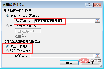
In the pop-up dialog box, we need to pay attention to whether the automatically expanded area is the area we want to set. Below you can select the location where the pivot table will be created, and the bottle will be created in a new worksheet.

After confirmation, PivotTable 1 is inserted into the new worksheet. Click on the PivotTable and the settings dialog box will appear on the right. It's very simple below. You just need to drag the fields above to the bottom according to your needs, and the data summary can be automatically completed.

2. Summarize data on demand
Usually, the reports we make will be given to Used by different leaders and different departments. Different leaders and different departments may have different concerns about tabular data. For example, regarding the current materials, the leader may be concerned about the difference in the usage of different departments, or may be concerned about the changes in the usage of materials in different months, or may be concerned about the ranking of the usage of various materials. The same data needs to be summarized in different ways. Are you frustrated? In fact, with a pivot table, it is quite simple.
Here are examples of data summary for three different needs.
1. Check the received quantities of different personnel in different departments
Drag "Department" and "Name" to the row label respectively, and drag "Received Quantity" to numerical value. At this time, a summary table has been automatically formed on the left.

The summary table at this time is not in the form of a regular table. Click any cell in the pivot table and click "Design" - "Report Layout" - "Display in Table Format".

At this time, the table is as shown below, with a telescopic fold button on the left, which is not the style we usually need. Click the "/-button" in "Options" to turn it off.


The table for closing the fold/open button looks like this:
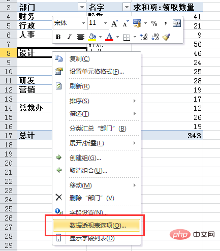
For the "Department" in the first column, different companies have different requirements. If you need to merge and display the same departments (currently a non-duplicate display, the cells are not merged), right-click the pivot table and select "Pivot Table Options" , check "Merge and center labeled cells" in the dialog box.

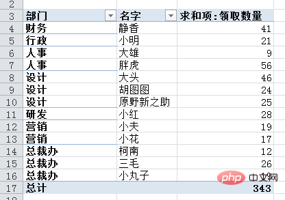
At this time, the table style is as follows:

Some companies need to display the same departments repeatedly. Click the pivot table, click "Report Layout" - "Repeat All Items Labels" in the "Design" tab.

The format of the table is as follows:

2. View the data of different people in different months Receive amount
Right-click the pivot table and click "Show Field List".
In the field list, uncheck "Department" and drag "Collection Date" under the row label. The results are shown below.

Right-click in the date column and select "Create Group".

In the pop-up dialog box, select "Month" and click OK.

The table is as follows, displayed by month.

Following the previous method, we can merge the same months and display them as follows:

Click in the date column Right-click and select "Receipt Date" for classification and summary.

The final form is as follows,

3. Check the number of collections per person by department
Right-click the pivot table to bring up the field list, uncheck "Date", and drag "Department" to the report filter. The results are as follows:

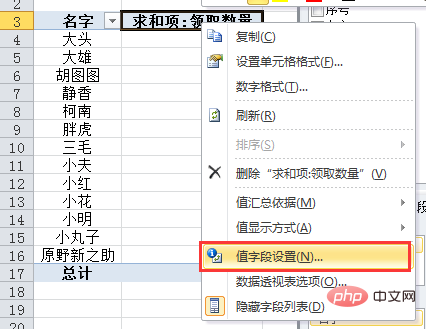
#Right-click the "Sum Item: Received Quantity" column and select "Value Field Settings".

Select "Count" in the pop-up dialog box. Click OK.
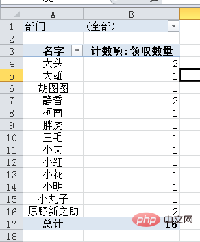
The report is as follows. Click the drop-down menu of cells A1-B1 to filter the departments and view the number of employee receipts by department.

The Human Resources Department was screened out, and the results are as follows:
Due to limited space, Bottle is only introduced here. In the three cases, pivot tables actually have many functions, including splitting, sorting, filtering, updating data in real time, making dynamic charts, etc. You can try it yourself first, and I will recommend these tutorials to you later.
3. Quickly split the worksheet
The previous operations are just different ways of data aggregation based on the different needs of the leader. What if our data needs to be split according to departments and then shown to different departments?
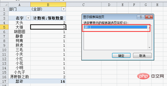
Click any cell in the pivot table and click "Options" - "Show Report Filter Page".

In the pop-up dialog box, you can see that "Department" is used as the split field because in the previous operation, we only dragged "Department" into the report filter. The pivot data splitting worksheet is based on filtering. Which condition needs to be split according to which condition needs to be filtered in advance.

#After clicking OK, you can see that a worksheet named after the department appears below the table, which is the effect after splitting.
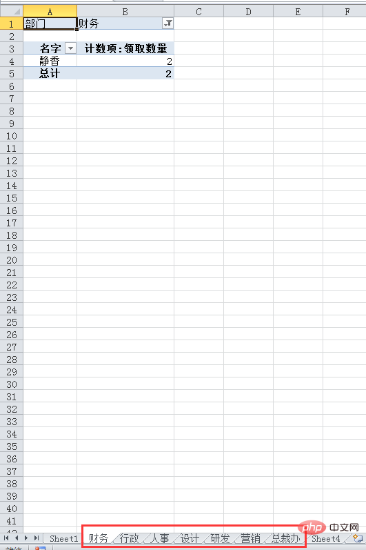
At this point, if the form needs to be printed and distributed to various departments, you can print it directly. But if we need to send the spreadsheet directly to various departments, we still need one more step. Why? As shown below, you can still see the data of all departments by clicking the drop-down menu behind finance.
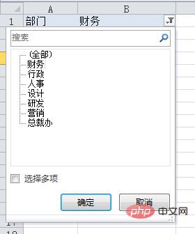
Hold down the ctrl key, click the worksheet name of each department below, then press the ctrl A shortcut key to select the entire worksheet, and press ctrl C to copy.
Right-click and paste special into value.
At this point you can see that each worksheet only displays data for one department. You can directly send electronic files to different departments!
When everyone sees this, do you feel that excel is really a great invention, and pivot tables are simply the gospel of civilized people!
Related learning recommendations: excel tutorial
The above is the detailed content of Excel Pivot Table Learning: Summarize Data on Demand and Split Worksheets. For more information, please follow other related articles on the PHP Chinese website!
 Compare the similarities and differences between two columns of data in excel
 excel duplicate item filter color
 How to copy an Excel table to make it the same size as the original
 Excel table slash divided into two
 Excel diagonal header is divided into two
 Absolute reference input method
 java export excel
 Excel input value is illegal


