
 Web Front-end
Bootstrap Tutorial
A brief analysis of relevant knowledge points about responsive layout in Bootstrap
Web Front-end
Bootstrap Tutorial
A brief analysis of relevant knowledge points about responsive layout in Bootstrap
A brief analysis of relevant knowledge points about responsive layout in Bootstrap

This article will talk about Bootstrap in practice and introduce the responsive layout of Bootstrap. I hope it will be helpful to everyone!

#Responsive layout means that a website can be compatible with multiple terminals, rather than making a specific version for each terminal. This concept was born to solve mobile Internet browsing.
Navigation bar and carousel occupy a high proportion in the header of most websites, especially the navigation bar, which plays the role of site map.
In responsive layout, the navigation bar is required to display different styles according to the terminal screen size.
1. Knowledge points
1.1 Navigation bar
Official explanation: The navigation bar is in your application or website As a responsive basic component for the navigation page header. They collapse (and can be opened and closed) on mobile devices and gradually expand horizontally as the viewport width increases.
1.1.1 Basic navigation bar
Before using Bootstrap, I was used to using <ul> <li> to construct a navigation bar. [Related recommendations: "bootstrap tutorial"]
<!--代码部分-->
<style>
.navigation-past{
    list-style: none;
}
.navigation-past>li{
    float: left;
    padding: 8px;
}
.navigation-past>li>a{
    text-decoration: none;
    color: #000;
}
.active-past{
    background: #E7E7E7;
}
</style>
<ul class="navigation-past">
	   <!--选中-->
    <li class="active-past"><a href="#">Navigation First</a></li>
    <li><a href="#">Navigation Second</a></li>
    <li><a href="#">Navigation Third</a></li>
    <li><a href="#">Navigation Fourth</a></li>
    <li><a href="#">Navigation Fifth</a></li>
</ul>Rendering:

If you use Bootstrap, you are familiar with this Just add some modifications to the structure. First, put a layer of <div> outside <ul>, and add the style navbar navbar-default; and then give the < inside ;ul> Add style nav navbar-nav; Finally, add style active to the selected part. A most basic Bootstrap navigation is completed.
<!--代码部分-->
<div class="navbar navbar-default" role="navigation">
    <ul class="nav navbar-nav">
        <li class="active"><a href="#">Navigation First</a></li>
        <li><a href="#">Navigation Second</a></li>
        <li><a href="#">Navigation Third</a></li>
        <li><a href="#">Navigation Fourth</a></li>
        <li><a href="#">Navigation Fifth</a></li>
    </ul>
</div>
Rendering:

Here is a role="navigation" attribute added to the outermost layer, here is HTML5 The purpose of the tag attribute is to make the tags semantic, making it easier for screen readers to identify them, and also to facilitate browsing by special groups of people.
1.1.2 Advanced navigation bar
When browsing some official websites, the first thing that comes into view is the distinctive company LOGO and exaggerated carousel in the upper left corner , Bootstrap reserves the position of the LOGO in the navigation. The method of use is to add a <div> with style navbar-header inside the outer <div>, this <div> Add a <a> element with style navbar-brand inside.
<!--代码部分-->
<div class="navbar navbar-default" role="navigation">
			<div class="navbar-header">
						<a href="#" class="navbar-brand">LOGO</a>
			</div>
    <ul class="nav navbar-nav">
        <li class="active"><a href="#">Navigation First</a></li>
        <li><a href="#">Navigation Second</a></li>
        <li><a href="#">Navigation Third</a></li>
        <li><a href="#">Navigation Fourth</a></li>
        <li><a href="#">Navigation Fifth</a></li>
    </ul>
</div>
Rendering:

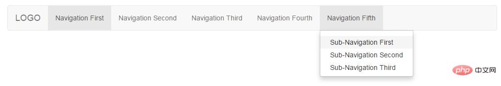
Sometimes the first-level navigation is not enough, and it needs to be paired with the second-level navigation to display more content. How to use: First add style dropdown to the <li> element that needs to add secondary navigation, and add style to the <a> element. dropdown-toggle and attribute data-toggle="dropdown"; then put a # below <li> inside <a> ##<ul> <li> Combination, <ul> Label added style dropdown-menu.
<!--代码部分-->
<div class="navbar navbar-default" role="navigation">
			<div class="navbar-header">
						<a href="#" class="navbar-brand">LOGO</a>
			</div>
    <ul class="nav navbar-nav">
        <li class="active"><a href="#">Navigation First</a></li>
        <li><a href="#">Navigation Second</a></li>
        <li><a href="#">Navigation Third</a></li>
        <li><a href="#">Navigation Fourth</a></li>
        <li class="dropdown">
            <a href="#" class="dropdown-toggle" data-toggle="dropdown" role="button" aria-haspopup="true" aria-expanded="false">
                Navigation Fifth
                <ul class="dropdown-menu">
                    <li><a href="#">Sub-Navigation First</a></li>
                    <li><a href="#">Sub-Navigation Second</a></li>
                    <li><a href="#">Sub-Navigation Third</a></li>
                </ul>
            </a>
        </li>
    </ul>
</div>
 ##New attributes appear here
, similarly, this is also a newly added attribute of HTML5. Here is the answer from Jiang Zhongqiu in the Segmentfault community.
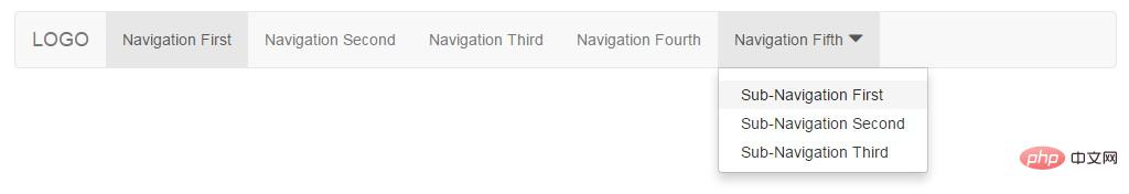
means that a menu or floating element will appear when clicked; false means that there is no pop-up effect. aria-expanded: Indicates the expanded state. The default is undefined, which means the current expansion status is unknown. Other optional values: true indicates that the element is expanded; false indicates that the element is not expanded. The drop-down boxes you usually see usually have a downward arrow symbol ▼. Similarly, this effect is also supported in Bootstrap, but you need to introduce its own font library Glyphicons font icon.
Official introduction: Bootstrap includes more than 250 font icons from Glyphicon Halflings. Glyphicons Halflings are generally paid, but their authors allow Bootstrap to use them for free. In order to express your gratitude, I hope you will try to add a friendly link to Glyphicons when using it.
使用方法:新建一个 <span> 元素,然后在里面加上样式 glyphicon glyphicon-triangle-bottom。
Glyphicons 字体图标使用示例:
<!--代码部分-->
<li class="dropdown">
    <a href="#" class="dropdown-toggle" data-toggle="dropdown" role="button" aria-haspopup="true" aria-expanded="false">
        Navigation Fifth <span class="glyphicon glyphicon-triangle-bottom" aria-hidden="true"></span>
        <ul class="dropdown-menu">
            <li><a href="#">Sub-Navigation First</a></li>
            <li><a href="#">Sub-Navigation Second</a></li>
            <li><a href="#">Sub-Navigation Third</a></li>
        </ul>
    </a>
</li>
效果图:
注意:
<ul> <li>Glyphicons 字体图标和文本之间添加一个空格,不然会影响样式(padding)的正确显示。
<li>服务器需要正确添加相应的 MIME 类型,否则加载字体会报 404 错误。
另外这里的箭头也可以使用 Bootstrap 自带的样式 caret 来实现,这里的箭头是用 CSS 实现了,使用方法:<span class="caret"></span>。
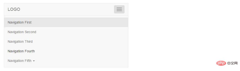
1.1.3 响应式导航栏
在手机端浏览网站的时候常看到几个横线(≡)组成的导航向导,Bootstrap 作为一个移动设备优先也是支持这样的需求的,响应式导航的使用的方法比较固定,首先在导航标题 <div class="navbar-header"> 内加上一段固定写法的代码;然后在需要在小屏时折叠的 <ul> 元素外包一层样式 collapse navbar-collapse 的 <div> 元素,并给这个元素加上任意名称的 ID,例如:id="navigation-collapse";最后在响应式按钮 <button> 元素上加上 data-target 属性指向要折叠的内容 id,例如:data-target="#navigation-collapse"。
<!--代码部分-->
<div class="navbar navbar-default" role="navigation">
    <div class="navbar-header">
						<!--以下为固定写法,用到的时候复制粘贴即可-->
        <button class="navbar-toggle" type="button" data-toggle="collapse" data-target="#navigation-collapse">
          <span class="sr-only">Toggle Navigation</span>
          <span class="icon-bar"></span>
          <span class="icon-bar"></span>
          <span class="icon-bar"></span>
        </button>
        <a href="#" class="navbar-brand">LOGO</a>
    </div>
    <div class="collapse navbar-collapse" id="navigation-collapse">
        <ul class="nav navbar-nav">
            <li class="active"><a href="#">Navigation First</a></li>
            <li><a href="#">Navigation Second</a></li>
            <li><a href="#">Navigation Third</a></li>
            <li><a href="#">Navigation Fourth</a></li>
            <li class="dropdown">
                <a href="#" class="dropdown-toggle" data-toggle="dropdown" role="button" aria-haspopup="true" aria-expanded="false">
                    Navigation Fifth <span class="caret"></span>
                    <ul class="dropdown-menu">
                        <li><a href="#">Sub-Navigation First</a></li>
                        <li><a href="#">Sub-Navigation Second</a></li>
                        <li><a href="#">Sub-Navigation Third</a></li>
                    </ul>
                </a>
            </li>
        </ul>
    </div>
</div>
效果图:
1.2 轮播
图片轮播是网站的重要组成部分之一,常用来放活动广告或企业宣传图,有时也叫做“幻灯片”,Bootstrap 中的轮播效果是由 JavaScript 插件 Carousel 来实现的。
1.2.1 基础轮播
轮播的使用方法也是相对固定的,特殊场景按需求修改即可。需要注意的是需要给最外层 <div> 元素加上一个 id,并在小圆点出指向这个 id。
<!--代码部分-->
<div id="my-banner" class="carousel">
    <!--放置小圆点,点击可以切换轮播-->
    <ol class="carousel-indicators">
        <!--加上样式active表示默认显示的轮播,data-slide-to="0"属性表示显示轮播的顺序-->
        <li data-target="#my-banner" data-slide-to="0" class="active"></li>
        <li data-target="#my-banner" data-slide-to="1"></li>
    </ol>
    <!--这里放置轮播显示的图片-->
    <div class="carousel-inner">
        <!--加上样式active表示默认显示的图片-->
        <div class="item active">
            <img src="http://www.mazey.net/img/upload/image/20170712/b1.jpg" alt="轮播">
        </div>
        <div class="item">
            <img src="http://www.mazey.net/img/upload/image/20170712/b2.jpg" alt="轮播">
        </div>
    </div>
</div>
效果图:

1.2.2 进阶的轮播
一个完整的轮播应具有自动播放、点击切换、悬浮停止、外加说明文字功能,别担心,这些 Bootstrap 通通都有!
1.2.2.1 自动播发
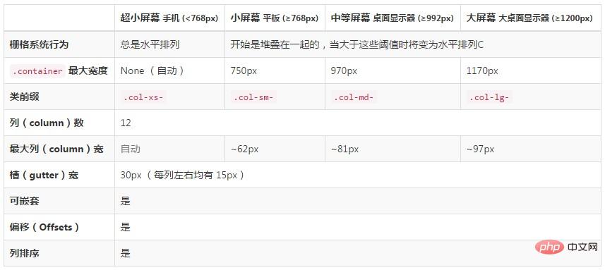
最外层 在轮播图片 在轮播图片下面放置两个 轮播代码示例: 效果图: 试着组合栅格系统 + 导航栏 + 轮播布局一个响应式页面。 电脑端效果图: 移动端效果图: 其实实现这样一个效果很简单,首先看一下栅格参数如何在多种屏幕设备上工作的。 Add styles Demo address: https://mazey.cn/bootstrap-blueprints/lesson-second-navigation/index.html Source code address: https://github.com/ mazeyqian/bootstrap-blueprints/tree/master/lesson-second-navigation. For more knowledge about bootstrap, please visit: bootstrap basic tutorial! ! The above is the detailed content of A brief analysis of relevant knowledge points about responsive layout in Bootstrap. For more information, please follow other related articles on the PHP Chinese website!<div> 元素添加属性 data-ride="carousel" 和样式 slide(使轮播播放更平滑),如:data-interval="你想要的值",如我想要 3 秒(3000 ms)轮播一次则设置 data-interval="3000"。另外轮播是默认悬浮停止播放的(data-pause="hover"),如想禁止悬浮播放设置属性 data-pause="false" 即可。
1.2.2.2 添加文字
<img> 元素下面添加样式 carousel-caption 的 <div>,里面存放文字便可正确显示在轮播上面。<!--代码部分-->
<div class="carousel-caption">
<h5>夜里总是下雨</h5>
</div>
1.2.2.3 点击切换
<a> 元素,href 指向轮播 id,添加属性 data-slide="prev/next 向前/向后"。<!--代码部分-->
<!--<a>元素的href指向轮播id-->
<a class="left carousel-control" href="#my-banner" data-slide="prev" role="button">
<span class="glyphicon glyphicon-chevron-left"></span>
</a>
<a class="right carousel-control" href="#my-banner" data-slide="next" role="button">
<span class="glyphicon glyphicon-chevron-right"></span>
</a>
<!--代码部分-->
<div id="my-banner" class="carousel slide" data-ride="carousel" data-interval="3000" data-pause="false">
<!--放置小圆点,点击可以切换轮播-->
<ol class="carousel-indicators">
<!--加上样式active表示默认显示的轮播,data-slide-to="0"属性表示显示轮播的顺序-->
<li data-target="#my-banner" data-slide-to="0" class="active"></li>
<li data-target="#my-banner" data-slide-to="1"></li>
</ol>
<!--这里放置轮播显示的图片-->
<div class="carousel-inner">
<!--加上样式active表示默认显示的图片-->
<div class="item active">
<img src="http://www.mazey.net/img/upload/image/20170712/b1.jpg" alt="轮播">
<div class="carousel-caption">
<h5>夜里总是下雨</h5>
</div>
</div>
<div class="item">
<img src="http://www.mazey.net/img/upload/image/20170712/b2.jpg" alt="轮播">
<div class="carousel-caption">
<h5>后除提醒君の世界</h5>
</div>
</div>
</div>
<!--<a>元素的href指向轮播id-->
<a class="left carousel-control" href="#my-banner" data-slide="prev" role="button">
<span class="glyphicon glyphicon-chevron-left"></span>
</a>
<a class="right carousel-control" href="#my-banner" data-slide="next" role="button">
<span class="glyphicon glyphicon-chevron-right"></span>
</a>
</div>

二、实战
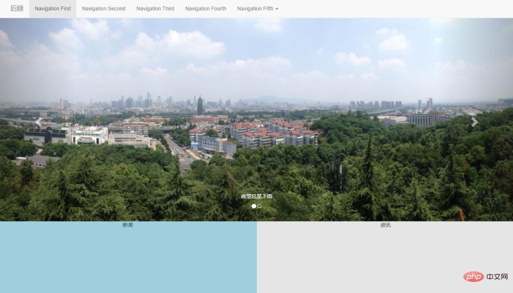
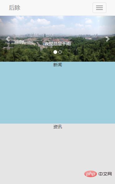
col-xs-*, col-sm-* and to the news and information boxes at the same time col-md-*, when the screen is small (screen width col-xs-*, col-sm-* takes effect, col-md- * Invalid; when the screen is large (screen width ≥ 992px) col-md-* takes effect, col-xs-*, col-sm-* Invalid. For example: <div class="col-xs-12 col-sm-12 col-md-6">News</div><div class="col-xs-12 col-sm- 12 col-md-6">Information</div>.

Hot AI Tools

Undresser.AI Undress
AI-powered app for creating realistic nude photos

AI Clothes Remover
Online AI tool for removing clothes from photos.

Undress AI Tool
Undress images for free

Clothoff.io
AI clothes remover

AI Hentai Generator
Generate AI Hentai for free.

Hot Article
Hot Tools

Notepad++7.3.1
Easy-to-use and free code editor

SublimeText3 Chinese version
Chinese version, very easy to use

Zend Studio 13.0.1
Powerful PHP integrated development environment

Dreamweaver CS6
Visual web development tools

SublimeText3 Mac version
God-level code editing software (SublimeText3)
Hot Topics
 1376
1376
 52
52

 How to do vertical centering of bootstrap
Apr 07, 2025 pm 03:21 PM
How to do vertical centering of bootstrap
Apr 07, 2025 pm 03:21 PM
Use Bootstrap to implement vertical centering: flexbox method: Use the d-flex, justify-content-center, and align-items-center classes to place elements in the flexbox container. align-items-center class method: For browsers that do not support flexbox, use the align-items-center class, provided that the parent element has a defined height.
 How to use bootstrap button
Apr 07, 2025 pm 03:09 PM
How to use bootstrap button
Apr 07, 2025 pm 03:09 PM
How to use the Bootstrap button? Introduce Bootstrap CSS to create button elements and add Bootstrap button class to add button text
 How to resize bootstrap
Apr 07, 2025 pm 03:18 PM
How to resize bootstrap
Apr 07, 2025 pm 03:18 PM
To adjust the size of elements in Bootstrap, you can use the dimension class, which includes: adjusting width: .col-, .w-, .mw-adjust height: .h-, .min-h-, .max-h-
 How to get the bootstrap search bar
Apr 07, 2025 pm 03:33 PM
How to get the bootstrap search bar
Apr 07, 2025 pm 03:33 PM
How to use Bootstrap to get the value of the search bar: Determines the ID or name of the search bar. Use JavaScript to get DOM elements. Gets the value of the element. Perform the required actions.
 How to view the date of bootstrap
Apr 07, 2025 pm 03:03 PM
How to view the date of bootstrap
Apr 07, 2025 pm 03:03 PM
Answer: You can use the date picker component of Bootstrap to view dates in the page. Steps: Introduce the Bootstrap framework. Create a date selector input box in HTML. Bootstrap will automatically add styles to the selector. Use JavaScript to get the selected date.
 How to insert pictures on bootstrap
Apr 07, 2025 pm 03:30 PM
How to insert pictures on bootstrap
Apr 07, 2025 pm 03:30 PM
There are several ways to insert images in Bootstrap: insert images directly, using the HTML img tag. With the Bootstrap image component, you can provide responsive images and more styles. Set the image size, use the img-fluid class to make the image adaptable. Set the border, using the img-bordered class. Set the rounded corners and use the img-rounded class. Set the shadow, use the shadow class. Resize and position the image, using CSS style. Using the background image, use the background-image CSS property.
 How to write split lines on bootstrap
Apr 07, 2025 pm 03:12 PM
How to write split lines on bootstrap
Apr 07, 2025 pm 03:12 PM
There are two ways to create a Bootstrap split line: using the tag, which creates a horizontal split line. Use the CSS border property to create custom style split lines.
 How to set up the framework for bootstrap
Apr 07, 2025 pm 03:27 PM
How to set up the framework for bootstrap
Apr 07, 2025 pm 03:27 PM
To set up the Bootstrap framework, you need to follow these steps: 1. Reference the Bootstrap file via CDN; 2. Download and host the file on your own server; 3. Include the Bootstrap file in HTML; 4. Compile Sass/Less as needed; 5. Import a custom file (optional). Once setup is complete, you can use Bootstrap's grid systems, components, and styles to create responsive websites and applications.
