

CSS Tips Sharing: Pure CSS to Implement Table Responsive Layout

如何利用纯CSS实现表格响应式布局?下面本篇文章就来给大家分享超 Nice 的表格响应式布局小技巧,希望对大家有所帮助!

今天,遇到了一个很有意思的问题,一名群友问我,仅仅使用 CSS,能否实现这样一种响应式的布局效果:
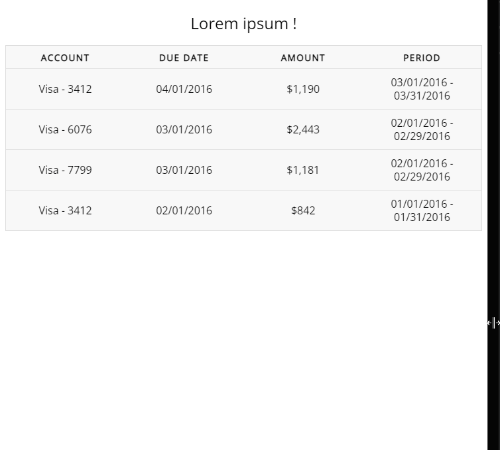
简单解析一下效果:
在屏幕视口较为宽时,表现为一个整体 Table 的样式
而当屏幕视口宽度较小时,原 Table 的每一行数据单独拆分为一个 Table 进行展示
很有意思的一个响应式布局,让信息在小屏幕下得到了一种不错的展示。
那么,仅仅使用 CSS 的话,能否实现这样一个布局呢?答案是可以的。【推荐学习:css视频教程】
首先,肯定会用到媒体查询,这个不难看出。另外,我们观察下拆分后的每一组数据:
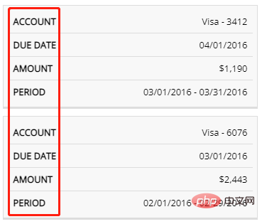
都会存在一组原本整体一个 Table 时的表头信息,主要的难点就是在这里,我们如何在拆分成一个一个的子 Table 展示时,同时展示这些表头信息?
基本结构的实现
首先,我们先实现常规宽屏下的 HTML 及对应的 CSS。
比较简单,这里没有什么特殊之处,使用 <table> 标签或者使用 div、ul 等标签进行模拟一个表格都可以。
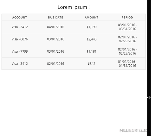
<table>
  <caption>Lorem ipsum !</caption>
  <thead>
    <tr>
      <th>Account</th>
      <th>Due Date</th>
      <th>Amount</th>
      <th">Period</th>
    </tr>
  </thead>
  <tbody>
    <tr>
      <td data-label="Account">Visa - 3412</td>
      <td data-label="Due Date">04/01/2016</td>
      <td data-label="Amount">$1,190</td>
      <td data-label="Period">03/01/2016 - 03/31/2016</td>
    </tr>
    // ... 重复多组
  </tbody>
</table>
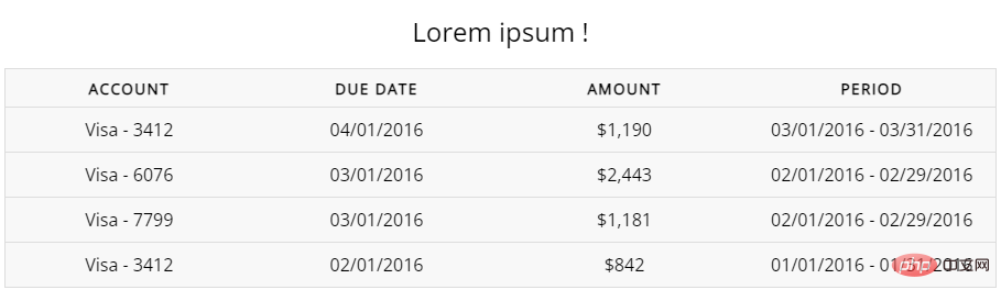
得到这样一个简单的 Table:
使用媒体查询将单个 Table 拆分成多个
下一步也很简单,设定合适的阈值(视实际业务情况而定),使用媒体查询将单个 Table 拆分成多个子 Table。
@media screen and (max-width: 600px) {
  table {
    border: 0;
  }
  table thead {
    display: none;
  }
  table tr {
    display: block;
    margin-bottom: 10px;
  }
  table td {
    border-bottom: 1px solid #ddd;
    display: block;
  }
}这里做的事情也非常简单:
利用媒体查询,设定屏幕宽度小于
600px的样式去掉原本表格的
<thead>表头,直接隐藏即可将原本的一行
<tr>,设置为display: block, 并且设置一个下边距,使之每一个分开将原本的一行内的
<td>,设置为display: block,这样,它们就会竖向排列,使每一个<tr>形成新的一个子 table
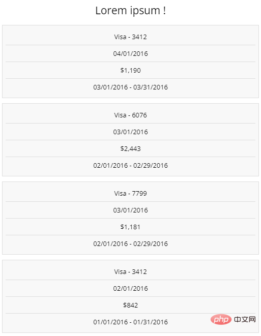
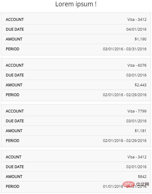
好,这样,再屏幕宽度小于 600px 时,我们就得到了这样一个 Table:
借助伪元素及其特性,实现表头信息展示
下面一步,也就是最为关键的一步,我们如何在子 table 的每一行,也就是 <td> 内,再展示原本的表头信息呢?
这里其实也非常简单,只是简单的运用了伪元素,极其可以读取 HTML 标签属性的小特性实现。
我们只需要简单改造一下代码,给每个 <td> 的 HTML,带上与之对应的表头列描述信息:
<table>
  // 上方信息保持一致
  <tbody>
    <tr>
      <td data-label="Account">Visa - 3412</td>
      <td data-label="Due Date">04/01/2016</td>
      <td data-label="Amount">$1,190</td>
      <td data-label="Period">03/01/2016 - 03/31/2016</td>
    </tr>
    <tr>
      <td scope="row" data-label="Account">Visa - 6076</td>
      <td data-label="Due Date">03/01/2016</td>
      <td data-label="Amount">$2,443</td>
      <td data-label="Period">02/01/2016 - 02/29/2016</td>
    </tr>
    // ... 每个 tr 进行同样的处理
  </tbody>
</table>
接着,借助 td 的伪元素,实现表头信息的展示即可:
@media screen and (max-width: 600px) {
  // ... 保持一致
  table td {
    position: relative;
    display: block;
    text-align: right;
  }
  table td::before {
    position: absolute;
    left: 10px;
    right: 0;
    content: attr(data-label);
  }
}这里,我们核心的知识点就是利用了元素的伪元素可以在 content 属性里,读取其 HTML 元素内的属性内容,并进行展示的知识点。
假设一个 HTML 标签定义为:
<div data-msg="ABC">那么该 div 对应的伪类如果设置了
content: attr(data-msg),就可以读取到 data-msg 的值,相当于content:"ABC"
这样,我们在小屏幕下,就得到了这样一种效果:
完整的效果,即如题图所示:
For the complete DEMO, you can click here: CodePen Demo -- Simple Responsive Table in CSS
Original address: https://www .cnblogs.com/coco1s/p/16422777.html
Author: ChokCoco
(Learning video sharing: web front-end)
The above is the detailed content of CSS Tips Sharing: Pure CSS to Implement Table Responsive Layout. For more information, please follow other related articles on the PHP Chinese website!

Hot AI Tools

Undresser.AI Undress
AI-powered app for creating realistic nude photos

AI Clothes Remover
Online AI tool for removing clothes from photos.

Undress AI Tool
Undress images for free

Clothoff.io
AI clothes remover

AI Hentai Generator
Generate AI Hentai for free.

Hot Article
Hot Tools

Notepad++7.3.1
Easy-to-use and free code editor

SublimeText3 Chinese version
Chinese version, very easy to use

Zend Studio 13.0.1
Powerful PHP integrated development environment

Dreamweaver CS6
Visual web development tools

SublimeText3 Mac version
God-level code editing software (SublimeText3)
Hot Topics


 What does placeholder mean in vue
May 07, 2024 am 09:57 AM
What does placeholder mean in vue
May 07, 2024 am 09:57 AM
In Vue.js, the placeholder attribute specifies the placeholder text of the input element, which is displayed when the user has not entered content, provides input tips or examples, and improves form accessibility. Its usage is to set the placeholder attribute on the input element and customize the appearance using CSS. Best practices include being relevant to the input, being short and clear, avoiding default text, and considering accessibility.
 What does span mean in js
May 06, 2024 am 11:42 AM
What does span mean in js
May 06, 2024 am 11:42 AM
The span tag can add styles, attributes, or behaviors to text. It is used to: add styles, such as color and font size. Set attributes such as id, class, etc. Associated behaviors such as clicks, hovers, etc. Mark text for further processing or citation.
 What does rem mean in js
May 06, 2024 am 11:30 AM
What does rem mean in js
May 06, 2024 am 11:30 AM
REM in CSS is a relative unit relative to the font size of the root element (html). It has the following characteristics: relative to the root element font size, not affected by the parent element. When the root element's font size changes, elements using REM will adjust accordingly. Can be used with any CSS property. Advantages of using REM include: Responsiveness: Keep text readable on different devices and screen sizes. Consistency: Make sure font sizes are consistent throughout your website. Scalability: Easily change the global font size by adjusting the root element font size.
 How to introduce images into vue
May 02, 2024 pm 10:48 PM
How to introduce images into vue
May 02, 2024 pm 10:48 PM
There are five ways to introduce images in Vue: through URL, require function, static file, v-bind directive and CSS background image. Dynamic images can be handled in Vue's computed properties or listeners, and bundled tools can be used to optimize image loading. Make sure the path is correct otherwise a loading error will appear.
 What is node in js
May 07, 2024 pm 09:06 PM
What is node in js
May 07, 2024 pm 09:06 PM
Nodes are entities in the JavaScript DOM that represent HTML elements. They represent a specific element in the page and can be used to access and manipulate that element. Common node types include element nodes, text nodes, comment nodes, and document nodes. Through DOM methods such as getElementById(), you can access nodes and operate on them, including modifying properties, adding/removing child nodes, inserting/replacing nodes, and cloning nodes. Node traversal helps navigate within the DOM structure. Nodes are useful for dynamically creating page content, event handling, animation, and data binding.
 What language is the browser plug-in written in?
May 08, 2024 pm 09:36 PM
What language is the browser plug-in written in?
May 08, 2024 pm 09:36 PM
Browser plug-ins are usually written in the following languages: Front-end languages: JavaScript, HTML, CSS Back-end languages: C++, Rust, WebAssembly Other languages: Python, Java
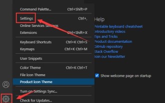 How to set unknown attributes in vscode vscode method to set unknown attributes
May 09, 2024 pm 02:43 PM
How to set unknown attributes in vscode vscode method to set unknown attributes
May 09, 2024 pm 02:43 PM
1. First, open the settings icon in the lower left corner and click the settings option. 2. Then, find the CSS column in the jumped window. 3. Finally, change the drop-down option in the unknownproperties menu to the error button.
 What do ref and id in vue do?
May 02, 2024 pm 08:42 PM
What do ref and id in vue do?
May 02, 2024 pm 08:42 PM
In Vue.js, ref is used in JavaScript to reference a DOM element (accessible to subcomponents and the DOM element itself), while id is used to set the HTML id attribute (can be used for CSS styling, HTML markup, and JavaScript lookup).
