In CSS, calc means calculation; calc can be understood as a function, which is the abbreviation of calculate, used to specify the length of an element. Calc can calculate the element using the specified unit value. To get the length value, the syntax is "element {length attribute: calc (expression)}".

The operating environment of this tutorial: Windows 10 system, CSS3&&HTML5 version, Dell G3 computer.
calc() Literally we can understand it as a function function. In fact, calc is the abbreviation of the English word calculate . It is a new function of CSS3 and is used to specify the length of elements.
For example, you can use calc() to set dynamic values for the border, margin, padding, font-size, and width attributes of the element. Why is it called a dynamic value? Because we use expressions to get the value. However, the biggest benefit of calc() is that it can be used in fluid layout. The width of the element can be calculated through calc().
What can calc() do?
calc() allows you to calculate the width or height of a div element using percentage, em, px and rem unit values, for example "width:calc(50% 2em)", so that you don't have to consider the width value of the element DIV, and leave this annoying task to the browser to calculate.
calc() syntax
calc() syntax is very simple, just like when we were young, we learned to add (), subtract (-), and multiply (*), like division (/), use mathematical expressions to express:
.elm {
  width: calc(expression);
}where "expression" is an expression used to calculate the length.
Operation rules of calc()
calc() uses general mathematical operation rules, but also provides smarter functions:
Use the four arithmetic operations " ", "-", "*" and "/";
You can use percentage, px, em, rem and other units;
You can use a mixture of various Calculation is performed in different units;
When there are " " and "-" in the expression, there must be spaces before and after them. For example, "widht: calc(12% 5em)" is wrong to write without spaces. ;
When there are "*" and "/" in the expression, there can be no spaces before and after them, but it is recommended to leave spaces.
When you actually use it, you also need to add the browser prefix
 .elm {
    /*Firefox*/
    -moz-calc(expression);
    /*chrome safari*/
    -webkit-calc(expression);
    /*Standard */
    calc();
}Through the above understanding, everyone is no longer unfamiliar with calc(), but they may still not know much about the actual application. , then everyone will follow me to understand him through examples. First, let’s look at one of the most commonly used examples:
<div class="demo">
     <div class="box"></div>
</div>The above structure is very simple, that is, a div.demo element contains a div.box element. Next, let’s look at the changes step by step. .
Step 1: Add a normal style:
.demo {
    width: 300px;
    background: #60f;
}
.box {
  width: 100%;
    background: #f60;
    height: 50px;
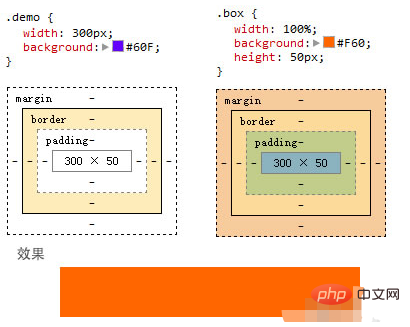
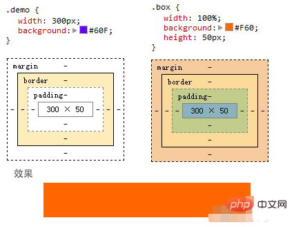
}The effect at this time is very simple, that is, div.box completely covers div.demo , as shown in the picture below:

The second step is to add border and padding on div.box
This step is very tricky. Add 10px padding to div.box and add 5px border:
.demo {
    width: 300px;
    background: #60f;
}
.box {
  width: 100%;
  background: #f60;
  height: 50px;
  padding: 10px;
  border: 5px solid green;
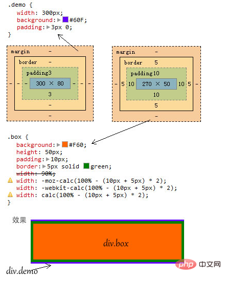
}In order to better illustrate the problem, I added 10px padding to div.demo. A padding: 3px 0;
.demo {
    width: 300px;
    background: #60f;
padding: 3px 0;
}
.box {
  width: 100%;
  background: #f60;
  height: 50px;
  padding: 10px;
  border: 5px solid green;
}At this time, everyone doesn’t know if they can think of where the problem will occur? In fact, it is very simple. At this time, the width of div.box is greater than the total width of its container div.demo, thus breaking the container and stretching out, as shown in the picture:

The third step, the use of calc()
In order to solve the problem of breaking the container, we could only calculate the width of div.box and use the container width Subtract the padding and border values, but sometimes, we suffer from not knowing the total width of the element. For example, in an adaptive layout, we only know a percentage value, but the other values are values such as px. This is The difficulty is, I'm stuck. With the emergence of CSS3, box-sizing is used to change the box model type of elements to achieve the effect, but the calc() method we learned today is even more convenient.
Know that the total width is 100%, subtract the width of the boder (5px 2 = 10px), and subtract the width of the padding (10px 2 = 20px), that is, "100% - (10px 5px ) * 2 = 30px”, the final value is the width value of div.box:
.demo {
    width: 300px;
    background: #60f;
    padding: 3px 0;
}
.box {
    background: #f60;
    height: 50px;
    padding: 10px;
    border: 5px solid green;
width: 90%;/*写给不支持calc()的浏览器*/
    width:-moz-calc(100% - (10px + 5px) * 2);
    width:-webkit-calc(100% - (10px + 5px) * 2);
    width: calc(100% - (10px + 5px) * 2);
}In this way, after calculation by calc(), div.box will no longer exceed the width of its container div.demo ,as the picture shows:

(Learning video sharing: css video tutorial, html video tutorial)
The above is the detailed content of What does calc in css style mean?. For more information, please follow other related articles on the PHP Chinese website!