
 Web Front-end
Front-end Q&A
How to achieve the effect of adding shadow to element blocks in css
Web Front-end
Front-end Q&A
How to achieve the effect of adding shadow to element blocks in css
How to achieve the effect of adding shadow to element blocks in css

In CSS, you can use the box-shadow attribute to achieve the effect of adding shadow to an element block. The box-shadow attribute can realize the border shadow effect and apply the shadow to the box element. The syntax is "box-shadow: Horizontal shadow Vertical shadow Blur radius Expansion radius Shadow color Projection mode"; if the projection mode is set to "inset", inner shadow can be achieved.

The operating environment of this tutorial: Windows 7 system, CSS3&&HTML5 version, Dell G3 computer.
In CSS, you can use the box-shadow attribute to achieve the effect of adding shadow to an element block.
The box-shadow property can apply shadow to the text box, and can set the pixel length, width and blur distance of the shadow as well as the color of the shadow.
box-shadow can add shadows to box elements, supporting adding one or more.
box-shadow: X轴偏移量 Y轴偏移量 阴影模糊半径 阴影扩展半径 阴影颜色 投影方式;
Note: The boxShadow property adds one or more drop-down shadows to the box. This property is a comma-separated list of shades, each shade specified by 2-4 length values, an optional color value, and an optional inset keyword. The value for omitted length is 0.
Note: inset can be written in the first or last parameter, and other positions are invalid.
X-axis offset and Y-axis offset values (horizontal shading and vertical shading)
X-axis offset and Y-axis offset The axis offset value can be set to a negative number
Shadow blur radius:
This parameter is optional and the value can only be positive. If the value is 0, it means that the shadow has no blur effect. The larger the value, the blurr the edge of the shadow.
Shadow expansion radius:
This parameter is optional. The value can be positive or negative. If the value is positive, the entire shadow will be extended. Expand, otherwise if the value is negative, reduce it.
Usage of box-shadow attribute
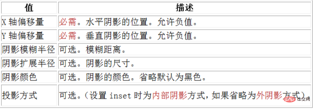
1. The horizontal and vertical offset can also be 0. Shadow
If the offset-x or offset-y value is 0, the shadow is behind the element. At this time, giving the blur-radius value or spread value can produce a shadow effect.
Example:
The first div produces a shadow effect by setting blur-radius.
The second div produces a shadow effect by setting a positive spread value.
The third div produces a shadow effect by setting a negative spread value.
But there is one thing to note: expanded shadows must be used in conjunction with the shadow blur radius.
I personally think it should be used without coordination, but it is impossible to only set the extended shadow, because the values of the extended shadow and shadow blur can both be positive. If there is only extended shadow, it will be parsed as a blur shadow by the browser, so it can also be simply understood as "expanded shadow must be used in conjunction with the shadow blur radius". If only extended shadow is used, it can be written as: box-shadow:0 0 0 1px;.
<style type="text/css">
div{
    width: 100px;
    height: 100px;
    margin:50px;
    border: 10px dotted pink;
    display: inline-block;
}
.blur{
        box-shadow: 0 0  20px ;
        /*box-shadow: 0 0  20px green;*/ /*也可以自定义颜色*/
}
.spread-positive{
        box-shadow: 0 0 20px 5px ;
        /* box-shadow: 0 0 20px 5px green;*/ /*也可以自定义颜色*/
}
.spread-negative{
        box-shadow: 0 0 20px -5px ;
        /* box-shadow: 0 0 20px -5px green;*/ /*也可以自定义颜色*/
}
</style>
<body>
<div class="blur"></div>
<div class="spread-positive"></div>
<div class="spread-negative"></div>
</body>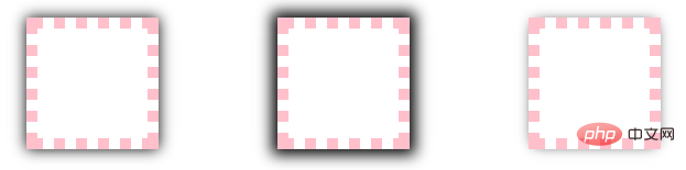
2. Set the horizontal and vertical offset to get the shadow effect
outset situation: horizontal and vertical offset Move to 0, but do not set blur and spread, and the shadow cannot be seen, because the perimeter of the box-shadow is the same as border-box at this time, so the shadow can be displayed by setting the offset.
inset situation: the horizontal and vertical offset is 0, blur and spread are not set, and the shadow is also not visible, because the perimeter of box-shadow is the same as padding-box at this time, the same You can make the shadow show through by setting an offset.
Example:
<style type="text/css">
div{
    width: 100px;
    height: 100px;
    margin:50px;
    border: 10px dotted pink;
    display: inline-block;
}
.shadow0{box-shadow: 0 0;}
.shadow1{box-shadow: 1px 1px;}
.shadow10{box-shadow: 10px 10px;}
.inset-shadow0{box-shadow: 0 0 inset;}
.inset-shadow1{box-shadow: 1px 1px inset;}
.inset-shadow10{box-shadow: 10px 10px inset;}
</style>
<body>
    <div class="shadow0"></div>
    <div class="shadow1"></div>
    <div class="shadow10"></div>
    <div class="inset-shadow0"></div>
    <div class="inset-shadow1"></div>
    <div class="inset-shadow10"></div>
</body>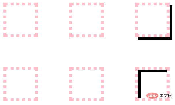
3. Projection method
The default projection method is Outset, that is, external projection, can be set to inset to project inward.
Example: The first div defaults to outset, the second div sets inset, the third div sets two shadows at the same time to better see the relationship between outset and inset, and the fourth div can see the inset shadow. Above the background, below the content.
<style type="text/css">
div{
    width: 100px;
    height: 100px;
    margin:50px;
    border: 10px dotted pink;
    display: inline-block;
    vertical-align: top;
}
.outset{
    box-shadow: 10px 10px teal;
}
.inset{
    box-shadow: 10px 10px teal inset;
}
.double{
    box-shadow: 10px 10px teal inset,10px 10px teal;
}
.bg{
    background-color: yellow;
}
</style>
<body>
    <div class="outset"></div>
    <div class="inset"></div>
    <div class="double"></div>
    <div class="inset bg">inset阴影在背景之上,内容之下</div>
</body>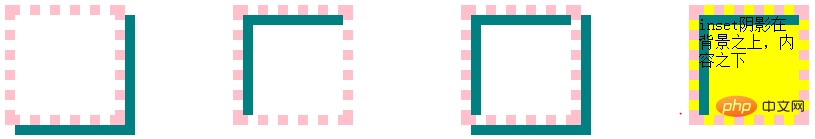
4. If the element also specifies the border-radius attribute, the shadow will have the same rounded corners.
<style type="text/css">
 div{
 width: 100px;
    height: 100px;
    margin:50px;
    border: 10px dotted pink;
    display: inline-block;
    border-radius: 50px;
 }
.shadow{
    box-shadow: 0 0  10px 10px green;
}
</style>
<body>
<div class="shadow"></div>
</body>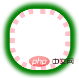
5. Classic example
An example in w3c. http://www.w3.org/TR/css3-background/#the-box-shadow
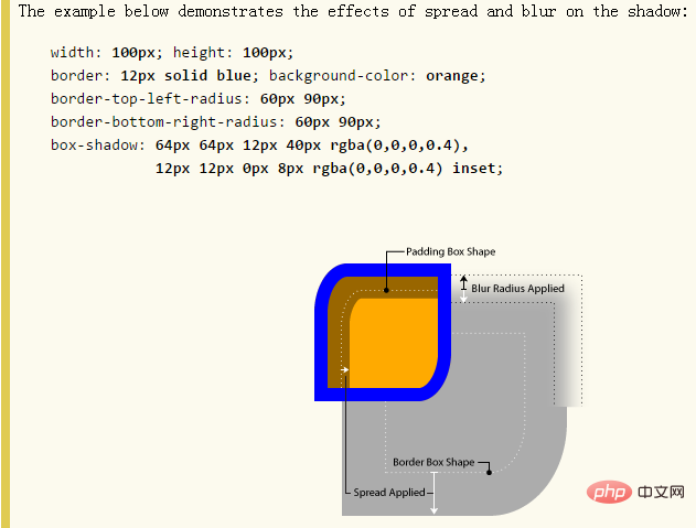
- border-radius会以相同的作用影响阴影外形
- border-image,padding不会影响阴影的任何外形
- 阴影box和box模型一样
- 外阴影在对象背景之下,内阴影在背景之上。
- 层次:内容>内阴影>背景图片>背景颜色>外阴影
6、多重阴影
这个效果在上面就看到了,现在再补充一些内容。
语法:可以设置任意多个阴影,用逗号隔开。
一个box有多重阴影时,需要注意顺序:多个阴影从上往下分布,第一个阴影在最顶层。
举例:单边阴影效果
先解释一下:可单独设置左边框的阴影,右边框的阴影,上边框的阴影,下边框的阴影,其实这样说也对,因为效果看起来就是这样,但根本原因是阴影在盒子后面,只是让阴影的位置发生了变化,其他3 个边的阴影还是存在的,只是被覆盖住了而已,所以,设置某个边的阴影是个很虚的东东了,哎,网上这种说法初看还让我略感困惑,所以我这里说是单边阴影效果,告诉大家只是一种效果,本质还是个box。
例子解释:给第一个div的上右下左border分别设置红橙黄绿,四种颜色,则red-shadow在最顶层,green-shadow在最底层,如下图左。
给其加上blur模糊半径,效果更明显,如下图中,可见red-shadow的模糊半径不受干扰,因为在最顶层;接下来orange-shadow次之,被red-shadow的radius干扰;yellow-shadow被orange-shadow和red-shadow的radius干扰;同理green-shadow被它上面的所有shadow的radius干扰。
如果还是不太理解,那给red-shadow设置一个很大的radius,比如50,就可以看到非常明显的效果了,见下图右。
<style type="text/css">
div{
    width: 100px;
    height: 100px;
    margin:50px;
    display: inline-block;
    border: 10px dotted pink;
}
.shadow{
    box-shadow: 0 -5px red,
    5px 0 orange,
    0 5px yellow,
    -5px 0 green;
}
.blur-shadow{
    box-shadow: 0 -5px 5px red,
    5px 0 5px orange,
    0 5px 5px yellow,
    -5px 0 5px green;
}
.big-redShadow{
    box-shadow: 0 -5px 50px red,
    5px 0 5px orange,
    0 5px 5px yellow,
    -5px 0 5px green;
}
</style>
<body>
    <div class="shadow"></div>
    <div class="blur-shadow"></div>
    <div class="big-redShadow"></div>
</body>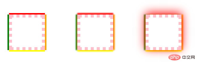
7、阴影和布局
阴影不影响布局, 但是可能会覆盖其他box或者其他box的阴影。
阴影不触发滚动条,也不增加滚动区域的大小。
所以布局时可忽略阴影。
8、spread妙用
用spread模拟实现border
<style type="text/css">
div{
    width: 100px;
    height: 100px;
    display: inline-block;
    margin:10px;
    vertical-align: top;
}
.border{
    border:1px solid red;
}
.spread{
    box-shadow: 0 0 0 1px red;
}
.muli-border{
    box-shadow: 0 0 0 2px red,0 0 0 4px green,0 0 0 6px blue;
}
</style>
<body>
    <div class="border">border</div>
    <div class="spread">box-shadow</div>
    <div class="muli-border">多重<br/>box-shadow</div>
</body>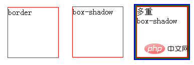
用spread实现双色方括号
<style type="text/css">
.decorator {
width: 300px;
height: 100px;
padding: 30px;
box-shadow: -30px -30px 0 -25px red,30px 30px  0 -25px green;
}
</style>
<body>
<div class="decorator">段落内容:用box-shadow模拟双色方括号box-shadow: -24px -24px 0 -20px red,24px 24px  0 -20px green; </div>
</body>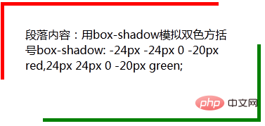
(学习视频分享:web前端)
The above is the detailed content of How to achieve the effect of adding shadow to element blocks in css. For more information, please follow other related articles on the PHP Chinese website!

Hot AI Tools

Undresser.AI Undress
AI-powered app for creating realistic nude photos

AI Clothes Remover
Online AI tool for removing clothes from photos.

Undress AI Tool
Undress images for free

Clothoff.io
AI clothes remover

AI Hentai Generator
Generate AI Hentai for free.

Hot Article
Hot Tools

Notepad++7.3.1
Easy-to-use and free code editor

SublimeText3 Chinese version
Chinese version, very easy to use

Zend Studio 13.0.1
Powerful PHP integrated development environment

Dreamweaver CS6
Visual web development tools

SublimeText3 Mac version
God-level code editing software (SublimeText3)
Hot Topics
 1378
1378
 52
52

 How to write split lines on bootstrap
Apr 07, 2025 pm 03:12 PM
How to write split lines on bootstrap
Apr 07, 2025 pm 03:12 PM
There are two ways to create a Bootstrap split line: using the tag, which creates a horizontal split line. Use the CSS border property to create custom style split lines.
 How to insert pictures on bootstrap
Apr 07, 2025 pm 03:30 PM
How to insert pictures on bootstrap
Apr 07, 2025 pm 03:30 PM
There are several ways to insert images in Bootstrap: insert images directly, using the HTML img tag. With the Bootstrap image component, you can provide responsive images and more styles. Set the image size, use the img-fluid class to make the image adaptable. Set the border, using the img-bordered class. Set the rounded corners and use the img-rounded class. Set the shadow, use the shadow class. Resize and position the image, using CSS style. Using the background image, use the background-image CSS property.
 How to resize bootstrap
Apr 07, 2025 pm 03:18 PM
How to resize bootstrap
Apr 07, 2025 pm 03:18 PM
To adjust the size of elements in Bootstrap, you can use the dimension class, which includes: adjusting width: .col-, .w-, .mw-adjust height: .h-, .min-h-, .max-h-
 The Roles of HTML, CSS, and JavaScript: Core Responsibilities
Apr 08, 2025 pm 07:05 PM
The Roles of HTML, CSS, and JavaScript: Core Responsibilities
Apr 08, 2025 pm 07:05 PM
HTML defines the web structure, CSS is responsible for style and layout, and JavaScript gives dynamic interaction. The three perform their duties in web development and jointly build a colorful website.
 How to set up the framework for bootstrap
Apr 07, 2025 pm 03:27 PM
How to set up the framework for bootstrap
Apr 07, 2025 pm 03:27 PM
To set up the Bootstrap framework, you need to follow these steps: 1. Reference the Bootstrap file via CDN; 2. Download and host the file on your own server; 3. Include the Bootstrap file in HTML; 4. Compile Sass/Less as needed; 5. Import a custom file (optional). Once setup is complete, you can use Bootstrap's grid systems, components, and styles to create responsive websites and applications.
 How to use bootstrap button
Apr 07, 2025 pm 03:09 PM
How to use bootstrap button
Apr 07, 2025 pm 03:09 PM
How to use the Bootstrap button? Introduce Bootstrap CSS to create button elements and add Bootstrap button class to add button text
 How to view the date of bootstrap
Apr 07, 2025 pm 03:03 PM
How to view the date of bootstrap
Apr 07, 2025 pm 03:03 PM
Answer: You can use the date picker component of Bootstrap to view dates in the page. Steps: Introduce the Bootstrap framework. Create a date selector input box in HTML. Bootstrap will automatically add styles to the selector. Use JavaScript to get the selected date.
 How to use bootstrap in vue
Apr 07, 2025 pm 11:33 PM
How to use bootstrap in vue
Apr 07, 2025 pm 11:33 PM
Using Bootstrap in Vue.js is divided into five steps: Install Bootstrap. Import Bootstrap in main.js. Use the Bootstrap component directly in the template. Optional: Custom style. Optional: Use plug-ins.
