vueHow to implement data visualization charts without Echarts in the project? The following article will introduce to you the method of using antv to implement data visualization charts in the Vue project. I hope it will be helpful to you!

Technology never ends, let’s see more different scenery
Still happily adding bricks and tiles to the mobile framework, supervisor He came over and asked me if he could spare a week to do other things. I was a little surprised by this tone. I asked what needed to be done. It turned out that the business department had a big data chart and there were no extra people to do it. I needed to provide support. Although I was a little refused, the supervisor spoke and I could only arrange it. I used to use echarts when making visual charts. The reason is that it was the first time I used it, and then I got used to it. It can basically meet my business needs. I am also familiar with documents, and the people who use it are also familiar with it. If you encounter problems, you can quickly find solutions. It's a bit unfortunate that this time the customer can only use Ali's antv when naming, so I have no second choice. [Related recommendations: vuejs video tutorial]
I don’t have much contact with antv. When it was first open source, I went to watch it. It was very cool. Compared with echarts, it is more beautiful, but at that time the documentation was not so complete and there were not many examples. Now when I look at it, it is already very comprehensive, with multiple series of different scenarios and commonly used chartsG2, G6 for data association diagrams, F2 for mobile visualization, and L7 focusing on maps, and of course the previous ones The basic chart is made into a layer of encapsulated plot classes, such as @antv/g2plot, @antv/l7plot. This development is about PC, so it will mainly involve G2 and L7. My feeling during the development process is that it is quite simple to use, but some property settings are not documented and you need to find them from examples. Then there are relatively few articles about its use on the Internet, not as many as echarts, maybe It takes time to find the answer by yourself in the documents and examples.
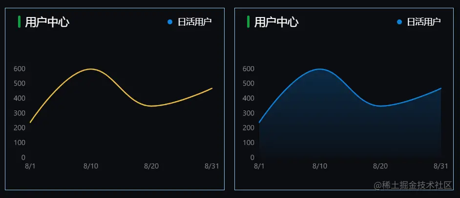
Line chart is a frequently used and relatively easy graph. There is no specific chart type in G2 (bar chart, scatter chart, line chart Charts, etc.) concept, users can draw a certain type of chart alone, such as a pie chart, or draw a mixed chart, such as a combination of a line chart and a column chart, and a mixture of a line chart and an area chart to achieve the effect shown;

| Attribute | Description | Type | Default value |
|---|---|---|---|
| Specify For the DOM drawn by the chart, you can pass in the DOM id or directly pass in the dom instance | string | HTMLElement | - | |
| Whether the chart adapts to the width and height of the container. If the user sets the height, the height set by the user will prevail. | boolean | false | |
| Chart width | number | - | |
| Chart height | number | - | |
| Chart padding | 'auto'|number |number[] | 'auto' |
| Description | Type | Default value | |
|---|---|---|---|
| Set the minimum value of the corresponding coordinate system | any | - | |
| Set the minimum value of the corresponding coordinate system | any | - | |
| The drawing range of the coordinate system generally does not need to be modified | [number,number] | [ 0, 1] | |
| The display alias of the data field, generally used to set the corresponding Chinese name of the field | string | - | |
| Automatically adjust min and max | boolean | false |
| Description | Type | Default value | |
|---|---|---|---|
| Whether to display the tooltip title | boolean | false | |
| true means to merge all the data corresponding to the current point and display it, false means to only display the data content closest to the current point | boolean | false | |
| Whether to display tooltips auxiliary lines. | boolean | false |
| Attribute | Description | Type | Default value |
|---|---|---|---|
| line | Configuration item of the coordinate axis, null means not to display | null | object | - |
| tickLine | Configuration item of coordinate axis tick line, null means not to display | null | object | - |
| grid | Configuration item of coordinate axis grid line, null means not to display | null | object | - |
Used to draw line charts, curve charts, stepped line charts, etc.
Used to draw area charts (area charts), cascading area charts, interval area charts, etc.
Configure position channel mapping rules
Example:
// 数据结构: [{ x: 'A', y: 10, color: 'red' }]
geom.position('x*y');Configure chart color
// 基础颜色设置
geom.color('#1890ff');
// 渐变
geom.color("l(90) 0:#0b83de 1:#0c1c2d")Graphic related settings, the instructions in the document are not very complete, you can Get the corresponding information from the chart example
| Properties | Description |
|---|---|
| smooth | Used for line chart smoothing settings |
<template>
  <div></div>
</template>
<script>
import { Chart } from "@antv/g2";
export default {
  mounted() {
    // 数据源
    const data = [
      { time: "8/1", value: 240 },
      { time: "8/10", value: 600 },
      { time: "8/20", value: 350 },
      { time: "8/31", value: 470 },
    ];
    // 初始化图表,列出图表属性
    const chart = new Chart({
      container: "container",
      autoFit: true,
      height: 276,
      padding: [100, 20, 30, 40],
    });
    // 图表关联数据chart.position()方法决定的,在下面有设置chart.position("time*value")
    // 前面为x轴,所以 time 为 x 轴, value 为 y 轴
    chart.data(data);
    // 度量
    // x,y轴坐标系是根据
    chart.scale({
      // y轴坐标系设置
      value: {
        min: 0,
        nice: true,
        alias: "用户",
      },
      // x轴坐标系设置
      time: {
        range: [0, 1],
      },
    });
    // 提示信息
    chart.tooltip({
      // 是否显示辅助线
      showCrosshairs: true,
      // 是否合并所有点展示
      shared: false,
    });
    // value 坐标系设置
    chart.axis("value", {
      grid: null,
      tickLine: null,
    });
    // time 坐标系设置
    chart.axis("time", {
      line: null,
      tickLine: null,
    });
    // 图表绘制设置
    // 面积图
    chart
      .area()
      .position("time*value")
      .color("l(90) 0:#0b83de 1:#0c1c2d")
      .shape("smooth");
    // 折线图
    chart.line().position("time*value").color("#0b83de").shape("smooth");
    // 渲染图表
    chart.render();
  },
};
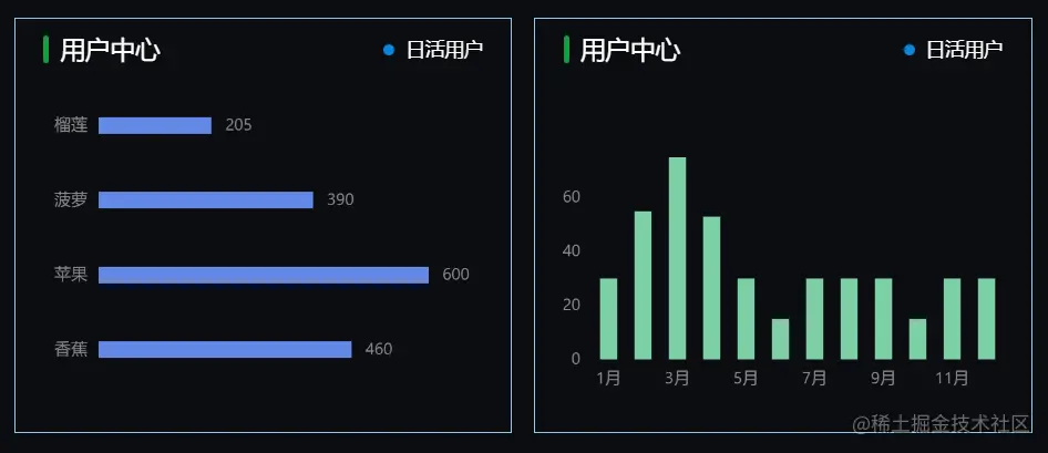
</script>Histogram is normally used in daily data analysis , and it is relatively intuitive. Here I have listed some of the attributes used. Others are consistent with the common parameter documents above

| Attribute | Description | Type | Default value |
|---|---|---|---|
| offset | The offset distance of the relative data point | number | - |
| offsetX | The offset distance relative to the data point in the X direction | number | - |
| offsetY | relative to the data The offset distance of the point in the Y direction | number | - |
| style | Text graphic attribute style, you need to use to set the color fill | number | - |
Chart coordinate system Setting
| Attribute | Description | Type | Default value |
|---|---|---|---|
| rotate | Configure the degree of rotation, using the radian system | number | - |
| reflect | Mirror along the x direction or map along the y axis | x | y | - |
| scale | along Scaling ratio in x and y directions | number, number | - |
| transpose | x, y-axis displacement, commonly used Convert between bar chart and column chart | - | - |
<template>
  <div></div>
</template>
<script>
import { Chart } from "@antv/g2";
export default {
  mounted() {
    // 数据源
    const data = [
      { type: "香蕉", value: 460 },
      { type: "苹果", value: 600 },
      { type: "菠萝", value: 390 },
      { type: "榴莲", value: 205 },
    ];
    // 初始化图表
    const chart = new Chart({
      container: "container",
      autoFit: true,
      height: 276,
      padding: [50, 60, 10, 60],
    });
    // 关联数据
    chart.data(data);
    // 图表关联数据chart.position()方法决定的,在下面有设置chart.position("type*value")
    // 前面为x轴,所以 type 为 x 轴, value 为 y 轴

    // 设置 x 轴坐标系
    chart.axis("type", {
      grid: null,
      tickLine: null,
      line: null,
    });
    // 设置 y 轴坐标系
    chart.axis("value", {
      grid: null,
      label: null,
    });
    // 隐藏图例
    chart.legend(false);
    // x,y 轴置换
    chart.coordinate().transpose();
    // chart.interval(options) 柱状图
    // geom.position() 配置 position 通道映射规则
    // geom.size 设置图形大小
    // geom.color 设置图形颜色
    // geom.label 数据标签设置
    chart
      .interval()
      .position("type*value")
      .size(12)
      .color("#678ef2")
      .label("value", {
        style: {
          fill: "#8d8d8d",
        },
        offset: 10,
      });
    chart.interaction("element-active");
    // 渲染图形
    chart.render();
  },
};
</script>antvThe document does not fully describe the map, such as map level viewLevel and map boundary settings , map color configuration, these need to be slowly explored based on examples. I implemented the more commonly used China map, including toolTip, and the scatter plot of the province. Just modify the map level viewLevel , and with the corresponding data, scatter plots of different provinces and cities can be realized, and everyone can draw inferences from one example.
@antv/l7plot, and the map-related drawing is packaged internally. If @antv/l7 is used, it is mainly based on requests. The map path coordinate data request is drawn, and the data is quite large, which will be more troublesome.
Github to view the
| Description | Type | Default value | |
|---|---|---|---|
| Map base map type, amap: Gaode map, mapbox: Mapbox map | string | amap | |
| Initial center latitude and longitude | number[] | [0, 0] | |
| Initial tilt angle | number | 0 | |
| Initial zoom level | number | 0 | |
| Built-in styles: dark: dark, light: bright, normal: normal, blank: no basemap | string | dark | |
| Whether to display the logo | boolean | true |
| 属性 | 说明 |
|---|---|
| level | 层级 国家;"country"、省份:"province"、市:"city"、县:"district" |
| adcode | 层级编码 中国;100000、浙江省:"330000"、杭州市:"330100"、西湖区:"330106" |
<template>
  <div></div>
</template>
<script>
import { Choropleth } from "@antv/l7plot";
// 地图数据
import data from "../data/userMap";
export default {
  mounted() {
    // 初始化地图
    // eslint-disable-next-line no-unused-vars
    const map = new Choropleth("container", {
      // 地图容器配置
      map: {
        type: "mapbox",
        style: "blank",
        center: [120.19382669582967, 30.258134],
        zoom: 3,
        pitch: 0,
        logo: false,
      },
      // 关联数据
      source: {
        data: data,
        joinBy: { sourceField: "code" },
      },
      // 地图等级
      viewLevel: {
        level: "country",
        adcode: 100000,
      },
      // 根据容器宽高自定义图表
      autoFit: true,
      // 设置地图颜色
      color: {
        field: "value",
        value: ["#B8E1FF", "#7DAAFF", "#3D76DD", "#0047A5", "#001D70"],
        scale: { type: "quantile" },
      },
      // 边框
      chinaBorder: {
        // 国界
        national: null,
        // 争议
        dispute: { color: "#ccc", width: 1, opacity: 0.8, dashArray: [2, 2] },
        // 海洋
        coast: { color: "#ccc", width: 0.7, opacity: 0.8 },
        // 港澳
        hkm: { color: "gray", width: 0.7, opacity: 0.8 },
      },
      // 边界颜色
      style: {
        opacity: 1,
        stroke: "rgb(93,112,146)",
        lineWidth: 0.6,
        lineOpacity: 1,
      },
      // 数据标签
      label: {
        visible: false,
      },
      // 选择高亮
      state: {
        active: { stroke: "black", lineWidth: 1 },
      },
      // 提示
      tooltip: {
        inPlot: false,
        items: ["name", "code", "value"],
      },
    });
  },
};
</script>
<style>
#container {
  width: 100%;
  height: 300px;
}
</style>如果你还没了解antv,现在它应该进入你的视野了,他提供了很多炫酷的图表,以及强大的图表功能,就算现在用不到,下次做个尝试也未尝不可,可能你会喜欢上它,并且替换掉echarts。
就举这些图表例子了,文章相关的例子源码也上传到Github了。这次开发过程中,也是把antv文档上上下下翻了好几遍,对于使用方式以及属性有一定的了解,如果你是刚刚要使用antv或者使用中遇到问题,可以评论区留言,共同成长,fighting~
The above is the detailed content of Let's talk about how vue+antv implements data visualization charts. For more information, please follow other related articles on the PHP Chinese website!