
 Web Front-end
CSS Tutorial
Clever use of CSS to achieve secondary bolding and multiple border effects on text
Web Front-end
CSS Tutorial
Clever use of CSS to achieve secondary bolding and multiple border effects on text
Clever use of CSS to achieve secondary bolding and multiple border effects on text

How to bold text twice? How to implement multiple borders? The following article will introduce you to the clever use of CSS to achieve secondary bolding and multiple border effects of text. I hope it will be helpful to you!

This article will explain how to achieve the
text bold and border effect in extreme scenarios through a practical business requirement
The effect of multiple borders on text
Required background - secondary bolding of text
Encountered today I came to such an interesting question: When
is displaying text, I use font-weight: bold to bold the text, but I feel it is still not bold enough. Is there any way to make the text bold? What about thicker?
emm, if compatibility is not considered, the answer is that you can use the -webkit-text-stroke attribute of the text to make the text bold twice.
MDN - webkit-text-stroke: This attribute adds a border (stroke tip) to the text character, specifying the width and color# of the border, which is the abbreviation of the -webkit-text-stroke-width and -webkit-text-stroke-color properties.
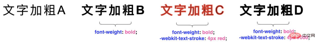
Look at the DEMO below, we can use -webkit-text-stroke to bold the text twice:
<p>文字加粗CSS</p>
<p>文字加粗CSS</p>
<p>文字加粗CSS</p>
<p>文字加粗CSS</p>
p {
    font-size: 48px;
    letter-spacing: 6px;
}
p:nth-child(2) {
    font-weight: bold;
}
p:nth-child(3) {
    -webkit-text-stroke: 3px red;
}
p:nth-child(4) {
    -webkit-text-stroke: 3px #000;
}Compare the following 4 types of text, the last one This uses font-weight: bold and -webkit-text-stroke to make the text bold.
CodePen Demo -- font-weight: bold and -webkit-text-stroke secondary bold text
How to add a border to twice bold text?
OK, after completing the first step above, the matter is not over yet, and a more terrifying problem has come.
Now the text needs to be bolded twice and a border of a different color is added.
We used the -webkit-text-stroke attribute that might have been used to add a border to the text, and now things get a little tricky. This question can also be transformed into, how to add 2 layers of borders of different colors to the text?
Of course, this is not a problem with the powerful CSS (SVG), let’s try it.
Try method one: Use the pseudo-element of text to enlarge the text
The first method to try is a bit troublesome. We can refine each text, use the pseudo elements of the text to slightly enlarge the text, and fit the original text and the retrieved text together.
Split the text into independent elements for processing
Use the
attr()feature of pseudo-element, use The pseudo-element of the element implements the same textenlarges the pseudo-element’s text
and superimposes it under the original text
Code:
- 文
- 字
- 加
- 粗
- C
- S
- S
ul {
    display: flex;
    flex-wrap: nowrap;
}

li {
    position: relative;
    font-size: 64px;
    letter-spacing: 6px;
    font-weight: bold;
    -webkit-text-stroke: 3px #000;

    &::before {
        content: attr(data-text);
        position: absolute;
        top: 0;
        left: 0;
        bottom: 0;
        right: 0;
        color: red;
        -webkit-text-stroke: 3px #f00;
        z-index: -1;
        transform: scale(1.15);
    }
}You can simply add an animation to the above effect, and you will understand it at a glance:

looks good, but in fact, if you look closely, the border effect is very rough, and every part of the text is not covered regularly. The effect Not very acceptable:##CodePen Demo -- Using pseudo elements to add borders to bold text

Try method two: Use text-shadow to simulate the border
The first method failed, we Continue to try the second method, usingtext-shadow to simulate the border.
<p>文字加粗CSS</p>
p {
    font-size: 48px;
    letter-spacing: 6px;
    font-weight: bold;
    -webkit-text-stroke: 1px #000;
    text-shadow: 0 0 2px red;
}
text-shadow supports multiple shadows. Let’s overlay the above text-shadow several times:
p {
    font-size: 48px;
    letter-spacing: 6px;
    font-weight: bold;
    -webkit-text-stroke: 1px #000;
  - text-shadow: 0 0 2px red;
  + text-shadow: 0 0 2px red,0 0 2px red,0 0 2px red,0 0 2px red,0 0 2px red,0 0 2px red,0 0 2px red,0 0 2px red,0 0 2px red,0 0 2px red;
}
text-shadow, it really looks like a border!

尝试方法三:利用多重 drop-shadow()
在尝试了 text-shadow 之后,自然而然的就会想到多重 filter: drop-shadow(),主观上认为会和多重 text-shadow 的效果应该是一致的。
不过,实践出真知。
在实际测试中,发现利用 filter: drop-shadow() 的效果比多重 text-shadow 要好,模糊感会弱一些:
p {
    font-weight: bold;
    -webkit-text-stroke: 1px #000;
    filter:
        drop-shadow(0 0 0.25px red)
        drop-shadow(0 0 0.25px red)
        drop-shadow(0 0 0.25px red)
        drop-shadow(0 0 0.25px red)
        drop-shadow(0 0 0.25px red)
        drop-shadow(0 0 0.25px red)
        drop-shadow(0 0 0.25px red)
        drop-shadow(0 0 0.25px red)
        drop-shadow(0 0 0.25px red)
        drop-shadow(0 0 0.25px red)
        drop-shadow(0 0 0.25px red);
}效果如下:

我们甚至可以利用它制作文字二次加粗后的多重边框:
p {
    font-weight: bold;
    -webkit-text-stroke: 1px #000;
    filter:
        drop-shadow(0 0 0.2px red)
        // 重复 N 次
        drop-shadow(0 0 0.2px red)
        drop-shadow(0 0 0.25px blue)
        // 重复 N 次
        drop-shadow(0 0 0.25px blue);
}效果如下:

然而,在不同屏幕下(高清屏和普通屏),drop-shadow() 的表现效果差别非常之大,实则也难堪重用。
我们没有办法了吗?不,还有终极杀手锏 SVG。
尝试方法四:利用 SVG feMorphology 滤镜给文字添加边框
其实利用 SVG 的 feMorphology 滤镜,可以非常完美的实现这个需求。
这个技巧,我在 有意思!不规则边框的生成方案 这篇文章中也有提及。
借用 feMorphology 的扩张能力给不规则图形添加边框。
直接上代码:
<p>文字加粗CSS</p>
p {
    font-size: 64px;
    letter-spacing: 6px;
    font-weight: bold;
    -webkit-text-stroke: 2px #000;
    filter: url(#dilate);
}效果如下:

我们可以通过 SVG feMorphology 滤镜中的 radius 控制边框大小,feFlood 滤镜中的 flood-color 控制边框颜色。并且,这里的 SVG 代码可以任意放置,只需要在 CSS 中利用 filter 引入即可。
本文不对 SVG 滤镜做过多的讲解,对 SVG 滤镜原理感兴趣的,可以翻看我上述提到的文章。
至此,我们就完美的实现了在已经利用 font-weight: bold 和 -webkit-text-stroke 的基础上,再给文字添加不一样颜色的边框的需求。
放大了看,这种方式生成的边框,是真边框,不带任何的模糊:

最后
OK,本文到此结束,介绍了一些 CSS 中的奇技淫巧去实现文字二次加粗后加边框的需求,实际需求中,如果不是要求任意字都要有这个效果,其实我更推荐切图大法,高保真,不丢失细节。
当然,可能还有更便捷更有意思的解法,欢迎在评论区不吝赐教。
The above is the detailed content of Clever use of CSS to achieve secondary bolding and multiple border effects on text. For more information, please follow other related articles on the PHP Chinese website!

Hot AI Tools

Undresser.AI Undress
AI-powered app for creating realistic nude photos

AI Clothes Remover
Online AI tool for removing clothes from photos.

Undress AI Tool
Undress images for free

Clothoff.io
AI clothes remover

AI Hentai Generator
Generate AI Hentai for free.

Hot Article
Hot Tools

Notepad++7.3.1
Easy-to-use and free code editor

SublimeText3 Chinese version
Chinese version, very easy to use

Zend Studio 13.0.1
Powerful PHP integrated development environment

Dreamweaver CS6
Visual web development tools

SublimeText3 Mac version
God-level code editing software (SublimeText3)
Hot Topics
 1376
1376
 52
52

 How to use bootstrap button
Apr 07, 2025 pm 03:09 PM
How to use bootstrap button
Apr 07, 2025 pm 03:09 PM
How to use the Bootstrap button? Introduce Bootstrap CSS to create button elements and add Bootstrap button class to add button text
 How to resize bootstrap
Apr 07, 2025 pm 03:18 PM
How to resize bootstrap
Apr 07, 2025 pm 03:18 PM
To adjust the size of elements in Bootstrap, you can use the dimension class, which includes: adjusting width: .col-, .w-, .mw-adjust height: .h-, .min-h-, .max-h-
 How to set up the framework for bootstrap
Apr 07, 2025 pm 03:27 PM
How to set up the framework for bootstrap
Apr 07, 2025 pm 03:27 PM
To set up the Bootstrap framework, you need to follow these steps: 1. Reference the Bootstrap file via CDN; 2. Download and host the file on your own server; 3. Include the Bootstrap file in HTML; 4. Compile Sass/Less as needed; 5. Import a custom file (optional). Once setup is complete, you can use Bootstrap's grid systems, components, and styles to create responsive websites and applications.
 How to insert pictures on bootstrap
Apr 07, 2025 pm 03:30 PM
How to insert pictures on bootstrap
Apr 07, 2025 pm 03:30 PM
There are several ways to insert images in Bootstrap: insert images directly, using the HTML img tag. With the Bootstrap image component, you can provide responsive images and more styles. Set the image size, use the img-fluid class to make the image adaptable. Set the border, using the img-bordered class. Set the rounded corners and use the img-rounded class. Set the shadow, use the shadow class. Resize and position the image, using CSS style. Using the background image, use the background-image CSS property.
 How to view the date of bootstrap
Apr 07, 2025 pm 03:03 PM
How to view the date of bootstrap
Apr 07, 2025 pm 03:03 PM
Answer: You can use the date picker component of Bootstrap to view dates in the page. Steps: Introduce the Bootstrap framework. Create a date selector input box in HTML. Bootstrap will automatically add styles to the selector. Use JavaScript to get the selected date.
 How to verify bootstrap date
Apr 07, 2025 pm 03:06 PM
How to verify bootstrap date
Apr 07, 2025 pm 03:06 PM
To verify dates in Bootstrap, follow these steps: Introduce the required scripts and styles; initialize the date selector component; set the data-bv-date attribute to enable verification; configure verification rules (such as date formats, error messages, etc.); integrate the Bootstrap verification framework and automatically verify date input when form is submitted.
 How to write split lines on bootstrap
Apr 07, 2025 pm 03:12 PM
How to write split lines on bootstrap
Apr 07, 2025 pm 03:12 PM
There are two ways to create a Bootstrap split line: using the tag, which creates a horizontal split line. Use the CSS border property to create custom style split lines.
 How to set the bootstrap navigation bar
Apr 07, 2025 pm 01:51 PM
How to set the bootstrap navigation bar
Apr 07, 2025 pm 01:51 PM
Bootstrap provides a simple guide to setting up navigation bars: Introducing the Bootstrap library to create navigation bar containers Add brand identity Create navigation links Add other elements (optional) Adjust styles (optional)
