

Which item in css language is floating syntax?

The floating syntax in the CSS language is "float: attribute value;". The float attribute is used to define the direction in which the element floats. It will make the box (element) float on the standard flow, and the elements around it will also be rearranged until its outer edge touches the border of the containing box or another floating box. . This attribute has three attribute values: 1. "left", which defines the element to float to the left; 2. "right", which defines the element to float to the right; 3. "none", which defines the element not to float.
The operating environment of this tutorial: Windows 7 system, CSS3&&HTML5 version, Dell G3 computer.
In the CSS language, if you want an element to float, you need to use the float attribute; This attribute specifies whether a box (element) should float. In the past, this property was always applied to images to make the text surround the image, but in CSS, any element can be floated. A floated element creates a block-level box, regardless of what type of element it is.
If floating non-replaced elements, specify an explicit width; otherwise, they are made as narrow as possible.
Note: If there is very little space for a floating element on a row, the element will jump to the next row, and this process will continue until a certain row has enough space.
The three attribute values of the float floating attribute:
left The element floats to the left.
#right The element floats to the right.
#none Default value. The element is not floated and appears where it appears in the text.
Floating
1. Three mechanisms of CSS layout
css provides 3 mechanisms to set The placement positions of the boxes are: normal flow (standard flow), floating and positioning, among which:
1. Normal flow (standard flow: "Block-level elements" will occupy one line, "from top to bottom" "Arrangement; "Inline elements" will be arranged in order, "from left to right", and will automatically wrap when touching the edge of the parent element;
2. Floating: Let the box "float" from the normal flow, the main function Let multiple block-level boxes be displayed in one line.
3. Positioning: "Position" the box at a certain position - CSS is inseparable from positioning, especially the subsequent js special effects.
2. Why is floating required?
**Concept: **Element floating means**an element with a floating attribute set will:**
- Out of the control of standard ordinary flow.
- Move to the specified position.
Function:
- Let more Boxes (divs) are arranged horizontally in a row, making floating an important means of layout.
- Can realize left and right alignment of boxes, etc...
- Floating was first used Control the image to achieve the effect of text surrounding the image.
Floating Tips——Floating
nbsp;html>


    <meta>
    <meta>
    <title>Document</title>
    <style>
        .box1{
            width: 200px;
            height: 200px;
            background-color: rgba(255,0,0,0.5);
            float: left;
        }
        .box2{
            width: 300px;
            height: 150px;
            background-color: skyblue;
        }
    </style>


    <div></div>
    <div></div>
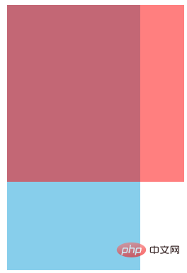
## The float<span style="background-color: rgb(255, 192, 0);"></span> attribute will make the box float on top of the standard stream, so the second standard stream box runs to the bottom of the floating box.
nbsp;html>


    <meta>
    <meta>
    <title>Document</title>
    <style>
        .box1{
            width: 200px;
            height: 200px;
            background-color: rgba(255,0,0,0.5);
            /* 让第一个盒子浮动起来,不占位置 */
            float: left;
        }
        .box2{
            width: 300px;
            height: 150px;
            background-color: skyblue;
        }
    </style>


    <div></div>
    <div></div>

div {
  width: 200px;
  height: 200px;
  background-color: pink;
  /* 转换为行内块元素,可以水平显示,不过 div 之间有间隙,不方便处理 */
  /* display: inline-block; */
  /* 设置浮动属性,可以让 div 水平排列,并且没有间隙 */
  float: left;
}

.two {
  background-color: hotpink;
}
1. The relationship between floating elements and parent boxes
- The float of the child box is aligned with the parent box.

2. The relationship between floating elements and sibling boxes
In a parent box, if ** before A brother box** is:
- 浮动的,那么当前盒子会与前一个盒子的顶部对齐;
- 普通流的,那么当前盒子会显示在前一个兄弟盒子的下方。
结论: 如果一个盒子里面有多个子盒子,如果其中一个盒子浮动了,其他兄弟也应该浮动。防止引起问题
ps:浮动只会影响当前的或者后面的标准流的盒子,不会影响前面的标准流
建议:如果一个盒子里面有多个盒子,如果其中的一个盒子浮动了,其他兄弟也应该浮动。防止引起问题
三、为什么要清除浮动
因为父级盒子很多情况下,不方便给高度,但是子盒子浮动就不占有位置,最后父级盒子高度为0,就影响了下面的标准流盒子。 !
结论:
- 由于浮动元素不再占用原文档流的位置,所以它会对后面的元素排版产生影响
- 准确地说,并不是清除浮动,而是清除浮动后造成的影响
四、清除浮动本质
清除浮动主要为了解决父级元素因为子级浮动引起内部高度为0 的问题。 清除浮动之后, 父级就会根据浮动的子盒子自动检测高度。 父级有了高度,就不会影响下面的标准流了
五、清除浮动的四种方式
在CSS中,clear属性用于清除浮动
语法:
选择器{clear:属性值;} //clear 清除| 属性值 | 右描述 |
|---|---|
| left | 不允许左侧有浮动元素(清除左侧浮动的影响) |
| right | 不允许右侧有浮动元素(清除右侧浮动的影响) |
| both | 同时清除左右俩侧浮动的影响 |
但是我们实际工作中, 几乎只用 clear: both;
1.额外标签法(隔墙法)
<!-- 是W3C推荐的做法是通过在浮动元素末尾添加一个空的标签:
  1.添加在浮动元素最后
  2.该元素必须是块元素,行内元素无效
 -->

<div></div>
- 优点:通俗易懂,书写方便
- 缺点:添加许多无意义的标签,结构化较差
2.父级添加overflow属性方法
可以给父级添加: overflow为 hidden| auto| scroll 都可以实现。
- 优点:代码简洁
- 缺点:内容增多时候容易造成不会自动换行导致内容被隐藏掉,无法显示需要溢出的元素。
3.使用after伪元素清除浮动
after 方式为空元素额外标签法的升级版,好处是不用单独加标签了
.clearfix:after {
  content: "";
  display: block;
  height: 0;
  clear: both;
  visibility: hidden;
}

.clearfix {
  /* IE6、7 专有 */
  *zoom: 1;
}- 优点:符合闭合浮动思想 结构语义化正确
- 缺点:由于IE6-7不支持:after,使用 zoom:1触发 hasLayout。
4.使用双伪元素清除浮动
.clearfix:before,.clearfix:after {
  content:"";
  display:table;
}
.clearfix:after {
 clear:both;
}
.clearfix {
  *zoom:1;
}- 优点:代码更简洁
- 缺点:由于IE6-7不支持:after,使用 zoom:1触发 hasLayout。
总结
标准流(普通流)在布局中 块级元素会独占一行,从上向下排列;行内元素会按照顺序,从左到右排列,碰到父元素边缘则自动换行。
浮动的应用场景大部分用于让盒子水平排列成一行和控制图片。
清除浮动主要为了解决父级元素因为子级浮动引起内部高度为0 的问题。
-
清除浮动一共有4中方式:
额外标签法(隔墙法)
父级添加overflow属性方法
使用after伪元素清除浮动
使用双伪元素清除浮动
(学习视频分享:web前端)
The above is the detailed content of Which item in css language is floating syntax?. For more information, please follow other related articles on the PHP Chinese website!

Hot AI Tools

Undresser.AI Undress
AI-powered app for creating realistic nude photos

AI Clothes Remover
Online AI tool for removing clothes from photos.

Undress AI Tool
Undress images for free

Clothoff.io
AI clothes remover

Video Face Swap
Swap faces in any video effortlessly with our completely free AI face swap tool!

Hot Article
Hot Tools

Notepad++7.3.1
Easy-to-use and free code editor

SublimeText3 Chinese version
Chinese version, very easy to use

Zend Studio 13.0.1
Powerful PHP integrated development environment

Dreamweaver CS6
Visual web development tools

SublimeText3 Mac version
God-level code editing software (SublimeText3)
Hot Topics
 1386
1386
 52
52

 How to use bootstrap in vue
Apr 07, 2025 pm 11:33 PM
How to use bootstrap in vue
Apr 07, 2025 pm 11:33 PM
Using Bootstrap in Vue.js is divided into five steps: Install Bootstrap. Import Bootstrap in main.js. Use the Bootstrap component directly in the template. Optional: Custom style. Optional: Use plug-ins.
 The Roles of HTML, CSS, and JavaScript: Core Responsibilities
Apr 08, 2025 pm 07:05 PM
The Roles of HTML, CSS, and JavaScript: Core Responsibilities
Apr 08, 2025 pm 07:05 PM
HTML defines the web structure, CSS is responsible for style and layout, and JavaScript gives dynamic interaction. The three perform their duties in web development and jointly build a colorful website.
 How to write split lines on bootstrap
Apr 07, 2025 pm 03:12 PM
How to write split lines on bootstrap
Apr 07, 2025 pm 03:12 PM
There are two ways to create a Bootstrap split line: using the tag, which creates a horizontal split line. Use the CSS border property to create custom style split lines.
 Understanding HTML, CSS, and JavaScript: A Beginner's Guide
Apr 12, 2025 am 12:02 AM
Understanding HTML, CSS, and JavaScript: A Beginner's Guide
Apr 12, 2025 am 12:02 AM
WebdevelopmentreliesonHTML,CSS,andJavaScript:1)HTMLstructurescontent,2)CSSstylesit,and3)JavaScriptaddsinteractivity,formingthebasisofmodernwebexperiences.
 How to insert pictures on bootstrap
Apr 07, 2025 pm 03:30 PM
How to insert pictures on bootstrap
Apr 07, 2025 pm 03:30 PM
There are several ways to insert images in Bootstrap: insert images directly, using the HTML img tag. With the Bootstrap image component, you can provide responsive images and more styles. Set the image size, use the img-fluid class to make the image adaptable. Set the border, using the img-bordered class. Set the rounded corners and use the img-rounded class. Set the shadow, use the shadow class. Resize and position the image, using CSS style. Using the background image, use the background-image CSS property.
 How to resize bootstrap
Apr 07, 2025 pm 03:18 PM
How to resize bootstrap
Apr 07, 2025 pm 03:18 PM
To adjust the size of elements in Bootstrap, you can use the dimension class, which includes: adjusting width: .col-, .w-, .mw-adjust height: .h-, .min-h-, .max-h-
 How to set up the framework for bootstrap
Apr 07, 2025 pm 03:27 PM
How to set up the framework for bootstrap
Apr 07, 2025 pm 03:27 PM
To set up the Bootstrap framework, you need to follow these steps: 1. Reference the Bootstrap file via CDN; 2. Download and host the file on your own server; 3. Include the Bootstrap file in HTML; 4. Compile Sass/Less as needed; 5. Import a custom file (optional). Once setup is complete, you can use Bootstrap's grid systems, components, and styles to create responsive websites and applications.
 How to use bootstrap button
Apr 07, 2025 pm 03:09 PM
How to use bootstrap button
Apr 07, 2025 pm 03:09 PM
How to use the Bootstrap button? Introduce Bootstrap CSS to create button elements and add Bootstrap button class to add button text
