css length units are: 1. em, relative font length unit, its unit length is determined based on the vertical length of the text of the element; 2. rem, relative font length unit, only relative to the root element, that is html element font size to determine its length; 3. %, relative to the parent element width or font size as a percentage; 4. px, pixels, relative to the monitor screen resolution; 5. vw, relative to the browser window The width; 6. vh, relative to the height of the browser window; 7. ch, relative to the height of the number 0 in the font used.

The operating environment of this tutorial: Windows 7 system, CSS3&&HTML5 version, Dell G3 computer.
CSS style consists of three parts: selector, attribute and value (for example, p{width: 100px;}). When setting certain attribute values, the unit corresponding to the value may be involved. CSS supports a variety of different length units, which can be divided into two categories according to type: absolute length units (such as inches, centimeters, points) and relative length units (such as percentages).
1. Relative length unit
The relative length unit means that this unit does not have a fixed value, and its value is affected by the attributes of other elements. (such as the size of the browser window, the size of the parent element), relative length units are very suitable for responsive layout.
The following table lists the relative length units supported in CSS:
| Unit | Description | Example |
|---|---|---|
| em |
Relative font length unit, its unit length is determined based on the vertical length of the element's text. Relative to the value of its own font-size (font size) attribute, if it is not set, it inherits the value of the font-size attribute of the parent element. 1em is equivalent to the value of the font-size attribute, such as font-size. The value is 16px, then 1em is equal to 16px, and 2em is equal to 32px |
p{line-height:2em;} |
| rem |
Relative font length unit, the length is determined only relative to the font size of the root element, that is, the html element. Relative to the size of the font-size attribute of the root element |
p{font-size: 1.2rem;} |
| ex | Relative to the height of the lowercase English letter x in the font used, if the height of x cannot be determined The height is calculated using 0.5em | p{font-size: 1ex;} |
| ch | relative to the height of the number 0 in the font used, If the height of 0 cannot be determined, use 0.5em to calculate | p{line-height: 3ch} |
| vw | relative to the browser window Width, 1vw = 1% of the window width | p{font-size: 5vw;} |
| vh | relative to the height of the browser window , 1vh = 1% of the window height | p{font-size: 5vh;} |
| vmin | The smaller value between vw and vh | p{font-size: 5vmin;} |
| vmax | The larger value between vw and vh | p{ font-size: 5vmax;} |
| % | Percent relative to the width or font size of the parent element | div{width: 55%} |
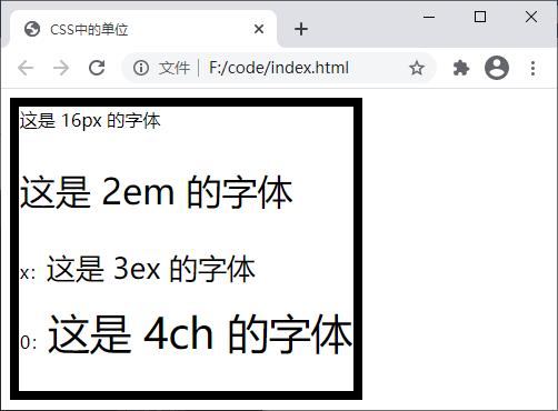
[Example] The following uses a comprehensive example to demonstrate the use of relative length units:
<!DOCTYPE html>
<html>
    <head>
        <title>CSS中的单位</title>
        <style>
            .box{
                width: 60vw;
                height: 88vh;
                border: 1ex solid black;
                font-size: 16px;
            }
            .info{
                font-size: 2em;
            }
            .ex > span{
                font-size: 3ex;
            }
            .ch > span{
                font-size: 4ch;
            }
        </style>
    </head>
    <body>
        <div class="box">
            这是 16px 的字体
            <p class="info">这是 2em 的字体</p>
            <p class="ex">
                x:<span>这是 3ex 的字体</span>
            </p>
            <p class="ch">
                0:<span>这是 4ch 的字体</span>
            </p>
        </div>
    </body>
</html>The running results are as shown below:

2. Absolute length unit
The absolute length unit represents a real physical size. Its size is fixed and does not Will change due to changes in the size of other elements. The following table lists the absolute length units supported in CSS:
| Unit | Description | Example |
|---|---|---|
| cm | CM | p{font-size: 0.5cm;} |
| mm | MM | p{font-size: 5mm;} |
| in | Inches (1in = 96px = 2.54cm) | p{ font-size: 1in;} |
| pixels are relative to the monitor screen resolution (1px = 1/96in) | p{font-size: 16px;}||
| point, is a special printing unit "Point", also known as "point" (1pt = 1/72in) | p{font-size: 16pt;} | |
| pica, which can be called "pica" in Chinese, is a unit used in the printing industry to describe font size, which is equivalent to the size of my country's new No. 4 type (1pc = 12pt) | p{font-size: 5pc ;} |
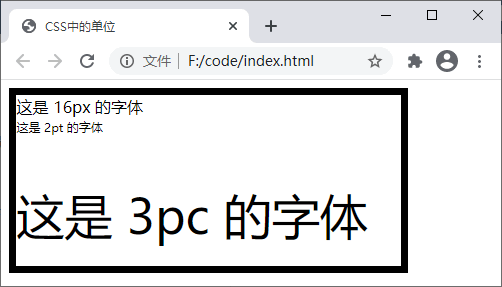
<!DOCTYPE html>
<html>
    <head>
        <title>CSS中的单位</title>
        <style>
            .box{
                width: 4in;
                height: 4.5cm;
                border: 2mm solid black;
                font-size: 16px;
            }
            .pt{
                font-size: 2pt;
            }
            .pc{
                font-size: 3pc;
            }
        </style>
    </head>
    <body>
        <div class="box">
            这是 16px 的字体
            <p class="pt">这是 2pt 的字体</p>
            <p class="pc">这是 3pc 的字体</p>
        </div>
    </body>
</html>

web front-end)
The above is the detailed content of What are the units for setting length in css?. For more information, please follow other related articles on the PHP Chinese website!