translate means "move" and is a function built into CSS. Used in conjunction with the transform attribute, it can move elements along the horizontal direction (X-axis) and vertical direction (Y-axis). The use of translate is divided into three situations: 1. "translateX(x)", the element only moves in the horizontal direction; 2. "translateY(y)", the element only moves in the vertical direction; 3. "transklate(x,y) ”, the element moves both horizontally and vertically.

The operating environment of this tutorial: Windows 7 system, CSS3&&HTML5 version, Dell G3 computer.
translate means: movement, translation, displacement.
CSS transform: translate
In CSS, the translate() method is used in conjunction with the transform attribute to transform elements in the horizontal direction ( X-axis) and vertical direction (Y-axis) movement.
For the displacement translate() method, we are divided into 3 situations:
translateX(x): The element only moves in the horizontal direction (X-axis movement);
translateY(y): The element moves only in the vertical direction (Y-axis movement);
transklate(x,y): The element moves horizontally Move in both direction and vertical direction (X-axis and Y-axis move simultaneously)
where:
x means that the element moves in the horizontal direction (X-axis ). When x is positive, it means that the element moves to the right in the horizontal direction (positive direction of X-axis); when x is negative, it means that the element moves to the left in the horizontal direction (negative direction of X-axis).
y represents the moving distance of the element in the horizontal direction (y-axis). When y is positive, it means that the element moves downward in the vertical direction; when y is negative, it means that the element moves downward in the vertical direction. Move vertically upward.
In the W3C regulations, due to human habit of reading from top to bottom, the positive direction of the x-axis in the selected coordinate system is to the right, while the positive direction of the y-axis is downward.
In CSS3, all transformation methods belong to the transform attribute, so all transformation methods must be preceded by "tranform:" to indicate "transformation" processing. Everyone must remember this.
The unit is px, em or percentage, etc. When x and y are percentages, it is equivalent to the percentage of the width padding and height padding of the moved element.
1. translate(x, y): Define 2D mobile transformation
x is the first transition value parameter, y is the second transition value parameter options. If not provided, ty has 0 as its value. That is, translate(x,y), which means that the object is translated according to the set x, y parameter values. When the value is a negative number, the object is moved in the opposite direction. Its base point defaults to the center point of the element, or it can also be based on transform-origin. Make a base point change.
For example:
transform:translate(50px,50px):

2. translate(x): Specify a Move
For example:
transform:translateX(50px):

##3. translate(y): Specify the Y-axis direction A move
Example:transform:translateY(50px):

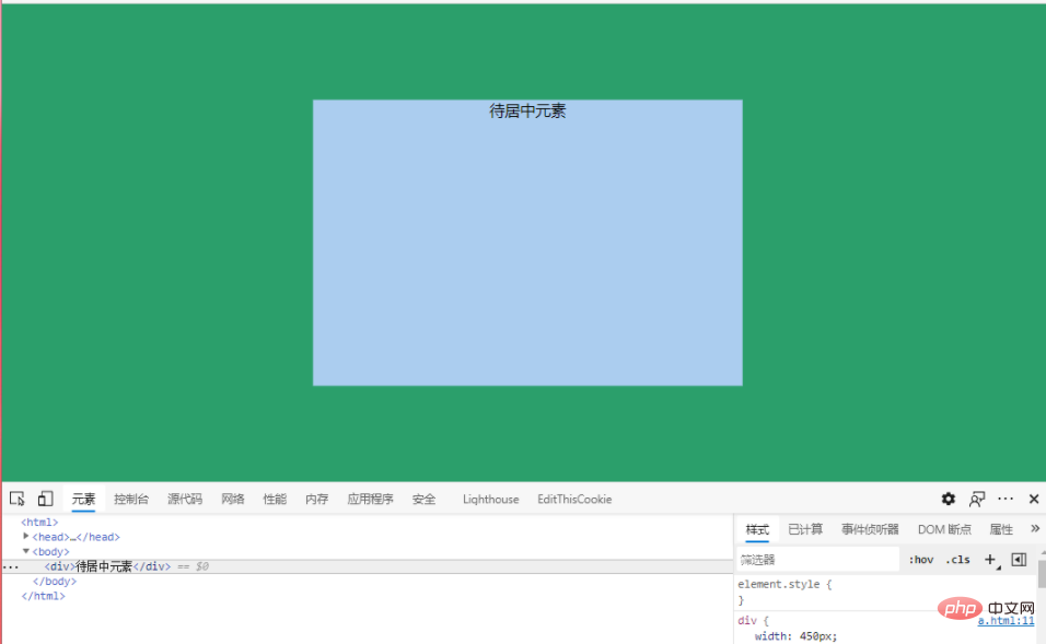
Example: Element centered in web page
Code:<html>
<head>
<title>元素页面正中间居中</title>
<style>
html,body{
height: 100%;
margin: 0;
padding: 0;
background-color: #2b9f6b
}
div{
width: 450px;
height: 300px;
background-color: #abcdef;
position: absolute;
left: 50%;
top: 50%;
transform: translate(-50%,-50%);
text-align: center;
}
</style>
</head>
<body>
<div>待居中元素</div>
</body>
</html>
web front-end)
The above is the detailed content of What does translate mean in css. For more information, please follow other related articles on the PHP Chinese website!