 Web Front-end
 CSS Tutorial
 Take you step by step to implement 3D dice using CSS Flex and Grid layout (with code)
Take you step by step to implement 3D dice using CSS Flex and Grid layout (with code)
In front-end interviews, we are often asked how to use CSS to implement dice/mahjong layout. The following article will introduce to you how to use CSS to create a 3D dice (Flex and Grid layout implement 3D dice). I hope it will be helpful to you!

You can learn from this article:
- Use transform to realize 3D shapes;
- Implement rotation animation for 3D dice;
- Use Flex layout to implement dice layout;
- Use Grid layout to implement dice layout. [Recommended learning: css video tutorial]
1. Use Flex layout to implement six sides
First, define the HTML structure of the six sides of the dice:
<div class="dice-box">
  <div class="dice first-face">
    <span class="dot"></span>
  </div>
  <div class="dice second-face">
    <span class="dot"></span>
    <span class="dot"></span>
  </div>
  <div class="dice third-face">
    <span class="dot"></span>
    <span class="dot"></span>
    <span class="dot"></span>
  </div>
  <div class="dice fourth-face">
    <div class="column">
      <span class="dot"></span>
      <span class="dot"></span>
    </div>
    <div class="column">
      <span class="dot"></span>
      <span class="dot"></span>
    </div>
  </div>
  <div class="fifth-face dice">
    <div class="column">
      <span class="dot"></span>
      <span class="dot"></span>
    </div>
    <div class="column">
      <span class="dot"></span>
    </div>
    <div class="column">
      <span class="dot"></span>
      <span class="dot"></span>
    </div>
  </div>
  <div class="dice sixth-face">
    <div class="column">
      <span class="dot"></span>
      <span class="dot"></span>
      <span class="dot"></span>
    </div>
    <div class="column">
      <span class="dot"></span>
      <span class="dot"></span>
      <span class="dot"></span>
    </div>
  </div>
</div>Let’s implement the basic style of each surface and each point:
.dice {
  width: 200px;
  height: 200px;
  padding: 20px;
  background-color: tomato;
  border-radius: 10%;
}

.dot {
   display: inline-block;
   width: 50px;
   height: 50px;
   border-radius: 50%;
   background-color: white;
}The effect is as follows:
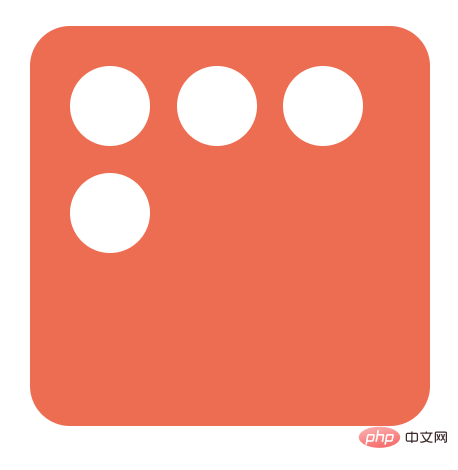
(1 ) A point
HTML structure is as follows:
<div class="dice first-face">
  <span class="dot"></span>
</div>
To implement the first face, you only need to center it horizontally and vertically:
- justify- content:center: Aligns the point with the center of the main axis (horizontal).
- align-items:center: Align the point with the center of the cross axis (vertical).
The code is implemented as follows:
.first-face {
  display: flex;
  justify-content: center;
  align-items: center;
}Now the first side is like this:

(2) Two points
HTML structure is as follows:
<div class="dice second-face">
  <span class="dot"></span>
  <span class="dot"></span>
</div>
First set the parent element of the second side to flex layout and add the following attributes:
justify-content: space-between: Place child elements at the beginning and end of the flex container.
.second-face {
   display: flex;
   justify-content : space-between;
}The current point position is as follows:

At this time, the first point is in the correct position: the upper left corner. And the second point needs to be in the lower right corner. So, let's use the align-self property to individually adjust the position of the second point:
align-self: flex-end: Align the item to the end of the Flex container.
.second-face .dot:nth-of-type(2) {
 align-self: flex-end;
}Now the second side looks like this:

(3) Three dots
The HTML structure is as follows:
<div class="dice third-face">
  <span class="dot"></span>
  <span class="dot"></span>
  <span class="dot"></span>
</div>
The third side can be achieved by placing another center point on the second side.
- align-self: flex-end: Align items to the end of the Flex container.
- align-self: center: Align items to the middle of the Flex container.
.third-face {
 display: flex;
  justify-content : space-between;
}

.third-face .dot:nth-of-type(2) {
 align-self: center;
}

.third-face .dot:nth-of-type(3) {
 align-self: flex-end;
}Now the third side looks like this:

If you want the first point to be in the upper right corner and the third point to be in the lower left corner corner, you can change the align-self of the first point to flex-end, the second point remains unchanged, and the third point does not need to be set. The default is on the far left:
.third-face {
 display: flex;
  justify-content : space-between;
}

.third-face .dot:nth-of-type(1) {
 align-self :flex-end;
}

.third-face .dot:nth-of-type(2) {
 align-self :center;
}Now the third side is Like this:

(4) Four points
HTML structure is as follows:
<div class="dice fourth-face">
  <div class="column">
    <span class="dot"></span>
    <span class="dot"></span>
  </div>
  <div class="column">
    <span class="dot"></span>
    <span class="dot"></span>
  </div>
</div>In the face of four points, you can Divide it into two rows with two columns each. One row will be at flex-start and the other row will be at flex-end . And add justify-content: space-between to place it on the left and right side of the dice.
.fourth-face {
 display: flex;
 justify-content: space-between
}Next, you need to layout the two column points respectively:
- Set the column to flex layout;
- Set flex-direction to column so that the Points are placed vertically
- Set justify-content to space-between, it will make the first point at the top and the second point at the bottom.
.fourth-face .column {
 display: flex;
  flex-direction: column;
  justify-content: space-between;
}Now the fourth side looks like this:

(5) Five points
The HTML structure is as follows:
<div class="fifth-face dice">
  <div class="column">
    <span class="dot"></span>
    <span class="dot"></span>
  </div>
  <div class="column">
    <span class="dot"></span>
  </div>
  <div class="column">
    <span class="dot"></span>
    <span class="dot"></span>
  </div>
</div>The difference between the fifth side and the fourth side is that there is an extra dot in the middle. Therefore, you can add a column in the middle based on the fourth side. The style is as follows:
.fifth-face {
 display: flex;
 justify-content: space-between
}

.fifth-face .column {
 display: flex;
  flex-direction: column;
  justify-content: space-between;
}Now the fifth side looks like this:

You also need to correct To adjust the middle point, you can set justify-content to center to center it vertically:
.fifth-face .column:nth-of-type(2) {
 justify-content: center;
}Now the fifth side looks like this:

(6 ) Six points
HTML structure is as follows:
<div class="dice sixth-face">
  <div class="column">
    <span class="dot"></span>
    <span class="dot"></span>
    <span class="dot"></span>
  </div>
  <div class="column">
    <span class="dot"></span>
    <span class="dot"></span>
    <span class="dot"></span>
  </div>
</div>The layout of the sixth side is almost exactly the same as the fourth one, except that each column has one more element. The layout is implemented as follows:
.sixth-face {
 display: flex;
 justify-content: space-between
}

.sixth-face .column {
 display: flex;
  flex-direction: column;
  justify-content: space-between;
}Now the sixth side is like this:

2. 使用 Grid 布局实现六个面
骰子每个面其实可以想象成一个 3 x 3 的网格,其中每个单元格代表一个点的位置:
+---+---+---+
| a | b | c |
+---+---+---+
| d | e | f |
+---+---+---+
| g | h | i |
+---+---+---+
要创建一个 3 x 3 的网格,只需要设置一个容器元素,并且设置三个大小相同的行和列:
.dice {
    display: grid;
    grid-template-rows: 1fr 1fr 1fr;
    grid-template-columns: 1fr 1fr 1fr;
}这里的 fr 单位允许将行或列的大小设置为网格容器可用空间的一部分,这上面的例子中,我们需要三分之一的可用空间,所以设置了 1fr 三次。
我们还可以使用 repeat(3, 1fr) 将 1fr 重复 3 次,来代替 1fr 1fr 1fr。还可以使用定义行/列的grid-template速记属性将上述代码进行简化:
.dice {
    display: grid;
    grid-template: repeat(3, 1fr) / repeat(3, 1fr);
}每个面所需要定义的 HTML 就像是这样:
<div class="dice">
  <span class="dot"></span>
  <span class="dot"></span>
  <span class="dot"></span>
  <span class="dot"></span>
</div>
所有的点将自动放置在每个单元格中,从左到右:

现在我们需要为每个骰子值定位点数。开始时我们提到,可以将每个面分成 3 x 3 的表格,但是这些表格并不是每一个都是我们需要的,分析骰子的六个面,可以发现,我们只需要以下七个位置的点:
+---+---+---+
| a | | c |
+---+---+---+
| e | g | f |
+---+---+---+
| d | | b |
+---+---+---+
我们可以使用grid-template-areas属性将此布局转换为 CSS:
.dice {
  display: grid;
  grid-template-areas:
    "a . c"
    "e g f"
    "d . b";
}因此,我们可以不使用传统的单位来调整行和列的大小,而只需使用名称来引用每个单元格。其语法本身提供了网格结构的可视化,名称由网格项的网格区域属性定义。中间列中的点表示一个空单元格。
下面来使用grid-area属性为网格项命名,然后,网格模板可以通过其名称引用该项目,以将其放置在网格中的特定区域中。:nth-child()伪选择器允许单独定位每个点。
.dot:nth-child(2) {
    grid-area: b;
}

.dot:nth-child(3) {
    grid-area: c;
}

.dot:nth-child(4) {
    grid-area: d;
}

.dot:nth-child(5) {
    grid-area: e;
}

.dot:nth-child(6) {
    grid-area: f;
}现在六个面的样式如下:
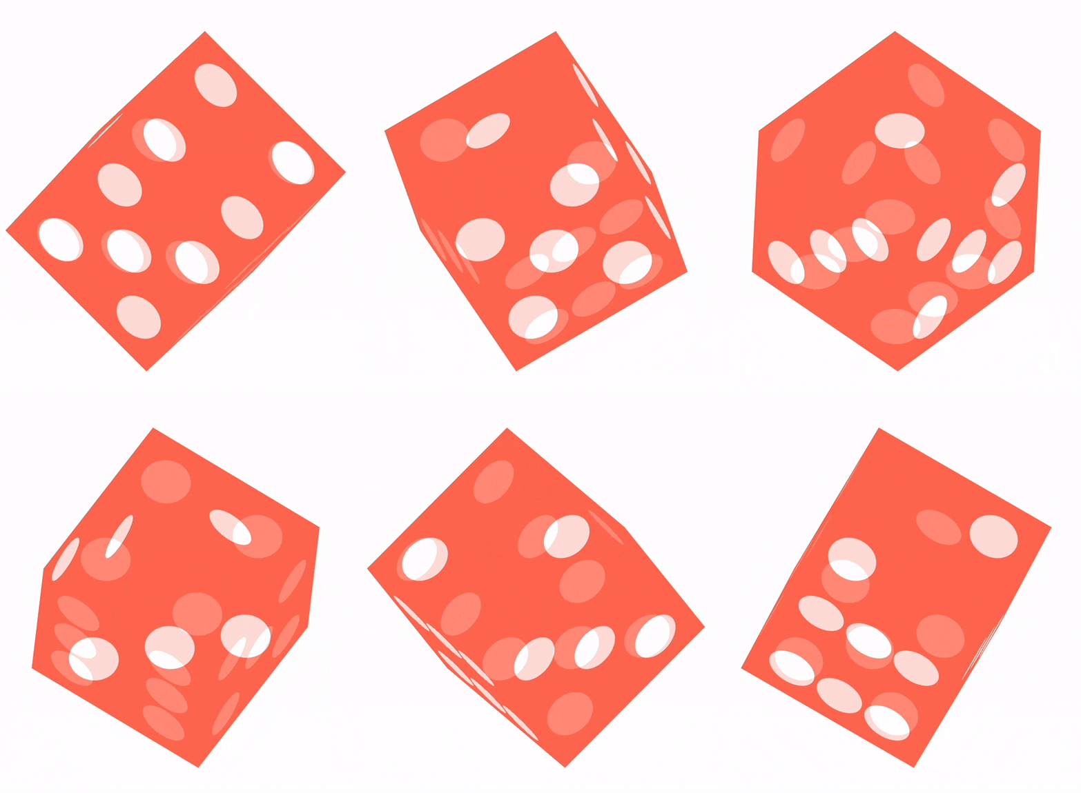
可以看到,1、3、5的布局仍然是不正确的,只需要重新定位每个骰子的最后一个点即可:
.dot:nth-child(odd):last-child {
    grid-area: g;
}这时所有点的位置都正确了:

对于上面的 CSS,对应的 HTML分别是父级为一个p标签,该面有几个点,子级就有几个span标签。代码如下:
<div class="dice-box">
  <div class="dice first-face">
    <span class="dot"></span>
  </div>
  <div class="dice second-face">
    <span class="dot"></span>
    <span class="dot"></span>
  </div>
  <div class="dice third-face">
    <span class="dot"></span>
    <span class="dot"></span>
    <span class="dot"></span>
  </div>
  <div class="dice fourth-face">
    <span class="dot"></span>
    <span class="dot"></span>
    <span class="dot"></span>
    <span class="dot"></span>
  </div>
  <div class="fifth-face dice">
    <span class="dot"></span>
    <span class="dot"></span>
    <span class="dot"></span>
    <span class="dot"></span>
    <span class="dot"></span>
  </div>
  <div class="dice sixth-face">
    <span class="dot"></span>
    <span class="dot"></span>
    <span class="dot"></span>
    <span class="dot"></span>
    <span class="dot"></span>
    <span class="dot"></span>
  </div>
</div>整体的 CSS 代码如下:
.dice {
  width: 200px;
  height: 200px;
  padding: 20px;
  background-color: tomato;
  border-radius: 10%;
  display: grid;
  grid-template: repeat(3, 1fr) / repeat(3, 1fr);
  grid-template-areas:
    "a . c"
    "e g f"
    "d . b";
}

.dot {
  display: inline-block;
  width: 50px;
  height: 50px;
  border-radius: 50%;
  background-color: white;
}

.dot:nth-child(2) {
  grid-area: b;
}

.dot:nth-child(3) {
  grid-area: c;
}

.dot:nth-child(4) {
  grid-area: d;
}

.dot:nth-child(5) {
  grid-area: e;
}

.dot:nth-child(6) {
  grid-area: f;
}

.dot:nth-child(odd):last-child {
  grid-area: g;
}3. 实现 3D 骰子
上面我们分别使用 Flex 和 Grid 布局实现了骰子的六个面,下面来这将六个面组合成一个正方体。
首先对六个面进行一些样式修改:
.dice {
  width: 200px;
  height: 200px;
  padding: 20px;
  box-sizing: border-box;
  opacity: 0.7;
  background-color: tomato;
  position: absolute;
}定义它们的父元素:
.dice-box {
  width: 200px;
  height: 200px;
  position: relative;
  transform-style: preserve-3d;
  transform: rotateY(185deg) rotateX(150deg) rotateZ(315deg);
}其中,transform-style: preserve-3d;表示所有子元素在3D空间中呈现。这里的transform 的角度不重要,主要是便于后面查看。
此时六个面的这样的:

看起来有点奇怪,所有面都叠加在一起。不要急,我们来一个个调整位置。
首先将第一个面在 Z 轴移动 100px:
.first-face {
  transform: translateZ(100px);
}第一面就到了所有面的上方:

因为每个面的宽高都是 200px,所以将第六面沿 Z 轴向下调整 100px:
.sixth-face {
  transform: translateZ(-100px);
}第六面就到了所有面的下方:

下面来调整第二面,将其在X轴向后移动 100px,并沿着 Y 轴旋转 -90 度:
.second-face {
  transform: translateX(-100px) rotateY(-90deg);
}此时六个面是这样的:

下面来调整第二面的对面:第五面,将其沿 X 轴的正方向移动 100px,并沿着 Y 轴方向选择 90 度:
.fifth-face {
  transform: translateX(100px) rotateY(90deg);
}此时六个面是这样的:

下面来调整第三面,道理同上:
.third-face {
  transform: translateY(100px) rotateX(90deg);
}此时六个面是这样的:

最后来调整第五面:
.fourth-face {
  transform: translateY(-100px) rotateX(90deg);
}此时六个面就组成了一个完整的正方体:

下面来为这个骰子设置一个动画,让它转起来:
@keyframes rotate {
  from {
    transform: rotateY(0) rotateX(45deg) rotateZ(45deg);
  }
  to {
    transform: rotateY(360deg) rotateX(45deg) rotateZ(45deg);
  }
}

.dice-box {
  animation: rotate 5s linear infinite;
}最终的效果如下:

在线体验:
3D 骰子-Flex:https://codepen.io/cugergz/pen/jOzYGyV
3D 骰子-Grid:https://codepen.io/cugergz/pen/GROMgEe
The above is the detailed content of Take you step by step to implement 3D dice using CSS Flex and Grid layout (with code). For more information, please follow other related articles on the PHP Chinese website!

Hot AI Tools

Undresser.AI Undress
AI-powered app for creating realistic nude photos

AI Clothes Remover
Online AI tool for removing clothes from photos.

Undress AI Tool
Undress images for free

Clothoff.io
AI clothes remover

Video Face Swap
Swap faces in any video effortlessly with our completely free AI face swap tool!

Hot Article

Hot Tools

Notepad++7.3.1
Easy-to-use and free code editor

SublimeText3 Chinese version
Chinese version, very easy to use

Zend Studio 13.0.1
Powerful PHP integrated development environment

Dreamweaver CS6
Visual web development tools

SublimeText3 Mac version
God-level code editing software (SublimeText3)

Hot Topics
 1386
1386
 52
52
 How to use bootstrap in vue
Apr 07, 2025 pm 11:33 PM
Using Bootstrap in Vue.js is divided into five steps: Install Bootstrap. Import Bootstrap in main.js. Use the Bootstrap component directly in the template. Optional: Custom style. Optional: Use plug-ins.
 The Roles of HTML, CSS, and JavaScript: Core Responsibilities
Apr 08, 2025 pm 07:05 PM
HTML defines the web structure, CSS is responsible for style and layout, and JavaScript gives dynamic interaction. The three perform their duties in web development and jointly build a colorful website.
 How to write split lines on bootstrap
Apr 07, 2025 pm 03:12 PM
There are two ways to create a Bootstrap split line: using the tag, which creates a horizontal split line. Use the CSS border property to create custom style split lines.
 Understanding HTML, CSS, and JavaScript: A Beginner's Guide
Apr 12, 2025 am 12:02 AM
WebdevelopmentreliesonHTML,CSS,andJavaScript:1)HTMLstructurescontent,2)CSSstylesit,and3)JavaScriptaddsinteractivity,formingthebasisofmodernwebexperiences.
 How to insert pictures on bootstrap
Apr 07, 2025 pm 03:30 PM
There are several ways to insert images in Bootstrap: insert images directly, using the HTML img tag. With the Bootstrap image component, you can provide responsive images and more styles. Set the image size, use the img-fluid class to make the image adaptable. Set the border, using the img-bordered class. Set the rounded corners and use the img-rounded class. Set the shadow, use the shadow class. Resize and position the image, using CSS style. Using the background image, use the background-image CSS property.
 How to resize bootstrap
Apr 07, 2025 pm 03:18 PM
To adjust the size of elements in Bootstrap, you can use the dimension class, which includes: adjusting width: .col-, .w-, .mw-adjust height: .h-, .min-h-, .max-h-
 How to set up the framework for bootstrap
Apr 07, 2025 pm 03:27 PM
To set up the Bootstrap framework, you need to follow these steps: 1. Reference the Bootstrap file via CDN; 2. Download and host the file on your own server; 3. Include the Bootstrap file in HTML; 4. Compile Sass/Less as needed; 5. Import a custom file (optional). Once setup is complete, you can use Bootstrap's grid systems, components, and styles to create responsive websites and applications.
 How to use bootstrap button
Apr 07, 2025 pm 03:09 PM
How to use the Bootstrap button? Introduce Bootstrap CSS to create button elements and add Bootstrap button class to add button text


