CSS tip: Use transition to retain hover state
How to retain the hover state? The following article will introduce to you how to retain the hover state without using JavaScript. I hope it will be helpful to you!

Normally, hover cannot save the state. Additional styles are triggered when the mouse is moved in, and restored once the mouse is moved out.
1 2 3 |
|
This means that if you need to retain the status of hover, you may have to resort to JS. For example, the following is the ranking effect of the home page of a certain academy

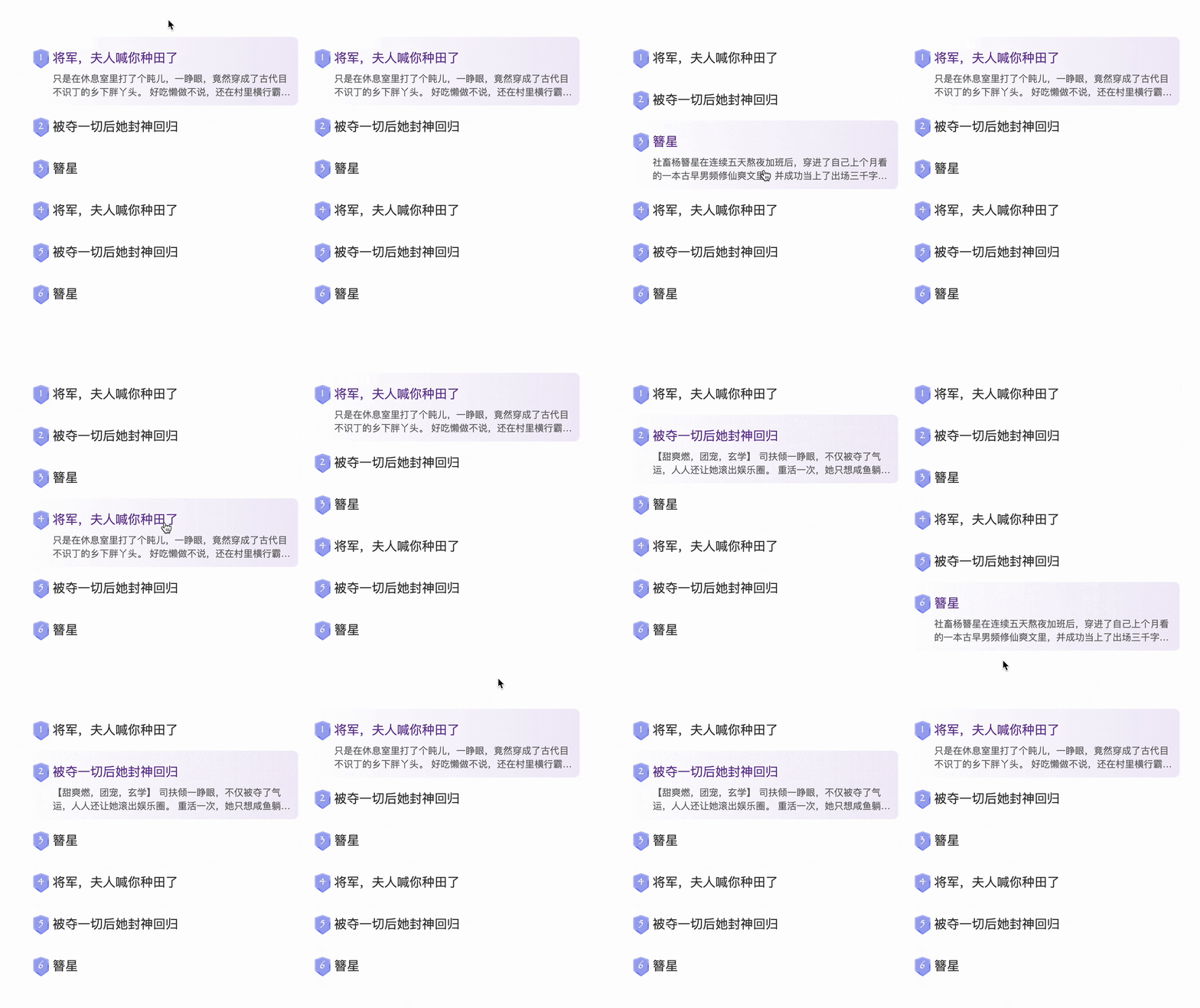
The main interactions here are as follows
The mouse slides over to trigger the selected state
-
The last selected state will remain after the mouse is moved out of the list (emphasis added)
The first item in the default list is selected
The current implementation of the official website is also implemented through JS. In fact, it can be completely achieved only through CSS, and some small delays of transition are required. Let’s take a look at the techniques. [Recommended learning: css video tutorial]
1. The mouse slides over to trigger the selected state
Everything is inseparable from layout.
Assume the listHTML is like this
1 |
|
-
将军,夫人喊你种田了
只是在休息室里打了个盹儿,一睁眼,竟然穿成了古代目不识丁的乡下胖丫头。 好吃懒做不说,还在村里横行霸道。 十里八乡没人愿意娶她,好不容易买了个金龟婿,大婚之日竟让人逃了。 恶霸老爹一怒之下去道上掳了个夫君给她。 就是……爹你掳的是不是有点不太对呀? * 婚后的苏胖丫很忙。 忙着改造恶霸爹爹与恶霸弟弟。 忙着抢救貌美如花的神将夫君。 忙着养育三个小小恶霸小豆丁。 一不小心,将自己忙成了大燕最位高权重的一品女侯!
-
被夺一切后她封神回归
【甜爽燃,团宠,玄学】 司扶倾一睁眼,不仅被夺了气运,人人还让她滚出娱乐圈。 重活一次,她只想咸鱼躺,谁知现在圈内人只知拉踩营销,没点真本事,不好好磨炼演技,这样下去还能行?怎么也得收拾收拾。 司扶倾捏了捏手腕,动了。 后来,网上疯狂骂她不自量力倒贴郁曜,造谣她私生活不检点,而—— 国际天后:今天我能站在这里,多亏了倾倾 top1男顶流:离我妹妹远点@郁曜 就连国际运动会官方:恭喜司扶倾拿下第13枚个人金牌,等一个退圈 当天,全网瘫痪。 · 史书记载,胤皇年少成名,八方征战,平天下,安宇内,是大夏朝最年轻的帝王,他完美强大,心怀天下,却因病死于27岁,一生短暂,无妻无妾,无子无孙,是无数人的白月光男神。 无人知晓,他再睁开眼,来到了1500年后。 这一次,他看见了他遥想过的盛世大夏。 · 不久后胤皇身份曝光,司扶倾得知偶像竟然就在身边,她敬佩万分,只想—— 司扶倾:努力奋斗,报效大夏! 胤皇:以身相许 司扶倾:??? 我一心奋发上进你却想要我? · 全能颜巅女神×杀伐清贵帝王 从全网黑到封神顶流,顺便和男神1v1
...
Simple modification
1 2 3 4 5 6 7 8 9 10 11 12 13 14 15 16 17 18 19 20 21 22 23 24 25 26 27 28 29 30 31 32 33 34 35 36 37 38 39 40 41 42 43 44 45 46 47 48 49 50 |
|
The effect is as follows
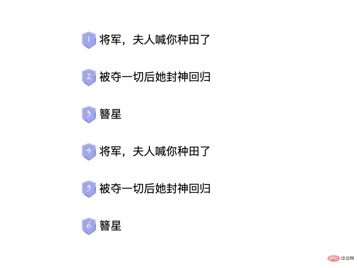
Now add the effect of hover
1 2 3 4 5 6 7 8 9 |
|
The effect is as follows
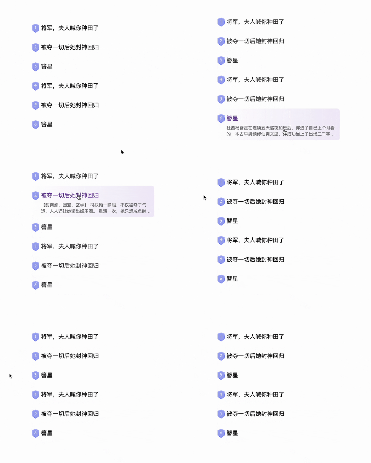
hover effect, Nothing special, so how to retain the last state after moving out? Then read on
hover
You need to use such a little trick to achieve hover retention status.
hover style to an element
1 2 3 |
|

1 2 3 |
|

hover
1 2 3 4 |
|

1 2 3 |
|
9999s before it changes to its original state, which is equivalent to retaining the hover state

hover, as follows
1 2 3 4 5 6 7 8 9 10 11 12 13 14 15 16 17 18 19 |
|
transition, so all state changes All need to support transition attributes , such as hiding sumary here is height: 0 instead of display:none, and the selected background Color change, because background-image does not support transition, so I changed it to ::before, and then used opacity alone to control some details, etc. The effect is as follows
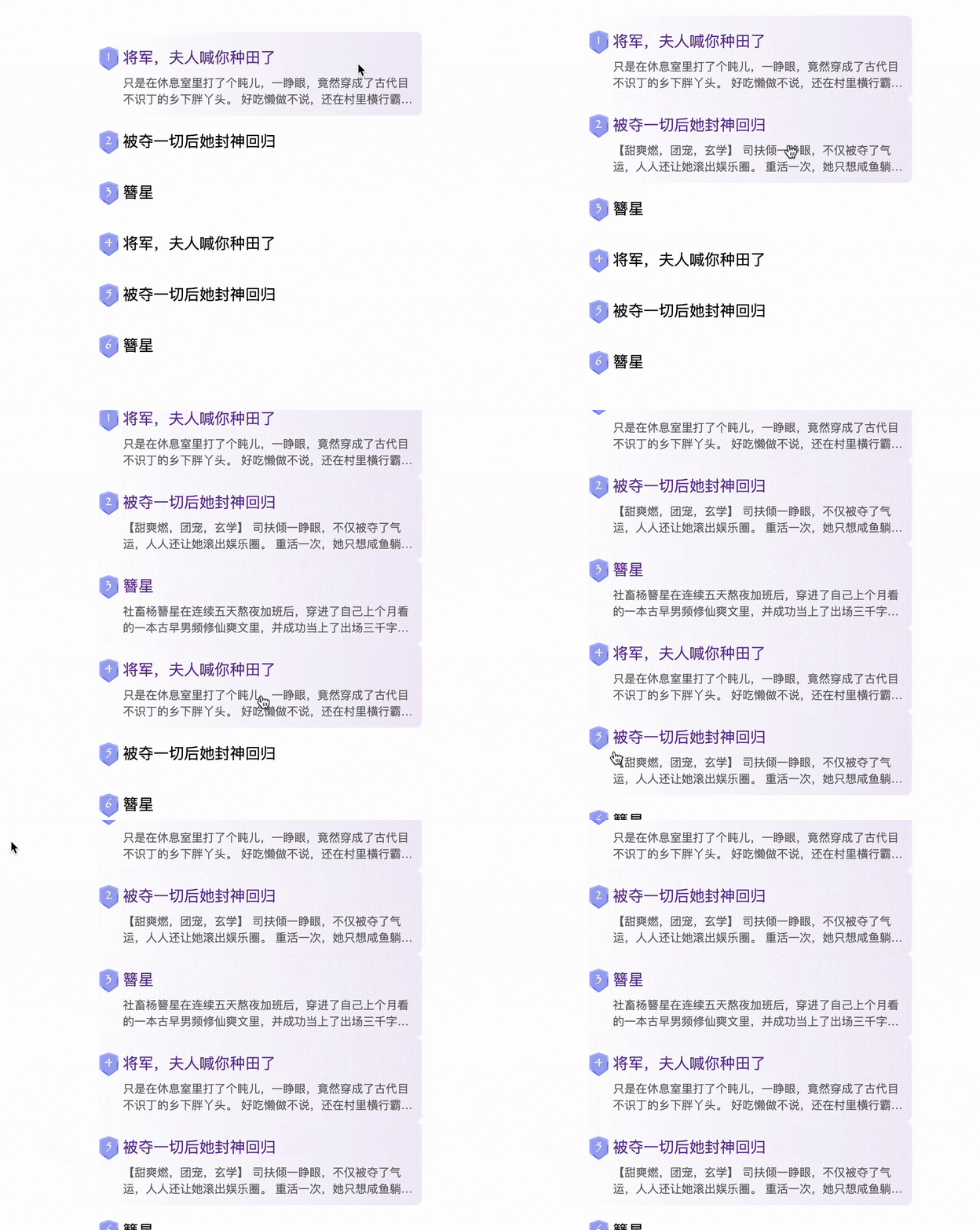
这里需要换一种思路,可以这么做,鼠标在移入整个列表的时候就清除所有的状态,这样就只有当前hover的选项才会保留下来,有点类似于JS中的思维,先把所有的.current都移除,再给当前项添加.current,实现如下
1 2 3 4 5 6 7 8 9 10 11 12 13 |
|
这样就实现了鼠标移出列表后仍然保留上一次的选中态的功能,有点像单选框的效果,只不过是hover触发的,效果如下
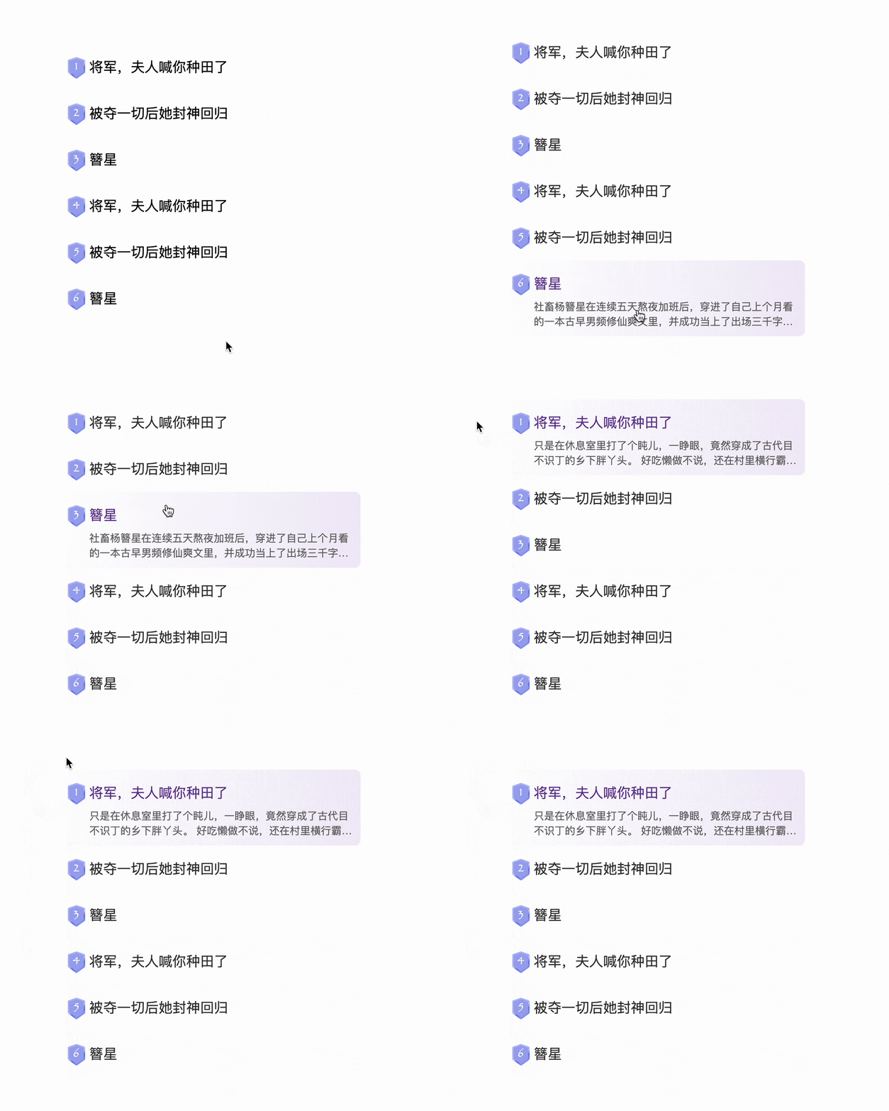
四、默认列表的第一项为选中态
下面来实现最后一个功能。
这个相对而言比较容易,需要用到:first-child伪类,可以匹配到第一个元素。
不过需要考虑的是优先级的问题,这个是默认状态,权限应该是最低的,其他hover样式都应该可以覆盖它,所以可以放在最前面,如下
1 2 3 4 5 6 7 8 9 10 11 12 13 14 |
|
这样就完美实现了文章开头的效果

由于是 CSS 实现,多个列表也是完全复用的
完整代码可以查看线上 demo:CSS keep hover(runjs.work)
五、总结一下
以上就是通过纯 CSS 实现保留鼠标滑过样式的全部技巧了,主要还是对transition-delay的灵活运用,下面总结一下
实现原理的利用
transition-delay,让“还原”的时间足够长,这样就实现了保留hover状态的效果了单选效果可以在鼠标移入整个列表的时候就清除所有的状态,这样就只有当前
hover的选项才会保留下来,有点类似于JS中的思维需要注意所有属性必须是支持
transition的,比如display:none就不支持transition,需要用其他样式代替
当然,整个实现对于 CSS 以及选择器要求是相当高的,实际项目过程中可能并不如 JS 实现来的快,但是,CSS能够实现的又何必动用 JS呢?在我看来,JS就应该回归本职,专心处理数据逻辑交互,视觉方面全部交给CSS就行了,只是现在CSS还不够强大,实现需要用到很多奇技淫巧,但是,CSS现在已经在变得足够强大,比如:has伪类,相信未来CSS会越来越美好
The above is the detailed content of CSS tip: Use transition to retain hover state. For more information, please follow other related articles on the PHP Chinese website!

Hot AI Tools

Undresser.AI Undress
AI-powered app for creating realistic nude photos

AI Clothes Remover
Online AI tool for removing clothes from photos.

Undress AI Tool
Undress images for free

Clothoff.io
AI clothes remover

AI Hentai Generator
Generate AI Hentai for free.

Hot Article

Hot Tools

Notepad++7.3.1
Easy-to-use and free code editor

SublimeText3 Chinese version
Chinese version, very easy to use

Zend Studio 13.0.1
Powerful PHP integrated development environment

Dreamweaver CS6
Visual web development tools

SublimeText3 Mac version
God-level code editing software (SublimeText3)

Hot Topics
 1376
1376
 52
52
 How to use bootstrap button
Apr 07, 2025 pm 03:09 PM
How to use the Bootstrap button? Introduce Bootstrap CSS to create button elements and add Bootstrap button class to add button text
 How to insert pictures on bootstrap
Apr 07, 2025 pm 03:30 PM
There are several ways to insert images in Bootstrap: insert images directly, using the HTML img tag. With the Bootstrap image component, you can provide responsive images and more styles. Set the image size, use the img-fluid class to make the image adaptable. Set the border, using the img-bordered class. Set the rounded corners and use the img-rounded class. Set the shadow, use the shadow class. Resize and position the image, using CSS style. Using the background image, use the background-image CSS property.
 How to resize bootstrap
Apr 07, 2025 pm 03:18 PM
To adjust the size of elements in Bootstrap, you can use the dimension class, which includes: adjusting width: .col-, .w-, .mw-adjust height: .h-, .min-h-, .max-h-
 How to set up the framework for bootstrap
Apr 07, 2025 pm 03:27 PM
To set up the Bootstrap framework, you need to follow these steps: 1. Reference the Bootstrap file via CDN; 2. Download and host the file on your own server; 3. Include the Bootstrap file in HTML; 4. Compile Sass/Less as needed; 5. Import a custom file (optional). Once setup is complete, you can use Bootstrap's grid systems, components, and styles to create responsive websites and applications.
 How to verify bootstrap date
Apr 07, 2025 pm 03:06 PM
To verify dates in Bootstrap, follow these steps: Introduce the required scripts and styles; initialize the date selector component; set the data-bv-date attribute to enable verification; configure verification rules (such as date formats, error messages, etc.); integrate the Bootstrap verification framework and automatically verify date input when form is submitted.
 How to set the bootstrap navigation bar
Apr 07, 2025 pm 01:51 PM
Bootstrap provides a simple guide to setting up navigation bars: Introducing the Bootstrap library to create navigation bar containers Add brand identity Create navigation links Add other elements (optional) Adjust styles (optional)
 How to upload files on bootstrap
Apr 07, 2025 pm 01:09 PM
The file upload function can be implemented through Bootstrap. The steps are as follows: introduce Bootstrap CSS and JavaScript files; create file input fields; create file upload buttons; handle file uploads (using FormData to collect data and then send to the server); custom style (optional).
 How to view the date of bootstrap
Apr 07, 2025 pm 03:03 PM
Answer: You can use the date picker component of Bootstrap to view dates in the page. Steps: Introduce the Bootstrap framework. Create a date selector input box in HTML. Bootstrap will automatically add styles to the selector. Use JavaScript to get the selected date.


