How to adapt the Vite project to the screen? Two options to share
How to adapt the Vite project to the screen? The following article will share with you two solutions for screen adaptation of the Vite project. It is very detailed. Come and collect it to learn!

Recently, Xiaomei, a student in the project team, seems to have encountered a difficult problem, and she always looks depressed.
With the intention that we are all a project team and should help each other and solve problems together, I sent a message to Xiaomei.
Me: "I see that you haven't been very happy recently. Have you encountered any problems?"
Xiaomei: "I have been checking the information on screen adaptation of the vue3 project recently and found online information. It’s all related to vue2 webpack. I don’t know how to adapt to the vite project? o(╥﹏╥)o”. [Related recommendations: vuejs video tutorial]
Me: "OK, leave it to brother, I'll help you settle it!"
Xiaomei: "❤( ´ ・ᴗ・` )❤”
If you think the article is good or helpful to your own development, please like and collect it! ❤❤❤
rem-based adaptation scheme
What is rem?
rem refers to the unit of font size relative to the root element. In the daily development process, we usually set the font of the root element (html/body) to 10px, which is convenient for us to calculate (at this time 1rem of a child element is equivalent to 10px).
Applicable scenarios
Web applications with no fixed aspect ratio, suitable for most business scenarios
Project actual combat
1. Installation dependencies
npm i postcss-pxtorem autoprefixer amfe-flexible --save-dev
## that is compatible with many current browsers. #2. Create the project root directorypostcss-pxtorem is a plug-in for PostCSS, used to generate rem units from pixel units
autoprefixer Browse The browser prefix processing plug-in
amfe-flexible scalable layout solution replaces the originallib-flexibleand uses theviewport
postcss.config.js file
 ##
##
module.exports = {
	plugins: {
		autoprefixer: {
			overrideBrowserslist: [
				"Android 4.1",
				"iOS 7.1",
				"Chrome > 31",
				"ff > 31",
				"ie >= 8",
				"last 10 versions", // 所有主流浏览器最近10版本用
			],
			grid: true,
		},
		"postcss-pxtorem": {
			rootValue: 192, // 设计稿宽度的1/ 10 例如设计稿按照 1920设计 此处就为192
			propList: ["*", "!border"], // 除 border 外所有px 转 rem
			selectorBlackList: [".el-"], // 过滤掉.el-开头的class,不进行rem转换
		},
	},
};3, main.ts/js
Import dependencies in the file<div class="code" style="position:relative; padding:0px; margin:0px;"><pre class="brush:php;toolbar:false">import "amfe-flexible/index.js";</pre><div class="contentsignin">Copy after login</div></div>4. Restart the project
In CSS3, we can use the transform attribute scale() method to achieve the scaling effect of elements. Zoom refers to the meaning of "zooming out" and "zooming in".
transform: scaleX(x); / Scale along the x-axis direction/- transform: scaleY(y); / Scale along the y-axis direction/
- transform : scale(); / Scale along the x-axis and y-axis simultaneously/
Web applications with fixed aspect ratio, such as large screens or Fixed window business application

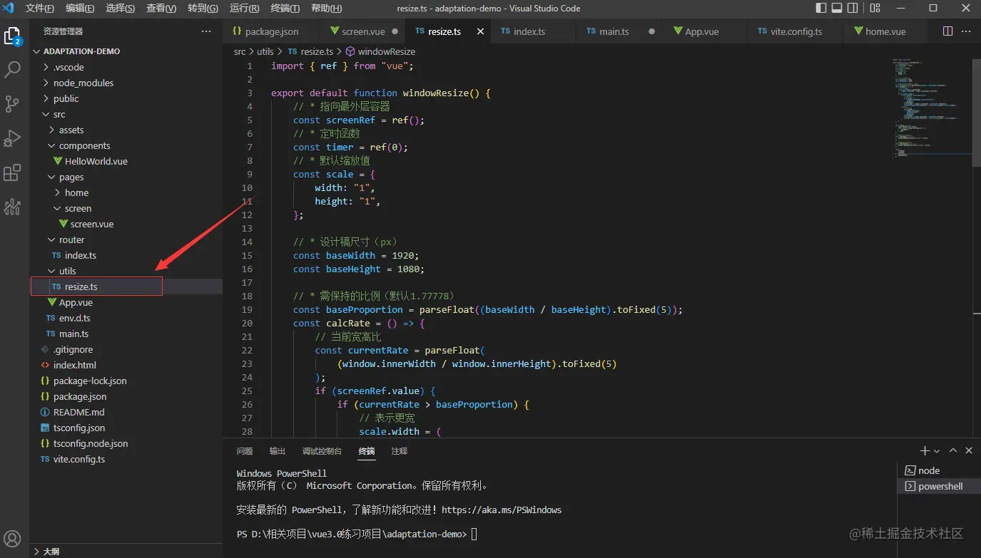
1. Create a new
resize.ts/js file
import { ref } from "vue";

export default function windowResize() {
	// * 指向最外层容器
	const screenRef = ref();
	// * 定时函数
	const timer = ref(0);
	// * 默认缩放值
	const scale = {
		width: "1",
		height: "1",
	};

	// * 设计稿尺寸(px)
	const baseWidth = 1920;
	const baseHeight = 1080;

	// * 需保持的比例(默认1.77778)
	const baseProportion = parseFloat((baseWidth / baseHeight).toFixed(5));
	const calcRate = () => {
		// 当前宽高比
		const currentRate = parseFloat(
			(window.innerWidth / window.innerHeight).toFixed(5)
		);
		if (screenRef.value) {
			if (currentRate > baseProportion) {
				// 表示更宽
				scale.width = (
					(window.innerHeight * baseProportion) /
					baseWidth
				).toFixed(5);
				scale.height = (window.innerHeight / baseHeight).toFixed(5);
				screenRef.value.style.transform = `scale(${scale.width}, ${scale.height})`;
			} else {
				// 表示更高
				scale.height = (
					window.innerWidth /
					baseProportion /
					baseHeight
				).toFixed(5);
				scale.width = (window.innerWidth / baseWidth).toFixed(5);
				screenRef.value.style.transform = `scale(${scale.width}, ${scale.height})`;
			}
		}
	};

	const resize = () => {
		clearTimeout(timer.value);
		timer.value = window.setTimeout(() => {
			calcRate();
		}, 200);
	};

	// 改变窗口大小重新绘制
	const windowDraw = () => {
		window.addEventListener("resize", resize);
	};

	// 改变窗口大小重新绘制
	const unWindowDraw = () => {
		window.removeEventListener("resize", resize);
	};

	return {
		screenRef,
		calcRate,
		windowDraw,
		unWindowDraw,
	};
} 2. Relevant interface introductionresize.ts/js
<template>
<div>
<div>
<span>基于scale的适配方案</span>
<img src="/static/imghw/default1.png" data-src="https://img2.baidu.com/it/u=1297807229,3828610143&fm=253&fmt=auto&app=138&f=JPEG?w=500&h=281" class="lazy" alt="How to adapt the Vite project to the screen? Two options to share" >
</div>
</div>
</template>
<script>
import windowResize from '../../utils/resize';
import {onMounted, onUnmounted} from 'vue';
const { screenRef, calcRate, windowDraw, unWindowDraw } = windowResize()
onMounted(() => {
// 监听浏览器窗口尺寸变化
windowDraw()
calcRate()
})
onUnmounted(() => {
unWindowDraw();
})
</script>
<style>
.screen-container {
height: 100%;
background-color: lightcyan;
display: flex;
justify-content: center;
align-items: center;
.screen-content {
width: 1920px;
height: 1080px;
background-color: #fff;
display: flex;
justify-content: center;
align-items: center;
flex-direction: column;
.screen-title {
font-size: 32px;
}
.screen-img {
margin-top: 20px;
}
}
}
</style>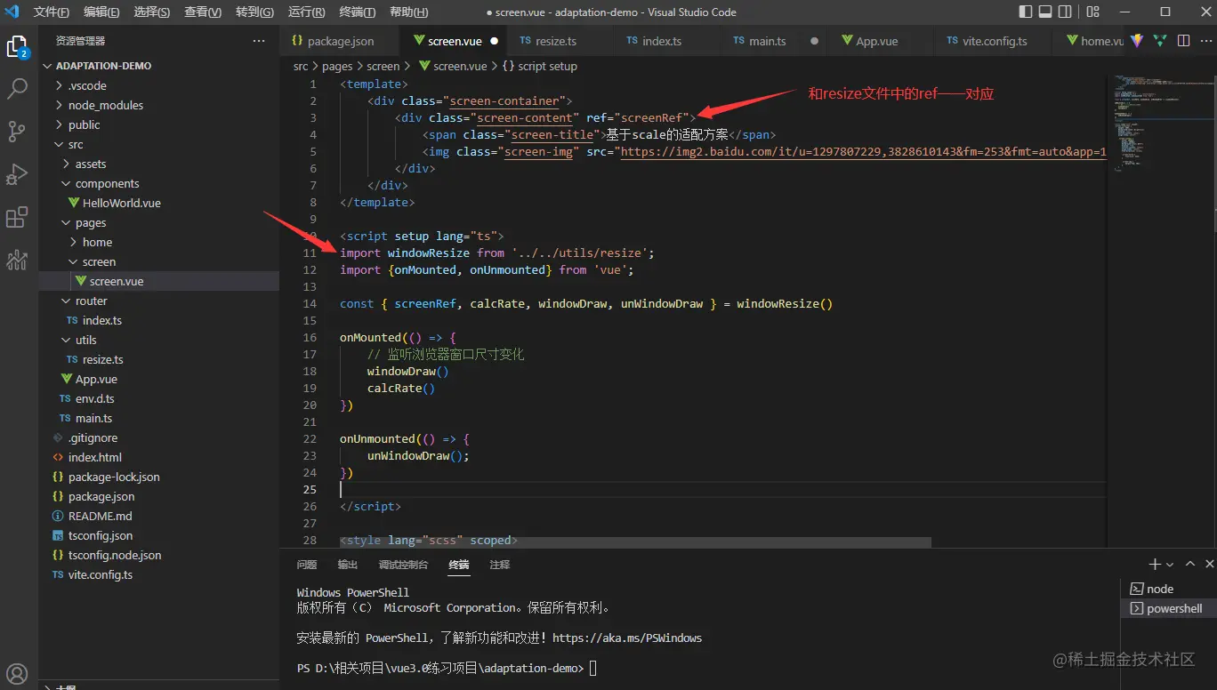 Write at the end
Recommend open source projects participated by two authors. If the project is helpful to you, please star it!
A simple
backend management project based on Vue3, TS, Vite, qiankun technology stack: www.xkxk.techA simple one based on Vue3 , Vite’s
: screen.xkxk.tech (Learning video sharing:
The above is the detailed content of How to adapt the Vite project to the screen? Two options to share. For more information, please follow other related articles on the PHP Chinese website!

Hot AI Tools

Undresser.AI Undress
AI-powered app for creating realistic nude photos

AI Clothes Remover
Online AI tool for removing clothes from photos.

Undress AI Tool
Undress images for free

Clothoff.io
AI clothes remover

Video Face Swap
Swap faces in any video effortlessly with our completely free AI face swap tool!

Hot Article

Hot Tools

Notepad++7.3.1
Easy-to-use and free code editor

SublimeText3 Chinese version
Chinese version, very easy to use

Zend Studio 13.0.1
Powerful PHP integrated development environment

Dreamweaver CS6
Visual web development tools

SublimeText3 Mac version
God-level code editing software (SublimeText3)

Hot Topics
 How to use bootstrap in vue
Apr 07, 2025 pm 11:33 PM
Using Bootstrap in Vue.js is divided into five steps: Install Bootstrap. Import Bootstrap in main.js. Use the Bootstrap component directly in the template. Optional: Custom style. Optional: Use plug-ins.
 How to add functions to buttons for vue
Apr 08, 2025 am 08:51 AM
You can add a function to the Vue button by binding the button in the HTML template to a method. Define the method and write function logic in the Vue instance.
 How to use watch in vue
Apr 07, 2025 pm 11:36 PM
The watch option in Vue.js allows developers to listen for changes in specific data. When the data changes, watch triggers a callback function to perform update views or other tasks. Its configuration options include immediate, which specifies whether to execute a callback immediately, and deep, which specifies whether to recursively listen to changes to objects or arrays.
 What does vue multi-page development mean?
Apr 07, 2025 pm 11:57 PM
Vue multi-page development is a way to build applications using the Vue.js framework, where the application is divided into separate pages: Code Maintenance: Splitting the application into multiple pages can make the code easier to manage and maintain. Modularity: Each page can be used as a separate module for easy reuse and replacement. Simple routing: Navigation between pages can be managed through simple routing configuration. SEO Optimization: Each page has its own URL, which helps SEO.
 How to reference js file with vue.js
Apr 07, 2025 pm 11:27 PM
There are three ways to refer to JS files in Vue.js: directly specify the path using the <script> tag;; dynamic import using the mounted() lifecycle hook; and importing through the Vuex state management library.
 How to return to previous page by vue
Apr 07, 2025 pm 11:30 PM
Vue.js has four methods to return to the previous page: $router.go(-1)$router.back() uses <router-link to="/" component window.history.back(), and the method selection depends on the scene.
 How to use vue traversal
Apr 07, 2025 pm 11:48 PM
There are three common methods for Vue.js to traverse arrays and objects: the v-for directive is used to traverse each element and render templates; the v-bind directive can be used with v-for to dynamically set attribute values for each element; and the .map method can convert array elements into new arrays.
 How to jump to the div of vue
Apr 08, 2025 am 09:18 AM
There are two ways to jump div elements in Vue: use Vue Router and add router-link component. Add the @click event listener and call this.$router.push() method to jump.


