 WeChat Applet
 Mini Program Development
 Detailed explanation of the host environment for WeChat applet development
Detailed explanation of the host environment for WeChat applet development
This article brings you relevant knowledge about WeChat Mini Program, which mainly introduces related issues about the host environment. WeChat mobile phone is the host environment of the mini program, and the mini program relies on the host environment The capabilities provided can realize many functions that ordinary web pages cannot complete. Let's take a look at them together. I hope it will be helpful to everyone.

[Related learning recommendations: 小program learning tutorial]
小program hosting environment
手机微信It is the host environment for mini programs. With the help of the capabilities provided by the host environment, mini programs can realize many functions that ordinary web pages cannot complete. For example: the mini program calls the API provided by WeChat to implement functions such as QR code scanning and payment.
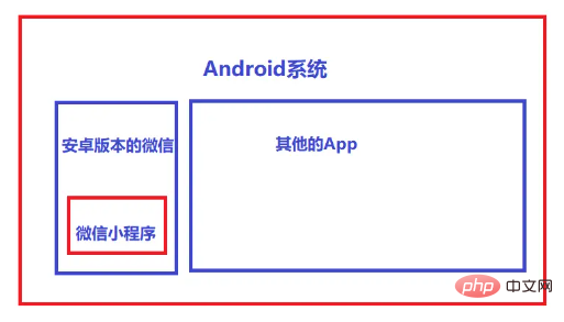
The hosting environment of the applet contains:
Communication model
Running mechanism
Components
API
Communication model
1. The main body of communication
In the applet The main body of communication is the rendering layer and the logic layer, among which:
WXML templates and WXSS styles work in the rendering layer
JS scripts work in the logic layer
2. The communication model of the mini program
The communication model of the mini program is divided into two parts:
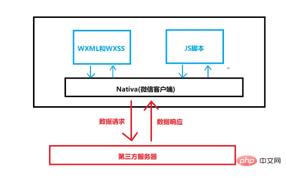
Rendering layer and logic layer Communication between
Communication between the logic layer and the third-party server
Both are forwarded through the WeChat client
Operating mechanism
1. The startup process of the mini program
Download the code package of the mini program to the local
Parse app.json globally Configuration file
Execute the app.js applet entry file, call App() to create the applet instance
Render the applet home page
The applet startup is completed

2. Page rendering process
Load the .json configuration file of the parsed page
Load the page .wxml template and .wxss style
Execute the .js file of the page and call Page() to create the page instance
Page rendering is completed
Component
1. Classification of components in mini programs:
The components in mini programs are also provided by the host environment. Developers can use components based on Quickly build a beautiful page structure. Officially, the components of the mini program are divided into 9 categories, which are:
View container
Basic content
Form component
Navigation component
Body component
map map component
canvas canvas component
Open capability
Accessibility
2. Commonly used view container class components
view
Normal view area
is similar to The div in HTML is a block-level element
Commonly used to achieve page layout effects
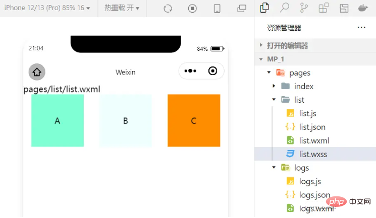
For example: use flex to achieve horizontal layout.
wxml code:
<view class="container1">
<view>A</view>
<view>B</view>
<view>C</view>
</view>
wxss code:
.container1 view{
  width:100px;
  height:100px;
  text-align: center;
  line-height: 100px;
}
.container1 view:nth-child(1){
  background-color: aquamarine;
}
.container1 view:nth-child(2){
  background-color: azure;
}
.container1 view:nth-child(3){
  background-color: darkorange;
}
.container1 {
  display: flex;
  justify-content: space-around;
}Achievement effect:
scroll-view
Scrollable view area
Commonly used to achieve scrolling list effect
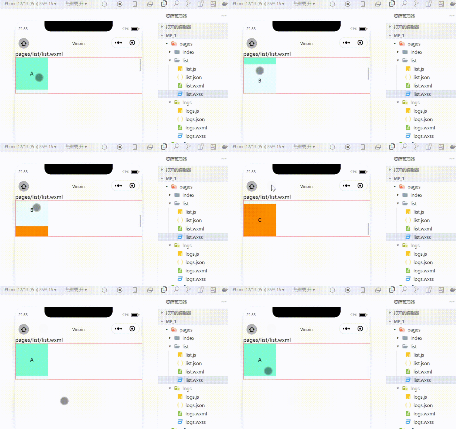
Use scroll- View realizes the effect of scrolling up and down
wxml code:
<scroll-view class="container1" scroll-y>
<view>A</view>
<view>B</view>
<view>C</view>
</scroll-view>
Modified wxss code:
.container1 {
  border:1px solid red;
  height:110px;
/*使用scroll-view时设置固定的高度*/Achieved effect:
swiper and swiper-item
Carousel chart container component and carousel chart item component
Use these two components to achieve the carousel chart effect:
wxml code :
<swiper class="swiper-container" indicator-dots="true" indicator-color="white" indicator-active-color="red" autoplay="true" interval="1000" circular>
<swiper-item>
<view class="item">A</view>
</swiper-item>
<swiper-item>
  <view class="item">B</view>
</swiper-item>
<swiper-item>
  <view class="item">C</view>
</swiper-item>
</swiper>
wxss code:
.swiper-container{
  height:150px;
}
.item{
  height:100%;
  line-height: 150px;
  text-align: center;
}
swiper-item:nth-child(1) .item{
  background-color: aquamarine;
}
swiper-item:nth-child(2) .item{
  background-color: azure;
}
swiper-item:nth-child(3) .item{
  background-color: darkorange;
}Achievement effect:
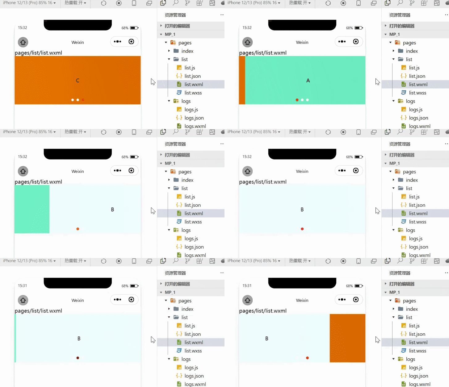
3. Commonly used basic content components
text
Text component
Similar to the span tag in HTML, it is an inline element
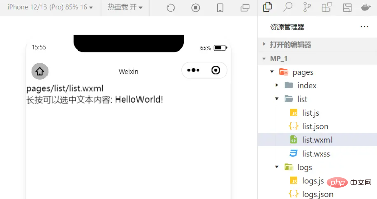
Long press to select text content The effect
<view>
长按可以选中文本内容:
<text user-select>HelloWorld!</text>
</view>
rich-text
The rich text component supports rendering HTML strings into WXML structures
Rendering HTML strings For the corresponding UI structure
<rich-text nodes="<h1 id="标题">标题</h1>"> </rich-text>
4.其他常用组件
button
按钮组件
功能比 HTML 中的 button 按钮丰富
通过 open-type 属性可以调用微信提供的各种功能(客服、转发、获取用户授权、获取用户信息等)
image
图片组件
image 组件默认宽度约 300px、高度约 240px
navigator
页面导航组件
类似于 HTML 中的 a 链接,实现页面的跳转
5.API
小程序中的 API 是由宿主环境提供的,通过这些丰富的小程序 API,开发者可以方便的调用微信提供的能力,例如:实现支付,扫码等功能。
小程序 API 的 3 大分类:
事件监听 API
特点:以 on 开头,用来监听某些事件的触发
举例:wx.onWindowResize(function callback) 监听窗口尺寸变化的事件
同步 API
特点1:以 Sync 结尾的 API 都是同步 API
特点2:同步 API 的执行结果,可以通过函数返回值直接获取,如果执行出错会抛出异常
举例:wx.setStorageSync('key', 'value') 向本地存储中写入内容
异步 API
特点:类似于 jQuery 中的 $.ajax(options) 函数,需要通过 success、fail、complete 接收调用的结果
举例:wx.request() 发起网络数据请求,通过 success 回调函数接收数据
【相关学习推荐:小程序学习教程】
The above is the detailed content of Detailed explanation of the host environment for WeChat applet development. For more information, please follow other related articles on the PHP Chinese website!

Hot AI Tools

Undresser.AI Undress
AI-powered app for creating realistic nude photos

AI Clothes Remover
Online AI tool for removing clothes from photos.

Undress AI Tool
Undress images for free

Clothoff.io
AI clothes remover

AI Hentai Generator
Generate AI Hentai for free.

Hot Article

Hot Tools

Notepad++7.3.1
Easy-to-use and free code editor

SublimeText3 Chinese version
Chinese version, very easy to use

Zend Studio 13.0.1
Powerful PHP integrated development environment

Dreamweaver CS6
Visual web development tools

SublimeText3 Mac version
God-level code editing software (SublimeText3)

Hot Topics
 1377
1377
 52
52
 Xianyu WeChat mini program officially launched
Feb 10, 2024 pm 10:39 PM
Xianyu's official WeChat mini program has quietly been launched. In the mini program, you can post private messages to communicate with buyers/sellers, view personal information and orders, search for items, etc. If you are curious about what the Xianyu WeChat mini program is called, take a look now. What is the name of the Xianyu WeChat applet? Answer: Xianyu, idle transactions, second-hand sales, valuations and recycling. 1. In the mini program, you can post idle messages, communicate with buyers/sellers via private messages, view personal information and orders, search for specified items, etc.; 2. On the mini program page, there are homepage, nearby, post idle, messages, and mine. 5 functions; 3. If you want to use it, you must activate WeChat payment before you can purchase it;
 WeChat applet implements image upload function
Nov 21, 2023 am 09:08 AM
WeChat applet implements picture upload function With the development of mobile Internet, WeChat applet has become an indispensable part of people's lives. WeChat mini programs not only provide a wealth of application scenarios, but also support developer-defined functions, including image upload functions. This article will introduce how to implement the image upload function in the WeChat applet and provide specific code examples. 1. Preparatory work Before starting to write code, we need to download and install the WeChat developer tools and register as a WeChat developer. At the same time, you also need to understand WeChat
 Implement the drop-down menu effect in WeChat applet
Nov 21, 2023 pm 03:03 PM
To implement the drop-down menu effect in WeChat Mini Programs, specific code examples are required. With the popularity of mobile Internet, WeChat Mini Programs have become an important part of Internet development, and more and more people have begun to pay attention to and use WeChat Mini Programs. The development of WeChat mini programs is simpler and faster than traditional APP development, but it also requires mastering certain development skills. In the development of WeChat mini programs, drop-down menus are a common UI component, achieving a better user experience. This article will introduce in detail how to implement the drop-down menu effect in the WeChat applet and provide practical
 Implement image filter effects in WeChat mini programs
Nov 21, 2023 pm 06:22 PM
Implementing picture filter effects in WeChat mini programs With the popularity of social media applications, people are increasingly fond of applying filter effects to photos to enhance the artistic effect and attractiveness of the photos. Picture filter effects can also be implemented in WeChat mini programs, providing users with more interesting and creative photo editing functions. This article will introduce how to implement image filter effects in WeChat mini programs and provide specific code examples. First, we need to use the canvas component in the WeChat applet to load and edit images. The canvas component can be used on the page
 Use WeChat applet to achieve carousel switching effect
Nov 21, 2023 pm 05:59 PM
Use the WeChat applet to achieve the carousel switching effect. The WeChat applet is a lightweight application that is simple and efficient to develop and use. In WeChat mini programs, it is a common requirement to achieve carousel switching effects. This article will introduce how to use the WeChat applet to achieve the carousel switching effect, and give specific code examples. First, add a carousel component to the page file of the WeChat applet. For example, you can use the <swiper> tag to achieve the switching effect of the carousel. In this component, you can pass b
 What is the name of Xianyu WeChat applet?
Feb 27, 2024 pm 01:11 PM
The official WeChat mini program of Xianyu has been quietly launched. It provides users with a convenient platform that allows you to easily publish and trade idle items. In the mini program, you can communicate with buyers or sellers via private messages, view personal information and orders, and search for the items you want. So what exactly is Xianyu called in the WeChat mini program? This tutorial guide will introduce it to you in detail. Users who want to know, please follow this article and continue reading! What is the name of the Xianyu WeChat applet? Answer: Xianyu, idle transactions, second-hand sales, valuations and recycling. 1. In the mini program, you can post idle messages, communicate with buyers/sellers via private messages, view personal information and orders, search for specified items, etc.; 2. On the mini program page, there are homepage, nearby, post idle, messages, and mine. 5 functions; 3.
 How to use PHP to develop the second-hand transaction function of WeChat applet?
Oct 27, 2023 pm 05:15 PM
How to use PHP to develop the second-hand transaction function of WeChat applet? As a popular mobile application development platform, WeChat applet is used by more and more developers. In WeChat mini programs, second-hand transactions are a common functional requirement. This article will introduce how to use PHP to develop the second-hand transaction function of the WeChat applet and provide specific code examples. 1. Preparation work Before starting development, you need to ensure that the following conditions are met: the development environment of the WeChat applet has been set up, including registering the AppID of the applet and setting it in the background of the applet.
 Implement image rotation effect in WeChat applet
Nov 21, 2023 am 08:26 AM
To implement the picture rotation effect in WeChat Mini Program, specific code examples are required. WeChat Mini Program is a lightweight application that provides users with rich functions and a good user experience. In mini programs, developers can use various components and APIs to achieve various effects. Among them, the picture rotation effect is a common animation effect that can add interest and visual effects to the mini program. To achieve image rotation effects in WeChat mini programs, you need to use the animation API provided by the mini program. The following is a specific code example that shows how to


