
 Web Front-end
CSS Tutorial
Detailed explanation of how to use pure CSS to realize the fade animation of multi-line text
Web Front-end
CSS Tutorial
Detailed explanation of how to use pure CSS to realize the fade animation of multi-line text
Detailed explanation of how to use pure CSS to realize the fade animation of multi-line text

 <p>【Learning video sharing: css video tutorial, web front-end】
Single line and Fade out multi-line text
<p> First, let’s look at an example where we want to implement such a single line text fade out: <p>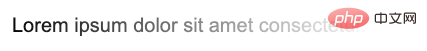 <p> Using
 mask, you can easily achieve this effect, just:
<p>Lorem ipsum dolor sit amet consectetur.</p>
p {
    mask: linear-gradient(90deg, #fff, transparent);
} <p>This is a little more complicated, but there are many This can be achieved in several ways.
<p>First let’s look at how to use
<p>This is a little more complicated, but there are many This can be achieved in several ways.
<p>First let’s look at how to use background.
Use <span style="font-size: 18px;">background</span> Implementation
<p>Here will use a The trick is that the background display form of display: inline inline elements is the same as display: block block-level elements (or inline-block, flex, grid) are inconsistent.
<p>A simple example:
<p>Lorem .....</p>
<a>Lorem .....</a>
<p> element is a block-level element, and < a> is an inline element.
<p>We add a gradient background color from green to blue to them:
p, a {
  background: linear-gradient(90deg, blue, green);
}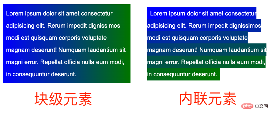 <p>What? What does it mean? The difference is obvious. The background of block-level elements is a gradient as a whole, while each row of inline elements has a different effect, and the whole is connected in series to form a whole.
<p>Based on this feature, we can construct such a layout:
<p>What? What does it mean? The difference is obvious. The background of block-level elements is a gradient as a whole, while each row of inline elements has a different effect, and the whole is connected in series to form a whole.
<p>Based on this feature, we can construct such a layout:
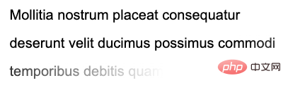
<p><a>Mollitia nostrum placeat consequatur deserunt velit ducimus possimus commodi temporibus debitis quam</a></p>
p {
    position: relative;
    width: 400px;
}

a {
    background: linear-gradient(90deg, transparent, transparent 70%, #fff);
    background-repeat: no-repeat;
    cursor: pointer;
    color: transparent;

    &::before {
        content: "Mollitia nostrum placeat consequatur deserunt velit ducimus possimus commodi temporibus debitis quam";
        position: absolute;
        top: 0;
        left: 0;
        color: #000;
        z-index: -1;
    }
}- <p>In order to take advantage of the actual inline elements The
backgroundfeature, we need to wrap the actual text inside the inline element<a> - <p>The actual text, using
opacity: 0is hidden. The actual displayed text uses the pseudo-element of the<a>element, and sets its level to-1. The purpose is to allow the background of the parent element to cover it - <p>##<a>
The gradient of the element is from transparent to white, and use it to cover the actual underlying Use pseudo elements to display text to achieve the fading of text
 Here, the gradient of the <p><a>
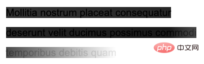
 element is from transparent to white, using the white behind to gradually cover the text. If I change the gradient from black to white (for ease of understanding, the black and white of the gradient have some transparency), you can quickly understand what is going on: <p>
a {
    background: linear-gradient(90deg, rgba(0,0,0, .8), rgba(0,0,0, .9) 70%, rgba(255, 255, 255, .9));
} For the complete code, you can click here: <p>CodePen Demo -- Text fades away Of course, this solution has many problems, such as using <p>z-index: -1
, if the parent container sets a background color, it will be invalid, and it will not be easy to accurately locate the last row. Therefore, a better way is to use mask to solve it.
Use mask<span style="font-size: 18px;"></span> to achieve
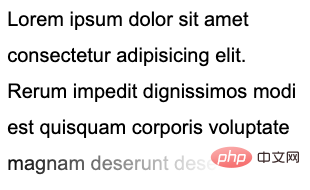
Then, if you use <p>mask, the problem will become simpler. We only need to implement two mask areas in one mask, one for accurately controlling the last line , a piece used to control the transparency of the remaining parts. There is no need to specially construct HTML: <p>
<p>Lorem ipsum dolor sit amet ....</p>
p {
    width: 300px;
    padding: 10px;
    line-height: 36px;
    mask:
        linear-gradient(270deg, transparent, transparent 30%, #000),
        linear-gradient(270deg, #000, #000);
    mask-size: 100% 46px, 100% calc(100% - 46px);
    mask-position: bottom, top;
    mask-repeat: no-repeat;
} <p>核心在于整个
 mask 相关的代码,正如上面而言的,mask 将整个区域分成了两块进行控制:
<p>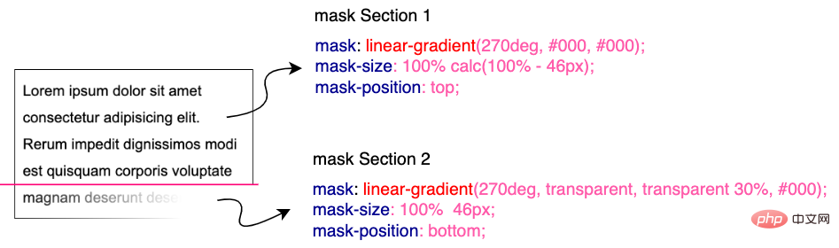 <p>在下部分这块,我们利用
 mask 做了从右向左的渐隐效果。并且利用了 mask-position 定位,以及 calc 的计算,无论文本都多少行,都是适用的!需要说明的是,这里的 46px 的意思是单行文本的行高加上 padding-bottom 的距离。可以适配任意行数的文本:
<p>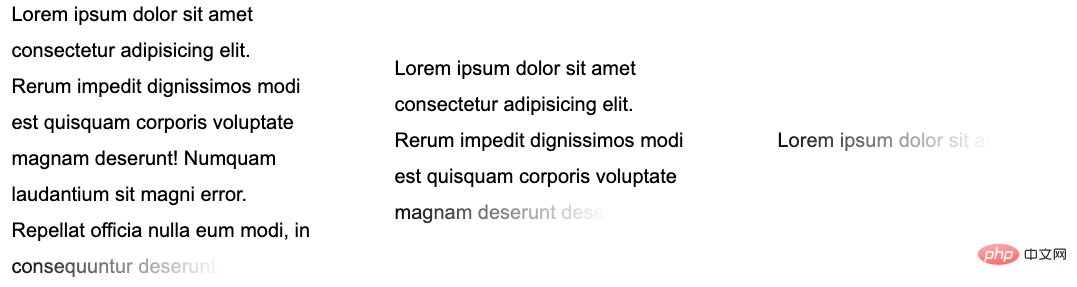 <p>完整的代码,你可以戳这里:CodePen Demo -- Text fades away 2
添加动画效果
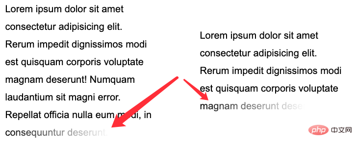
<p>好,看完静态的,我们再来实现一种**动态的文字渐隐消失。 <p>整体的效果是当鼠标 Hover 到文字的时候,整个文本逐行逐渐消失。像是这样: <p>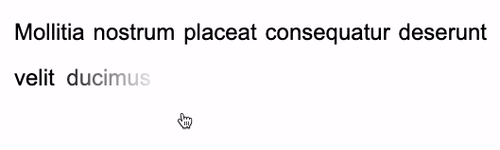 <p>这里的核心在于,需要去适配不同的行数,不同的宽度,而且文字是一行一行的进行消失。
<p>这里核心还是会运用上内联元素
<p>这里的核心在于,需要去适配不同的行数,不同的宽度,而且文字是一行一行的进行消失。
<p>这里核心还是会运用上内联元素 background 的特性。在 妙用 background 实现花式文字效果 这篇文章中,我们介绍了这样一种技巧。
<p>实现整段文字的渐现,从一种颜色到另外一种颜色:
<div class="button">Button</div>
<p><a>Lorem ipsum dolor sit amet consectetur adipisicing elit. Mollitia nostrum placeat consequatur deserunt velit ducimus possimus commodi temporibus debitis quam, molestiae laboriosam sit repellendus sed sapiente quidem quod accusantium vero.</a></p>
a {
    background:
        linear-gradient(90deg, #999, #999),
        linear-gradient(90deg, #fc0, #fc0);
    background-size: 100% 100%, 0 100px;
    background-repeat: no-repeat;
    background-position: 100% 100%, 0 100%;
    color: transparent;
    background-clip: text;
}
.button:hover ~ p a {
    transition: .8s all linear;
    background-size: 0 100px, 100% 100%;
}color: transparent,但是文字默认还是有颜色的,默认的文字颜色,是由第一层渐变赋予的 background: linear-gradient(90deg, #999, #999), linear-gradient(90deg, #fc0, #fc0),也就是这一层:linear-gradient(90deg, #999, #999)。
<p>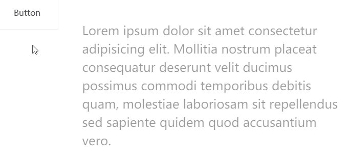 <p>当 hover 触发时,
linear-gradient(90deg, #999, #999) 这一层渐变逐渐消失,而另外一层 linear-gradient(90deg, #fc0, #fc0)` 逐渐出现,借此实现上述效果。
<p>CodePen -- background-clip 文字渐现效果
<p>好,我们可以借鉴这个技巧,去实现文字的渐隐消失。一层为实际的文本,而另外一层是进行动画的遮罩,进行动画的这一层,本身的文字设置为 color: transparent,这样,我们就只能看到背景颜色的变化。
<p>大致的代码如下:
<p>
    <a class="word">Mollitia nostrum placeat consequatur deserunt.</a>
    <a class="pesudo">Mollitia nostrum placeat consequatur deserunt.</a>
</p>
p {
    width: 500px;
}
.word {
    position: absolute;
    top: 0;
    left: 0;
    color: transparent;
    color: #000;
}
.pesudo {
    position: relative;
    background: linear-gradient(90deg, transparent, #fff 20%, #fff);
    background-size: 0 100%;
    background-repeat: no-repeat;
    background-position: 100% 100%;
    transition: all 3s linear;
    color: transparent;
}
p:hover .pesudo,
p:active .pesudo{
    background-size: 500% 100%;
}.word 为实际在底部,展示的文字层,而 pesudo 为叠在上方的背景层,hover 的时候,触发上方元素的背景变化,逐渐遮挡住下方的文字,并且,能适用于不同长度的文本。
<p>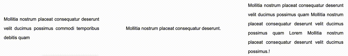 <p>当然,上述方案会有一点瑕疵,我们无法让不同长度的文本整体的动画时间一致。当文案数量相差不大时,整体可以接受,文案相差数量较大时,需要分别设定下
 transition-duration 的时长。
<p>完整的 DEMO,你可以戳:CodePen -- Text fades away Animation
<p>原文地址:https://www.cnblogs.com/coco1s/p/16590809.html <p>作者:ChokCoco<p>更多编程相关知识,请访问:编程视频!!
The above is the detailed content of Detailed explanation of how to use pure CSS to realize the fade animation of multi-line text. For more information, please follow other related articles on the PHP Chinese website!

Hot AI Tools

Undresser.AI Undress
AI-powered app for creating realistic nude photos

AI Clothes Remover
Online AI tool for removing clothes from photos.

Undress AI Tool
Undress images for free

Clothoff.io
AI clothes remover

AI Hentai Generator
Generate AI Hentai for free.

Hot Article
Hot Tools

Notepad++7.3.1
Easy-to-use and free code editor

SublimeText3 Chinese version
Chinese version, very easy to use

Zend Studio 13.0.1
Powerful PHP integrated development environment

Dreamweaver CS6
Visual web development tools

SublimeText3 Mac version
God-level code editing software (SublimeText3)
Hot Topics
 1378
1378
 52
52

 How to write split lines on bootstrap
Apr 07, 2025 pm 03:12 PM
How to write split lines on bootstrap
Apr 07, 2025 pm 03:12 PM
There are two ways to create a Bootstrap split line: using the tag, which creates a horizontal split line. Use the CSS border property to create custom style split lines.
 The Roles of HTML, CSS, and JavaScript: Core Responsibilities
Apr 08, 2025 pm 07:05 PM
The Roles of HTML, CSS, and JavaScript: Core Responsibilities
Apr 08, 2025 pm 07:05 PM
HTML defines the web structure, CSS is responsible for style and layout, and JavaScript gives dynamic interaction. The three perform their duties in web development and jointly build a colorful website.
 How to insert pictures on bootstrap
Apr 07, 2025 pm 03:30 PM
How to insert pictures on bootstrap
Apr 07, 2025 pm 03:30 PM
There are several ways to insert images in Bootstrap: insert images directly, using the HTML img tag. With the Bootstrap image component, you can provide responsive images and more styles. Set the image size, use the img-fluid class to make the image adaptable. Set the border, using the img-bordered class. Set the rounded corners and use the img-rounded class. Set the shadow, use the shadow class. Resize and position the image, using CSS style. Using the background image, use the background-image CSS property.
 How to resize bootstrap
Apr 07, 2025 pm 03:18 PM
How to resize bootstrap
Apr 07, 2025 pm 03:18 PM
To adjust the size of elements in Bootstrap, you can use the dimension class, which includes: adjusting width: .col-, .w-, .mw-adjust height: .h-, .min-h-, .max-h-
 How to use bootstrap in vue
Apr 07, 2025 pm 11:33 PM
How to use bootstrap in vue
Apr 07, 2025 pm 11:33 PM
Using Bootstrap in Vue.js is divided into five steps: Install Bootstrap. Import Bootstrap in main.js. Use the Bootstrap component directly in the template. Optional: Custom style. Optional: Use plug-ins.
 How to set up the framework for bootstrap
Apr 07, 2025 pm 03:27 PM
How to set up the framework for bootstrap
Apr 07, 2025 pm 03:27 PM
To set up the Bootstrap framework, you need to follow these steps: 1. Reference the Bootstrap file via CDN; 2. Download and host the file on your own server; 3. Include the Bootstrap file in HTML; 4. Compile Sass/Less as needed; 5. Import a custom file (optional). Once setup is complete, you can use Bootstrap's grid systems, components, and styles to create responsive websites and applications.
 How to use bootstrap button
Apr 07, 2025 pm 03:09 PM
How to use bootstrap button
Apr 07, 2025 pm 03:09 PM
How to use the Bootstrap button? Introduce Bootstrap CSS to create button elements and add Bootstrap button class to add button text
 How to view the date of bootstrap
Apr 07, 2025 pm 03:03 PM
How to view the date of bootstrap
Apr 07, 2025 pm 03:03 PM
Answer: You can use the date picker component of Bootstrap to view dates in the page. Steps: Introduce the Bootstrap framework. Create a date selector input box in HTML. Bootstrap will automatically add styles to the selector. Use JavaScript to get the selected date.
