
 Web Front-end
CSS Tutorial
Let's talk about how to use CSS to build fancy perspective backgrounds
Web Front-end
CSS Tutorial
Let's talk about how to use CSS to build fancy perspective backgrounds
Let's talk about how to use CSS to build fancy perspective backgrounds

This article will introduce a way to use background and backdrop-filter to create an interesting perspective background effect. I hope it will be helpful to everyone!

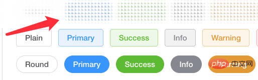
#This technique comes from a question from a group friend, how to build a top bar background effect like an ElementUI document, see the effect:

Look carefully, during the scrolling process of the page, the background of the top bar is not white, nor is it a frosted glass effect, but the background can be granulated:
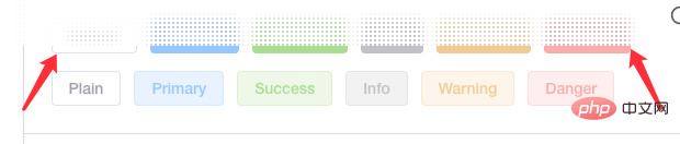
To be precise, it is a frosted glass effect based on granulation. The elements are first granulated, and secondly, the edges of the elements are also blurred to a certain extent. . So, how do we achieve this effect?
Requirement dismantling
The above effect may seem magical, but the principle is actually very simple. The main thing is granular background background plus backdrop-filter: blur().
First, we need to implement the particle background.
We use background to achieve such a background:
<div></div>
div {
    background: radial-gradient(transparent, #000 20px);
    background-size: 40px 40px;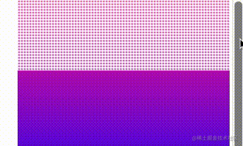
}The radial gradient effect from transparent to black is as follows:

It should be noted that the white part in the picture is actually transparent and can reveal the background behind it. At this time, if there are elements behind the background, the effect will be like this:

Okay, we will background: radial-gradient(transparent, #000 20px)# Replace the black in ## with white , the effect is as follows:

div {
    background: radial-gradient(transparent, rgba(255, 255, 255, 1) 2px);
    background-size: 4px 4px;
}
backdrop-filter: blur(). Let’s try it by adding one:
div {
    background: radial-gradient(transparent, rgba(255, 255, 255, 1) 2px);
    background-size: 4px 4px;
    backdrop-filter: blur(10px);
}
background-size and the different backdrop-filter: blur( 10px) value will affect the effect.

background: radial-gradient() graphics, and change the background-size, and try various different shapes of perspective backgrounds. Just give a few examples:
div {
    background: linear-gradient(45deg, transparent, #fff 4px);
    background-size: 6px 6px;
    backdrop-filter: saturate(50%) blur(4px);
}linear-gradient() is used instead of radila-gradient():
Original address: https://www.cnblogs.com/coco1s/p/16549752.htmlAuthor: ChokCocoMore programming For related knowledge, please visit:
programming video! !
The above is the detailed content of Let's talk about how to use CSS to build fancy perspective backgrounds. For more information, please follow other related articles on the PHP Chinese website!

Hot AI Tools

Undresser.AI Undress
AI-powered app for creating realistic nude photos

AI Clothes Remover
Online AI tool for removing clothes from photos.

Undress AI Tool
Undress images for free

Clothoff.io
AI clothes remover

Video Face Swap
Swap faces in any video effortlessly with our completely free AI face swap tool!

Hot Article
Hot Tools

Notepad++7.3.1
Easy-to-use and free code editor

SublimeText3 Chinese version
Chinese version, very easy to use

Zend Studio 13.0.1
Powerful PHP integrated development environment

Dreamweaver CS6
Visual web development tools

SublimeText3 Mac version
God-level code editing software (SublimeText3)
Hot Topics
 1392
1392
 52
36
110
52
36
110

 How to use bootstrap in vue
Apr 07, 2025 pm 11:33 PM
How to use bootstrap in vue
Apr 07, 2025 pm 11:33 PM
Using Bootstrap in Vue.js is divided into five steps: Install Bootstrap. Import Bootstrap in main.js. Use the Bootstrap component directly in the template. Optional: Custom style. Optional: Use plug-ins.
 The Roles of HTML, CSS, and JavaScript: Core Responsibilities
Apr 08, 2025 pm 07:05 PM
The Roles of HTML, CSS, and JavaScript: Core Responsibilities
Apr 08, 2025 pm 07:05 PM
HTML defines the web structure, CSS is responsible for style and layout, and JavaScript gives dynamic interaction. The three perform their duties in web development and jointly build a colorful website.
 How to write split lines on bootstrap
Apr 07, 2025 pm 03:12 PM
How to write split lines on bootstrap
Apr 07, 2025 pm 03:12 PM
There are two ways to create a Bootstrap split line: using the tag, which creates a horizontal split line. Use the CSS border property to create custom style split lines.
 Understanding HTML, CSS, and JavaScript: A Beginner's Guide
Apr 12, 2025 am 12:02 AM
Understanding HTML, CSS, and JavaScript: A Beginner's Guide
Apr 12, 2025 am 12:02 AM
WebdevelopmentreliesonHTML,CSS,andJavaScript:1)HTMLstructurescontent,2)CSSstylesit,and3)JavaScriptaddsinteractivity,formingthebasisofmodernwebexperiences.
 How to use bootstrap button
Apr 07, 2025 pm 03:09 PM
How to use bootstrap button
Apr 07, 2025 pm 03:09 PM
How to use the Bootstrap button? Introduce Bootstrap CSS to create button elements and add Bootstrap button class to add button text
 How to resize bootstrap
Apr 07, 2025 pm 03:18 PM
How to resize bootstrap
Apr 07, 2025 pm 03:18 PM
To adjust the size of elements in Bootstrap, you can use the dimension class, which includes: adjusting width: .col-, .w-, .mw-adjust height: .h-, .min-h-, .max-h-
 How to set up the framework for bootstrap
Apr 07, 2025 pm 03:27 PM
How to set up the framework for bootstrap
Apr 07, 2025 pm 03:27 PM
To set up the Bootstrap framework, you need to follow these steps: 1. Reference the Bootstrap file via CDN; 2. Download and host the file on your own server; 3. Include the Bootstrap file in HTML; 4. Compile Sass/Less as needed; 5. Import a custom file (optional). Once setup is complete, you can use Bootstrap's grid systems, components, and styles to create responsive websites and applications.
 How to insert pictures on bootstrap
Apr 07, 2025 pm 03:30 PM
How to insert pictures on bootstrap
Apr 07, 2025 pm 03:30 PM
There are several ways to insert images in Bootstrap: insert images directly, using the HTML img tag. With the Bootstrap image component, you can provide responsive images and more styles. Set the image size, use the img-fluid class to make the image adaptable. Set the border, using the img-bordered class. Set the rounded corners and use the img-rounded class. Set the shadow, use the shadow class. Resize and position the image, using CSS style. Using the background image, use the background-image CSS property.
