 Web Front-end
 CSS Tutorial
 CSS flex layout properties: the difference between align-items and align-content
CSS flex layout properties: the difference between align-items and align-content
When using flex for layout, I found that there are two attributes that seem to have similar functions: align-items and CSS flex layout properties: the difference between align-items and align-content. At first glance, They are used to define the cross axis of the elements in the flex container (the main axis is the direction defined by flex-deriction, the default is row, then the cross axis is perpendicular to the main axis, which is the column. Otherwise, they interchange, and flex is basically The concept of alignment is as shown in the figure below), so what is the difference between them?

This article uses example code to study this (flex-direction defaults to horizontal direction, the environment is Google browser: version 72), which is mainly divided into three Part:
① Translate a good answer from stack overflow.
② Use your own code example to show the difference.
③ Summary.
Note: This article is limited to the case where the attribute value is center. Please try other attribute values yourself. [Learning video sharing: css video tutorial, web front-end]
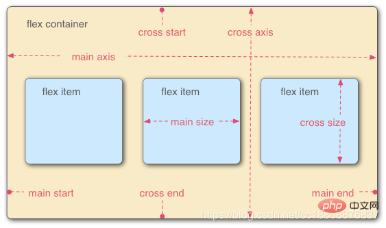
##1. Answer on stack overflow (translation)
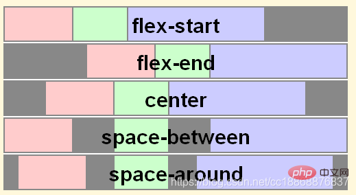
See the question for details: https://stackoverflow.com/questions/31250174/css-flexbox-difference-between-align-items-and-CSS flex layout properties: the difference between align-items and align-content- justfiy-content property can be applied to all flex containers. Its function is to set the alignment of flex items on the main axis. The effects of different values are as follows:
-
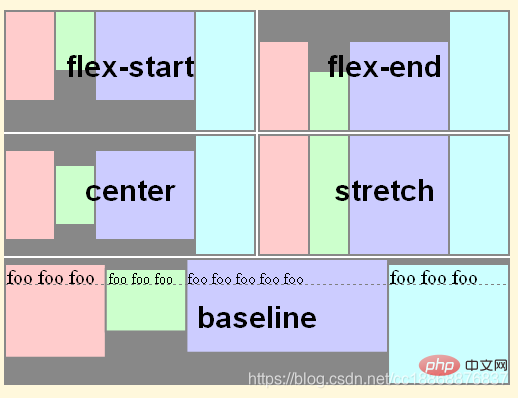
 align-items property can be applied to all flex containers. Its function is to set the flex items on the cross axis of each flex row. the default alignment. The effects of different values are as follows:
 -
 CSS flex layout properties: the difference between align-items and align-content
 -
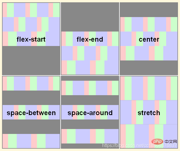
is only applicable to multi-line flex containers (that is, in flex containers This attribute only has an effect when the child item is more than one row). Its function is to treat the child item as a whole when the flex container has extra space on the cross axis (when the attribute value is: flex-start, flex-end, center ) to align. The effects of different values are as follows:
 In fact, this statement is not very accurate (see the example in Section 2.3). Let’s verify it through the example code below.
2. Do it yourself
2.1 The case where the sub-item is a single row
Initial code (the code in the following examples omits the parts that are irrelevant to flex and remain unchanged,React is used here, so it is className) as follows:
1 2 3 4 5 6 |
|
1 2 3 4 5 6 7 8 9 10 11 12 13 14 15 16 17 18 19 20 21 22 23 24 25 26 27 28 |
|

Conclusion: In all flex layouts, there are actually browser default properties here : align-items: normal; and CSS flex layout properties: the difference between align-items and align-content: normal;, the effect is top alignment.
2.1.1 The height of the flex container is not set
Initial state:1 2 3 |
|

Conclusion: There is a default attribute align-items: normal;, the effect is top alignment.
- Set
align-items: center
##1
2
3
4
.flex {display: flex;align-items: center;}Copy after loginThe effect is as follows:
 Conclusion
: You can see that the height of the container is the height of the tallest child, and all the children in a row are centered on the cross axis, which is the height of the child. The center line coincides with the center line of the flex cross axis.
- Set
CSS flex layout properties: the difference between align-items and align-content: center
##The effect is as follows:1
2
3
4
.flex {display: flex;CSS flex layout properties: the difference between align-itemsandalign-content: center;}Copy after login
Conclusion : You can see that there is no difference from the initial state, that is, when the flex container does not set a height and the child has only one row,
CSS flex layout properties: the difference between align-items and align-contentAttributes have no effect. 2.1.2 Set height of flex container
Initial state: 1
2
3
4
.flex {
height: 500px; /* 给flex容器添加一个高度 */
display: flex;
}
Copy after login
The effect is as follows:1 2 3 4 |
|

结论: 与flex容器不设置高度差不多,只是外层容器的高度增加而已。
设置
align-items : center
1 2 3 4 5 |
|
效果如下所示:
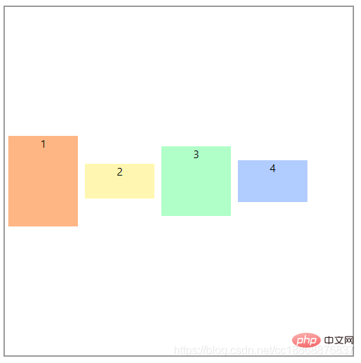
结论:可以看到在一行的所有子项全都在交叉轴上居中对齐,与flex容器高度不设置时的效果一样(只不过此时高度最大的子项也居中对齐了)。
设置
CSS flex layout properties: the difference between align-items and align-content: center
1 2 3 4 |
|
效果如下所示:
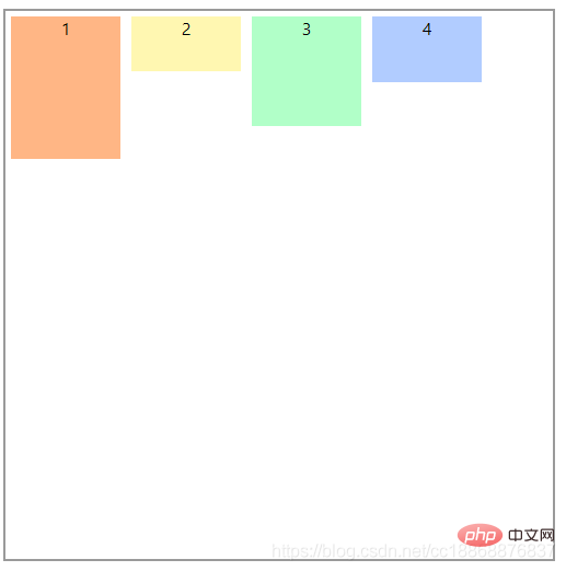
结论:可以看到,此时CSS flex layout properties: the difference between align-items and align-content: center;并没有起作用,效果与CSS flex layout properties: the difference between align-items and align-content一样。
2.2 子项为多行的情况
CSS flex layout properties: the difference between align-items and align-content:
1 2 3 4 5 6 7 8 |
|
对应的CSS:
1 2 3 4 5 6 7 8 9 10 11 12 13 14 15 16 |
|
效果如下所示:
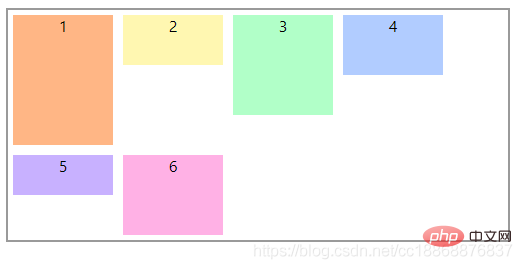
结论:同单行一样,这里也有浏览器默认的属性:align-items: normal; 和 CSS flex layout properties: the difference between align-items and align-content: normal;,效果为顶部对齐。
2.2.1 flex容器不设置高度
CSS flex layout properties: the difference between align-items and align-content:
1 2 3 4 |
|
效果如下所示:
结论:默认顶部对齐,每一行的高度为该行子项中高度最大的那个值。
设置
align-items : center
1 2 3 4 5 |
|
效果如下所示:
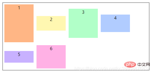
结论:可以看到各行的子项都在各自行上居中对齐(各行的高度由高度最高的子项决定,flex容器的高度为所有行的高度最高的子项高度之和)。
设置
CSS flex layout properties: the difference between align-items and align-content: center
1 2 3 4 5 |
|
效果如下所示: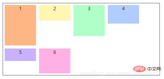
结论:与CSS flex layout properties: the difference between align-items and align-content一样,CSS flex layout properties: the difference between align-items and align-content: center并没有起作用,因为此时是以所有子项作为一个整体,而flex容器并没有指定高度(flex容器的高度即为子项整体的最大高度),所以flex容器在交叉轴上没有多余的空间,那么子项整体自然而然也就没有在交叉轴上对齐的说法了。
2.2.2 flex容器设置高度
CSS flex layout properties: the difference between align-items and align-content:
1 2 3 4 5 |
|
效果如下所示: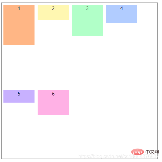
结论:由浏览器的默认值确定。
设置
align-items : center
1 2 3 4 5 6 |
|
效果如下所示:
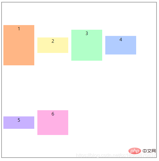
结论:这里我们可以看出,子项分为2行,flex容器将交叉轴上的多余空间按行数平均分给每行,然后每行各自按自己所在的行居中对齐(此时的单行效果跟2.1.2中的例子1效果一样)
设置
CSS flex layout properties: the difference between align-items and align-content: center
1 2 3 4 5 6 |
|
效果如下所示: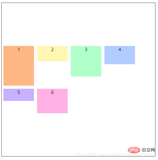
结论:我们可以看到,在flex容器指定高度并且子项为多行时,CSS flex layout properties: the difference between align-items and align-content: center是将子项作为一个整体,然后这个整体在flex容器的交叉轴上居中对齐的。
2.3 补充
以上为什么要区分flex容器是否有固定高度是因为有一种特殊的情况,即:当子项为单行,flex容器具有固定的高度并且设置了flex-wrap: wrap;时,CSS flex layout properties: the difference between align-items and align-content: center;对单行的子项也有作用。
1 2 3 4 5 6 |
|
1 2 3 4 5 6 |
|
效果如下所示: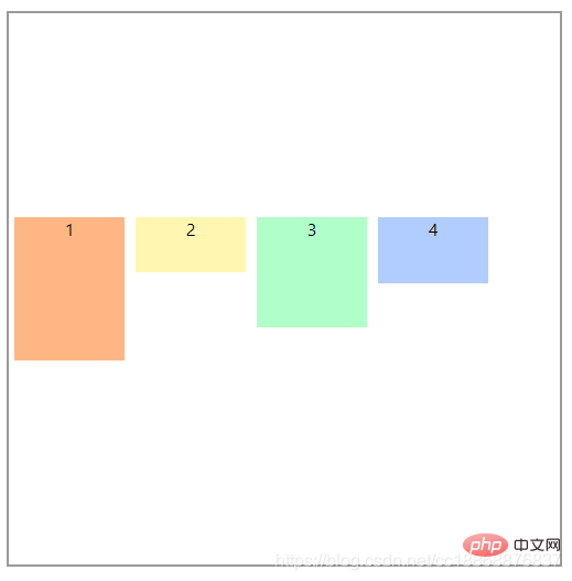
结论:可以看到此时,CSS flex layout properties: the difference between align-items and align-content: center;将单行的子项作为一个整体在交叉轴居中了。
3. 总结
如下表:
| 条件 | 属性(是否有效果) | ||
| 子项 | flex容器 | align-items | CSS flex layout properties: the difference between align-items and align-content |
| 单行 | 不指定高度 | 是 | 否 |
| 固定高度 | 是 | 否(但是有设置flex-wrap:wrap;时,有效果) | |
| 多行 | 不指定高度 | 是 | 否 |
| 固定高度 | 是 | 是 | |
结论:从上表可知,对于align-items和CSS flex layout properties: the difference between align-items and align-content的区别,我们只需要记住以下两点,
align-items属性是针对单独的每一个flex子项起作用,它的基本单位是每一个子项,在所有情况下都有效果(当然要看具体的属性值)。CSS flex layout properties: the difference between align-items and align-content属性是将flex子项作为一个整体起作用,它的基本单位是子项构成的行,只在两种情况下有效果:①子项多行且flex容器高度固定 ②子项单行,flex容器高度固定且设置了flex-wrap:wrap;
这里有个flex布局的小教程,感兴趣的同学可以玩玩:http://flexboxfroggy.com/
注:这里的高度固定的意思实际上是让flex容器在交叉轴上有多余的空间。
更多编程相关知识,请访问:编程视频!!
The above is the detailed content of CSS flex layout properties: the difference between align-items and align-content. For more information, please follow other related articles on the PHP Chinese website!

Hot AI Tools

Undresser.AI Undress
AI-powered app for creating realistic nude photos

AI Clothes Remover
Online AI tool for removing clothes from photos.

Undress AI Tool
Undress images for free

Clothoff.io
AI clothes remover

Video Face Swap
Swap faces in any video effortlessly with our completely free AI face swap tool!

Hot Article

Hot Tools

Notepad++7.3.1
Easy-to-use and free code editor

SublimeText3 Chinese version
Chinese version, very easy to use

Zend Studio 13.0.1
Powerful PHP integrated development environment

Dreamweaver CS6
Visual web development tools

SublimeText3 Mac version
God-level code editing software (SublimeText3)

Hot Topics
 How to implement an online speech recognition system using WebSocket and JavaScript
Dec 17, 2023 pm 02:54 PM
How to use WebSocket and JavaScript to implement an online speech recognition system Introduction: With the continuous development of technology, speech recognition technology has become an important part of the field of artificial intelligence. The online speech recognition system based on WebSocket and JavaScript has the characteristics of low latency, real-time and cross-platform, and has become a widely used solution. This article will introduce how to use WebSocket and JavaScript to implement an online speech recognition system.
 WebSocket and JavaScript: key technologies for implementing real-time monitoring systems
Dec 17, 2023 pm 05:30 PM
WebSocket and JavaScript: Key technologies for realizing real-time monitoring systems Introduction: With the rapid development of Internet technology, real-time monitoring systems have been widely used in various fields. One of the key technologies to achieve real-time monitoring is the combination of WebSocket and JavaScript. This article will introduce the application of WebSocket and JavaScript in real-time monitoring systems, give code examples, and explain their implementation principles in detail. 1. WebSocket technology
 How to use JavaScript and WebSocket to implement a real-time online ordering system
Dec 17, 2023 pm 12:09 PM
Introduction to how to use JavaScript and WebSocket to implement a real-time online ordering system: With the popularity of the Internet and the advancement of technology, more and more restaurants have begun to provide online ordering services. In order to implement a real-time online ordering system, we can use JavaScript and WebSocket technology. WebSocket is a full-duplex communication protocol based on the TCP protocol, which can realize real-time two-way communication between the client and the server. In the real-time online ordering system, when the user selects dishes and places an order
 How to implement an online reservation system using WebSocket and JavaScript
Dec 17, 2023 am 09:39 AM
How to use WebSocket and JavaScript to implement an online reservation system. In today's digital era, more and more businesses and services need to provide online reservation functions. It is crucial to implement an efficient and real-time online reservation system. This article will introduce how to use WebSocket and JavaScript to implement an online reservation system, and provide specific code examples. 1. What is WebSocket? WebSocket is a full-duplex method on a single TCP connection.
 JavaScript and WebSocket: Building an efficient real-time weather forecasting system
Dec 17, 2023 pm 05:13 PM
JavaScript and WebSocket: Building an efficient real-time weather forecast system Introduction: Today, the accuracy of weather forecasts is of great significance to daily life and decision-making. As technology develops, we can provide more accurate and reliable weather forecasts by obtaining weather data in real time. In this article, we will learn how to use JavaScript and WebSocket technology to build an efficient real-time weather forecast system. This article will demonstrate the implementation process through specific code examples. We
 Simple JavaScript Tutorial: How to Get HTTP Status Code
Jan 05, 2024 pm 06:08 PM
JavaScript tutorial: How to get HTTP status code, specific code examples are required. Preface: In web development, data interaction with the server is often involved. When communicating with the server, we often need to obtain the returned HTTP status code to determine whether the operation is successful, and perform corresponding processing based on different status codes. This article will teach you how to use JavaScript to obtain HTTP status codes and provide some practical code examples. Using XMLHttpRequest
 How to use insertBefore in javascript
Nov 24, 2023 am 11:56 AM
Usage: In JavaScript, the insertBefore() method is used to insert a new node in the DOM tree. This method requires two parameters: the new node to be inserted and the reference node (that is, the node where the new node will be inserted).
 JavaScript and WebSocket: Building an efficient real-time image processing system
Dec 17, 2023 am 08:41 AM
JavaScript is a programming language widely used in web development, while WebSocket is a network protocol used for real-time communication. Combining the powerful functions of the two, we can create an efficient real-time image processing system. This article will introduce how to implement this system using JavaScript and WebSocket, and provide specific code examples. First, we need to clarify the requirements and goals of the real-time image processing system. Suppose we have a camera device that can collect real-time image data


 In fact, this statement is not very accurate (see the example in Section 2.3). Let’s verify it through the example code below.

