 Web Front-end
 CSS Tutorial
 Detailed explanation of comparison functions in CSS (example introduction)
Detailed explanation of comparison functions in CSS (example introduction)
CSS comparison functions have been supported since April 2020. I like to use these functions, but my favorite is clamp(), which is also the one I use most. In this lesson, we look at these comparison functions in detail.

Clamp(), Max(), and Min() functions
clamp() The function of Limit a value between an upper limit and a lower limit. When the value exceeds the range of the minimum and maximum values, select a value between the minimum and maximum values to use. It receives three parameters: minimum value, preferred value, maximum value. [Learning video sharing: css video tutorial, web front-end]
The size and positioning of fluid
is below In the example, there is a mobile phone style with two pictures placed on it at the same time, as shown below:
When the width of the container becomes smaller, we need to reduce the size of the picture. This way it won't deform. It is generally solved using percentage units, such as width: 20%, but this method does not give us much control.
We want to have a fluid size that requires a minimum and maximum value. This is where clamp comes in.
1 2 3 |
|

Example address: codepen.io/shadeed/pen…
Decorative elements
Sometimes, we need to add some decorative elements to the corners of the page, which need to be responsive. For example, the PC side looks like this (black dot part):

Then it looks like this on the mobile side:

In order to do this, we can use media queries:
1 2 3 4 5 6 7 8 9 10 11 12 13 14 15 16 |
|
Although this can be done, But we can use the clamp() function, which is more concise:
1 2 3 4 5 6 7 |
|
Example address: codepen.io/shadeed/pen…
fluid height
Sometimes, the height of the main area of our page needs to change according to the viewport size. In this scenario, we tend to change this situation through media queries or using viewport units.

1 2 3 4 5 6 7 8 9 |
|
We can also mix fixed values and viewport units:
1 2 3 4 5 6 7 8 9 |
|
But we need to pay attention to the height not being too high on larger viewports. So we need to set a maximum height. Using CSS clamp(), we can set the minimum, preferred and maximum height with just one CSS statement.
1 2 3 |
|
When the screen is resized, we will see that the height will gradually change according to the viewport width. In the above example, 50vmax represents 50% of the maximum viewport size.

Example address: codepen.io/shadeed/pen…
Loading Bar

The progress bar is generally a loading process from left to right. In CSS, we can position it on the left:
1 2 3 |
|
In order to move the progress bar To position it to the far right, we can use left: 100%, but this will cause a problem. The progress bar will run outside the container:

1 2 3 |
|
This is normal, 100% starts from the end of the progress bar, and the progress bar itself also has its own width, So the actual width will be greater than the width of the container.
We can use calc() to subtract the width of the progress bar, so that's it, but this is not 100% effective:
1 2 3 4 |
|
Let's take a look , how to use CSS variables and comparison functions to achieve better implementation:
1 2 3 4 5 6 7 8 9 10 11 12 13 |
|
The above steps are as follows:
First, we set a minimum value as
0%The preferred value is the current value of the
--loadingCSS variable最大值代表当前的加载量减去进度条件的宽度
这里的CSS clamp()为我们提供了这个组件的三种不同的状态信息,这个方案很 nice:

不仅如此,我们还可以以相同的方式来处理不同UI

1 2 3 |
|
最小值等于圆圈宽度的一半,首选值是当前的加载百分比,最大值是当前百分比与圆圈一半的减去结果。

动态分割器
考虑下图,我们在两个区域之间有一个行分隔符。

在移动端上,这个分隔符应该变成水平的,如下图:

我的解决方案是使用一个边框和flex。思路是,边框作为伪元素,以填补垂直和水平状态的可用空间:
1 2 3 4 5 6 7 8 9 10 11 12 13 14 15 16 17 18 |
|
我们也可以使用 clamp 而不需要媒体查询的解决方案:
1 2 3 4 5 6 7 8 9 10 11 |
|
来剖析一下上面的CSS:
- 0px:最小值,用于垂直分隔符。它的值是
0,因为我们使用的是一个CSS边框 (var(--breakpoint) - 100%) * 999是一个个切换器,根据视口宽度在0px或100%之间切换。

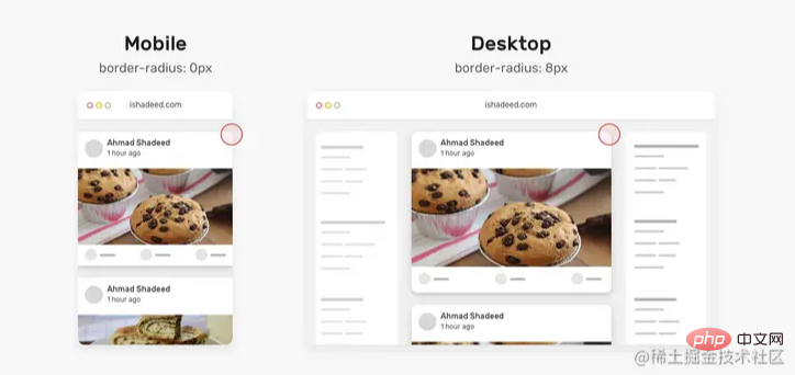
动态 border Radius
一年前,发现了一个巧妙的CSS技巧。使用CSS max()函数,根据视口宽度,将卡片的border-radius 从 0px 切换到 8px。

1 2 3 4 5 6 |
|
来剖析一下上面的CSS:
我们有一个
max()函数,在0px和min()的计算值之间进行比较,并选择较大的值。min()函数在8px和calc((100vw - 4px - 100%) * 9999的计算值之间进行比较,这会得到一个非常大的正数或负数。9999是一个很大的数字,这样min的值都是8px
间距
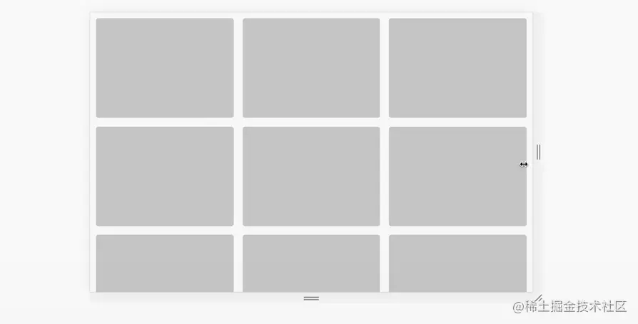
有时,我们可能需要根据视口宽度来改变一个组件或一个网格的间距。有了CS函数就不一样了,我们只需要设置一次。
1 2 3 4 5 |
|

原文地址:https://isdeed.com/article/use-cases-css-comparison-functions/
更多编程相关知识,请访问:编程视频!!
The above is the detailed content of Detailed explanation of comparison functions in CSS (example introduction). For more information, please follow other related articles on the PHP Chinese website!

Hot AI Tools

Undresser.AI Undress
AI-powered app for creating realistic nude photos

AI Clothes Remover
Online AI tool for removing clothes from photos.

Undress AI Tool
Undress images for free

Clothoff.io
AI clothes remover

Video Face Swap
Swap faces in any video effortlessly with our completely free AI face swap tool!

Hot Article

Hot Tools

Notepad++7.3.1
Easy-to-use and free code editor

SublimeText3 Chinese version
Chinese version, very easy to use

Zend Studio 13.0.1
Powerful PHP integrated development environment

Dreamweaver CS6
Visual web development tools

SublimeText3 Mac version
God-level code editing software (SublimeText3)

Hot Topics
 1393
1393
 52
52
 1205
1205
 24
24
 How to use bootstrap in vue
Apr 07, 2025 pm 11:33 PM
Using Bootstrap in Vue.js is divided into five steps: Install Bootstrap. Import Bootstrap in main.js. Use the Bootstrap component directly in the template. Optional: Custom style. Optional: Use plug-ins.
 The Roles of HTML, CSS, and JavaScript: Core Responsibilities
Apr 08, 2025 pm 07:05 PM
HTML defines the web structure, CSS is responsible for style and layout, and JavaScript gives dynamic interaction. The three perform their duties in web development and jointly build a colorful website.
 How to write split lines on bootstrap
Apr 07, 2025 pm 03:12 PM
There are two ways to create a Bootstrap split line: using the tag, which creates a horizontal split line. Use the CSS border property to create custom style split lines.
 Understanding HTML, CSS, and JavaScript: A Beginner's Guide
Apr 12, 2025 am 12:02 AM
WebdevelopmentreliesonHTML,CSS,andJavaScript:1)HTMLstructurescontent,2)CSSstylesit,and3)JavaScriptaddsinteractivity,formingthebasisofmodernwebexperiences.
 How to use bootstrap button
Apr 07, 2025 pm 03:09 PM
How to use the Bootstrap button? Introduce Bootstrap CSS to create button elements and add Bootstrap button class to add button text
 How to resize bootstrap
Apr 07, 2025 pm 03:18 PM
To adjust the size of elements in Bootstrap, you can use the dimension class, which includes: adjusting width: .col-, .w-, .mw-adjust height: .h-, .min-h-, .max-h-
 How to set up the framework for bootstrap
Apr 07, 2025 pm 03:27 PM
To set up the Bootstrap framework, you need to follow these steps: 1. Reference the Bootstrap file via CDN; 2. Download and host the file on your own server; 3. Include the Bootstrap file in HTML; 4. Compile Sass/Less as needed; 5. Import a custom file (optional). Once setup is complete, you can use Bootstrap's grid systems, components, and styles to create responsive websites and applications.
 How to insert pictures on bootstrap
Apr 07, 2025 pm 03:30 PM
There are several ways to insert images in Bootstrap: insert images directly, using the HTML img tag. With the Bootstrap image component, you can provide responsive images and more styles. Set the image size, use the img-fluid class to make the image adaptable. Set the border, using the img-bordered class. Set the rounded corners and use the img-rounded class. Set the shadow, use the shadow class. Resize and position the image, using CSS style. Using the background image, use the background-image CSS property.


