 headlines
 Explore what technology is used to prevent people from being blocked by barrages at Station B!
Explore what technology is used to prevent people from being blocked by barrages at Station B!

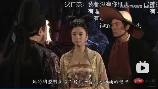
When I was watching a video at Station B that day, I accidentally discovered that when the subtitles met the characters, they were cropped and would not block the characters. I thought it was amazing, so I decided to find out. .
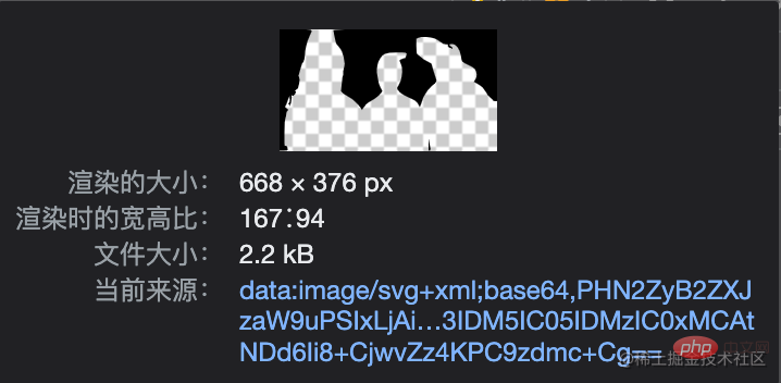
High-end effects often only require the simplest implementation method. After two hours of busy work, Master Chen turned on F12 and suddenly became enlightened. One picture and one attribute, it can be done directly. [Learning video sharing: css video tutorial, web front-end]


In order to confirm My idea, I decided to write a demo myself
<!DOCTYPE html>
<html>
<head>
  <meta charset="UTF-8">
  <title>Title</title>
  <style>
    .video {
      width: 668px;
      height: 376px;
      position: relative;
      -webkit-mask-image: url("mask.svg");
      -webkit-mask-size: 668px 376px;
    }
    .bullet {
      position: absolute;
      font-size: 20px;
    }
  </style>
</head>
<body>
<div>
  <div style="left: 100px; top: 0;">元芳,你怎么看</div>
  <div style="left: 200px; top: 20px;">你难道就是传说中的奶灵</div>
  <div style="left: 300px; top: 40px;">你好,我是胖灵</div>
  <div style="left: 400px; top: 60px;">这是第一集,还没有舔灵</div>
</div>
</body>
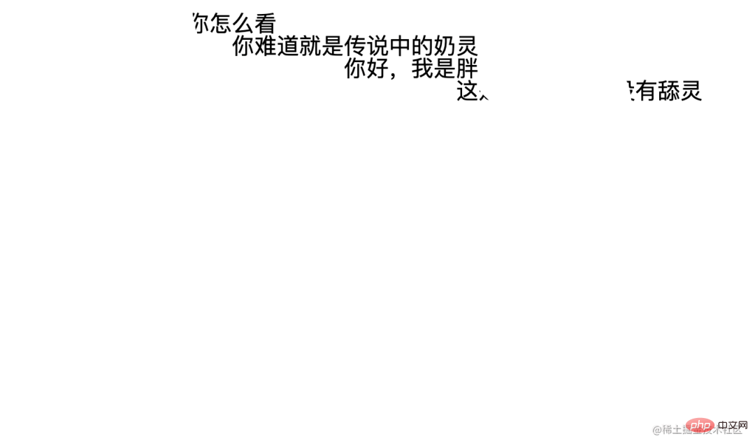
</html>The effect is like this

mask-image: https://developer.mozilla.org/zh-CN/docs/Web/CSS/ mask-image.
Experimental: This is an experimental feature. This feature is still under development in some browsers, and the prefixes suitable for use in different browsers are different. So you can use it as a highlight when developing requirements, but you cannot rely heavily on this attribute to make requirements. There are also a series of attributes here. If you are interested, you can try them one by one.Programming Video! !

Hot AI Tools

Undresser.AI Undress
AI-powered app for creating realistic nude photos

AI Clothes Remover
Online AI tool for removing clothes from photos.

Undress AI Tool
Undress images for free

Clothoff.io
AI clothes remover

AI Hentai Generator
Generate AI Hentai for free.

Hot Article

Hot Tools

Notepad++7.3.1
Easy-to-use and free code editor

SublimeText3 Chinese version
Chinese version, very easy to use

Zend Studio 13.0.1
Powerful PHP integrated development environment

Dreamweaver CS6
Visual web development tools

SublimeText3 Mac version
God-level code editing software (SublimeText3)

Hot Topics
 1381
1381
 52
52
 How to use bootstrap in vue
Apr 07, 2025 pm 11:33 PM
Using Bootstrap in Vue.js is divided into five steps: Install Bootstrap. Import Bootstrap in main.js. Use the Bootstrap component directly in the template. Optional: Custom style. Optional: Use plug-ins.
 The Roles of HTML, CSS, and JavaScript: Core Responsibilities
Apr 08, 2025 pm 07:05 PM
HTML defines the web structure, CSS is responsible for style and layout, and JavaScript gives dynamic interaction. The three perform their duties in web development and jointly build a colorful website.
 How to write split lines on bootstrap
Apr 07, 2025 pm 03:12 PM
There are two ways to create a Bootstrap split line: using the tag, which creates a horizontal split line. Use the CSS border property to create custom style split lines.
 How to resize bootstrap
Apr 07, 2025 pm 03:18 PM
To adjust the size of elements in Bootstrap, you can use the dimension class, which includes: adjusting width: .col-, .w-, .mw-adjust height: .h-, .min-h-, .max-h-
 How to insert pictures on bootstrap
Apr 07, 2025 pm 03:30 PM
There are several ways to insert images in Bootstrap: insert images directly, using the HTML img tag. With the Bootstrap image component, you can provide responsive images and more styles. Set the image size, use the img-fluid class to make the image adaptable. Set the border, using the img-bordered class. Set the rounded corners and use the img-rounded class. Set the shadow, use the shadow class. Resize and position the image, using CSS style. Using the background image, use the background-image CSS property.
 How to set up the framework for bootstrap
Apr 07, 2025 pm 03:27 PM
To set up the Bootstrap framework, you need to follow these steps: 1. Reference the Bootstrap file via CDN; 2. Download and host the file on your own server; 3. Include the Bootstrap file in HTML; 4. Compile Sass/Less as needed; 5. Import a custom file (optional). Once setup is complete, you can use Bootstrap's grid systems, components, and styles to create responsive websites and applications.
 How to view the date of bootstrap
Apr 07, 2025 pm 03:03 PM
Answer: You can use the date picker component of Bootstrap to view dates in the page. Steps: Introduce the Bootstrap framework. Create a date selector input box in HTML. Bootstrap will automatically add styles to the selector. Use JavaScript to get the selected date.
 How to use bootstrap button
Apr 07, 2025 pm 03:09 PM
How to use the Bootstrap button? Introduce Bootstrap CSS to create button elements and add Bootstrap button class to add button text


