

A detailed explanation of Flex layout in CSS3

This article will take you through the Flex layout in CSS3, I hope it will be helpful to you!

Introduction
What is Flex layout
Flex is the abbreviation of Flexible Box , also known as flexbox layout.
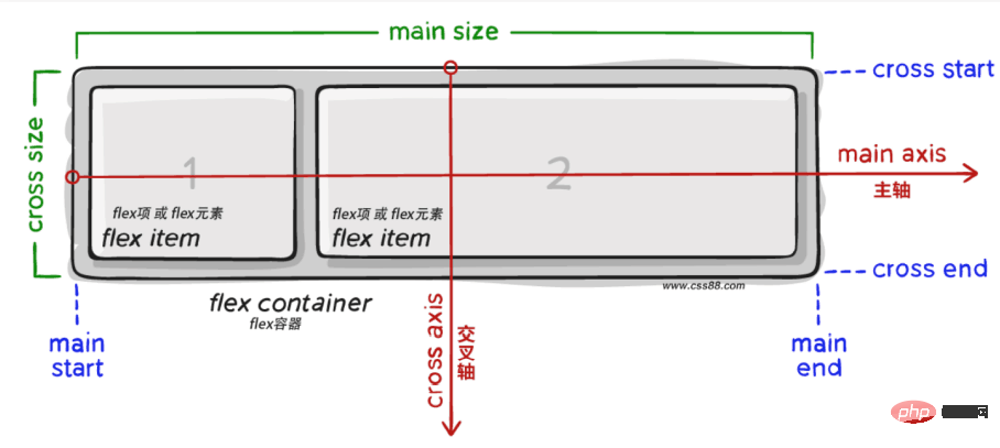
Flex layout composition:
- flex container (
flex container) - flex items (
flex items) - main axis
main axis - cross axis
cross axis
The role of Flex layout
Before flex layout appeared, the web page layout methods were standard flow, floating, positioning, etc. It is relatively troublesome to solve more complex problems. [Learning video sharing: css video tutorial, web front-end]
And flex layout can be:
- Automatic elastic scaling
- Easily design a flexible responsive layout structure
- Precisely and flexibly control the layout of block-level boxes
- Applicable to both PC and mobile terminals
Flex container (parent element) property
First define the Flex container before using flex layout.
display:flex;
After defining the Flex container, you can use the corresponding attributes to change the layout of the sub-elements so that the sub-elements can be automatically squeezed or stretched.
Corresponding attributes:
1. justify-content  主轴元素对齐方式
2. align-items      交叉轴元素对齐方式
3. flex-direction   设置主轴方向
4. flex-wrap        主轴一行满了换行
5. align-content    交叉轴行对齐方式
6. flex-flow        同时设置 flex-direction和 flex-wrap属性
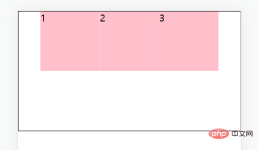
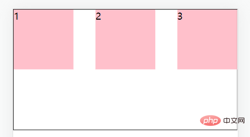
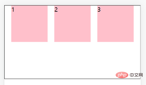
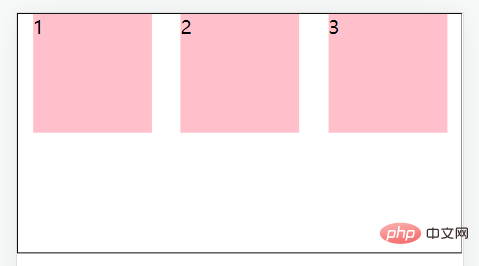
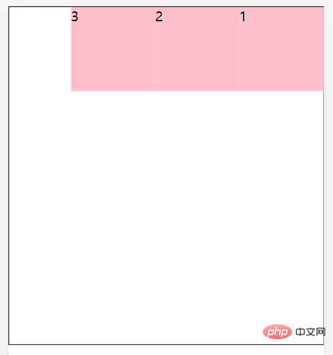
1. justify-content
The justify-content attribute of the container can set the child element in Alignment of main axis direction. (Remember to display:flex;define the container first)
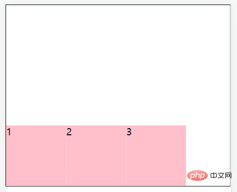
justify-content: center;//居中对齐
justify-content: space-between;//间距在子元素之间
justify-content: space-evenly;//主轴方向所有地方的间距都相等
justify-content: space-around;//间距加在子元素的两侧(中间大的是两个子元素的加在一起)
Code:
<!DOCTYPE html>
<html>


  <head>
    <meta charset="UTF-8">
    <meta http-equiv="X-UA-Compatible" content="IE=edge">
    <meta name="viewport" content="width=device-width, initial-scale=1.0">
    <title>主轴对齐方式</title>
    <style>
      * {
        margin: 0;
        padding: 0;
      }


      .box {
        display: flex;


        /* justify-content: center; */
        /* justify-content: space-between; */
        /* justify-content: space-evenly; */
        justify-content: space-around;

        height: 200px;
        margin: auto;
        border: 1px solid #000;
      }

      .box div {
        width: 100px;
        height: 100px;
        background-color: pink;
      }
    </style>
  </head>


  <body>
    <div>
      <div>1</div>
      <div>2</div>
      <div>3</div>
    </div>
  </body>

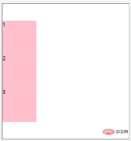
</html>2. align-items
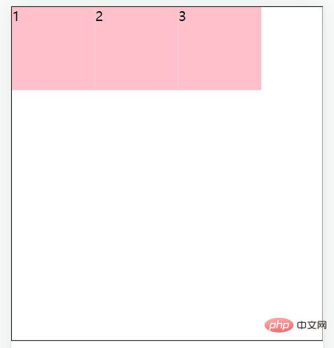
The align-items attribute of the container can be set to The alignment of the element in the cross-axis direction .
From this we can set the container attributes justify-content and align-items to be centered so that the element can be perfectly centered.
align-items: center;//居中
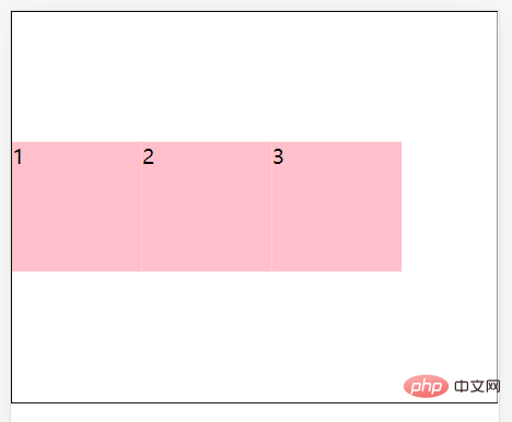
align-items: stretch;//拉伸,默认值(现有状态,这里测试去掉子级的高度)
align-items: flex-start;//将子元素在容器顶部对齐
align-items: flex-end;//将子元素在容器底部对齐
Code:
<!DOCTYPE html>
<html>
  <head>
    <meta charset="UTF-8">
    <meta http-equiv="X-UA-Compatible" content="IE=edge">
    <meta name="viewport" content="width=device-width, initial-scale=1.0">
    <title>交叉轴对齐方式</title>
    <style>
      * {
        margin: 0;
        padding: 0;
      }


      .father {
        display: flex;
        /* 居中 */
        /* align-items: center; */


        /* 拉伸,默认值(现有状态,测试的时候去掉子级的高度) */
        /* align-items: stretch; */


        /* align-items: flex-start; */
        align-items: flex-end;
        height: 300px;
        margin: auto;
        border: 1px solid #000;
      }

      .father div {
        /* 如果不设置宽,由内容撑开 */
        width: 100px;
        height: 100px;
        background-color: pink;
      }
    </style>
  </head>


  <body>
    <div>
      <div>1</div>
      <div>2</div>
      <div>3</div>
    </div>
  </body>


</html>3. flex-direction
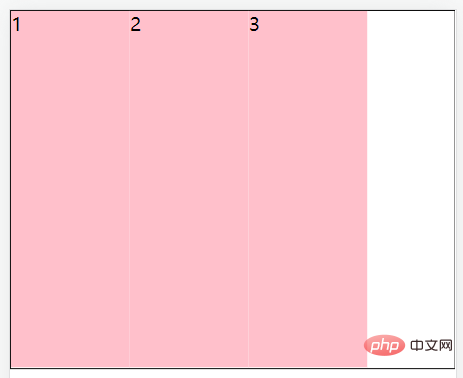
The flex-direction property of the container can change the main axis direction of the flex layout. The default flex spindle direction is horizontal to the right. If you change the main axis direction, the cross axis direction will also change.
flex-direction: column;//主轴方向为垂直方向(从上到下)
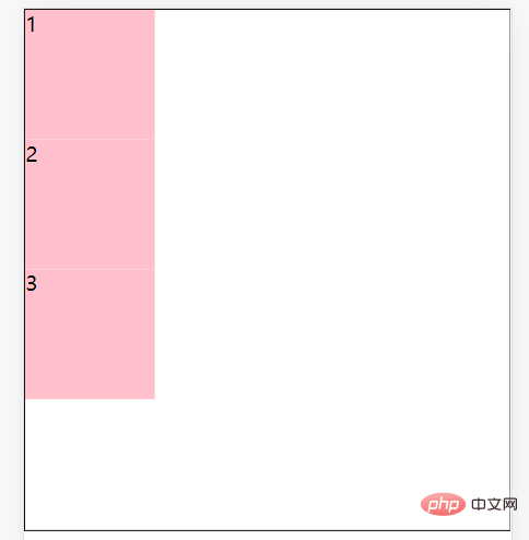
flex-direction: column-reverse;//主轴方向为垂直方向(从下到上)
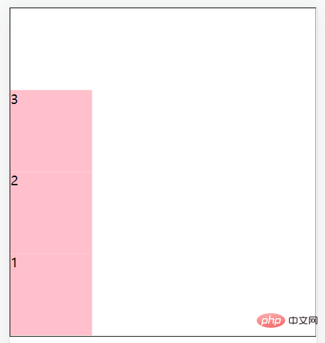
flex-direction: row;//主轴方向为水平方向(从左到右)
flex-direction: row-reverse;//主轴方向为水平方向(从右到左)
Achieve vertical centering after modifying the main axis direction :
display:flex;
flex-direction: column;
justify-content: center;
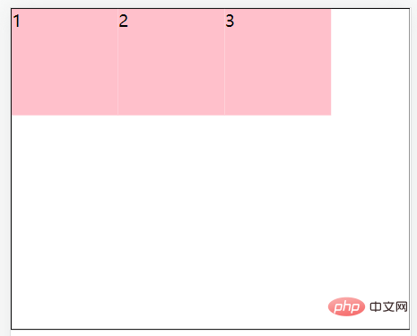
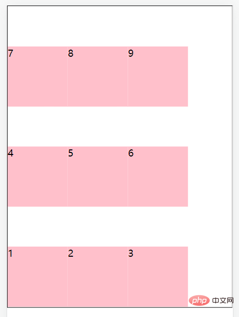
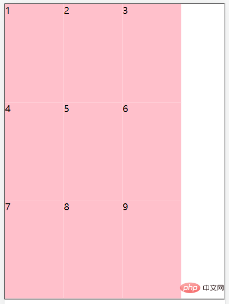
4. flex-wrap
After defining the flex container, if the child element passes If the width exceeds the main axis direction, the child elements in the container will automatically expand and contract.
Such as:
<!DOCTYPE html>
<html>
  <head>
    <meta charset="UTF-8">
    <meta http-equiv="X-UA-Compatible" content="IE=edge">
    <meta name="viewport" content="width=device-width, initial-scale=1.0">
    <title>弹性盒子换行</title>
    <style>
      * {
        margin: 0;
        padding: 0;
      }


      .box {
        display: flex;
        height: 500px;
        border: 1px solid #000;
      }

      .box div {
        width: 100px;
        height: 100px;
        background-color: pink;
      }
    </style>
  </head>


  <body>
    <div>
      <div>1</div>
      <div>2</div>
      <div>3</div>
      <div>4</div>
      <div>5</div>
      <div>6</div>
      <div>7</div>
      <div>8</div>
      <div>9</div>
    </div>
  </body>


</html>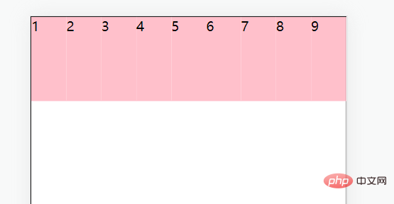
Solution: The flex-wrap property of the container can make sub-elements beyond the main axis of the container display in new lines.
flex-wrap: nowrap;//默认值,不换行
flex-wrap: wrap;//换行,从上到下
flex-wrap: wrap-reverse;//换行,从下到上
5. align-content
##align- of the container The content attribute can adjust the alignment of sub-element rows ( needs to be set first and then ).
align-content: center;//居中对齐
align-content: space-around;//间距加在子元素的两侧(中间大的是两个子元素的加在一起)
align-content: space-between;//间距在子元素之间
前三者的属性跟主轴对齐方式一样就不再赘述。
align-content: stretch;拉伸,默认值(现有状态,这里测试去掉子级的高度)
6.flex-flow
flex-flow属性是用于同时设置 flex-direction 和 flex-wrap 属性的简写属性。
flex-flow: row wrap;
Flex项(子元素)属性
我们可以设置相应属性让flex 容器的直接子元素成为弹性(flex)项目。(在使用flex布局之前首先定义 Flex 容器。)
相应属性:
1. flex-grow
2. flex-shrink
3. flex-basis
4. flex
5. align-self
6. order
1. flex-grow
使用flex-grow属性来定义弹性盒子内部子元素的放大比例(当所有子元素宽度之和小于父元素的宽度时子元素如何分配父元素的剩余空间)。
<!DOCTYPE html>
<html>
  <head>
    <meta charset="UTF-8">
    <meta http-equiv="X-UA-Compatible" content="IE=edge">
    <meta name="viewport" content="width=device-width, initial-scale=1.0">
    <title>Document</title>
    <style>
      .father{
        display:flex;
        width:200px;
        height:150px;
      }


      .box1{
        /* 没有设置宽度 */
        background:red;
        flex-grow: 1;
      }


      .box2{
        background:blue;
        flex-grow: 2;
      }


      .box3{
        background:orange;
        flex-grow: 1;
      }
    </style>
  </head>
  <body>
    <div>
      <div></div>
      <div></div>
      <div></div>
    </div>
  </body>
</html>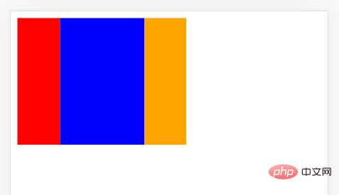
2. flex-shrink
使用flex-shrink属性来定义弹性盒子内部子元素的缩小比例(当所有子元素宽度之和大于父元素的宽度时子元素如何缩小自己的宽度)。
<!DOCTYPE html>
<html>
  <head>
    <meta charset="UTF-8">
    <meta http-equiv="X-UA-Compatible" content="IE=edge">
    <meta name="viewport" content="width=device-width, initial-scale=1.0">
    <title>Document</title>
    <style>
      .father{
        display:flex;
        width:200px;
        height:150px;
      }


      .box1{
        width: 100px;
        background:red;
        flex-shrink: 1;
      }


      .box2{
        width: 100px;
        background:blue;
        flex-shrink: 2;
      }


      .box3{
        width: 100px;
        background:orange;
        flex-shrink: 1;
      }
    </style>
  </head>
  <body>
    <div>
      <div></div>
      <div></div>
      <div></div>
    </div>
  </body>
</html>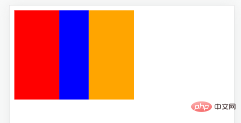
3. flex-basis
使用flex-basis属性来设置子元素的宽度,默认值为auto(作用跟width一样,优先级比width高,就算width在后面也会显示flex-basis)。
4. flex
使用flex属性来同时设置flex-grow、flex-shrink、flex-basis这3个属性,flex属性就是一个复合属性。
实际应用一般用复合属性。
语法:
flex: grow shrink basis;//顺序不能改变,默认值为0 1 auto;
5. align-self
使用align-self属性设置子元素项目的对齐方式。
注意:align-self属性会覆盖容器的 align-items 属性所设置的对齐方式。
<!DOCTYPE html>
<html>
  <head>
    <meta charset="UTF-8">
    <meta http-equiv="X-UA-Compatible" content="IE=edge">
    <meta name="viewport" content="width=device-width, initial-scale=1.0">
    <title>Document</title>
    <style>
      .father{
        display:flex;
        width:200px;
        height:150px;
        align-items: center;
        border: 1px solid #000;
      }


      .box1{
        width: 100px;
        height: 50px;
        background:red;
        align-self: flex-start;
      }


      .box2{
        width: 100px;
        height: 50px;
        background:blue;
      }


      .box3{
        width: 100px;
        height: 50px;
        background:orange;
      }
    </style>
  </head>
  <body>
    <div>
      <div>1</div>
      <div>2</div>
      <div>3</div>
    </div>
  </body>
</html>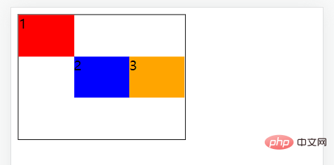
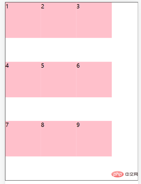
6. order
使用order属性来定义子元素的排列顺序。
<!DOCTYPE html>
<html>
  <head>
    <meta charset="UTF-8">
    <meta http-equiv="X-UA-Compatible" content="IE=edge">
    <meta name="viewport" content="width=device-width, initial-scale=1.0">
    <title>Document</title>
    <style>
      .father{
        display:flex;
        width:200px;
        height:150px;
      }


      .box1{
        width: 100px;
        background:red;
        order: 2;
      }


      .box2{
        width: 100px;
        background:blue;
        order: 1;
      }


      .box3{
        width: 100px;
        background:orange;
        order: 3;
      }
    </style>
  </head>
  <body>
    <div>
      <div>1</div>
      <div>2</div>
      <div>3</div>
    </div>
  </body>
</html>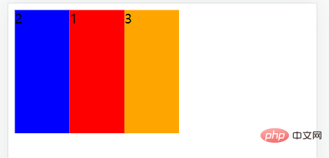
更多编程相关知识,请访问:编程视频!!
The above is the detailed content of A detailed explanation of Flex layout in CSS3. For more information, please follow other related articles on the PHP Chinese website!

Hot AI Tools

Undresser.AI Undress
AI-powered app for creating realistic nude photos

AI Clothes Remover
Online AI tool for removing clothes from photos.

Undress AI Tool
Undress images for free

Clothoff.io
AI clothes remover

AI Hentai Generator
Generate AI Hentai for free.

Hot Article
Hot Tools

Notepad++7.3.1
Easy-to-use and free code editor

SublimeText3 Chinese version
Chinese version, very easy to use

Zend Studio 13.0.1
Powerful PHP integrated development environment

Dreamweaver CS6
Visual web development tools

SublimeText3 Mac version
God-level code editing software (SublimeText3)
Hot Topics
 1376
1376
 52
52

 How to use bootstrap button
Apr 07, 2025 pm 03:09 PM
How to use bootstrap button
Apr 07, 2025 pm 03:09 PM
How to use the Bootstrap button? Introduce Bootstrap CSS to create button elements and add Bootstrap button class to add button text
 How to resize bootstrap
Apr 07, 2025 pm 03:18 PM
How to resize bootstrap
Apr 07, 2025 pm 03:18 PM
To adjust the size of elements in Bootstrap, you can use the dimension class, which includes: adjusting width: .col-, .w-, .mw-adjust height: .h-, .min-h-, .max-h-
 How to set up the framework for bootstrap
Apr 07, 2025 pm 03:27 PM
How to set up the framework for bootstrap
Apr 07, 2025 pm 03:27 PM
To set up the Bootstrap framework, you need to follow these steps: 1. Reference the Bootstrap file via CDN; 2. Download and host the file on your own server; 3. Include the Bootstrap file in HTML; 4. Compile Sass/Less as needed; 5. Import a custom file (optional). Once setup is complete, you can use Bootstrap's grid systems, components, and styles to create responsive websites and applications.
 How to insert pictures on bootstrap
Apr 07, 2025 pm 03:30 PM
How to insert pictures on bootstrap
Apr 07, 2025 pm 03:30 PM
There are several ways to insert images in Bootstrap: insert images directly, using the HTML img tag. With the Bootstrap image component, you can provide responsive images and more styles. Set the image size, use the img-fluid class to make the image adaptable. Set the border, using the img-bordered class. Set the rounded corners and use the img-rounded class. Set the shadow, use the shadow class. Resize and position the image, using CSS style. Using the background image, use the background-image CSS property.
 How to verify bootstrap date
Apr 07, 2025 pm 03:06 PM
How to verify bootstrap date
Apr 07, 2025 pm 03:06 PM
To verify dates in Bootstrap, follow these steps: Introduce the required scripts and styles; initialize the date selector component; set the data-bv-date attribute to enable verification; configure verification rules (such as date formats, error messages, etc.); integrate the Bootstrap verification framework and automatically verify date input when form is submitted.
 How to view the date of bootstrap
Apr 07, 2025 pm 03:03 PM
How to view the date of bootstrap
Apr 07, 2025 pm 03:03 PM
Answer: You can use the date picker component of Bootstrap to view dates in the page. Steps: Introduce the Bootstrap framework. Create a date selector input box in HTML. Bootstrap will automatically add styles to the selector. Use JavaScript to get the selected date.
 How to upload files on bootstrap
Apr 07, 2025 pm 01:09 PM
How to upload files on bootstrap
Apr 07, 2025 pm 01:09 PM
The file upload function can be implemented through Bootstrap. The steps are as follows: introduce Bootstrap CSS and JavaScript files; create file input fields; create file upload buttons; handle file uploads (using FormData to collect data and then send to the server); custom style (optional).
 How to write split lines on bootstrap
Apr 07, 2025 pm 03:12 PM
How to write split lines on bootstrap
Apr 07, 2025 pm 03:12 PM
There are two ways to create a Bootstrap split line: using the tag, which creates a horizontal split line. Use the CSS border property to create custom style split lines.
