 Web Front-end
 Vue.js
 Let's talk about how to write pop-up components faster and more efficiently with Vue3+hook
Let's talk about how to write pop-up components faster and more efficiently with Vue3+hook

Why do you have this idea?
In the development process of the management backend, there are too many pop-up business pop-ups involved, the most common of which is "Add XX data" , "Edit XX data", "View XX detailed data" and other pop-up window types are the most common. [Related recommendations: vuejs video tutorial, web front-end development]
Many of the codes for these pop-up components are the same, such as component status and form component related The method...
So, I simply re-encapsulated the Dialog component and hooks, reducing some repeated code
What to encapsulate
If it is used for ordinary pop-up windows, it is enough to directly use the el-dialog component
But I am still a person who loves to toss, we First take a look at the official dialog document to see what functions can be added
...
After a rough look, I plan to encapsulate the function
- Provide full-screen operation button (upper right corner)
- Provide "Confirm" and "Close" buttons by default
- Internally added
LoadingEffect
EncapsulationDialog
After determining the functions to be encapsulated, let’s first create a simple dialog component.
Process the two-way binding so that the outside can directly control the pop-up window through v-model.
<template>
    <el-dialog :model-value="props.modelValue"></el-dialog>
</template>
<script setup>
interface PropsType {
  modelValue?: boolean;
}

const props = withDefaults(defineProps<PropsType>(), {
  modelValue: false,
});

const emits = defineEmits<{
  (e: "update:modelValue"): void;
}>();
</script>header
The icon library @element-plus/icons-vue is used here
If it is not installed, please execute npm install @element-plus/icons-vue
Use the header slot provided by el-dialog to place the full-screen chart and close icon into the upper right corner . Pass the show-close attribute to el-dialog to close the default icon.
<template>
  <el-dialog :model-value="props.modelValue" :show-close="false">
    <template #header>
      <div>
        <span>{{ props.title }}</span>
      </div>
      <div>
        <el-icon><FullScreen /></el-icon>
        <el-icon><Close /></el-icon>
      </div>
    </template>
  </el-dialog>
</template>
<script setup>
import { FullScreen, Close } from "@element-plus/icons-vue";
</script>
<style scoped>
// 处理样式
:deep(.el-dialog__header) {
  border-bottom: 1px solid #eee;
  display: flex;
  padding: 12px 16px;
  align-items: center;
  justify-content: space-between;
  margin: 0;
}
.dialog-title {
  line-height: 24px;
  font-size: 18px;
  color: #303133;
}
.btns {
  display: flex;
  align-items: center;
  i {
    margin-right: 8px;

    font-size: 16px;
    cursor: pointer;
  }
  i:last-child {
    margin-right: 0;
  }
}
</style>The title text content of the pop-up window is passed through props, and the default is empty ('')
<script lang="ts" setup>
interface PropsType {
  // 忽略之前的代码
  title?: string;
}

const props = withDefaults(defineProps<PropsType>(), {
  title: "",
});

</script> Let’s take a look at the current header The effect (no title is passed in here, the default is '')
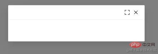
Now this button only has style effect, and the corresponding function has not been written yet~
Bind corresponding events and instructions to them first
<template>
    <el-dialog
    :model-value="props.modelValue"
    :show-close="false"
    :fullscreen="attrs?.fullscreen ?? isFullscreen"
    >
        <template #header>
        <div>
            <span class="dialog-title">{{ props.title }}</span>
        </div>
        <div class="btns">
            <el-icon v-if="isFullScreenBtn" @click="handleFullscreen"
            ><FullScreen
            /></el-icon>
            <el-icon @click="handleClose"><Close /></el-icon>
        </div>
        </template>
    </el-dialog>
</template>
<script setup lang="ts">
import { FullScreen, Close } from "@element-plus/icons-vue";

interface PropsType {
  title?: string;
  modelValue?: boolean;
  hiddenFullBtn?: boolean;
}

const props = withDefaults(defineProps<PropsType>(), {
  title: "",
  modelValue: false,
  hiddenFullBtn: false,
});

const emits = defineEmits<{
  (e: "update:modelValue"): void;
  (e: "close"): void;
}>();

// 当前是否处于全屏状态
const isFullscreen = ref(false);
// 是否显示全屏效果图标
const isFullScreenBtn = computed(() => {
  if (props.hiddenFullBtn) return false;
  if (attrs?.fullscreen) return false;
  return true;
});

// 开启、关闭全屏效果
const handleFullscreen = () => {
  if (attrs?.fullscreen) return;
  isFullscreen.value = !isFullscreen.value;
};

// 关闭弹窗时向外部发送close事件
const handleClose = () => {
  emits("close");
};
</script>Then click on the full screen icon to see the effect

NICE The header function is now complete
Footer
Next, let’s process the bottom content. Two buttons are provided by default, namely “OK” and “Close”. This name can also be passed propsProperty modification.
The two buttons are bound to click events and send different events to the outside.
<template>
  <div class="">
    <el-dialog
      v-bind="attrs"
      :model-value="props.modelValue"
      :show-close="false"
      :fullscreen="attrs?.fullscreen ?? isFullscreen"
    >
      <template #footer>
        <!-- 如果没有提供其他footer插槽,就使用默认的 -->
        <span v-if="!slots.footer" class="dialog-footer">
          <el-button type="primary" @click="handleConfirm">{{
            props.confirmText
          }}</el-button>
          <el-button @click="handleClose">{{ props.cancelText }}</el-button>
        </span>
        <!-- 使用传入进来的插槽 -->
        <slot v-else name="footer"></slot>
      </template>
    </el-dialog>
  </div>
</template>
<script setup lang="ts">
import { useSlots } from "vue";
// 获取插槽
const slots = useSlots();
interface PropsType {
    title?: string;
    width?: string | number;
    isDraggable?: boolean;
    modelValue?: boolean;
    hiddenFullBtn?: boolean;
    confirmText?: string;
    cancelText?: string;
}

const props = withDefaults(defineProps<PropsType>(), {
    title: "",
    isDraggable: false,
    modelValue: false,
    hiddenFullBtn: false,
    confirmText: "确认",
    cancelText: "关闭",
});
const handleClose = () => {
    emits("close");
};
const handleConfirm = () => {
    emits("confirm");
};
</script>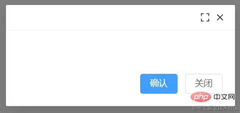
I’ve finished some of it, only the Content is left~
Content
The pop-up content passes through the default slot Pass it in and add the v-loading tag to the outer div element to achieve the loading state.
If you want the entire pop-up window to achieve the loading effect, please move v-loading to the outermost element. Note that it cannot be on the el-dialog element, otherwise it cannot be implemented. It may be that el-dialog uses the teleport component, causing v-loading to not work properly. I will study it when I have time~
<template>
  <div class="">
    <el-dialog
      v-bind="attrs"
      :model-value="props.modelValue"
      :show-close="false"
      :fullscreen="attrs?.fullscreen ?? isFullscreen"
    >
        <div class="content" v-loading="props.loading">
            <slot></slot>
        </div>
    </el-dialog>
  </div>
</template>
<script lang="ts" setup>
interface PropsType {
  loading?: boolean;
}

const props = withDefaults(defineProps<PropsType>(), {
  loading: false,
});

</script>Try to see the loadingeffect in the middle
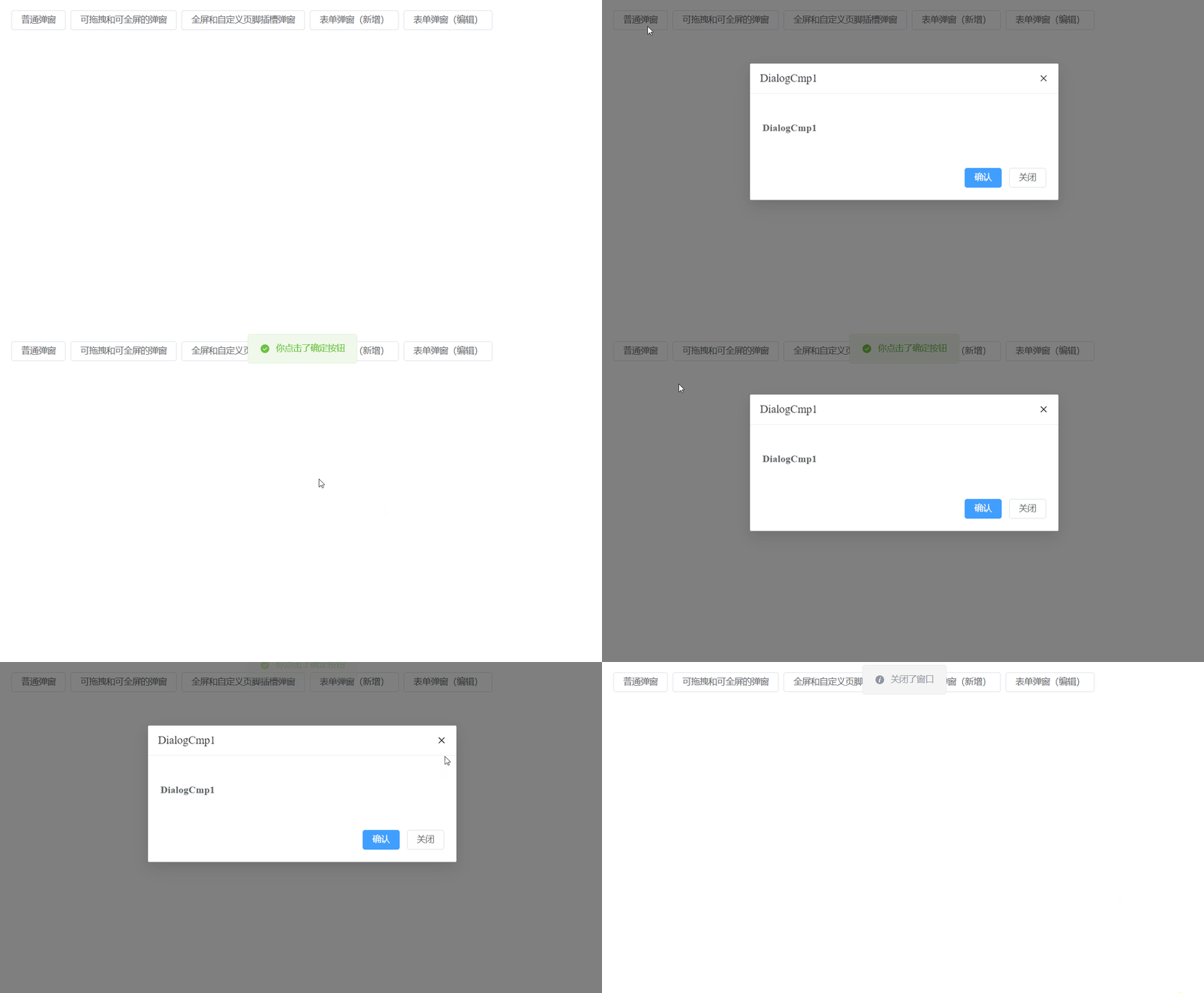
There are some details left to deal with
The el-dialog component provides many props properties for users to choose from, but only a small part of the dialog component we encapsulate now is used propsProperties. What should the user do when they want to use other props properties?
For example, when using the width attribute, do we need to receive props.width in the component we encapsulate and then pass it to <el-dialog :width="props.width" / >Component?
No, no, no, there is another method. Do you remember the useAttrsauxiliary function you just used when doing full-screen operation?
It can get the properties passed in by the current component. With this method, you can then cooperate and pass the functions passed in from the outside to the el-dialog component
<el-dialog
    v-bind="attrs"
    :model-value="props.modelValue"
    :show-close="false"
    :fullscreen="attrs?.fullscreen ?? isFullscreen"
    :before-close="handleClose"
>
    <!-- 忽略其他代码 -->
</el-dialog>In order to avoid the internally passed props from being overwritten Dropped,
v-bind="attrs"needs to be placed at the front
When used, a function may be passed to the before-close attribute, But later it was overwritten by the internal handleClose method.
解决方案是在handleClose函数中,获取attrs.['before-close']属性,如果类型是函数函数,先执行它。
const handleClose = () => {
  if (
    Reflect.has(attrs, "before-close") &&
    typeof attrs["before-close"] === "function"
  ) {
    attrs["before-close"]();
  }
  emits("close");
};有关于el-dialog组件的封装就到这里了
封装hooks
利用Vue composition Api再封装一下在使用el-dialog组件状态的管理hook
useDialog
简单处理显示和加载态开关的hook
import { ref } from "vue";

export default function useDialog() {
  const visible = ref(false);
  const loading = ref(false);
  const openDialog = () => (visible.value = true);
  const closeDialog = () => (visible.value = false);
  const openLoading = () => (loading.value = true);
  const closeLoading = () => (loading.value = false);
  return {
    visible,
    loading,
    openDialog,
    closeDialog,
    openLoading,
    closeLoading,
  };
}useDialog Demo

<template>
<el-button @click="openDialog1">普通弹窗</el-button>
<DialogCmp
  title="DialogCmp1"
  :hiddenFullBtn="true"
  v-model="visible1"
  @confirm="handleConfirm"
  @close="handleClose"
>
  <h3 id="DialogCmp">DialogCmp1</h3>
</DialogCmp>
</template>
<script setup lang="ts">
import useDialog from "./components/useDialog";
import DialogCmp from "./components/Dialog.vue";

const {
  visible: visible1,
  openDialog: openDialog1,
  closeDialog: closeDialog1,
} = useDialog();
</script>useDialogState 和 useDialogWithForm
useDialogState
针对开发管理后台弹窗状态封装的一个hook,搭配下面的useDialogWithForm使用。
export enum MODE {
  ADD,  EDIT,
}import { ref } from "vue";
import { MODE } from "./types";
export default function useDialogState() {
const mode = ref<MODE>(MODE.ADD);
const visible = ref(false);
const updateMode = (target: MODE) => {
mode.value = target;
};
return { mode, visible, updateMode };
}useDialogWithForm
针对表单弹窗组件封装的hooks,接收一个formRef实例,负责控制弹窗内标题及清空表单中的校验结果,减少多余的代码 ~
import { FormInstance } from "element-plus";
import { Ref, ref } from "vue";
import { MODE } from "./types";
import useDialogState from "./useDialogState";

export default function useDialogFn(
  formInstance: Ref<FormInstance>
) {
  const { visible, mode, updateMode } = useDialogState();

  const closeDialog = () => {
    formInstance.value.resetFields();
    visible.value = false;
  };
  const openDialog = (target: MODE) => {
    updateMode(target);
    visible.value = true;
  };
  return { visible, mode, openDialog, closeDialog };
}useDialogWithForm Demo

<template>
<Dialog
:before-close="customClose"
@confirm="confirm"
v-model="visible"
:title="mode == MODE.ADD ? '添加数据' : '编辑信息'"
:confirm-text="mode == MODE.ADD ? '添加' : '修改'"
>
<el-form
label-width="100px"
:model="formData"
ref="formDataRef"
style="max-width: 460px"
:rules="rules"
>
<el-form-item label="姓名" prop="name">
<el-input v-model="formData.name" />
</el-form-item>
<el-form-item label="年龄" prop="age">
<el-input v-model="formData.age" />
</el-form-item>
<el-form-item label="手机号码" prop="mobile">
<el-input v-model="formData.mobile" />
</el-form-item>
</el-form>
</Dialog>
</template>
<script setup>
import { ElMessage, FormInstance } from "element-plus";
import { Ref, ref } from "vue";
import Dialog from "./Dialog.vue";
import { MODE } from "./types";
import useDialogWithForm from "./useDialogWithForm";
const rules = {
name: {
type: "string",
required: true,
pattern: /^[a-z]+$/,
trigger: "change",
message: "只能是英文名称哦",
transform(value: string) {
return value.trim();
},
},
age: {
type: "string",
required: true,
pattern: /^[0-9]+$/,
trigger: "change",
message: "年龄只能是数字哦",
transform(value: string) {
return value.trim();
},
},
mobile: {
type: "string",
required: true,
pattern:
/^(?:(?:\+|00)86)?1(?:(?:3[\d])|(?:4[5-79])|(?:5[0-35-9])|(?:6[5-7])|(?:7[0-8])|(?:8[\d])|(?:9[189]))\d{8}$/,
trigger: "change",
message: "请输入正确的手机号码",
transform(value: string) {
return value.trim();
},
},
};
interface FromDataType {
name: string;
age: string;
mobile: string;
}
const formDataRef = ref<FormInstance | null>(null);
let formData = ref<FromDataType>({
name: "",
age: "",
mobile: "",
});
const { visible, closeDialog, openDialog, mode } = useDialogWithForm(
formDataRef as Ref<FormInstance>
);
const confirm = () => {
if (!formDataRef.value) return;
formDataRef.value.validate((valid) => {
if (valid) {
console.log("confirm");
ElMessage({
message: "提交成功",
type: "success",
});
closeDialog();
}
});
};
const customClose = () => {
ElMessage({
message: "取消提交",
type: "info",
});
closeDialog();
};
defineExpose({
closeDialog,
openDialog,
});
</script>
<style scoped></style>仓库地址

如果您觉得本文对您有帮助,请帮帮忙点个star
您的反馈 是我更新的动力!
The above is the detailed content of Let's talk about how to write pop-up components faster and more efficiently with Vue3+hook. For more information, please follow other related articles on the PHP Chinese website!

Hot AI Tools

Undresser.AI Undress
AI-powered app for creating realistic nude photos

AI Clothes Remover
Online AI tool for removing clothes from photos.

Undress AI Tool
Undress images for free

Clothoff.io
AI clothes remover

Video Face Swap
Swap faces in any video effortlessly with our completely free AI face swap tool!

Hot Article

Hot Tools

Notepad++7.3.1
Easy-to-use and free code editor

SublimeText3 Chinese version
Chinese version, very easy to use

Zend Studio 13.0.1
Powerful PHP integrated development environment

Dreamweaver CS6
Visual web development tools

SublimeText3 Mac version
God-level code editing software (SublimeText3)

Hot Topics
 1392
1392
 52
52
 How to use bootstrap in vue
Apr 07, 2025 pm 11:33 PM
Using Bootstrap in Vue.js is divided into five steps: Install Bootstrap. Import Bootstrap in main.js. Use the Bootstrap component directly in the template. Optional: Custom style. Optional: Use plug-ins.
 How to add functions to buttons for vue
Apr 08, 2025 am 08:51 AM
You can add a function to the Vue button by binding the button in the HTML template to a method. Define the method and write function logic in the Vue instance.
 How to reference js file with vue.js
Apr 07, 2025 pm 11:27 PM
There are three ways to refer to JS files in Vue.js: directly specify the path using the <script> tag;; dynamic import using the mounted() lifecycle hook; and importing through the Vuex state management library.
 How to use watch in vue
Apr 07, 2025 pm 11:36 PM
The watch option in Vue.js allows developers to listen for changes in specific data. When the data changes, watch triggers a callback function to perform update views or other tasks. Its configuration options include immediate, which specifies whether to execute a callback immediately, and deep, which specifies whether to recursively listen to changes to objects or arrays.
 What does vue multi-page development mean?
Apr 07, 2025 pm 11:57 PM
Vue multi-page development is a way to build applications using the Vue.js framework, where the application is divided into separate pages: Code Maintenance: Splitting the application into multiple pages can make the code easier to manage and maintain. Modularity: Each page can be used as a separate module for easy reuse and replacement. Simple routing: Navigation between pages can be managed through simple routing configuration. SEO Optimization: Each page has its own URL, which helps SEO.
 How to return to previous page by vue
Apr 07, 2025 pm 11:30 PM
Vue.js has four methods to return to the previous page: $router.go(-1)$router.back() uses <router-link to="/" component window.history.back(), and the method selection depends on the scene.
 How to use vue traversal
Apr 07, 2025 pm 11:48 PM
There are three common methods for Vue.js to traverse arrays and objects: the v-for directive is used to traverse each element and render templates; the v-bind directive can be used with v-for to dynamically set attribute values for each element; and the .map method can convert array elements into new arrays.
 How to jump a tag to vue
Apr 08, 2025 am 09:24 AM
The methods to implement the jump of a tag in Vue include: using the a tag in the HTML template to specify the href attribute. Use the router-link component of Vue routing. Use this.$router.push() method in JavaScript. Parameters can be passed through the query parameter and routes are configured in the router options for dynamic jumps.


