
 Web Front-end
CSS Tutorial
Use distance, angle, light and shadow to create cool 3D text effects
Web Front-end
CSS Tutorial
Use distance, angle, light and shadow to create cool 3D text effects
Use distance, angle, light and shadow to create cool 3D text effects

How to use CSS to realize 3D figures? The following article will show you how to use visual blindness to create different 3D text effects. I hope it will be helpful to you!

There is an interesting question in the group recently. Everyone is discussing whether using CSS 3D can achieve the following effect:
The core difficulty here is how to use CSS to realize a three-dimensional number? Can CSS do it?
It is not particularly easy to achieve, but if we only use visual blindness within a certain angle, we can still perfectly restore the above effect.
Use distance, angle and light and shadow to construct different 3D effects
This is a very interesting technique. Of course, the production process requires more debugging.
Use distance, angle and light and shadow reasonably to create different 3D effects. Take a look at the example below, which simply sets up three layers of characters so that they are a certain distance apart on the Z axis. [Recommended learning: css video tutorial]
The simple pseudo code is as follows:
<div> <span class='C'>C</span> <span class='S'>S</span> <span class='S'>S</span> <span></span> <span class='3'>3</span> <span class='D'>D</span> </div>
$bright : #AFA695;
$gold : #867862;
$dark : #746853;
$duration : 10s;
div {
	perspective: 2000px;
	transform-style: preserve-3d;
	animation: fade $duration infinite;
}
span {
	transform-style: preserve-3d;
	transform: rotateY(25deg);
	animation: rotate $duration infinite ease-in;

	&:after, &:before {
		content: attr(class);
		color: $gold;
		z-index: -1;
		animation: shadow $duration infinite;
	}
	&:after{
		transform: translateZ(-16px);
	}
	&:before {
		transform: translateZ(-8px);
	}
}
@keyframes fade {
	// 透明度变化
}
@keyframes rotate {
	// 字体旋转
}
@keyframes shadow {
       // 字体颜色变化
}A simple stroke, the core of the above code is:
Parent element and child element settings
transform-style: preserve-3dUse two pseudo-elements of the
spanelement Copy two identical words and usetranslateZ()to space them at a certain distance on the Z axisAdd simple rotation, transparency, and font color changes
You can get such a title 3D animation similar to the opening of a movie. In fact, it only has 3 layers of elements, but due to the appropriate angles and perfect visual connection, it looks very 3D.

Why does it say that distance, angle, light and shadow need to be used reasonably?
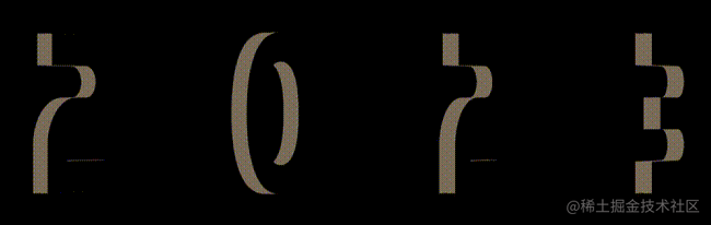
It’s still the same animation effect. If the initial rotation angle of the animation is set slightly larger, the entire effect will be distorted:

As you can see, in In the first few frames, a simple layered structure can be seen. Or, simply adjust the perspective and set the perspective of the parent container from 2000px to 500px, and the effect will be more obvious:

In other words, at the right distance and right angle, we can create a relatively good 3D effect visually with only a few elements.
For the complete code above, you can click here: CSS inspiration--3D text appearance animation
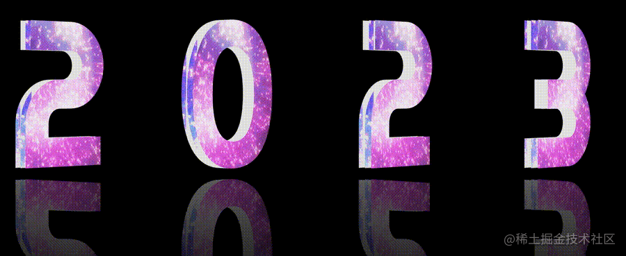
Based on this technique, let’s simply transform it. Let’s first Replace the text effect:
<div> <span class='2'>2</span> <span class='0'>0</span> <span class='2'>2</span> <span class='3'>3</span> </div>
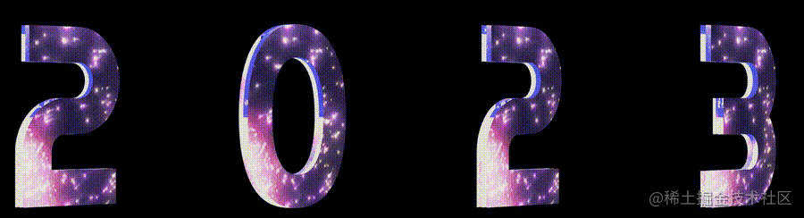
In this way, we can get an effect like this:
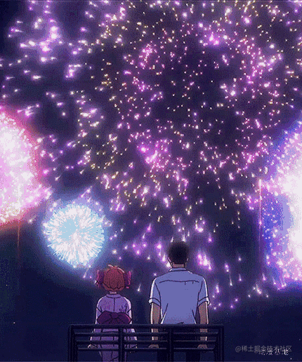
Wow, it kind of means that. Next, we need to change to festive text effects. First, just look for a fireworks Gif on the Internet, maybe something like this:
We use background-clip: text to give three layers of text. With an effect similar to this, the core pseudocode is as follows:
span {
	position: relative;
	transform-style: preserve-3d;
	color: transparent;
	background: url(xxx.gif);
	background-clip: text;

	&:after, &:before {
		position: absolute;
		content: attr(class);
		color: transparent;
		background: url(xxx.gif);
	        background-clip: text;
	}

	&:before {
		transform: translateZ(-12px);
	}
	&:after {
		transform: translateZ(-6px);
	}
}In this way, we get text with a firework effect, as well as a little 3D effect:
The last step is left, how to create the reflection effect?
There are many methods, the more convenient one is to use the webkit-box-reflect element. Only one line of code is needed:
div {
    //...
    -webkit-box-reflect: below -6vw linear-gradient(transparent 20%, rgba(255,255,255, .6));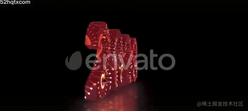
} Of course, if you are not satisfied with the visual thickness of the 3D text formed by the words generated by the two pseudo elements, you can also adjust the transform of the two pseudo elements simultaneously. : translateZ(-6px) value, after some adjustments, we simply reproduced the 2023 3D text animation effect as shown in the title picture:
For the complete code, you can click here:

Original address: https://juejin.cn/post/7184250130004967485 Author: ChokCoco(Learning video sharing:
web front-end )
The above is the detailed content of Use distance, angle, light and shadow to create cool 3D text effects. For more information, please follow other related articles on the PHP Chinese website!

Hot AI Tools

Undresser.AI Undress
AI-powered app for creating realistic nude photos

AI Clothes Remover
Online AI tool for removing clothes from photos.

Undress AI Tool
Undress images for free

Clothoff.io
AI clothes remover

Video Face Swap
Swap faces in any video effortlessly with our completely free AI face swap tool!

Hot Article
Hot Tools

Notepad++7.3.1
Easy-to-use and free code editor

SublimeText3 Chinese version
Chinese version, very easy to use

Zend Studio 13.0.1
Powerful PHP integrated development environment

Dreamweaver CS6
Visual web development tools

SublimeText3 Mac version
God-level code editing software (SublimeText3)
Hot Topics
 1386
1386
 52
52

 How to use bootstrap in vue
Apr 07, 2025 pm 11:33 PM
How to use bootstrap in vue
Apr 07, 2025 pm 11:33 PM
Using Bootstrap in Vue.js is divided into five steps: Install Bootstrap. Import Bootstrap in main.js. Use the Bootstrap component directly in the template. Optional: Custom style. Optional: Use plug-ins.
 The Roles of HTML, CSS, and JavaScript: Core Responsibilities
Apr 08, 2025 pm 07:05 PM
The Roles of HTML, CSS, and JavaScript: Core Responsibilities
Apr 08, 2025 pm 07:05 PM
HTML defines the web structure, CSS is responsible for style and layout, and JavaScript gives dynamic interaction. The three perform their duties in web development and jointly build a colorful website.
 How to write split lines on bootstrap
Apr 07, 2025 pm 03:12 PM
How to write split lines on bootstrap
Apr 07, 2025 pm 03:12 PM
There are two ways to create a Bootstrap split line: using the tag, which creates a horizontal split line. Use the CSS border property to create custom style split lines.
 Understanding HTML, CSS, and JavaScript: A Beginner's Guide
Apr 12, 2025 am 12:02 AM
Understanding HTML, CSS, and JavaScript: A Beginner's Guide
Apr 12, 2025 am 12:02 AM
WebdevelopmentreliesonHTML,CSS,andJavaScript:1)HTMLstructurescontent,2)CSSstylesit,and3)JavaScriptaddsinteractivity,formingthebasisofmodernwebexperiences.
 How to set up the framework for bootstrap
Apr 07, 2025 pm 03:27 PM
How to set up the framework for bootstrap
Apr 07, 2025 pm 03:27 PM
To set up the Bootstrap framework, you need to follow these steps: 1. Reference the Bootstrap file via CDN; 2. Download and host the file on your own server; 3. Include the Bootstrap file in HTML; 4. Compile Sass/Less as needed; 5. Import a custom file (optional). Once setup is complete, you can use Bootstrap's grid systems, components, and styles to create responsive websites and applications.
 How to resize bootstrap
Apr 07, 2025 pm 03:18 PM
How to resize bootstrap
Apr 07, 2025 pm 03:18 PM
To adjust the size of elements in Bootstrap, you can use the dimension class, which includes: adjusting width: .col-, .w-, .mw-adjust height: .h-, .min-h-, .max-h-
 How to insert pictures on bootstrap
Apr 07, 2025 pm 03:30 PM
How to insert pictures on bootstrap
Apr 07, 2025 pm 03:30 PM
There are several ways to insert images in Bootstrap: insert images directly, using the HTML img tag. With the Bootstrap image component, you can provide responsive images and more styles. Set the image size, use the img-fluid class to make the image adaptable. Set the border, using the img-bordered class. Set the rounded corners and use the img-rounded class. Set the shadow, use the shadow class. Resize and position the image, using CSS style. Using the background image, use the background-image CSS property.
 How to use bootstrap button
Apr 07, 2025 pm 03:09 PM
How to use bootstrap button
Apr 07, 2025 pm 03:09 PM
How to use the Bootstrap button? Introduce Bootstrap CSS to create button elements and add Bootstrap button class to add button text
