
This article brings you relevant knowledge about CSS. It mainly introduces that I got a new CSS knowledge out of curiosity. What makes me curious? For those who are interested, let’s take a look below. You may also be curious, haha.
When everyone checked the Element UI document, did you find the following effect?

Good guy, this effect should be How to achieve it? My idea is to set the background image to white and transparent, so that the image underneath can penetrate part of it and come up, creating an effect similar to frosted glass. Without further ado, let’s write code to see if it can be achieved:
.header {
    position: fixed;
    top: 0;
    width: 100%;
    height: 400px;
    background-image: radial-gradient(transparent 50px, #fff 50px);
    background-size: 200px 200px;
    background-color: yellow;
}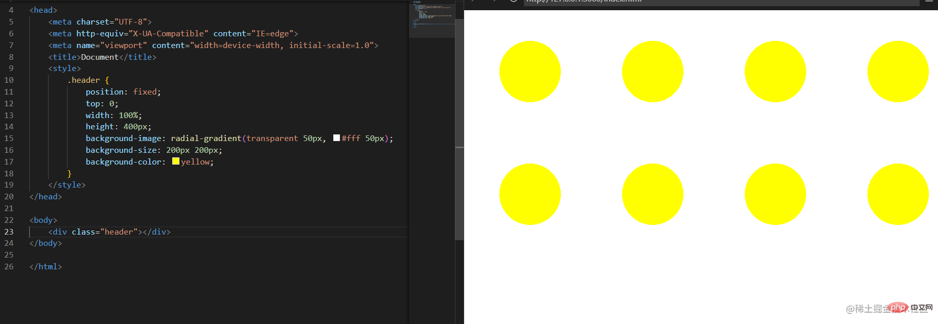 The radial gradient method is used here to set a The middle is transparent and the surrounding is white background. Maybe the above code does not fully reflect how this background works. Let’s take a look at the following one:
.header {
    position: fixed;
    top: 0;
    width: 100%;
    height: 400px;
    background-image: radial-gradient(transparent 50px, #fff 50px);
    background-size: 200px 200px;
    background-color: yellow;
+   background-repeat: no-repeat;
}
Do you understand? It is formed by tiled small squares like this. If our background color is not set, then this will be a hollow background.
We can see that our small round holes are evenly arranged. If I change the size of the background, the effect is as follows:
.header {
    position: fixed;
    top: 0;
    width: 100%;
    height: 400px;
    background-image: radial-gradient(transparent 50px, #fff 50px);
    background-size: 120px 120px;
    background-color: yellow;
    /* background-repeat: no-repeat; */
}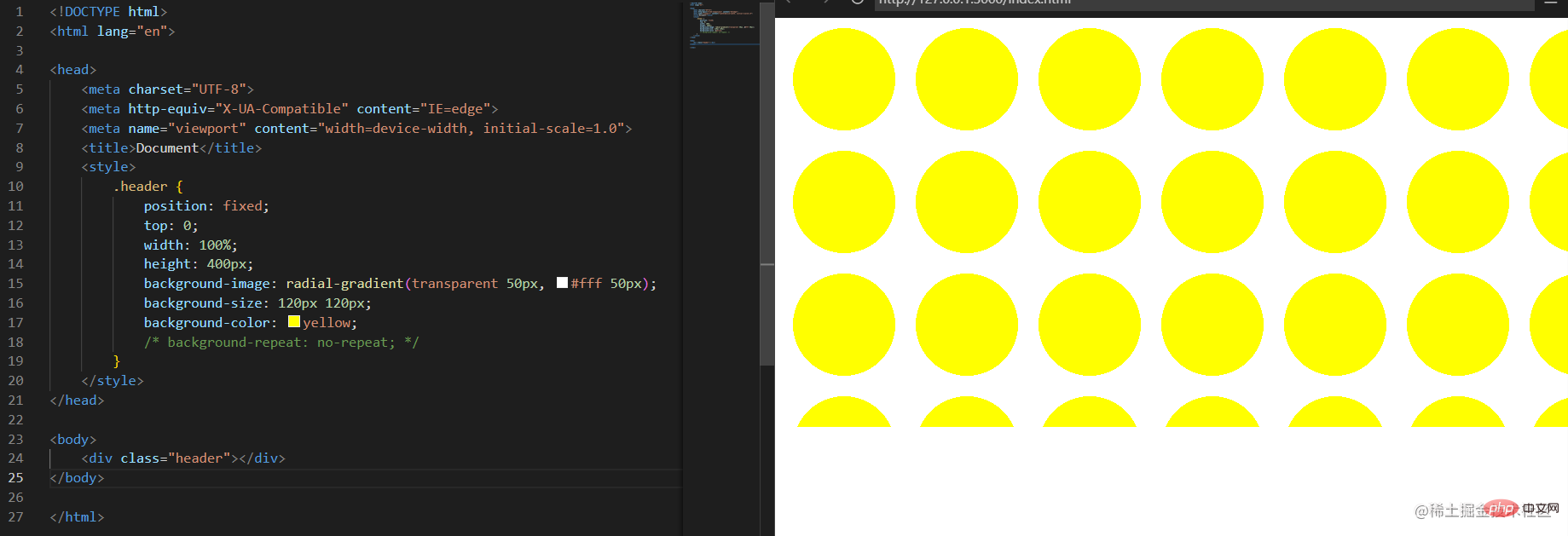 As you can see, the circular holes have become denser. So to what size can the background be adjusted to become completely transparent? I calculated it verbally, and it should be
 50 root number 2, which is about 71px. Try it?
.header {
    position: fixed;
    top: 0;
    width: 100%;
    height: 400px;
    background-image: radial-gradient(transparent 50px, #fff 50px);
    background-size: 71px 71px;
    background-color: yellow;
    /* background-repeat: no-repeat; */
}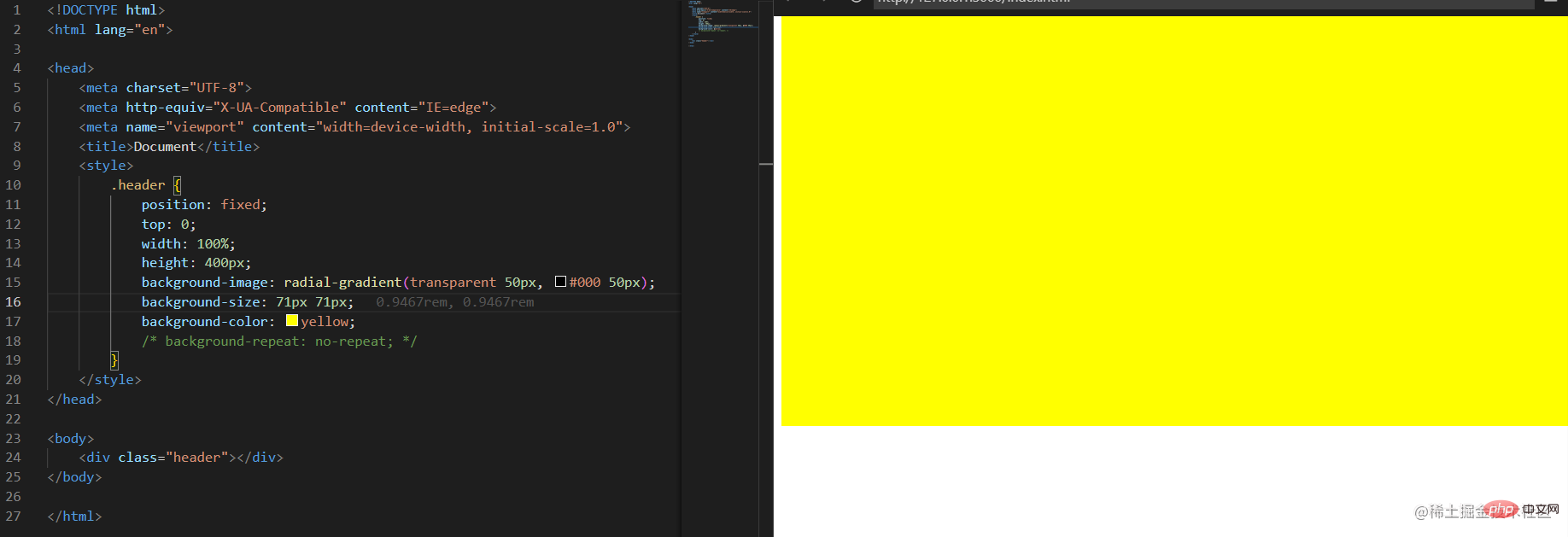 In order to see it more clearly, we changed the original white to black, and changed
 71px to 72px:
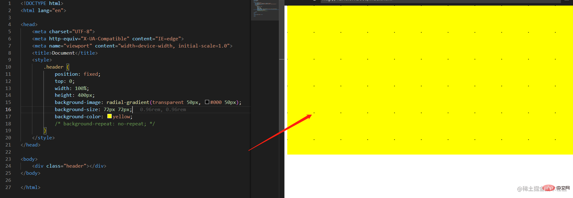 Black dots appear! It means that my calculation is good, not bad at all, I am awesome! ok, let’s continue to explore
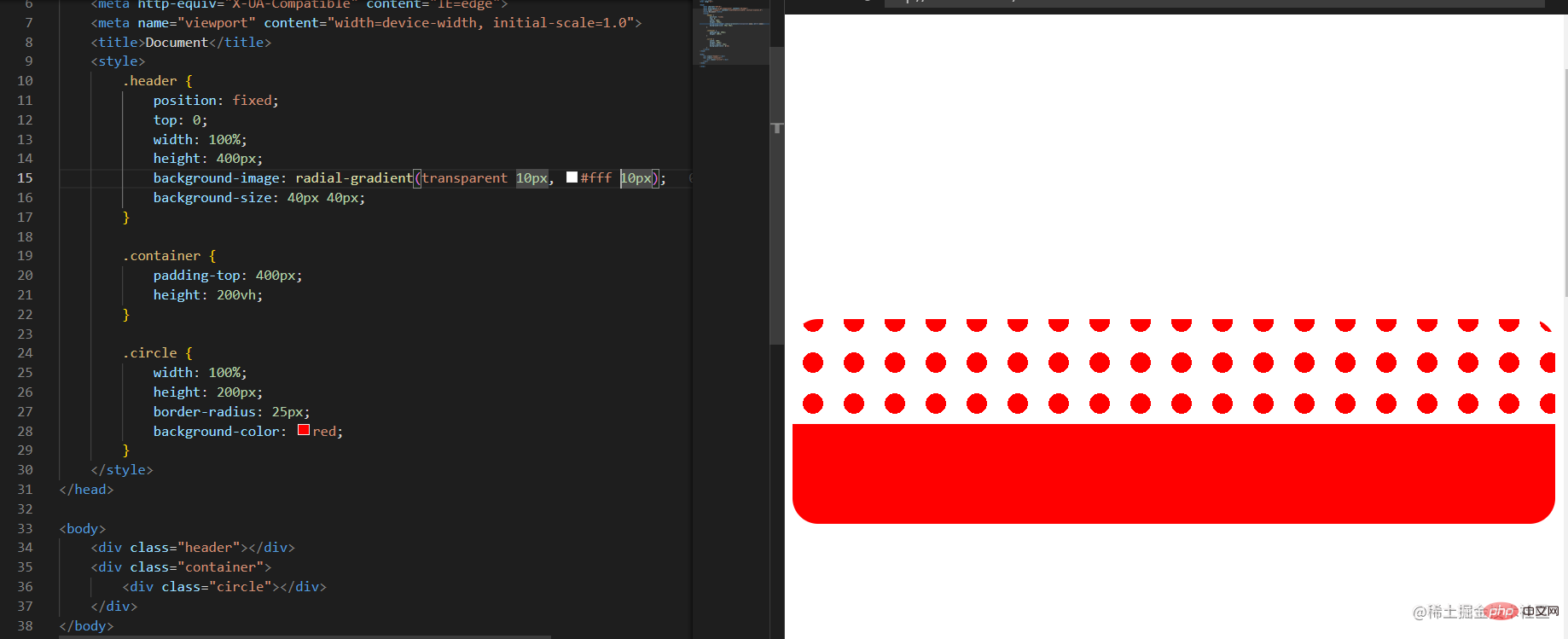
We now want to benchmark the effect like the Element official website. I made the following example:
.header {
    position: fixed;
    top: 0;
    width: 100%;
    height: 400px;
    background-image: radial-gradient(transparent 10px, #fff 10px);
    background-size: 40px 40px;
}

.container {
    padding-top: 400px;
    height: 200vh;
}

.circle {
    width: 100%;
    height: 200px;
    border-radius: 25px;
    background-color: red;
}
Change the size:
background-image: radial-gradient(transparent 1px, #fff 1px);
background-size: 4px 4px;
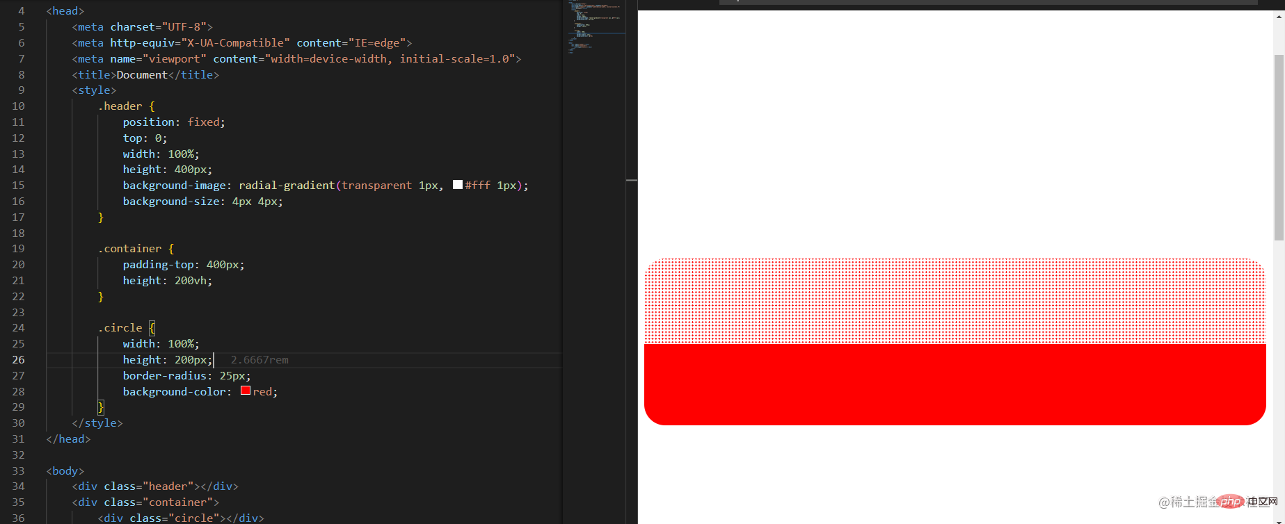 At this point, the effect is basically done, but there is still a difference. Others have a hairy effect, but mine does not. No, you have to learn how others do it!
 The code is as follows:
.navbar-wrapper {
  position: relative;
  border-bottom: 1px solid var(--border-color);
  height: var(--header-height);
  padding: 0 12px 0 24px;
  background-image: radial-gradient(transparent 1px,var(--bg-color) 1px);
  background-size: 4px 4px;
  backdrop-filter: saturate(50%) blur(4px);
  -webkit-backdrop-filter: saturate(50%) blur(4px);
  top: 0;
}欧? backdrop-filterWhat is this? I have never used it before. Give it a try. There are two properties here. The first one is a bit unfamiliar, and the second one should be to set the blur of the frosted glass effect. Let’s try it first:
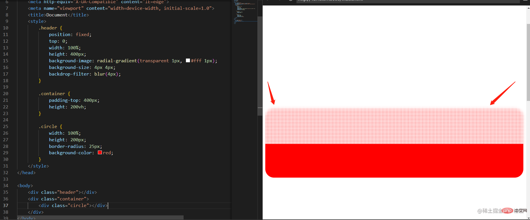
It does have a blurring effect. So what does saturate do? You’ll know after you try it:
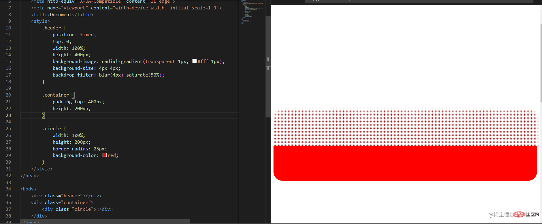
Hmm, it’s getting darker.
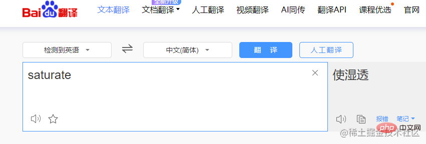 I checked the English meaning to make it wet, emmmm, It seems that red clothes do turn dark red when wet, which is interesting. There is a percentage setting here, try the effect:
We set the percentage to 10%:
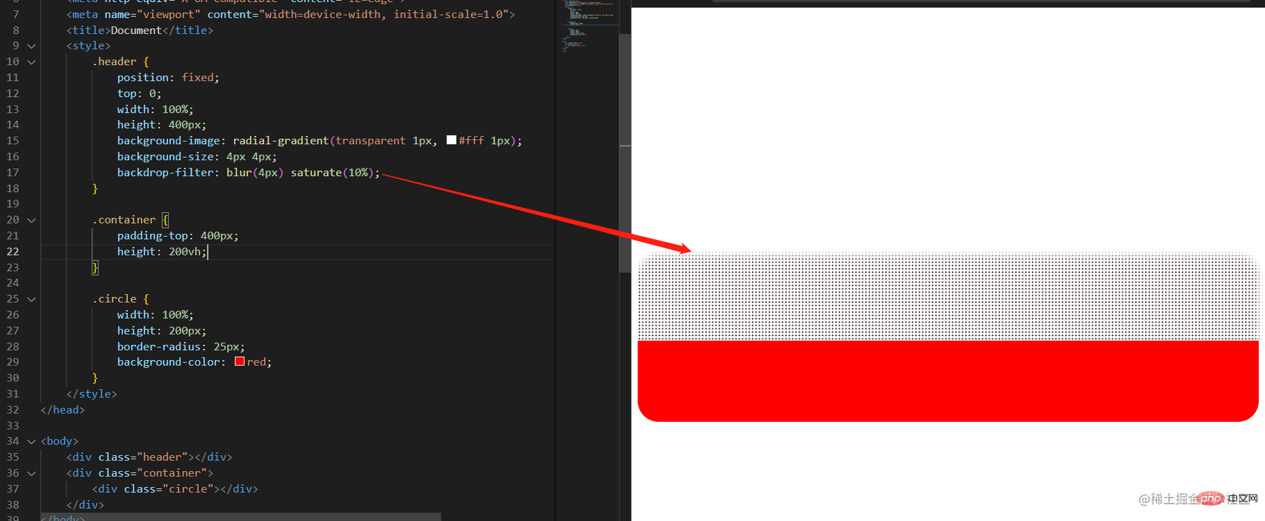
is completely black , red and black, so wet, hahaha~
ok, that’s it for today’s sharing. Friends who find it interesting remember to like, follow and add favorites, because today you have learned a word: saturate: Soaked. sa(wet)tu(transparent)rate(了)? ? ? ? ? ? ? ? ? ?
Recommended learning: "css video tutorial"
The above is the detailed content of 'saturate', I gained new CSS knowledge!. For more information, please follow other related articles on the PHP Chinese website!


