How to implement pop-up modal box in react
React method to implement a pop-up modal box: 1. Use createPortal to render the element directly under "document.body"; 2. Use "modelShow" and "modelShowAync" to control the display and hiding of the pop-up window; 3. , just use a controller controlShow to smoothly perform the update task.

The operating environment of this tutorial: Windows 10 system, react18.0.0 version, Dell G3 computer.
How to implement pop-up modal box in react?
React to implement Modal pop-up window
1. Dialog.js file
import React, {useMemo, useEffect, useState} from 'react'
import ReactDOM from 'react-dom'
/**
*
* 需要把元素渲染到组件之外,用 createPortal 把元素直接渲染到 document.body 下,为了防止函数组件每一次执行都触发 createPortal, 所以通过 useMemo 做性能优化。
因为需要渐变的动画效果,所以需要两个变量 modelShow / modelShowAync 来控制显示/隐藏,modelShow 让元素显示/隐藏,modelShowAync 控制动画执行。
当弹窗要显示的时候,要先设置 modelShow 让组件显示,然后用 setTimeout 调度让 modelShowAync 触发执行动画。
当弹窗要隐藏的时候,需要先让动画执行,所以先控制 modelShowAync ,然后通过控制 modelShow 元素隐藏,和上述流程相反。
用一个控制器 controlShow 来流畅执行更新任务。
*/
// 控制弹窗隐藏以及动画效果
const controlShow = (f1, f2, value, timer) => {
f1(value)
return setTimeout(() => {
f2(value)
}, timer)
}
export const Dialog = (props) => {
const {width, visible, closeCb, onClose} = props
// 控制 modelShow动画效果
const [modelShow, setModelShow] = useState(visible)
const [modelShowAsync, setModelShowAsync] = useState(visible)
const renderChildren = useMemo(() => {
// 把元素渲染到组件之外的document.body 上
return ReactDOM.createPortal(<div style={{display: modelShow ? 'block' : 'none'}}>
<div className="model_container" style={{opacity: modelShowAsync ? 1 : 0}}>
<div className="model_wrap">
<div style={{width: width + 'px'}}> {props.children} </div>
</div>
</div>
<div className="model_container mast" onClick={() => onClose && onClose()}
style={{opacity: modelShowAsync ? 0.6 : 0}}/>
</div>, document.body)
}, [modelShow, modelShowAsync])
useEffect(() => {
let timer
if (visible) {
// 打开弹窗,
timer = controlShow(setModelShow, setModelShowAsync, visible, 30)
} else {
timer = controlShow(setModelShowAsync,setModelShow,visible,1000)
}
return () => {
timer && clearTimeout(timer)
}
}, [visible])
return renderChildren
}2. Modal.js
import {Dialog} from "./Dialog";
import React, {useEffect, useState} from 'react'
import ReactDOM from 'react-dom'
import './style.scss'
class Modal extends React.PureComponent {
// 渲染底部按钮
renderFooter = () => {
const {onOk, onCancel, cancelText, okText, footer} = this.props
// 触发onOk / onCancel回调
if (footer && React.isValidElement(footer)) return footer
return <div className="model_bottom">
<div className="model_btn_box">
<button className="searchbtn"
onClick={(e) => {
onOk && onOk(e)
}}>{okText || '确定'}
</button>
<button className="concellbtn"
onClick={(e) => {
onCancel && onCancel(e)
}}>{cancelText || '取消'}
</button>
</div>
</div>
}
// 渲染底部
renderTop = () => {
const {title, onClose} = this.props
return <div className="model_top">
<p>{title}</p>
<span className="model_top_close" onClick={() => onClose && onClose()}>X</span>
</div>
}
// 渲染弹窗内容
renderContent = () => {
const {content, children} = this.props
return React.isValidElement(content) ? content : children ? children : null
}
render() {
const {visible, width = 500, closeCb, onClose} = this.props
return <Dialog
closeCb={closeCb}
onClose={onClose}
visible={visible}
width={width}
>
{this.renderTop()}
{this.renderContent()}
{this.renderFooter()}
</Dialog>
}
}
// 静态方法
let ModalContainer = null
const modelSymbol = Symbol('$$_model_Container_hidden')
// 静态属性show——控制
Modal.show = (config) => {
// 如果modal已经存在,name就不需要第二次show
if (ModalContainer) return
const props = {...config, visible: true}
const container = ModalContainer = document.createElement('div')
// 创建一个管理者,管理model状态
const manager = container[modelSymbol] = {
setShow: null,
mounted: false,
hidden() {
const {setShow} = manager
setShow && setShow(false)
},
destroy() {
// 卸载组件
ReactDOM.unmountComponentAtNode(container)
// 移除节点
document.body.removeChild(container)
// 置空元素
ModalContainer = null
}
}
const ModelApp = (props) => {
const [show, setShow] = useState(false)
manager.setShow = setShow
const {visible, ...trueProps} = props
useEffect(() => {
// 加载完成,设置状态
manager.mounted = true
setShow(visible)
}, [])
return <Modal {...trueProps} closeCb={() => manager.mounted && manager.destroy()} visible={show}/>
}
// 插入到body中
document.appendChild(container)
// 渲染React元素
ReactDOM.render(<ModelApp/>, container)
return manager
}
Modal.hidden = () => {
if(!ModalContainer) return
// 如果存在ModalContainer 那么隐藏ModalContainer
ModalContainer[modelSymbol] && ModalContainer[modelSymbol].hidden()
}
export default Modal3. style.scss style file
$bg-linear-gradien-red-light : linear-gradient(135deg, #fc4838 0%, #f6346b  100%);
$bg-linear-gradien-red-dark : linear-gradient(135deg, #fc4838 0%, #f6346b  100%);
.constrol{
  padding: 30px;
  width: 500px;
  border: 1px solid #ccc;
  height: 200px;
}
.feel{
  padding: 24px;
}
.model_top{
  height: 40px;
  border-radius: 5px  5px 0 0 ;
  position: relative;
  p{
    height: 40px;
    font-weight: bold;
    line-height: 40px;
    padding-left: 14px;
  }
  background-color: #eee;
  .model_top_close{
    position: absolute;
    font-size: 16px;
    cursor: pointer;
    right: 24px;
    top: 8px;
  }
}
.model_bottom{
  height: 50px;
  padding-top: 10px;
  .model_btn_box{
    display: inline-block;
    margin-left: 50%;
    transform: translateX(-50%);
  }
}
.model_container{
  .model_wrap{
    position: absolute;
    border-radius:5px ;
    background: #fff;
    left:50%;
    top:50%;
    transform: translate(-50%,-50%);
  }
  position: fixed;
  z-index: 10000;
  left:0;
  top:0;
  transition: opacity 0.3s;
  right: 0;
  bottom: 0;
}
.mast{
  background-color: #000;
  z-index: 9999;
}
.searchbtn{
  background: linear-gradient(135deg, #fc4838 0%, #f6346b  100%);
  color: #fff;
  min-width: 96px;
  height :36px;
  border :none;
  border-radius: 18px;
  font-size: 14px;
  font-weight: 500;
  cursor: pointer;
  margin-left: 20px !important;
}
.searchbtn:focus{
  background: $bg-linear-gradien-red-dark;
  color: #fff;
  min-width: 96px;
  height: 36px;
  border: none;
  border-radius: 18px;
  font-size: 14px;
  font-weight: 500;
  cursor: pointer;
  margin-left: 20px !important;
  box-shadow: 0 2px 7px 0 #FAA79B;
}
.searchbtn:hover{
  background :$bg-linear-gradien-red-light;
  color :#fff;
  min-width: 96px;
  height :36px;
  margin-left: 20px !important;
  border: none;
  border-radius: 18px;
  font-size :14px;
  font-weight: 500;
  cursor: pointer;
  box-shadow: 0 2px 7px 0 #FAA79B;
}
.searchbtn:disabled{
  background: #c0c6c6;
  color :#fff;
  min-width: 96px;
  height :36px;
  font-size :14px;
  font-weight: 500;
  border: none;
  border-radius: 18px;
  cursor: not-allowed;
}
.concellbtn{
  background :#fff;
  color :#303133;
  width: 96px;
  height: 36px;
  font-size: 14px;
  font-weight: 500;
  border :1px solid #E4E7ED;
  border-radius: 18px;
  cursor: pointer;
  // margin-right: 10px;
  margin-left: 10px;
}
.concellbtn:hover{
  background :rgba(220, 223, 230, 0.1);
  color: #303133;
  width :96px;
  height: 36px;
  font-size: 14px;
  font-weight: 500;
  border :1px solid #E4E7ED;
  border-radius: 18px;
  cursor: pointer;
  // margin-right: 10px;
  margin-left: 10px;
}
.concellbtn:focus{
  background :rgba(220, 223, 230, 0.24);
  color: #303133;
  width :96px;
  height: 36px;
  font-size: 14px;
  font-weight: 500;
  border: 1px solid #C0C4CC;
  border-radius: 18px;
  cursor: pointer;
  margin-right: 10px;
  margin-left: 10px;
}4. Calling example
import React, {useState, useMemo} from 'react'
import Modal from './customPopup/Modal'
/* 挂载方式调用modal */
export default function App() {
const [ visible , setVisible ] = useState(false)
const [ nameShow , setNameShow ] = useState(false)
const handleClick = () => {
setVisible(!visible)
setNameShow(!nameShow)
}
/* 防止 Model 的 PureComponent 失去作用 */
const [ handleClose ,handleOk, handleCancel ] = useMemo(()=>{
const Ok = () => console.log('点击确定按钮')
const Close = () => setVisible(false)
const Cancel = () => console.log('点击取消按钮')
return [Close , Ok , Cancel]
},[])
return <div>
<Modal
onCancel={handleCancel}
onClose={handleClose}
onOk={handleOk}
title={'标题'}
visible={visible}
width={700}
>
<div className="feel" >
内容。。。。。。。
</div>
</Modal>
<button onClick={() => {
setVisible(!visible)
setNameShow(false)
}}
> model show </button>
<button onClick={handleClick} > model show ( 显示作者 ) </button>
</div>
}Achieve effect
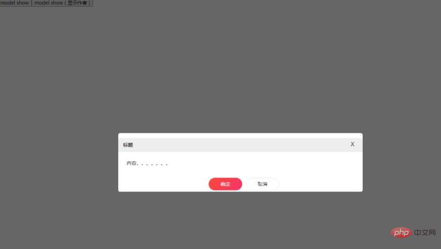
Recommended learning: "react video tutorial"
The above is the detailed content of How to implement pop-up modal box in react. For more information, please follow other related articles on the PHP Chinese website!

Hot AI Tools

Undresser.AI Undress
AI-powered app for creating realistic nude photos

AI Clothes Remover
Online AI tool for removing clothes from photos.

Undress AI Tool
Undress images for free

Clothoff.io
AI clothes remover

AI Hentai Generator
Generate AI Hentai for free.

Hot Article

Hot Tools

Notepad++7.3.1
Easy-to-use and free code editor

SublimeText3 Chinese version
Chinese version, very easy to use

Zend Studio 13.0.1
Powerful PHP integrated development environment

Dreamweaver CS6
Visual web development tools

SublimeText3 Mac version
God-level code editing software (SublimeText3)

Hot Topics
 1378
1378
 52
52
 How to build a real-time chat app with React and WebSocket
Sep 26, 2023 pm 07:46 PM
How to build a real-time chat application using React and WebSocket Introduction: With the rapid development of the Internet, real-time communication has attracted more and more attention. Live chat apps have become an integral part of modern social and work life. This article will introduce how to build a simple real-time chat application using React and WebSocket, and provide specific code examples. 1. Technical preparation Before starting to build a real-time chat application, we need to prepare the following technologies and tools: React: one for building
 Guide to React front-end and back-end separation: How to achieve decoupling and independent deployment of front-end and back-end
Sep 28, 2023 am 10:48 AM
React front-end and back-end separation guide: How to achieve front-end and back-end decoupling and independent deployment, specific code examples are required In today's web development environment, front-end and back-end separation has become a trend. By separating front-end and back-end code, development work can be made more flexible, efficient, and facilitate team collaboration. This article will introduce how to use React to achieve front-end and back-end separation, thereby achieving the goals of decoupling and independent deployment. First, we need to understand what front-end and back-end separation is. In the traditional web development model, the front-end and back-end are coupled
 How to build simple and easy-to-use web applications with React and Flask
Sep 27, 2023 am 11:09 AM
How to use React and Flask to build simple and easy-to-use web applications Introduction: With the development of the Internet, the needs of web applications are becoming more and more diverse and complex. In order to meet user requirements for ease of use and performance, it is becoming increasingly important to use modern technology stacks to build network applications. React and Flask are two very popular frameworks for front-end and back-end development, and they work well together to build simple and easy-to-use web applications. This article will detail how to leverage React and Flask
 How to build a reliable messaging app with React and RabbitMQ
Sep 28, 2023 pm 08:24 PM
How to build a reliable messaging application with React and RabbitMQ Introduction: Modern applications need to support reliable messaging to achieve features such as real-time updates and data synchronization. React is a popular JavaScript library for building user interfaces, while RabbitMQ is a reliable messaging middleware. This article will introduce how to combine React and RabbitMQ to build a reliable messaging application, and provide specific code examples. RabbitMQ overview:
 React responsive design guide: How to achieve adaptive front-end layout effects
Sep 26, 2023 am 11:34 AM
React Responsive Design Guide: How to Achieve Adaptive Front-end Layout Effects With the popularity of mobile devices and the increasing user demand for multi-screen experiences, responsive design has become one of the important considerations in modern front-end development. React, as one of the most popular front-end frameworks at present, provides a wealth of tools and components to help developers achieve adaptive layout effects. This article will share some guidelines and tips on implementing responsive design using React, and provide specific code examples for reference. Fle using React
 React code debugging guide: How to quickly locate and solve front-end bugs
Sep 26, 2023 pm 02:25 PM
React code debugging guide: How to quickly locate and resolve front-end bugs Introduction: When developing React applications, you often encounter a variety of bugs that may crash the application or cause incorrect behavior. Therefore, mastering debugging skills is an essential ability for every React developer. This article will introduce some practical techniques for locating and solving front-end bugs, and provide specific code examples to help readers quickly locate and solve bugs in React applications. 1. Selection of debugging tools: In Re
 React Router User Guide: How to implement front-end routing control
Sep 29, 2023 pm 05:45 PM
ReactRouter User Guide: How to Implement Front-End Routing Control With the popularity of single-page applications, front-end routing has become an important part that cannot be ignored. As the most popular routing library in the React ecosystem, ReactRouter provides rich functions and easy-to-use APIs, making the implementation of front-end routing very simple and flexible. This article will introduce how to use ReactRouter and provide some specific code examples. To install ReactRouter first, we need
 How to build a fast data analysis application using React and Google BigQuery
Sep 26, 2023 pm 06:12 PM
How to use React and Google BigQuery to build fast data analysis applications Introduction: In today's era of information explosion, data analysis has become an indispensable link in various industries. Among them, building fast and efficient data analysis applications has become the goal pursued by many companies and individuals. This article will introduce how to use React and Google BigQuery to build a fast data analysis application, and provide detailed code examples. 1. Overview React is a tool for building


