What to do if css3 rotation appears jagged?
Solution to jaggedness in css3 rotation: 1. Add "translateZ(0)" after the CSS3 transform attribute; 2. Use the "overflow:hidden;" of the outer container of the element to add the element "margin:- 1px;”; 3. When no border is needed, set the border attribute color of the element to transparent or the same as the background color.

The operating environment of this tutorial: Windows 10 system, css3 version, DELL G3 computer
What should I do if the css3 rotation appears jagged?
Solution to the jagged effect when using CSS3 transform rotate
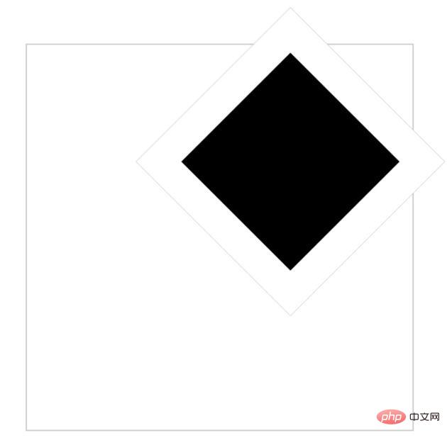
Today, a friend encountered some problems while learning CSS3. After transform rotate, the problem appeared. A "border" of the same color as the background. When I first saw it, I was very curious. I hadn't studied it as carefully as he did, and I had never encountered this problem.
This article only discusses the problem of aliasing.
Solution:
1. Add translateZ(0) after the CSS3 transform attribute
2. On mobile phones, use the overflow:hidden; of the outer container of the element to add the element margin:-1px;
3. When no border is required, set the border attribute color of the element to transparent or the same as the background color
Details:

The code is as follows:
nbsp;html>


    <title>分享图标</title>
    <style>
        * {
            margin: 0;
            padding: 0;
        }

        .container {
            position: relative;
            margin: 5% auto;
            border: 1px solid #cccccc;
            width: 300px;
            height: 300px;
        }

        .bor {
            position: relative;
            top: 2%;
            left: 40%;
            width: 40%;
            height: 40%;
            border: 25px solid white;
            transform: rotate(45deg);
            -webkit-transform: rotate(45deg);
            background-color: black;
        }
    </style>


    <div>
        <div>
        </div>
    </div>
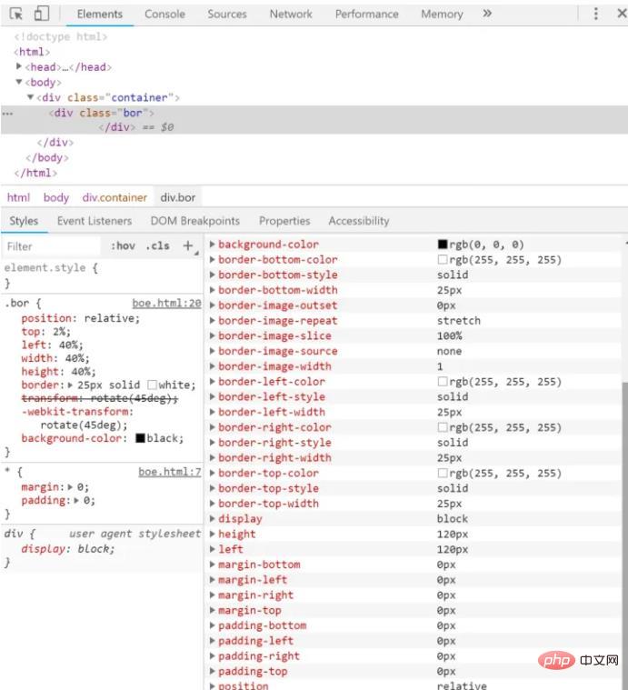
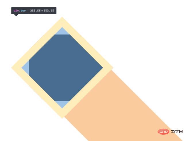
I found that the color of the "border" is the same as the background color, the values of the elements are normal as follows, and the element itself has been bordered, so I think it may be rendered by itself The problem.

After consulting the information, there are three methods:
1. Add translateZ(0)
# after the CSS3 transform attribute 
.container {
            position: relative;
            left: 100px;
            top: 300px;
            overflow: hidden;
        }

        .bor {
            margin: -1px;
            width: 200px;
            height: 200px;
            transform: rotate(45deg);
            -webkit-transform: rotate(45deg);
            border: 25px solid white;
            background-color: black;
        }


css video tutorial"
The above is the detailed content of What to do if css3 rotation appears jagged?. For more information, please follow other related articles on the PHP Chinese website!

Hot AI Tools

Undresser.AI Undress
AI-powered app for creating realistic nude photos

AI Clothes Remover
Online AI tool for removing clothes from photos.

Undress AI Tool
Undress images for free

Clothoff.io
AI clothes remover

AI Hentai Generator
Generate AI Hentai for free.

Hot Article

Hot Tools

Notepad++7.3.1
Easy-to-use and free code editor

SublimeText3 Chinese version
Chinese version, very easy to use

Zend Studio 13.0.1
Powerful PHP integrated development environment

Dreamweaver CS6
Visual web development tools

SublimeText3 Mac version
God-level code editing software (SublimeText3)

Hot Topics
 How to achieve wave effect with pure CSS3? (code example)
Jun 28, 2022 pm 01:39 PM
How to achieve wave effect with pure CSS3? This article will introduce to you how to use SVG and CSS animation to create wave effects. I hope it will be helpful to you!
 Use CSS skillfully to realize various strange-shaped buttons (with code)
Jul 19, 2022 am 11:28 AM
This article will show you how to use CSS to easily realize various weird-shaped buttons that appear frequently. I hope it will be helpful to you!
 How to hide elements in css without taking up space
Jun 01, 2022 pm 07:15 PM
Two methods: 1. Using the display attribute, just add the "display:none;" style to the element. 2. Use the position and top attributes to set the absolute positioning of the element to hide the element. Just add the "position:absolute;top:-9999px;" style to the element.
 Detailed example of how to solve the problem of CSS gradient aliasing!
Nov 25, 2022 pm 04:43 PM
This article will introduce to you how to solve the aliasing problem caused by using gradient graphics. The so-called CSS gradient aliasing disappearing technique can be done once you know it. Let's take a look at how to achieve it~ I hope it will be helpful to everyone. !
 How to implement lace borders in css3
Sep 16, 2022 pm 07:11 PM
In CSS, you can use the border-image attribute to achieve a lace border. The border-image attribute can use images to create borders, that is, add a background image to the border. You only need to specify the background image as a lace style; the syntax "border-image: url (image path) offsets the image border width inward. Whether outset is repeated;".
 It turns out that text carousel and image carousel can also be realized using pure CSS!
Jun 10, 2022 pm 01:00 PM
How to create text carousel and image carousel? The first thing everyone thinks of is whether to use js. In fact, text carousel and image carousel can also be realized using pure CSS. Let’s take a look at the implementation method. I hope it will be helpful to everyone!
 How to enlarge the image by clicking the mouse in css3
Apr 25, 2022 pm 04:52 PM
Implementation method: 1. Use the ":active" selector to select the state of the mouse click on the picture; 2. Use the transform attribute and scale() function to achieve the picture magnification effect, the syntax "img:active {transform: scale(x-axis magnification, y Axis magnification);}".
 css3 what is adaptive layout
Jun 02, 2022 pm 12:05 PM
Adaptive layout, also known as "responsive layout", refers to a web page layout that can automatically recognize the screen width and make corresponding adjustments; such a web page can be compatible with multiple different terminals instead of making a specific version for each terminal. . Adaptive layout was born to solve the problem of mobile web browsing, and can provide a good user experience for users using different terminals.


