How to achieve click-to-enlarge image using pure css
Pure CSS method to achieve click-to-enlarge images: 1. Create an HTML sample file; 2. Set "
"; 3. Use the "function showBgImg(e) {...}" method to achieve the effect of clicking on the image to enlarge it .

The operating environment of this tutorial: Windows 10 system, HTML5&&CSS3 version, DELL G3 computer
How to use pure css to click on the image to enlarge it?
Css actual training picture, click to enlarge
I. Background
This is a very common function, usually displayed on the website It's a thumbnail. After you click on the thumbnail, the enlarged picture will be displayed in a pop-up box
So how is this function implemented? I just learned the basic knowledge of CSS, and now I can do the actual thing Operation
1. Idea
First split the structure of the page:
- There is a pop-up window that displays a large image in the pop-up window; and The pop-up window is hidden by default
- You can place many pictures on the main page and add click events
- After clicking, the pop-up window displays and displays the big picture
- Click on the big picture After the following, close the pop-up window
II. Implementation
According to the above description, we first implement a basic version, first write HTML
<body>
<!-- 先来实现弹窗 -->
<div class='modal' id='modal'>
<img src="/static/imghw/default1.png" data-src="https://img.php.cn/upload/image/622/244/178/1674887775582644.jpg" class="lazy" id='bgImg' / alt="How to achieve click-to-enlarge image using pure css" >
</div>
<!-- 下面则是主页内容,先只给几个图片 -->
<div>
<img src="/static/imghw/default1.png" data-src="https://img.php.cn/upload/image/622/244/178/1674887775582644.jpg" class="lazy" class='thum-img'
src='http://f.hiphotos.baidu.com/image/pic/item/80cb39dbb6fd5266cdb2ba16a718972bd4073612.jpg' />
</div>
</body>Then add the corresponding style, which requires the modal to be hidden by default, so as follows (in order to better distinguish the pop-up window, the background color and border are added)
<style>
.modal {
    display: none;
    margin: auto;
    width: 80%;
    height: 80%;
    background-color: rgb(0, 0, 0, 0.89);
    z-index: 1;
    border: 1px solid rgb(255,255,255,1);
}

.modal>img {
    display: block;
    margin: auto;
    padding: 10%;
    max-width: 60%;
    max-height: 60%;
}

.thum-img {
    width: 200px;
    height: 200px;
    margin: auto;
    display: block;
    padding: 40px;
}

</style>The next step is to click on the logic of displaying the large image, which is implemented with the help of js.
<script>
var modal = document.getElementById('modal');
var bgImg = document.getElementById('bgImg');
var thumImg = document.getElementById('thumImg');
thumImg.onclick = function() {
modal.style.display = 'block';
bgImg.src = this.src;
}
bgImg.onclick = function() {
modal.style.display = 'none';
}
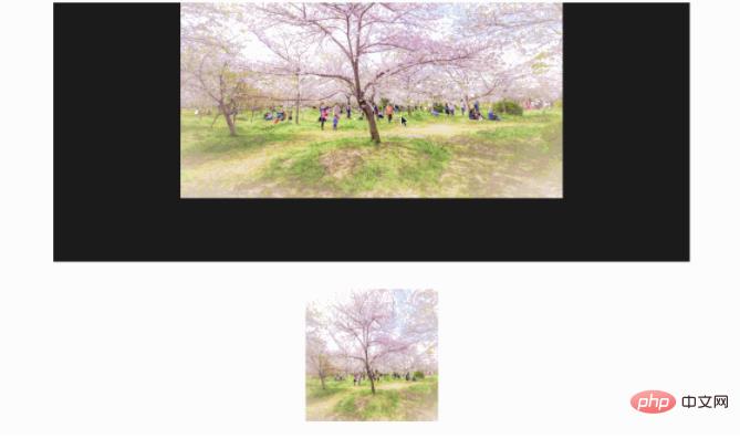
</script>After assembling the above implementation into an html, test it directly and view it. The demonstration effect is as follows

Although the above has achieved the results we expected, there are a few points that we are not satisfied with.
- is not the pop-up effect we expected. The original The picture is squeezed down
- It would be better if there is an enlarged animation effect in the pop-up window (just can use the animation learned before)
- When there are many pictures in the picture, How to click to enlarge
III. Advanced
First of all, if you want it to be a real pop-up window without affecting the existing layout, you usually do it by setting the position, as we do You can add another layer outside the modal to become
<div style='position:fixed'>
<div class='modal' id='modal'>
<img src="/static/imghw/default1.png" data-src="https://img.php.cn/upload/image/742/960/488/1674887791873102.jpg" class="lazy" id='bgImg' / alt="How to achieve click-to-enlarge image using pure css" >
</div>
</div>The second is that the style of the pop-up window is too ugly. We can use the border shadow we learned before to achieve a beautiful pop-up effect,
- Change to fill the background of all images
- Remove the background color, add a shadow, and add a white border
The modified css is as follows
.modal {
    display: none;
    margin: auto;
    padding-top: 5%;
    width: 50%;
    height: 80%;
    z-index: 1;
    background-color: white;
}

.modal img {
    display: block;
    padding: 10px;
    margin: auto;
    max-width: 100%;
    max-height: 100%;
    box-shadow: 0 2px 6px rgb(0, 0, 0, 0.2), 0 10px 20px rgb(0, 0, 0, 0.2);
    border-radius: 12px;
    border: 1px solid white;
}Next consider adding animation and a magnification effect
@keyframes zoom {
    from {transform: scale(0.1)}
    to {transform: scale(1)}
}

.modal img {
    animation-name: zoom;
    animation-duration: 0.6s;
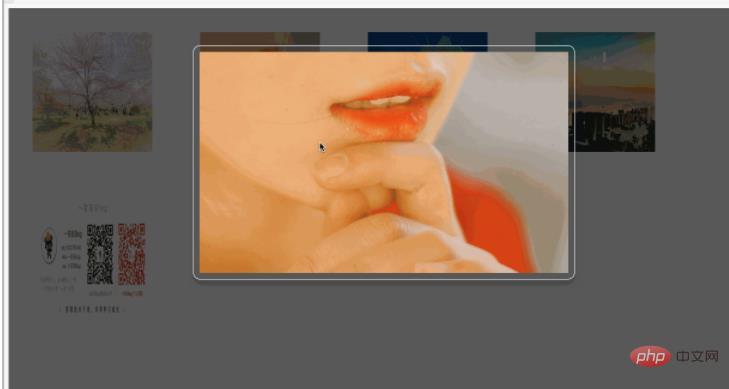
}Then let’s look at the demonstration effect as follows

The next step is to turn this into a universal solution to support multiple images. This is mainly a modification of the image click event. Just make some changes to the hard-coded parts above

IV. Source code
Finally give all the source code
<!DOCTYPE html>
<html>
<head>
<meta charset="utf-8">
<title>小灰灰css学习笔记</title>
<style>
#modal {
display: none;
}
.modal {
margin: auto;
padding-top: 5%;
width: 50%;
height: 80%;
z-index: 1;
}
.modal img {
animation-name: zoom;
animation-duration: 0.6s;
display: block;
padding: 10px;
margin: auto;
max-width: 100%;
max-height: 100%;
box-shadow: 0 2px 6px rgb(0, 0, 0, 0.2), 0 10px 20px rgb(0, 0, 0, 0.2);
border-radius: 12px;
border: 1px solid white;
}
@keyframes zoom {
from {transform: scale(0.1)}
to {transform: scale(1)}
}
.thum-img {
float: left;
width: 200px;
height: 200px;
margin: auto;
display: block;
padding: 40px;
}
</style>
</head>
<body>
<!-- 先来实现弹窗 -->
<div style='position:fixed;width:100%;height:100%;background-color:rgb(0,0,0,0.65)' id='modal'>
<div class='modal' id='modalw'>
<img id='bgImg' / alt="How to achieve click-to-enlarge image using pure css" >
</div>
</div>
<!-- 下面则是主页内容,先只给几个图片 -->
<div>
<img onclick='showBgImg(this)' class='thum-img'
src='http://f.hiphotos.baidu.com/image/pic/item/80cb39dbb6fd5266cdb2ba16a718972bd4073612.jpg' />
<img class='thum-img' src='http://a.hiphotos.baidu.com/image/pic/item/e61190ef76c6a7ef5e886d03f1faaf51f3de666d.jpg' onclick='showBgImg(this)'/ alt="How to achieve click-to-enlarge image using pure css" >
<img class='thum-img' src='http://g.hiphotos.baidu.com/image/pic/item/730e0cf3d7ca7bcb747b4a5cb2096b63f624a845.jpg' onclick='showBgImg(this)'/ alt="How to achieve click-to-enlarge image using pure css" >
<img class='thum-img' src='http://c.hiphotos.baidu.com/image/pic/item/b21c8701a18b87d6657856e70c0828381f30fd14.jpg' onclick='showBgImg(this)'/ alt="How to achieve click-to-enlarge image using pure css" >
<img class='thum-img' src='https://raw.githubusercontent.com/liuyueyi/Source/master/img/info/blogInfoV2.png' onclick='showBgImg(this)'/ alt="How to achieve click-to-enlarge image using pure css" >
</div>
<script>
var modal = document.getElementById('modal');
var bgImg = document.getElementById('bgImg');
function showBgImg(e) {
modal.style.display = 'block';
bgImg.src = e.src;
}
bgImg.onclick = function() {
modal.style.display = 'none';
}
</script>
</body>
</html>The above is the detailed content of How to achieve click-to-enlarge image using pure css. For more information, please follow other related articles on the PHP Chinese website!

Hot AI Tools

Undresser.AI Undress
AI-powered app for creating realistic nude photos

AI Clothes Remover
Online AI tool for removing clothes from photos.

Undress AI Tool
Undress images for free

Clothoff.io
AI clothes remover

AI Hentai Generator
Generate AI Hentai for free.

Hot Article

Hot Tools

Notepad++7.3.1
Easy-to-use and free code editor

SublimeText3 Chinese version
Chinese version, very easy to use

Zend Studio 13.0.1
Powerful PHP integrated development environment

Dreamweaver CS6
Visual web development tools

SublimeText3 Mac version
God-level code editing software (SublimeText3)

Hot Topics
 1378
1378
 52
52
 How to write split lines on bootstrap
Apr 07, 2025 pm 03:12 PM
There are two ways to create a Bootstrap split line: using the tag, which creates a horizontal split line. Use the CSS border property to create custom style split lines.
 How to insert pictures on bootstrap
Apr 07, 2025 pm 03:30 PM
There are several ways to insert images in Bootstrap: insert images directly, using the HTML img tag. With the Bootstrap image component, you can provide responsive images and more styles. Set the image size, use the img-fluid class to make the image adaptable. Set the border, using the img-bordered class. Set the rounded corners and use the img-rounded class. Set the shadow, use the shadow class. Resize and position the image, using CSS style. Using the background image, use the background-image CSS property.
 How to resize bootstrap
Apr 07, 2025 pm 03:18 PM
To adjust the size of elements in Bootstrap, you can use the dimension class, which includes: adjusting width: .col-, .w-, .mw-adjust height: .h-, .min-h-, .max-h-
 The Roles of HTML, CSS, and JavaScript: Core Responsibilities
Apr 08, 2025 pm 07:05 PM
HTML defines the web structure, CSS is responsible for style and layout, and JavaScript gives dynamic interaction. The three perform their duties in web development and jointly build a colorful website.
 How to set up the framework for bootstrap
Apr 07, 2025 pm 03:27 PM
To set up the Bootstrap framework, you need to follow these steps: 1. Reference the Bootstrap file via CDN; 2. Download and host the file on your own server; 3. Include the Bootstrap file in HTML; 4. Compile Sass/Less as needed; 5. Import a custom file (optional). Once setup is complete, you can use Bootstrap's grid systems, components, and styles to create responsive websites and applications.
 How to use bootstrap button
Apr 07, 2025 pm 03:09 PM
How to use the Bootstrap button? Introduce Bootstrap CSS to create button elements and add Bootstrap button class to add button text
 How to view the date of bootstrap
Apr 07, 2025 pm 03:03 PM
Answer: You can use the date picker component of Bootstrap to view dates in the page. Steps: Introduce the Bootstrap framework. Create a date selector input box in HTML. Bootstrap will automatically add styles to the selector. Use JavaScript to get the selected date.
 How to use bootstrap in vue
Apr 07, 2025 pm 11:33 PM
Using Bootstrap in Vue.js is divided into five steps: Install Bootstrap. Import Bootstrap in main.js. Use the Bootstrap component directly in the template. Optional: Custom style. Optional: Use plug-ins.


