Solutions for css animations that are not sliding smoothly: 1. Change the animation elements in image scaling to transform and avoid using height, width, margin or padding, etc.; 2. Turn on browser GPU hardware acceleration.

The operating environment of this tutorial: Windows 10 system, CSS3 version, DELL G3 computer
What should I do if the css animation does not slide smoothly?
CSS3 animation stuck solution
Using animation in the front-end time to realize the animation transition of the homepage in the H5 page, it is very simple An effect is that a customer service avatar is loaded on the homepage, zoomed in first, stayed there for 700ms and then zoomed to the top. The code is as follows
nbsp;html>
<meta>
<meta>
<script></script>
<title>首页加载动画</title>
<style>
.welcome-main{
display: none;
padding-bottom: 40px;
}
.top-info{
width: 100%;
position: absolute;
left: 0;
top: 93px;
}
.wec-img{
width: 175px;
height: 175px;
position: relative;
padding: 23px;
box-sizing: border-box;
margin: 0 auto;
}
.wec-img:before{
content: '';
position: absolute;
left: 0;
top: 0;
width: 100%;
height: 100%;
background: url("./images/kf-welcome-loading.png");
background-size: 100%;
}
.wec-img .img-con{
width: 100%;
height: 100%;
border-radius: 50%;
/*box-sizing: border-box;*/
background: url("./images/kf_1.jpg");
background-size: 100%;
padding: 1px;
}
.wec-img .img-con img{
width: 100%;
height: 100%;
border-radius: 50%;
}
.loaded .wec-img{
-webkit-transform-origin: center top;
}
.loading.welcome-main{
display: block;
}
.loading .wec-img{
-webkit-animation:fadeIn .3s ease both;
}
.loading .wec-img:before{
-webkit-animation:rotate .6s .2s linear both;
}
.loaded .top-info{
-webkit-animation:mainpadding 1s 0s ease both;
}
.loaded .wec-img{
-webkit-animation:imgSmall 1s 0s ease both; }
@-webkit-keyframes mainpadding{
0%{-webkit-transform:translateY(0)
}
100%{-webkit-transform:translateY(-87px)
}
}
@-webkit-keyframes imgSmall{
0%{
width: 175px;
height: 175px;
padding: 23px;
}
100%{
width: 60px;
height: 60px;
padding: 0;
}
}
@-webkit-keyframes fadeIn{
0%{opacity:0;-webkit-transform:scale(.3)}
100%{opacity:1;-webkit-transform:scale(1)}
}
@-webkit-keyframes rotate{
0%{opacity:0;-webkit-transform:rotate(0deg);}
50%{opacity:1;-webkit-transform:rotate(180deg);}
100%{opacity:0;-webkit-transform:rotate(360deg);}
}
</style>
<div>
<div>
<div><p><img src="/static/imghw/default1.png" data-src="" class="lazy" alt="What to do if the css animation is not sliding smoothly" ></p></div>
</div>
</div>
<script>
$('.welcome-main').addClass('loading');
setTimeout(function(){
$('.hi.fst').removeClass('loading');
$('.welcome-main').addClass('loaded');
},700); </script>
The test on chrome was ok, but when submitting it to QA for testing, it was found that some models, such as Huawei (system 4.2) and Oppo (system 5.1), had lags.
I was puzzled, and then I referred to the article "In-depth understanding of the performance issues of CSS animations and transitions in browsers" and changed the animation elements in to transform. As follows
@-webkit-keyframes imgSmall{
  0%{
      -webkit-transform:scale(1);
  }
  100%{
      -webkit-transform:scale(.465);
  }
}Sure enough, the lagging problem is solved.
The article explains in-depth browser understanding of the performance issues of CSS animations and transitions. Modern browsers usually have two important execution threads, and these two threads work together to Rendering a web page: main thread and composition thread.
Generally, the main thread is responsible for: running JavaScript; calculating the CSS style of HTML elements; laying out the page; drawing elements into one or more bitmaps; handing these bitmaps to the composition thread.
Accordingly, the composition thread is responsible for: drawing the bitmap to the screen through the GPU; notifying the main thread to update the bitmap of the parts of the page that are visible or about to become visible; calculating which part of the page is visible ; Calculate which part is about to become visible when you scroll the page; when you scroll the page, move the corresponding element to the visible area.
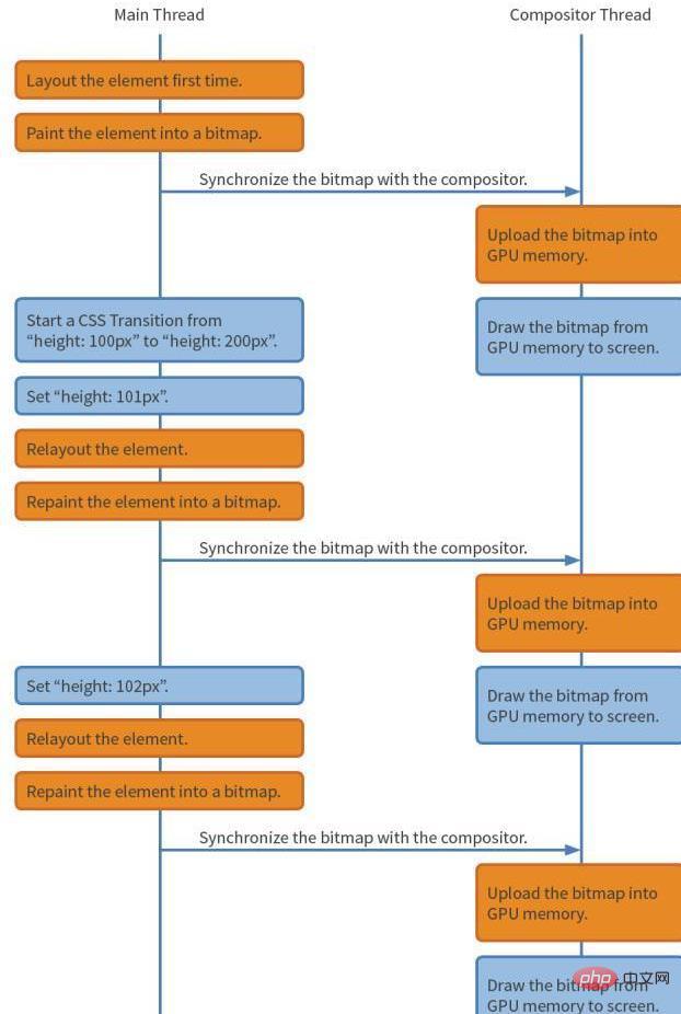
Suppose we want the height of an element to change from 100 px to 200 px, like this:
div {
    height: 100px;
    transition: height 1s linear;
}

div:hover {
    height: 200px;
}The main thread and the composition thread will perform the corresponding operations according to the flow chart below. Note that operations in the orange box may be more time-consuming, while operations in the blue box are faster.

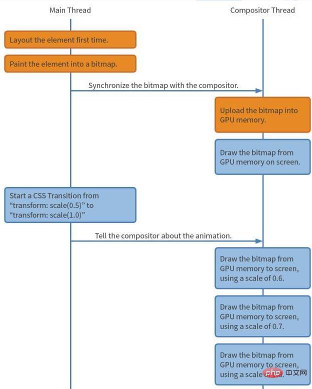
Use transform:scale to implement
div {
    transform: scale(0.5);
    transition: transform 1s linear;
}

div:hover {
    transform: scale(1.0);
}The process is as follows:

In other words, Using transform, the browser only needs to generate the bitmap of this element once and submit it to the GPU for processing when the animation starts. After that, the browser does not need to do any layout, drawing and submitting bitmap operations. As a result, the browser can take full advantage of the GPU's capabilities to quickly draw bitmaps in different positions, perform rotation or scaling.
In order to confirm this theory from an order of magnitude, I opened chrome's Timeline to view the page FPS

Among them, when using height as an animation element, The FPS during the switching process is only 44. We know that 60 frames per second is the most suitable interaction for the human eye. If it is less than 60, the human eye can clearly feel it, which is the reason for the lag.

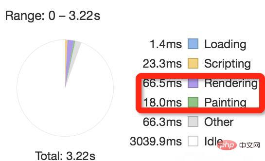
rendering 和 painting 所花的时间如下:

再来看看用 transform:scale

FPS 达到 66,且 rendering 和 painting 时间减少了 3 倍。
到此为止问题是解决了,隔了几天,看到一篇解决 Chrome 动画”卡顿”的办法,发现还能通过开启硬件加速的方式优化动画,于是又试了一遍。
webkit-transform: translate3d(0,0,0);
-moz-transform: translate3d(0,0,0);
-ms-transform: translate3d(0,0,0);
-o-transform: translate3d(0,0,0);
transform: translate3d(0,0,0);
惊人的事情发生了,FPS 达到 72:


尽量使用 transform 当成动画属性,避免使用 height,width,margin,padding 等;
要求较高时,可以开启浏览器开启 GPU 硬件加速。
推荐学习:《css视频教程》
The above is the detailed content of What to do if the css animation is not sliding smoothly. For more information, please follow other related articles on the PHP Chinese website!


