CSS native nested syntax is here! Quick guide!
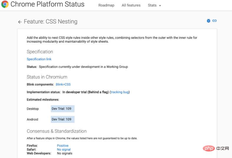
Currently, the CSS native nesting syntax is in developer trial status, and the CSS working group is formulating relevant specifications. The Chrome browser is expected to officially launch the CSS native nesting function in version 112.
Hello everyone, my name is CUGGZ.
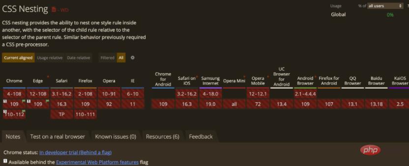
Recently while reading caniuse.com, I discovered that Chrome and Edge browsers will experimentally support CSS native nested syntax in version 109!

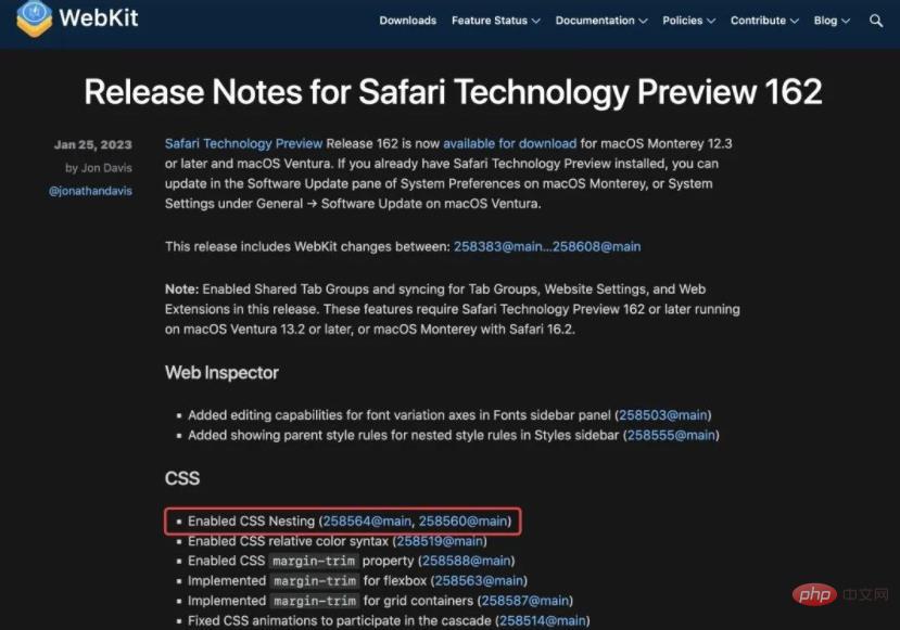
On January 10, Chrome 109 was released; on January 26, Safari Technical Preview 162 was released. Both browser versions bring experimental support for CSS nesting. Chrome officials pointed out that adding the ability to nest CSS style rules within other style rules will combine selectors from outside with internal rules to improve the modularity and maintainability of style sheets.


Let’s take a look at how CSS nested syntax is used!
Basic concept
The so-called nesting is to put one CSS rule in another (nested rule), and the selector of the child rule will be relative to the selector of the parent rule. This facilitates code modularity and maintainability. The nesting feature, which was previously only available in CSS preprocessors, can now be used in native CSS.
In fact, CSS nesting is similar to Sass nesting. For example, for the following CSS style:
table.colortable td {
  text-align:center;
}

table.colortable td.c {
  text-transform:uppercase;
}

table.colortable td:first-child, table.colortable td:first-child+td {
  border:1px solid black;
}

table.colortable th {
  text-align:center;
  background:black;
  color:white;
}如果使用 CSS 嵌套时,就是这样的:
table.colortable {
  & td {
    text-align:center;
    &.c { text-transform:uppercase }
    &:first-child, &:first-child + td { border:1px solid black }
  }
  & th {
    text-align:center;
    background:black;
    color:white;
  }
}可以看到,使用嵌套不仅消除重复,相关规则的分组还提高了生成的 CSS 的可读性和可维护性。
嵌套规则
嵌套规则可以使用嵌套选择器(&) 直接引用父规则的匹配元素,或者使用相对选择器语法指定“后代”以外的关系。
.foo {
  color: red;

  &:hover {
    color: blue;
  }
}

/* 相当于: */

.foo { color: red; }
.foo:hover { color: blue; }.foo {
color: red;
+ .bar {
color: blue;
}
}
/* 相当于: */
.foo { color: red; }
.foo + .bar { color: blue; }但是,以标识符(类型选择器)开始嵌套选择器是无效的:
div {
  color: red;

  input {
    margin: 1em;
  }
}
/* 无效,因为 input 是一个标识符 */如果想继续这样编写,就需要稍微进行修改:
div {
  color: red;

  & input { margin: 1em; }
  /* 有效,不再以标识符开头 */

  :is(input) { margin: 1em; }
  /* 有效,以冒号开头,并且等同于之前的规则 */
}更多嵌套规则详见 CSS 嵌套规范草案:https://drafts.csswg.org/css-nesting/
嵌套选择器
在使用嵌套规则时,必须能够引用父规则匹配的元素。为此,规范中定义了一个新的选择器,即嵌套选择器,写为 & 。
当在嵌套样式规则的选择器中使用时,嵌套选择器表示与父规则匹配的元素。当在任何其他上下文中使用时,它表示与该上下文中的 :scope 相同的元素。
嵌套选择器可以通过 :is() 选择器将其替换为父样式规则的选择器。例如:
a, b {
  & c { color: blue; }
}这就相当于:
:is(a, b) c { color: blue; }嵌套选择器不能表示伪元素(与 :is() 的行为相同):
.foo, .foo::before, .foo::after {
  color: red;

  &:hover { color: blue; }
}这里,& 只代表.foo匹配的元素,它等同于:
.foo, .foo::before, .foo::after {
  color: red;
}

.foo:hover {
  color: blue;
}嵌套选择器的特异性(权重)等于父样式规则的选择器列表中复杂选择器中最大的特异性(与 :is() 的行为相同):
#a, b {
  & c { color: blue; }
}

.foo c { color: red; }DOM 结构如下:
<b>
  <c>Blue text</c>
</b>
文本将是蓝色的,而不是红色的。& 的特异度是 #a([1,0,0]) 和 b([0,0,1]) 特异性中较大的一个,所以是 [1,0,0],而整个 & c 选择器具有特异性 [1,0,1],它大于 .foo c ([0,1,1]) 的特异性。
值得注意的是,这与将嵌套手动扩展为非嵌套规则时得到的结果不同,因为 color: blue 声明将由 b c 选择器 ([0,0,2]) 匹配,而不是#a c ([1,0,1])。
小结
目前,CSS 原生嵌套语法处于开发者试用状态,CSS 工作组正在制定相关规范,Chrome 浏览器预计将于 112 版本正式推出 CSS 原生嵌套功能。
由于 CSS 嵌套语法规范尚未完成,随时可能进行更改。因此,本文所展示的规则可能会有所变化。期待不久的将来 CSS 原生嵌套语法登录浏览器正式版本!
推荐学习:《CSS视频教程》
The above is the detailed content of CSS native nested syntax is here! Quick guide!. For more information, please follow other related articles on the PHP Chinese website!

Hot AI Tools

Undresser.AI Undress
AI-powered app for creating realistic nude photos

AI Clothes Remover
Online AI tool for removing clothes from photos.

Undress AI Tool
Undress images for free

Clothoff.io
AI clothes remover

Video Face Swap
Swap faces in any video effortlessly with our completely free AI face swap tool!

Hot Article

Hot Tools

Notepad++7.3.1
Easy-to-use and free code editor

SublimeText3 Chinese version
Chinese version, very easy to use

Zend Studio 13.0.1
Powerful PHP integrated development environment

Dreamweaver CS6
Visual web development tools

SublimeText3 Mac version
God-level code editing software (SublimeText3)

Hot Topics
 1389
1389
 52
52
 The Roles of HTML, CSS, and JavaScript: Core Responsibilities
Apr 08, 2025 pm 07:05 PM
HTML defines the web structure, CSS is responsible for style and layout, and JavaScript gives dynamic interaction. The three perform their duties in web development and jointly build a colorful website.
 How to use bootstrap in vue
Apr 07, 2025 pm 11:33 PM
Using Bootstrap in Vue.js is divided into five steps: Install Bootstrap. Import Bootstrap in main.js. Use the Bootstrap component directly in the template. Optional: Custom style. Optional: Use plug-ins.
 How to write split lines on bootstrap
Apr 07, 2025 pm 03:12 PM
There are two ways to create a Bootstrap split line: using the tag, which creates a horizontal split line. Use the CSS border property to create custom style split lines.
 Understanding HTML, CSS, and JavaScript: A Beginner's Guide
Apr 12, 2025 am 12:02 AM
WebdevelopmentreliesonHTML,CSS,andJavaScript:1)HTMLstructurescontent,2)CSSstylesit,and3)JavaScriptaddsinteractivity,formingthebasisofmodernwebexperiences.
 How to use bootstrap button
Apr 07, 2025 pm 03:09 PM
How to use the Bootstrap button? Introduce Bootstrap CSS to create button elements and add Bootstrap button class to add button text
 How to resize bootstrap
Apr 07, 2025 pm 03:18 PM
To adjust the size of elements in Bootstrap, you can use the dimension class, which includes: adjusting width: .col-, .w-, .mw-adjust height: .h-, .min-h-, .max-h-
 How to set up the framework for bootstrap
Apr 07, 2025 pm 03:27 PM
To set up the Bootstrap framework, you need to follow these steps: 1. Reference the Bootstrap file via CDN; 2. Download and host the file on your own server; 3. Include the Bootstrap file in HTML; 4. Compile Sass/Less as needed; 5. Import a custom file (optional). Once setup is complete, you can use Bootstrap's grid systems, components, and styles to create responsive websites and applications.
 How to insert pictures on bootstrap
Apr 07, 2025 pm 03:30 PM
There are several ways to insert images in Bootstrap: insert images directly, using the HTML img tag. With the Bootstrap image component, you can provide responsive images and more styles. Set the image size, use the img-fluid class to make the image adaptable. Set the border, using the img-bordered class. Set the rounded corners and use the img-rounded class. Set the shadow, use the shadow class. Resize and position the image, using CSS style. Using the background image, use the background-image CSS property.


