 Web Front-end
 CSS Tutorial
 Take a look at these front-end interview questions to help you master high-frequency knowledge points (4)
Take a look at these front-end interview questions to help you master high-frequency knowledge points (4)

10 questions every day, after 100 days, you will have mastered all the high-frequency knowledge points of front-end interviews, come on! ! ! , while reading the article, I hope you don’t look at the answers directly, but first think about whether you know it, and if so, what is your answer? Think about it and then compare it with the answer. Would it be better? Of course, if you have a better answer than mine, please leave a message in the comment area and discuss the beauty of technology together.
Interviewer: Please talk about the adaptive (adaptation) solution
Me: Uh~, okay, solve the adaptive problem The problem can be solved using "Taobao Unlimited Adaptation The layout unit uses rem", and the js required for adaptation also has documentation: Taobao's github URL, the entire code is as follows:
<style>
    *{margin: 0;padding: 0;}
    html{
        height: 37.5px;
    }
    .container{
        width: 1rem;
        height: 1rem;
        background-color: #f00;
    }
</style>
<script src="../index.js"></script>
<body>
    <div class="container">111</div>
</body>
[Related recommendations: web front-end development]
Interviewer: Talk about your understanding of responsiveness
Me: Uh~, okay, in layman’s terms, in html css, responsiveness means For: One URL can respond to multiple terminals . In short, the same URL can be adapted to different devices and different sizes. How to do this? The entire code is as follows:
<style>
    *{margin: 0;padding: 0;}
    ul{
        list-style: none;
    }
    ul li {
        display: inline-block;
        width: 100px;
        background-color: #f00;
    }
    @media only screen and (max-width: 1000px){
        ul li:last-child{
            display: none;
        }
    }
    @media only screen and (max-width: 800px){
        ul li:nth-child(5){
            display: none;
        }
    }
    @media only screen and (max-width: 500px){
        ul li:nth-child(4){
            display: none;
        }
    }
</style>
<body>
    <ul>
        <li>首页</li>
        <li>消息</li>
        <li>题库</li>
        <li>面试</li>
        <li>内容</li>
        <li>offer</li>
    </ul>
</body>Of course, you can also add responsiveness to the image. The entire code is as follows:
<style>
    *{margin: 0;padding: 0;}
    picture{
        width: 300px;
	    height: 300px;
    }
    img {
		width: 100%;
	    height: 100%;
	    object-fit: contain;
	};
    source {
		width: 80%;
	    height: 80%;
	    object-fit: contain;
	};
</style>
<body>
    <picture>
        <!-- 如果切换到不同设备上 -->
        <source srcset="../7.jpeg" media="(min-width: 1000px)">
        <source srcset="../004.jpeg" media="(min-width: 700px)">
        <!-- 默认加载该图片 -->
        <img src="../4.jpeg">
    </picture>
</body>
Interviewer : Talk about your understanding of the layout plan
Me: Uh~, okay, the layout plan has the following options based on the characteristics of the project:
1, When to use responsive layout
There is not a lot of data, the number of users is not very large, pure display projects are suitable for responsive layout
For example: the company's official website, special page
Projects that particularly pursue performance are not suitable for responsiveness, because if a lot of responsiveness is added, the loading speed will slow down.
2. What kind of layout plan should be made for the PC mobile terminal
Note: The number of visits is okay or relatively large, similar to Taobao.
The pc is a set, and a little bit of responsiveness will be added.
The mobile version is a set and will use an adaptive layout method.
3. PC design drawing
ui: 1980
Laptop: 1280
What should I do if the width of the ui drawing is not the same as the width of the computer?
1. Scale the UI image proportionally to the same size as the computer2. Change to a 1980 computer
4.Mobile design drawing
Width: 750
Because the 750 design drawing/2 is 375, which happens to be the iphone6 Size, we need to use the size of iPhone6 as the reference point.
Interviewer: What is reordering and redrawing, and how to reduce reshooting and redrawing?
Me: Uh~, okay, the summary is as follows:
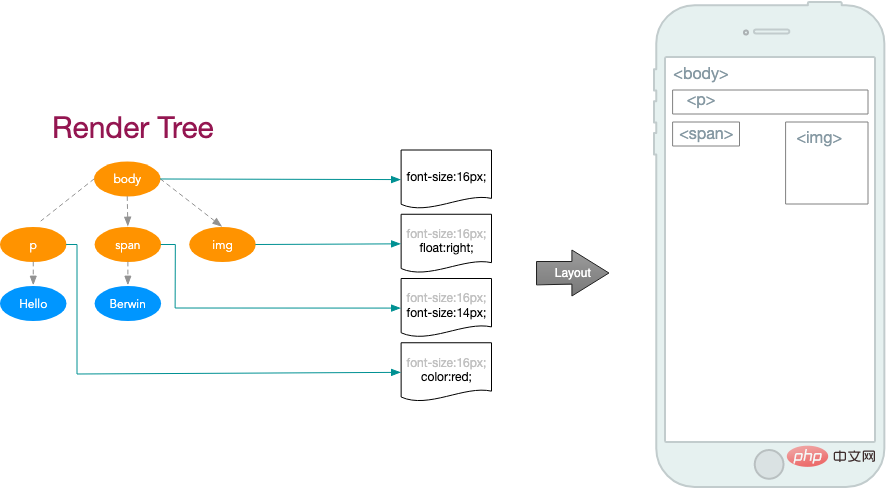
Reflow: Reflow occurs when the position of elements changes, also called reflow. At this point in the Layout phase of the critical rendering path, the exact position and size of each element within the device viewport is calculated. When the position of an element changes, the positions of its parent element and the elements behind it may change, which is extremely costly.
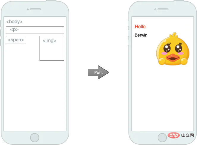
Repaint: The style of the element changes, but the position does not change. At this point in the Paint stage of the critical rendering path, each node in the render tree is converted into actual pixels on the screen. This step is often called painting or rasterization.
In addition, rearrangement will definitely cause redrawing. The following are ways to avoid excessive reshooting and redrawing
1) Use DocumentFragment for DOM operations, but now native operations are rare and basically unused
2) CSS styles should be modified in batches as much as possible
3) Avoid using table layout
4) Set the height and width of the element in advance, and do not change the position due to multiple renderings
面试官:css 动画与 js 动画哪个性能更好?
我:呃~,我对这两者的看法以及优缺点总结如下:
CSS3 的动画:
1.在性能上会稍微好一些,浏览器会对 CSS3 的动画做一些优化(比如专门新建一个图层用来跑动画)
2.代码相对简单
3.在动画控制上不够灵活
4.兼容性不好
5.部分动画功能无法实现(如滚动动画,视差滚动等)
JavaScript 的动画:
弥补了 css 缺点,控制能力很强,可以单帧的控制、变换,同时写得好完全可以兼容 IE6,并且功能强大。
总结: 对于一些复杂控制的动画,使用 javascript 会比较好。而在实现一些小的交互动效的时候,可以多考虑 CSS。
面试官:为什么会发生样式抖动?
我:呃~,因为没有指定元素具体高度和宽度,比如数据还没有加载进来时元素高度是 100px(假设这里是 100px),数据加载进来后,因为有了数据,然后元素被撑大,所有出现了抖动。
面试官:你做前端有多少时间花在写 css 上?
我:呃~,如果说是开发阶段,我会用 20%-30% 的时间写 CSS。但是如果项目是采用某种组件库的时候,比如:UI 设计时遵循了 element-ui 的规范,而开发使用的 UI 框架为 element-ui,因此大多数的界面并不需要写大量的 CSS,因为预设样式已足够使用。
面试官:介绍 CSS 隐藏页面中某个元素的几种方法
我:呃~,好的,隐藏元素的方法有如下几种:
display: none; :通过 CSS 操控 display,移出文档流。
opacity: 0; :透明度为 0,仍在文档流中,当作用于其上的事件(如点击)仍有效。
visibility: hidden; :透明度为 0,仍在文档流中,但作用于其上的事件(如点击)无效,这也是 visibility:hidden 与 opacity: 0 的区别。
content-visibility; :移出文档流,但是再次显示时消耗性能低。
position: absolute;top: -9000px;left: -9000px; :绝对定位于当前页面的不可见位置。
font-size: 0; :字体大小设置为 0
面试官:CSS 如何设置一行或多行超出显示省略号?
我:呃~,好的,整出代码如下:
<style>
  div{
    width: 100px;
    /* 使用如下来设置一行行超出显示省略号 */
    overflow: hidden;
    text-overflow: ellipsis;
    white-space: nowrap;
  }
  p{
    width: 100px;
    /* 使用 -webkit-line-clamp 来设置多行超出显示省略号 */
    overflow: hidden;
    display: -webkit-box;
    -webkit-box-orient: vertical;
    -webkit-line-clamp: 2;
  }
</style>
<body>
  <div>
    1222222222222222222222222222222
  </div>
  <p>Lorem ipsum dolor sit amet consectetur adipisicing elit. Iste esse velit illum vel cumque obcaecati. Quae, dicta nihil quod vero mollitia dignissimos autem, necessitatibus, iure a debitis temporibus eaque ratione.</p>
</body>
面试官:flex 布局中 order 有何作用?
我:呃~,order 属性定义 Flex 布局中子元素的排列顺序,数值越小,排列越靠前,默认为 0。整出代码如下:
<style>
  .container{
    width: 500px;
    border: 5px solid #ddd;
    display: flex;
    justify-content: space-around;
  }
  .container div{
    width: 100px;
    height: 100px;
    background-color: #f00;
  }
  #d1{
    order: 3;
  }
  #d2{
    order: 2;
  }
  #d3{
    order: 1;
  }
</style>
<body>
  <div class="container">
    <div id="d1">老大</div>
    <div id="d2">老二</div>
    <div id="d3">老三</div>
  </div>
</body>
The above is the detailed content of Take a look at these front-end interview questions to help you master high-frequency knowledge points (4). For more information, please follow other related articles on the PHP Chinese website!

Hot AI Tools

Undresser.AI Undress
AI-powered app for creating realistic nude photos

AI Clothes Remover
Online AI tool for removing clothes from photos.

Undress AI Tool
Undress images for free

Clothoff.io
AI clothes remover

AI Hentai Generator
Generate AI Hentai for free.

Hot Article

Hot Tools

Notepad++7.3.1
Easy-to-use and free code editor

SublimeText3 Chinese version
Chinese version, very easy to use

Zend Studio 13.0.1
Powerful PHP integrated development environment

Dreamweaver CS6
Visual web development tools

SublimeText3 Mac version
God-level code editing software (SublimeText3)

Hot Topics
 1378
1378
 52
52
 How to resize bootstrap
Apr 07, 2025 pm 03:18 PM
To adjust the size of elements in Bootstrap, you can use the dimension class, which includes: adjusting width: .col-, .w-, .mw-adjust height: .h-, .min-h-, .max-h-
 How to insert pictures on bootstrap
Apr 07, 2025 pm 03:30 PM
There are several ways to insert images in Bootstrap: insert images directly, using the HTML img tag. With the Bootstrap image component, you can provide responsive images and more styles. Set the image size, use the img-fluid class to make the image adaptable. Set the border, using the img-bordered class. Set the rounded corners and use the img-rounded class. Set the shadow, use the shadow class. Resize and position the image, using CSS style. Using the background image, use the background-image CSS property.
 How to set up the framework for bootstrap
Apr 07, 2025 pm 03:27 PM
To set up the Bootstrap framework, you need to follow these steps: 1. Reference the Bootstrap file via CDN; 2. Download and host the file on your own server; 3. Include the Bootstrap file in HTML; 4. Compile Sass/Less as needed; 5. Import a custom file (optional). Once setup is complete, you can use Bootstrap's grid systems, components, and styles to create responsive websites and applications.
 How to use bootstrap button
Apr 07, 2025 pm 03:09 PM
How to use the Bootstrap button? Introduce Bootstrap CSS to create button elements and add Bootstrap button class to add button text
 The Roles of HTML, CSS, and JavaScript: Core Responsibilities
Apr 08, 2025 pm 07:05 PM
HTML defines the web structure, CSS is responsible for style and layout, and JavaScript gives dynamic interaction. The three perform their duties in web development and jointly build a colorful website.
 How to write split lines on bootstrap
Apr 07, 2025 pm 03:12 PM
There are two ways to create a Bootstrap split line: using the tag, which creates a horizontal split line. Use the CSS border property to create custom style split lines.
 How to view the date of bootstrap
Apr 07, 2025 pm 03:03 PM
Answer: You can use the date picker component of Bootstrap to view dates in the page. Steps: Introduce the Bootstrap framework. Create a date selector input box in HTML. Bootstrap will automatically add styles to the selector. Use JavaScript to get the selected date.
 How to use bootstrap in vue
Apr 07, 2025 pm 11:33 PM
Using Bootstrap in Vue.js is divided into five steps: Install Bootstrap. Import Bootstrap in main.js. Use the Bootstrap component directly in the template. Optional: Custom style. Optional: Use plug-ins.


