
 Web Front-end
CSS Tutorial
Take a look at these front-end interview questions to help you master high-frequency knowledge points (5)
Web Front-end
CSS Tutorial
Take a look at these front-end interview questions to help you master high-frequency knowledge points (5)
Take a look at these front-end interview questions to help you master high-frequency knowledge points (5)


10 questions every day, after 100 days, you will have mastered all the high-frequency knowledge points of front-end interviews, come on! ! ! , while reading the article, I hope you don’t look at the answer directly, but first think about whether you know it, and if so, what is your answer? Think about it and then compare it with the answer. Would it be better? Of course, if you have a better answer than mine, please leave a message in the comment area and discuss the beauty of technology together.
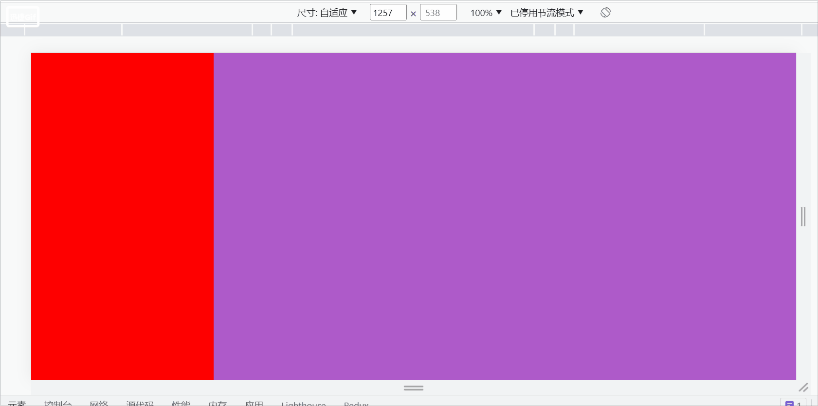
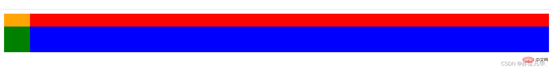
Interviewer: How to achieve a fixed 300px layout on the left side and adaptive layout on the right side using css?
Me: Uh~, okay, you can use flex layout or floating BFC. The entire code is as follows:
flex Layout:
1 2 3 4 5 6 7 8 9 10 11 12 13 14 15 16 17 18 19 20 21 |
|
Floating BFC:
1 2 3 4 5 6 7 8 9 10 11 12 13 14 15 16 17 18 19 20 21 22 23 |
|
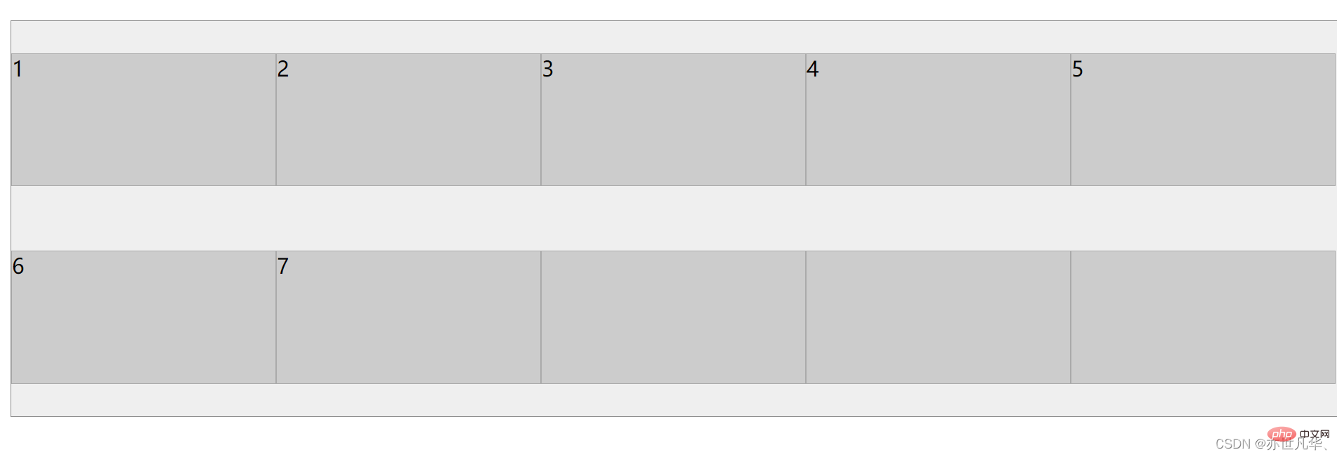
Interview Official: What is the difference between align-content and align-items in flex layout?
Me: Uh~, they are all elements that act on the vertical axis. The specific differences are as follows:
##align-content: Acts on multi-line elements on the vertical axis, but does not work on one-line elements. [Related recommendations: web front-end development]
1 2 3 4 5 6 7 8 9 10 11 12 13 14 15 16 17 18 19 20 21 22 23 24 25 26 27 28 29 30 31 32 |
|
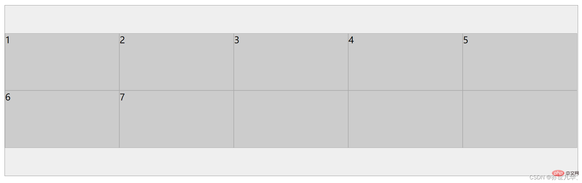
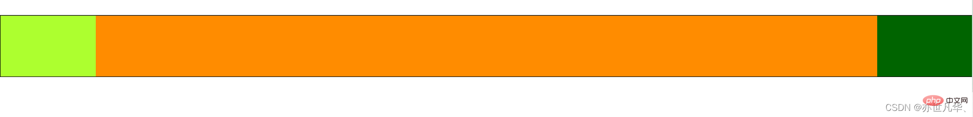
align-items: Acts on the vertical axis Single row element
1 2 3 4 5 6 7 8 9 10 11 12 13 14 15 16 17 18 19 20 21 22 23 24 25 26 27 28 29 30 31 32 |
|
Interviewer: What are the advantages of Grid layout?
Me: Uh~, Flex layout is an axis layout. You can only specify the position of the "item" against the axis. It can be regarded as a one-dimensional layout. Grid layout divides the container into "rows" and "columns", generates cells, and then specifies the cell where the "item is located", which can be regarded as a two-dimensional layout. Grid layout is far more powerful than Flex layout.
Interviewer: What is the difference between flex-basis and width in Flex layout?
Me: Uh~, the value of flex-basis is an ideal situation, but it may be compressed in actual situations. When flex-direction is column, the main axis is the vertical axis. At this time The correspondence between flex-basis and height
Interviewer: Will css loading block the parsing and rendering of the DOM tree?
Me: Uh~, css loading will directly affect the rendering of the web page, because only after the css is loaded and the CSSOM is built, the rendering tree (Render Tree) will be built and then rendered into Bitmap, if there is a script loaded in the html, it will also indirectly affect the parsing of the DOM tree, because the downloading, parsing and execution of javascript blocks the parsing of the DOM tree, and it is possible to access CSSOM in javascript, such as Element.getBoundingClientRect, so CSSOM The execution of javascript will not start until the construction is completed, indirectly blocking the parsing of the dom tree.
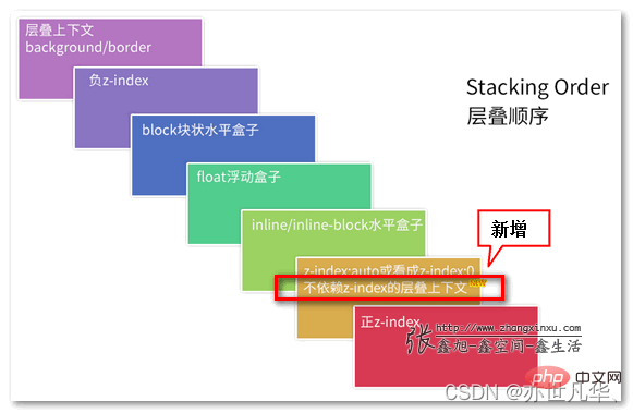
Interviewer: What is stacking context (stacking context), talk about your understanding of it
Me: Uh~, okay, A cascading context is a three-dimensional representation of these HTML elements. HTML elements occupy this space in order of priority based on their element attributes. The priority is as follows:If you want to know more about the stacking context: Recommended article:
In-depth understanding of the stacking context and stacking order in CSS.
面试官:z-index: 999 元素一定会置于 z-index: 0 元素之上吗?
我:呃~,不会,我们在进行层叠上下文时,会优先比较父级,如果父级是层叠上下文,子级即使有z-index也不再起作用了,如果父级层叠上下文层叠顺序相等,那么采取后来居上原则,前者覆盖后者。如果父级是普通元素,子级层叠比较就不受父级的影响,谁的层叠顺序高谁就先展示。
层叠黄金准则:
谁大谁上:当具有明显的层叠水平标示的时候,如识别的z-indx值,在同一个层叠上下文领域,层叠水平值大的那一个覆盖小的那一个。通俗讲就是官大的压死官小的。
后来居上:当元素的层叠水平一致、层叠顺序相同的时候,在DOM流中处于后面的元素会覆盖前面的元素。
整出代码如下:
1 2 3 4 5 6 7 8 9 10 11 12 13 14 15 16 17 18 19 20 21 22 23 24 25 26 27 28 29 30 31 32 33 34 35 36 |
|
面试官:什么是 Data URL?
我:呃~,Data URL 是将图片转换为 base64 直接嵌入到了网页中。
使用
这种方式引用图片,不需要再发请求获取图片。
使用 Data URL 也有一些缺点:
base64 编码后的图片会比原来的体积大三分之一左右。
Data URL 形式的图片不会缓存下来,每次访问页面都要被下载一次。可以将 Data URL 写入到 CSS 文件中随着 CSS 被缓存下来。
面试官:网站设置字体时,如何设置优先使用系统默认字体?
我:呃~,system-ui 将会自动选取系统默认字体作为字体。
面试官:CSS如何实现圣杯布局?
我:呃~,圣杯布局是指两端宽度固定,中间自适应。在日常开发中,圣杯布局的使用频率是比较高的。举一个简单的浮动例子,当然也可以使用定位或flex布局,整出代码如下:
浮动:
1 2 3 4 5 6 7 8 9 10 11 12 13 14 15 16 17 18 19 20 21 22 23 24 25 26 27 28 29 30 31 32 33 34 35 36 37 38 39 40 41 42 43 44 45 46 |
|
The above is the detailed content of Take a look at these front-end interview questions to help you master high-frequency knowledge points (5). For more information, please follow other related articles on the PHP Chinese website!

Hot AI Tools

Undresser.AI Undress
AI-powered app for creating realistic nude photos

AI Clothes Remover
Online AI tool for removing clothes from photos.

Undress AI Tool
Undress images for free

Clothoff.io
AI clothes remover

Video Face Swap
Swap faces in any video effortlessly with our completely free AI face swap tool!
Hot Article
Hot Tools

Notepad++7.3.1
Easy-to-use and free code editor

SublimeText3 Chinese version
Chinese version, very easy to use

Zend Studio 13.0.1
Powerful PHP integrated development environment

Dreamweaver CS6
Visual web development tools

SublimeText3 Mac version
God-level code editing software (SublimeText3)
Hot Topics
 1389
1389
 52
52

 How to use bootstrap in vue
Apr 07, 2025 pm 11:33 PM
How to use bootstrap in vue
Apr 07, 2025 pm 11:33 PM
Using Bootstrap in Vue.js is divided into five steps: Install Bootstrap. Import Bootstrap in main.js. Use the Bootstrap component directly in the template. Optional: Custom style. Optional: Use plug-ins.
 The Roles of HTML, CSS, and JavaScript: Core Responsibilities
Apr 08, 2025 pm 07:05 PM
The Roles of HTML, CSS, and JavaScript: Core Responsibilities
Apr 08, 2025 pm 07:05 PM
HTML defines the web structure, CSS is responsible for style and layout, and JavaScript gives dynamic interaction. The three perform their duties in web development and jointly build a colorful website.
 How to write split lines on bootstrap
Apr 07, 2025 pm 03:12 PM
How to write split lines on bootstrap
Apr 07, 2025 pm 03:12 PM
There are two ways to create a Bootstrap split line: using the tag, which creates a horizontal split line. Use the CSS border property to create custom style split lines.
 Understanding HTML, CSS, and JavaScript: A Beginner's Guide
Apr 12, 2025 am 12:02 AM
Understanding HTML, CSS, and JavaScript: A Beginner's Guide
Apr 12, 2025 am 12:02 AM
WebdevelopmentreliesonHTML,CSS,andJavaScript:1)HTMLstructurescontent,2)CSSstylesit,and3)JavaScriptaddsinteractivity,formingthebasisofmodernwebexperiences.
 How to use bootstrap button
Apr 07, 2025 pm 03:09 PM
How to use bootstrap button
Apr 07, 2025 pm 03:09 PM
How to use the Bootstrap button? Introduce Bootstrap CSS to create button elements and add Bootstrap button class to add button text
 How to resize bootstrap
Apr 07, 2025 pm 03:18 PM
How to resize bootstrap
Apr 07, 2025 pm 03:18 PM
To adjust the size of elements in Bootstrap, you can use the dimension class, which includes: adjusting width: .col-, .w-, .mw-adjust height: .h-, .min-h-, .max-h-
 React's Role in HTML: Enhancing User Experience
Apr 09, 2025 am 12:11 AM
React's Role in HTML: Enhancing User Experience
Apr 09, 2025 am 12:11 AM
React combines JSX and HTML to improve user experience. 1) JSX embeds HTML to make development more intuitive. 2) The virtual DOM mechanism optimizes performance and reduces DOM operations. 3) Component-based management UI to improve maintainability. 4) State management and event processing enhance interactivity.
 How to set up the framework for bootstrap
Apr 07, 2025 pm 03:27 PM
How to set up the framework for bootstrap
Apr 07, 2025 pm 03:27 PM
To set up the Bootstrap framework, you need to follow these steps: 1. Reference the Bootstrap file via CDN; 2. Download and host the file on your own server; 3. Include the Bootstrap file in HTML; 4. Compile Sass/Less as needed; 5. Import a custom file (optional). Once setup is complete, you can use Bootstrap's grid systems, components, and styles to create responsive websites and applications.
