
 Web Front-end
JS Tutorial
Detailed graphic explanation of Clip-path to implement button flowing border animation
Web Front-end
JS Tutorial
Detailed graphic explanation of Clip-path to implement button flowing border animation
Detailed graphic explanation of Clip-path to implement button flowing border animation

This article brings you relevant knowledge about front-end buttons. It mainly talks about how to use Clip-path to realize button flowing border animation. Friends who are interested can take a look at it together. I hope it will be helpful to everyone. helpful.
1. To achieve the effect

2. To achieve the steps
- Add div tag
<div>苏苏_icon</div>
- Add style

div {
  position: relative;
  width: 220px;
  height: 64px;
  line-height: 64px;
  text-align: center;
  color: #fff;
  font-size: 20px;
  background: #55557f;
  cursor: pointer;
  border-radius: 10px;
}- Add front and back pseudo-elements to the div. In order to facilitate distinction, set the border colors of the front and rear pseudo-elements to be different.
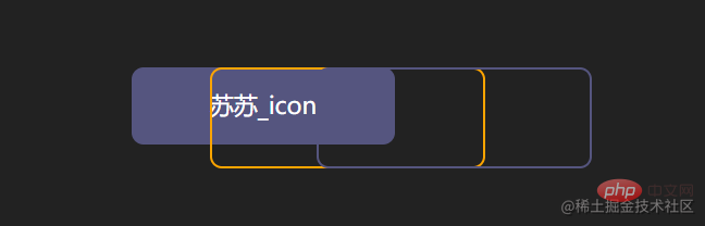
div::after,
div::before {
   content: "";
   position: absolute;
   width: 240px;
   height: 84px;
   border: 2px solid #55557f;
   border-radius: 10px;
 }
div::before{
 border: 2px solid orange;
}- Modify the positioning of the pseudo-element

div::after,
div::before{
 + left: calc(110px - 120px);
 + top: calc(32px - 42px);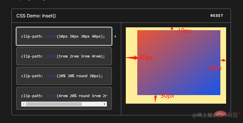
}- It can be abbreviated as inset
inset attribute: used to set left/right/bottom/top
div::after,
div::before{
 - left: calc(110px - 120px);
 - top: calc(32px - 42px);
 - inset: -10px;
}- to add animation effects to pseudo elements to achieve Variations of clip-path
clip-path: The clip-path CSS property uses clipping to create the displayable area of an element. Parts within the area are displayed and parts outside the area are hidden. inset() defines an inset rectangle.
- Syntax:
clip-path: inset(20px 50px 10px 0 round 50px);
- Explanation:
When all four parameters are provided:
They represent the top, right, bottom, and left offsets inward from the reference box, which define where the edges of the inserted rectangle are inserted. These parameters follow the syntax of margin shorthand, allowing you to set one, two, or four values for all four illustrations.
Optional border-radiu parameter:
Use border-radius shorthand syntax to define rounded corners for the inserted rectangle
- We try to set inset on the pseudo element

div::after,
div::before{
  + clip-path: inset(0 0 98% 0);
}
div::after,
div::before{
  + clip-path: inset(0 98% 0 0);
}
div::after,
div::before{
  + clip-path: inset( 98% 0  0 0);
}
div::after,
div::before{
 + clip-path: inset(0  0 0  98% ) ;
}- Add animation
 ##
##
div::after,
div::before{
  + animation: pathRotate 3s infinite linear;
}@keyframes pathRotate { 0%, 100% {
clip-path: inset(0 0 98% 0);
} 25% {
clip-path: inset(0 98% 0 0);
} 50% {
clip-path: inset(98% 0 0 0);
} 75% {
clip-path: inset(0 0 0 98%);
}
}- Add animation delay to the rear pseudo-element to form Parallax effect


animation-delay: The
CSS property specifies the time to wait from applying animation to an element to starting the animation. quantity. The animation can start later, immediately from the beginning, or immediately in the middle of the animation.
Positive values indicate that the animation should start after the specified amount of time has passed. The default value of 0s means the animation should start immediately after application.
Negative values cause the animation to start immediately, but midway through its loop. For example, if you specify a -1s animation delay time, the animation will start immediately, but 1 second after the animation sequence begins. If you specify a negative value for the animation delay but the start value is implicit, the start value is taken from the moment the animation is applied to the element.div::after { animation-delay: -1.5s; }Copy after login
- Remove the border color value setting of the front pseudo element

-div::before {
 -  border: 2px solid orange;
-}- Add hover event to div Done~

div:hover {
  filter: brightness(1.5);
}div{ /* 添加过渡效果 */
transition: all 0.5s;
}3.实现代码
clip-path实现按钮流动边框
<div>苏苏_icon</div>

The above is the detailed content of Detailed graphic explanation of Clip-path to implement button flowing border animation. For more information, please follow other related articles on the PHP Chinese website!

Hot AI Tools

Undresser.AI Undress
AI-powered app for creating realistic nude photos

AI Clothes Remover
Online AI tool for removing clothes from photos.

Undress AI Tool
Undress images for free

Clothoff.io
AI clothes remover

Video Face Swap
Swap faces in any video effortlessly with our completely free AI face swap tool!

Hot Article
Hot Tools

Notepad++7.3.1
Easy-to-use and free code editor

SublimeText3 Chinese version
Chinese version, very easy to use

Zend Studio 13.0.1
Powerful PHP integrated development environment

Dreamweaver CS6
Visual web development tools

SublimeText3 Mac version
God-level code editing software (SublimeText3)
Hot Topics


 What should I do if I encounter garbled code printing for front-end thermal paper receipts?
Apr 04, 2025 pm 02:42 PM
What should I do if I encounter garbled code printing for front-end thermal paper receipts?
Apr 04, 2025 pm 02:42 PM
Frequently Asked Questions and Solutions for Front-end Thermal Paper Ticket Printing In Front-end Development, Ticket Printing is a common requirement. However, many developers are implementing...
 Who gets paid more Python or JavaScript?
Apr 04, 2025 am 12:09 AM
Who gets paid more Python or JavaScript?
Apr 04, 2025 am 12:09 AM
There is no absolute salary for Python and JavaScript developers, depending on skills and industry needs. 1. Python may be paid more in data science and machine learning. 2. JavaScript has great demand in front-end and full-stack development, and its salary is also considerable. 3. Influencing factors include experience, geographical location, company size and specific skills.
 Demystifying JavaScript: What It Does and Why It Matters
Apr 09, 2025 am 12:07 AM
Demystifying JavaScript: What It Does and Why It Matters
Apr 09, 2025 am 12:07 AM
JavaScript is the cornerstone of modern web development, and its main functions include event-driven programming, dynamic content generation and asynchronous programming. 1) Event-driven programming allows web pages to change dynamically according to user operations. 2) Dynamic content generation allows page content to be adjusted according to conditions. 3) Asynchronous programming ensures that the user interface is not blocked. JavaScript is widely used in web interaction, single-page application and server-side development, greatly improving the flexibility of user experience and cross-platform development.
 How to merge array elements with the same ID into one object using JavaScript?
Apr 04, 2025 pm 05:09 PM
How to merge array elements with the same ID into one object using JavaScript?
Apr 04, 2025 pm 05:09 PM
How to merge array elements with the same ID into one object in JavaScript? When processing data, we often encounter the need to have the same ID...
 How to achieve parallax scrolling and element animation effects, like Shiseido's official website?
or:
How can we achieve the animation effect accompanied by page scrolling like Shiseido's official website?
Apr 04, 2025 pm 05:36 PM
How to achieve parallax scrolling and element animation effects, like Shiseido's official website?
or:
How can we achieve the animation effect accompanied by page scrolling like Shiseido's official website?
Apr 04, 2025 pm 05:36 PM
Discussion on the realization of parallax scrolling and element animation effects in this article will explore how to achieve similar to Shiseido official website (https://www.shiseido.co.jp/sb/wonderland/)...
 Is JavaScript hard to learn?
Apr 03, 2025 am 12:20 AM
Is JavaScript hard to learn?
Apr 03, 2025 am 12:20 AM
Learning JavaScript is not difficult, but it is challenging. 1) Understand basic concepts such as variables, data types, functions, etc. 2) Master asynchronous programming and implement it through event loops. 3) Use DOM operations and Promise to handle asynchronous requests. 4) Avoid common mistakes and use debugging techniques. 5) Optimize performance and follow best practices.
 How to implement panel drag and drop adjustment function similar to VSCode in front-end development?
Apr 04, 2025 pm 02:06 PM
How to implement panel drag and drop adjustment function similar to VSCode in front-end development?
Apr 04, 2025 pm 02:06 PM
Explore the implementation of panel drag and drop adjustment function similar to VSCode in the front-end. In front-end development, how to implement VSCode similar to VSCode...
 The difference in console.log output result: Why are the two calls different?
Apr 04, 2025 pm 05:12 PM
The difference in console.log output result: Why are the two calls different?
Apr 04, 2025 pm 05:12 PM
In-depth discussion of the root causes of the difference in console.log output. This article will analyze the differences in the output results of console.log function in a piece of code and explain the reasons behind it. �...
