 Backend Development
 Python Tutorial
 Draw such beautiful professional illustrations in Python? So easy!
Draw such beautiful professional illustrations in Python? So easy!

Text
Hello everyone, I am Python artificial intelligence technology
Method 1
Highly recommended Python's plotting module matplotlib: python plotting. The pictures drawn are really high-end and classy, low-key, luxurious and connotative~ It is suitable for all kinds of drawings from 2D to 3D, from scalar to vector. Can be saved in various formats from eps, pdf to svg, png, jpg. Moreover, the drawing functions of Matplotlib basically have similar names to those of Matlab, so the learning cost of migration is relatively low. Open source and free. As shown in the picture (the picture in the title description is at the end): (The following pictures are quoted from Thumbnail gallery)
Ordinary function images like this:
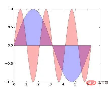
plt.fill(x, y1, 'b', x, y2, 'r', alpha=0.3)
And this kind of Scatter picture (I don’t know how to say it in Chinese...):
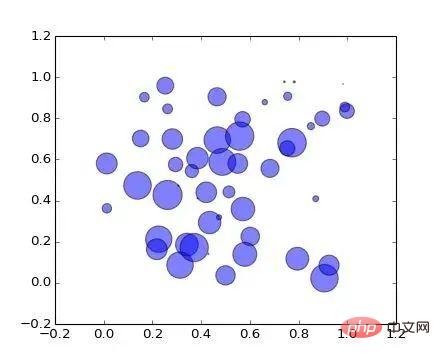
plt.scatter(x, y, s=area, alpha=0.5)
Exquisite curves, translucent color matching. Show your noble and cool personality. The most important thing is that it only takes one line of code to do it. From now on, you no longer have to endure the painful color matching in Matlab and GNUPlot.
Want to draw 3D data? No problem (it may be more convenient to use mayavi):
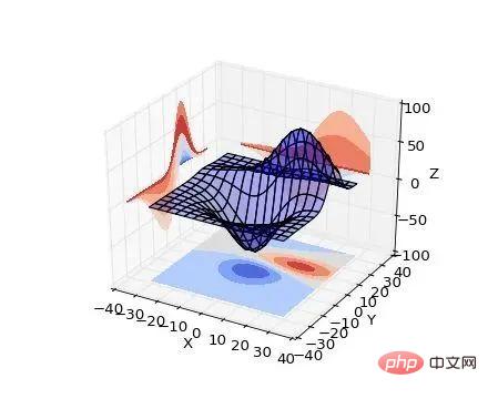
ax.plot_surface(X, Y, Z, rstride=8, cstride=8, alpha=0.3)
cset = ax.contourf(X, Y, Z, zdir='z', offset=-100, cmap=cm.coolwarm)
cset = ax.contourf(X, Y, Z, zdir='x', offset=-40, cmap=cm.coolwarm)
cset = ax.contourf(X, Y, Z, zdir='y', offset=40, cmap=cm.coolwarm)
You can have it with four lines of code (the last three lines are for drawing contour lines on the coordinate plane, Strictly speaking, it is still one line).
In addition, as long as you are a vector field, the network or any other weird needs can be handled:
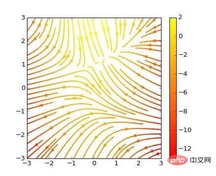
plt.streamplot(X, Y, U, V, color=U, linewidth=2, cmap=plt.cm.autumn)
plt.colorbar()
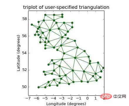
plt.triplot(x, y, triangles, 'go-')
plt.title('triplot of user-specified triangulation')
plt.xlabel('Longitude (degrees)')
plt.ylabel('Latitude (degrees)')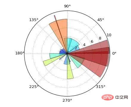
ax = plt.subplot(111, polar=True)
bars = ax.bar(theta, radii, width=width, bottom=0.0)
This is not over yet, Matplotlib also supports the insertion of Latex formulas, when the picture drawn by others still looks like this (the following picture is quoted from Matplotlib Tutorial (translation) )
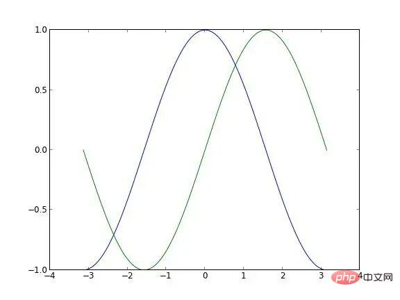
You can turn it into something like this:
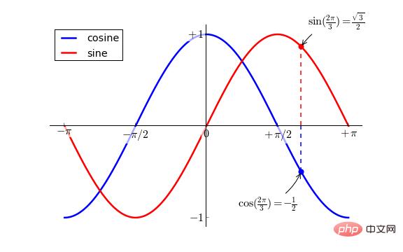
If you match it IPython is used as the running terminal (this picture was drawn by myself~):
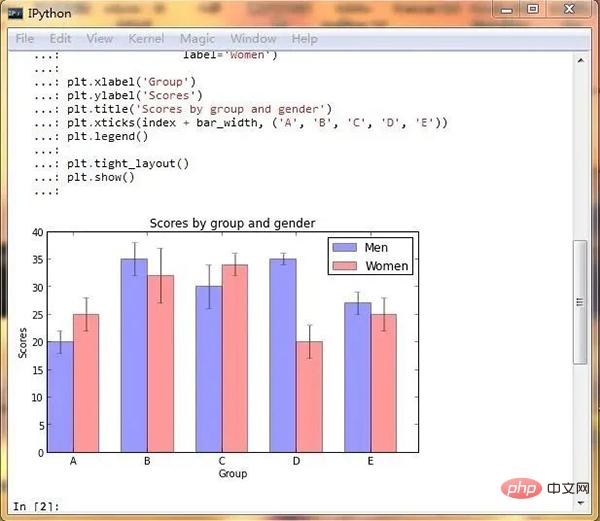
It is simply an artifact, does it exist?
Action is worse than heartbeat, what are you waiting for?
As reminded by @Xu Cheng, I would like to add that matplotlib can also produce xkcd-style graphics~
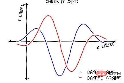
(picture Quoted from the Internet)
In addition, for more exciting content combined with IPython Notebook, please see http://nbviewer.ipython.org/
If you find it troublesome to install and it happens If you are under Windows system, you can try winpython, a distribution version of Python - Portable Scientific Python 2/3 32/64bit Distribution for Windows.
Since @van li questioned whether matplotlib can draw the image shown in the question, I will use matplotlib to draw the image in the question here as follows:
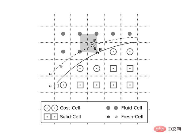
The code is here:
https://gist.github.com/coldfog/c479124328fc6bb8b789
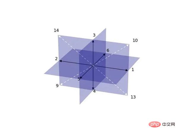
Code here:
https://gist.github.com/coldfog/5da63a6958fc0a949b52
看到楼下有人说配色和好看,唉....那我也贴几个吧...只不过当初限于篇幅没有写而已。另外,搜索公众号顶级python后台回复“进阶”,获取一份惊喜礼包。
首先,python有一个专门的配色包jiffyclub/brewer2mpl,提供了从美术角度来讲的精美配色(戳这里感受ColorBrewer: Color Advice for Maps)。
此外还有一些致力于美化绘图的库,用起来也都非常方便,比如olgabot/prettyplotlib 。
废话不多说,上图就是王道。(下面图片来源网络)
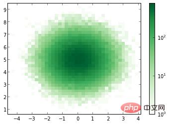
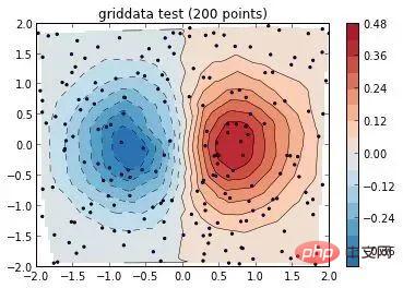
有人可能会说需要复杂的设置,其实也不用。比如上边这幅图,只需要多加一个参数就好:
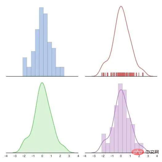
cmap=brewer2mpl.get_map('RdBu', 'diverging', 8, reverse=True).mpl_colormap,楼下说到统计绘图。嘛seaborn 是一个调用 matplotlib 的统计绘图库,上图:
(https://github.com/mwaskom/seaborn)
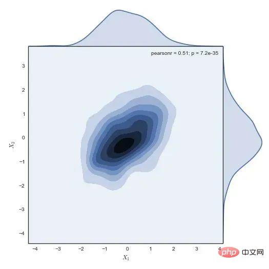
代码一行,后边的几乎都是一行,没做其他设置,默认就这样。我就不贴其他的代码了:
g = sns.jointplot(x1, x2, kind="kde", size=7, space=0)
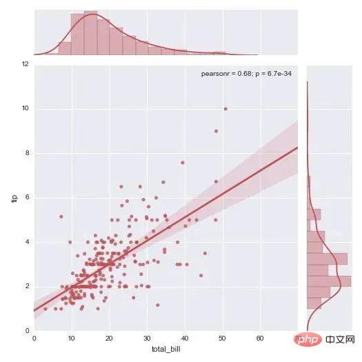
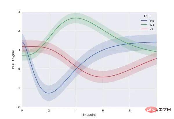
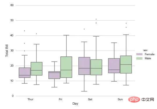
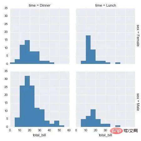
还有个更炫酷的可交互式绘图,大家自己戳开看吧:
http://nbviewer.ipython.org/github/plotly/python-user-guidechaocc/blob/master/s0_getting-started/s0_getting-started.ipynb
遇到安装问题的请尝试Anaconda这个Python发行版。下载安装后直接使用即可,它几乎预装了所有要用到的科学计算及可视化的库。
有盆友在评论里说希望能有完整的教程,确实就这个答案来说,离实际使用还有很大的距离,网上相关的中文资料也不多。不过真要写起来这个答案也装不下,况且写在这个问题下也不是很恰当。等到那天我有专栏了再说吧,到时候也许会写一个关于可视化的系列教程。
方法二
翻遍这个问题下的所有回答,发现凡是提到Matlab的,其评价中常有‘锯齿’,‘菜鸟’,‘难看’,‘不忍直视’等标签。
然而,2020年了,技术提升了,观念进步了,当一些基本问题解决后,Matlab还那么‘不堪’吗?

观察Mathematica、Origin、Python/matplotlib、R/ggplot2等软件绘制的数据、结果图,其与Matlab图的差异主要体现在点、线、面等对象属性(位置、尺寸、颜色等)的不同上。
既然只是属性的不同,那是不是只要修改一下这些信息,就可以实现各种软件绘图风格之间的转换了呢?
答案是肯定的。
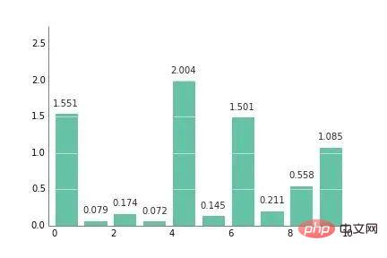
比如,这是高赞回答 @冯昱尧用Python/matplotlib绘制的一幅图:
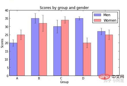
我们用Matlab默认属性来绘制,效果是这样的(没加误差棒):
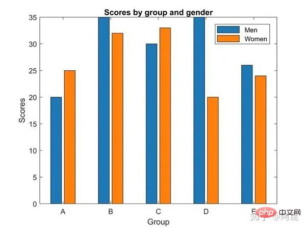
Then, just modify the position, size, color and other information to get a picture with a similar style (without adding error bars):
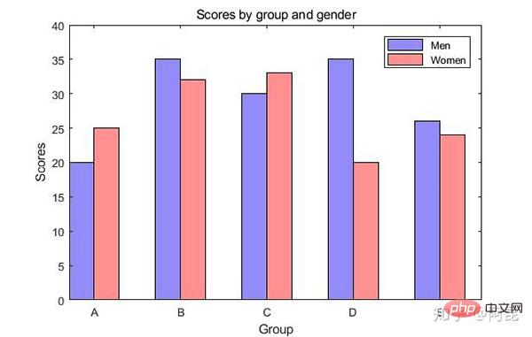
When we use this idea to think about how to draw illustrations, it is easy to realize our own small ideas, imitate or even create ideal illustrations.
For example, one day, I found that the color of the evening sky was very beautiful, and I thought: Why can’t I draw it into the illustration of the paper? (See: Matlab paper illustration color matching 2 - natural gradient)
So,
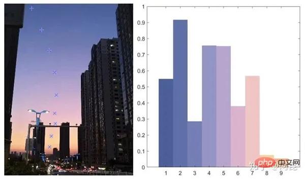
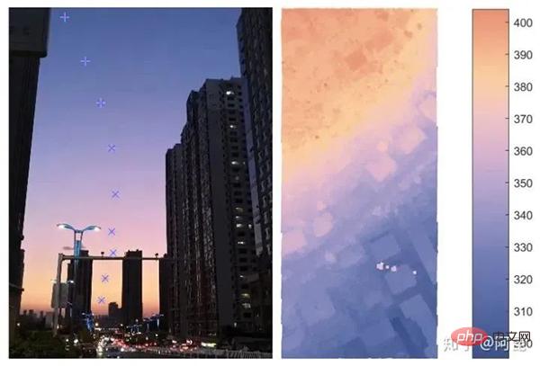

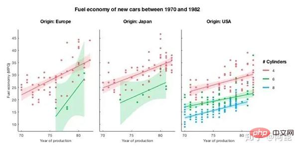
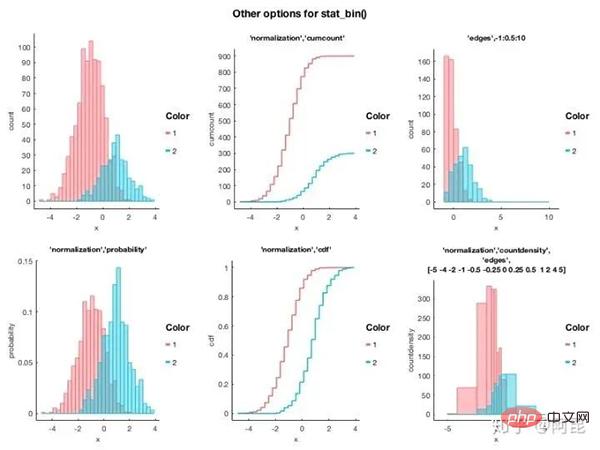
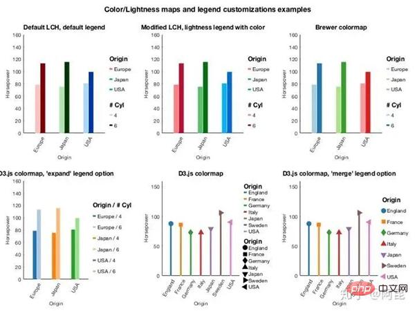
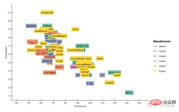
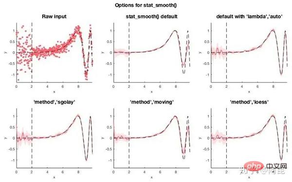
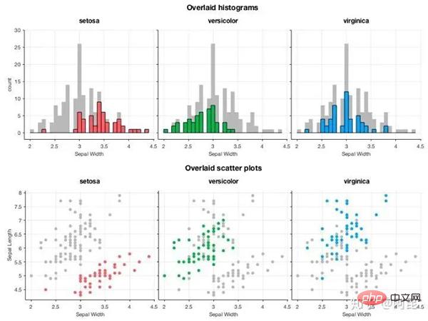
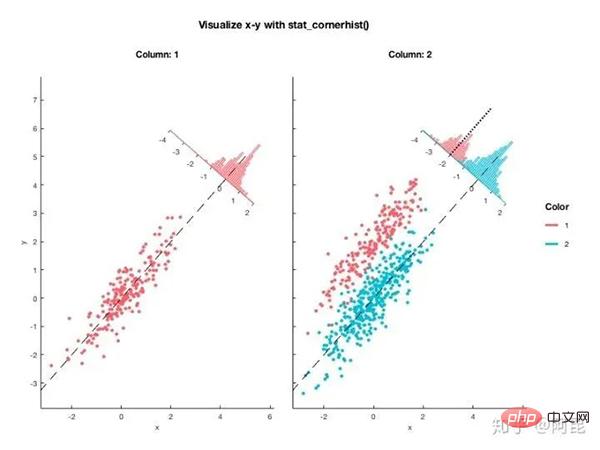
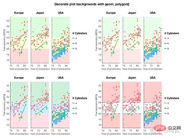
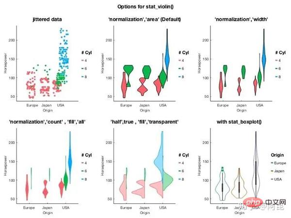
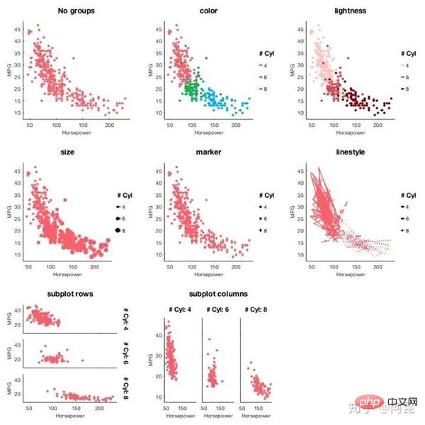
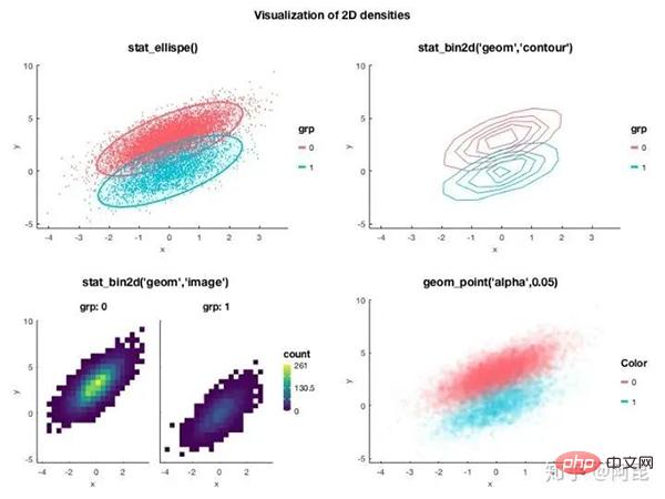 Similarly, Stephen Cobeldick [2] ported the matplotlib color scheme to Matlab.
In other words, you can use matplotlib's color scheme directly in Matlab, and you don't have to always use 'jet'.
The MatPlotLib 2.0 default colormaps ported to MATLAB. This submission also includes the Line ColorOrder colormaps!
The sample effect is as follows:
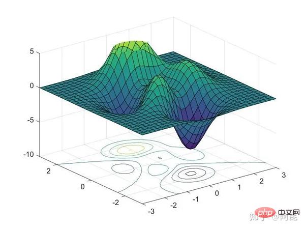
There are many toolkits specifically designed for paper illustrations, so I won’t introduce them one by one here.
In general, tools are just tools, they are not superior or inferior.
If you want to draw good-looking illustrations, the key lies in the person using the tools.
Concentrate and reach the top.
Reference:
https://www.php.cn/link/b3ddb7c5b10be95dbc3f9152c58becce
https://www.php.cn/link/171ae1bbb81475eb96287dd78565b38b
The above is the detailed content of Draw such beautiful professional illustrations in Python? So easy!. For more information, please follow other related articles on the PHP Chinese website!

Hot AI Tools

Undresser.AI Undress
AI-powered app for creating realistic nude photos

AI Clothes Remover
Online AI tool for removing clothes from photos.

Undress AI Tool
Undress images for free

Clothoff.io
AI clothes remover

AI Hentai Generator
Generate AI Hentai for free.

Hot Article

Hot Tools

Notepad++7.3.1
Easy-to-use and free code editor

SublimeText3 Chinese version
Chinese version, very easy to use

Zend Studio 13.0.1
Powerful PHP integrated development environment

Dreamweaver CS6
Visual web development tools

SublimeText3 Mac version
God-level code editing software (SublimeText3)

Hot Topics
 How to control the size of XML converted to images?
Apr 02, 2025 pm 07:24 PM
To generate images through XML, you need to use graph libraries (such as Pillow and JFreeChart) as bridges to generate images based on metadata (size, color) in XML. The key to controlling the size of the image is to adjust the values of the <width> and <height> tags in XML. However, in practical applications, the complexity of XML structure, the fineness of graph drawing, the speed of image generation and memory consumption, and the selection of image formats all have an impact on the generated image size. Therefore, it is necessary to have a deep understanding of XML structure, proficient in the graphics library, and consider factors such as optimization algorithms and image format selection.
 Is the conversion speed fast when converting XML to PDF on mobile phone?
Apr 02, 2025 pm 10:09 PM
The speed of mobile XML to PDF depends on the following factors: the complexity of XML structure. Mobile hardware configuration conversion method (library, algorithm) code quality optimization methods (select efficient libraries, optimize algorithms, cache data, and utilize multi-threading). Overall, there is no absolute answer and it needs to be optimized according to the specific situation.
 Is there any mobile app that can convert XML into PDF?
Apr 02, 2025 pm 08:54 PM
An application that converts XML directly to PDF cannot be found because they are two fundamentally different formats. XML is used to store data, while PDF is used to display documents. To complete the transformation, you can use programming languages and libraries such as Python and ReportLab to parse XML data and generate PDF documents.
 Is there a mobile app that can convert XML into PDF?
Apr 02, 2025 pm 09:45 PM
There is no APP that can convert all XML files into PDFs because the XML structure is flexible and diverse. The core of XML to PDF is to convert the data structure into a page layout, which requires parsing XML and generating PDF. Common methods include parsing XML using Python libraries such as ElementTree and generating PDFs using ReportLab library. For complex XML, it may be necessary to use XSLT transformation structures. When optimizing performance, consider using multithreaded or multiprocesses and select the appropriate library.
 How to convert XML files to PDF on your phone?
Apr 02, 2025 pm 10:12 PM
It is impossible to complete XML to PDF conversion directly on your phone with a single application. It is necessary to use cloud services, which can be achieved through two steps: 1. Convert XML to PDF in the cloud, 2. Access or download the converted PDF file on the mobile phone.
 What is the function of C language sum?
Apr 03, 2025 pm 02:21 PM
There is no built-in sum function in C language, so it needs to be written by yourself. Sum can be achieved by traversing the array and accumulating elements: Loop version: Sum is calculated using for loop and array length. Pointer version: Use pointers to point to array elements, and efficient summing is achieved through self-increment pointers. Dynamically allocate array version: Dynamically allocate arrays and manage memory yourself, ensuring that allocated memory is freed to prevent memory leaks.
 How to open xml format
Apr 02, 2025 pm 09:00 PM
Use most text editors to open XML files; if you need a more intuitive tree display, you can use an XML editor, such as Oxygen XML Editor or XMLSpy; if you process XML data in a program, you need to use a programming language (such as Python) and XML libraries (such as xml.etree.ElementTree) to parse.
 Recommended XML formatting tool
Apr 02, 2025 pm 09:03 PM
XML formatting tools can type code according to rules to improve readability and understanding. When selecting a tool, pay attention to customization capabilities, handling of special circumstances, performance and ease of use. Commonly used tool types include online tools, IDE plug-ins, and command-line tools.


