Microsoft Store gets new web interface similar to what's on Windows 10 and 11
A new design for the web version of the Microsoft Store is now live. It has a Preview label at the top, indicating that it's still an experimental design.
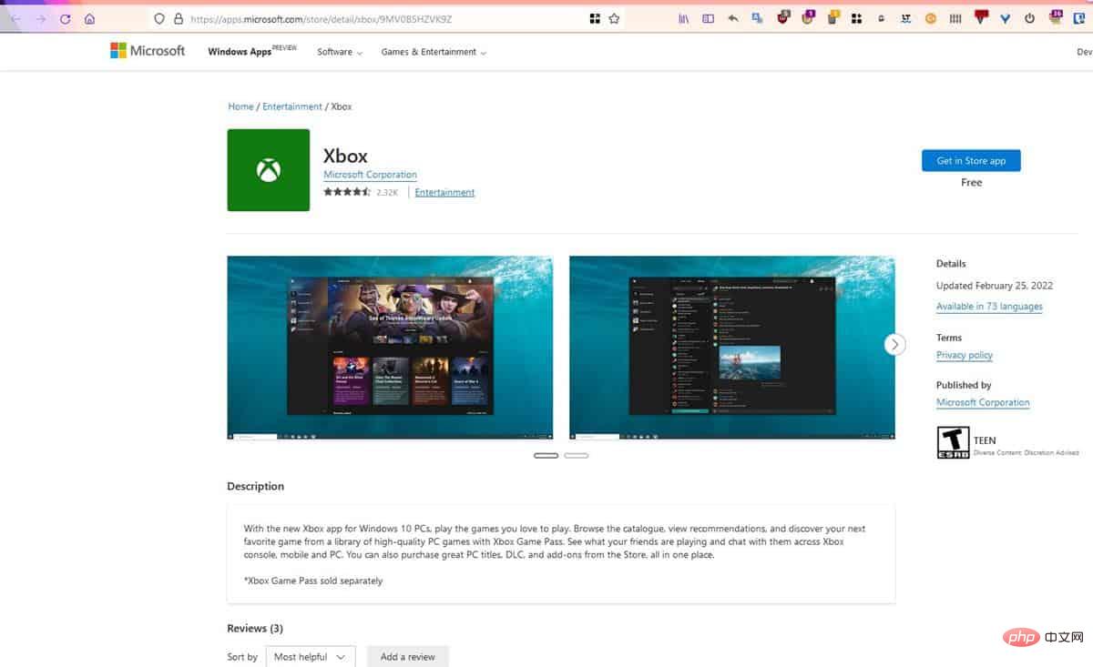
When Windows 11 was released last year, Microsoft overhauled the Store app on PC. This is a much needed change. I find myself using Store apps much more on Windows 11 than I did on Windows 10. The new design is very nice, easier to navigate and faster in terms of performance compared to the previous version. It's not perfect, there's always room for improvement.
New design for Microsoft Store on the web
FireCubeStudios has first spotted the redesigned Microsoft Store web interface. It is similar to the design of the Store app on Windows 11. The sidebar on the left provides a better way to filter apps in various categories.
The website can be accessed from this URL. It has the same card-style app interface, screenshots in the app list, descriptions, and more. There's also a new user reviews section where you can sort reviews by recency or usefulness.
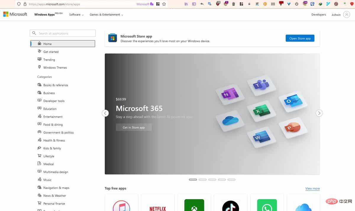
The Microsoft Store on the Web is not particularly useful and will still redirect you to its desktop program to download the apps you want . So it requires a few extra clicks, but since the store app's interface isn't particularly mouse-friendly, the web version turns out better. The latter makes it easier to share application links, since there are no restrictions that prevent us from using the browser's right-click menu (except for the sidebar).
The online version will display the update date of the application. In contrast, the Microsoft Store app doesn't provide us with this data. It's still missing other useful information, such as release notes, version number, and system requirements for the application. Another big absentee from the redesigned web version is the games section of the store, which may be added in the future.
Microsoft needs to curate its Store apps
All these improvements are good and welcome to have. But let's not forget the elephant in the room, which is what's available in the store. I am not talking about the quality of the apps but there are a lot of fake apps on the Microsoft Store. This isn't the first time we've seen dodgy apps on the storefront. Does Microsoft even care about this issue?
Not only do these deceptive apps violate the license and copyright of the programs they imitate, but they can also be potentially dangerous, aka malware. Some of these apps appear on the first page of search results. Not only will this confuse the average user, but people who don't know may end up installing the fake app instead of the original one because they can't tell the difference between the two. Why? Because the apps have similar names and/or icons.
Some of these fake apps are not free either, you have to pay for these illegal programs. It's really embarrassing and Microsoft needs to responsibly manage its store and check every app before allowing it to be published to ensure the safety of its consumer base.
The above is the detailed content of Microsoft Store gets new web interface similar to what's on Windows 10 and 11. For more information, please follow other related articles on the PHP Chinese website!

Hot AI Tools

Undresser.AI Undress
AI-powered app for creating realistic nude photos

AI Clothes Remover
Online AI tool for removing clothes from photos.

Undress AI Tool
Undress images for free

Clothoff.io
AI clothes remover

Video Face Swap
Swap faces in any video effortlessly with our completely free AI face swap tool!

Hot Article

Hot Tools

Notepad++7.3.1
Easy-to-use and free code editor

SublimeText3 Chinese version
Chinese version, very easy to use

Zend Studio 13.0.1
Powerful PHP integrated development environment

Dreamweaver CS6
Visual web development tools

SublimeText3 Mac version
God-level code editing software (SublimeText3)

Hot Topics
 1386
1386
 52
52
 What software is bonjour and can it be uninstalled?
Feb 20, 2024 am 09:33 AM
Title: Explore the Bonjour software and how to uninstall it Abstract: This article will introduce the functions, scope of use and how to uninstall the Bonjour software. At the same time, it will also be explained how to use other tools to replace Bonjour to meet the needs of users. Introduction: Bonjour is a common software in the field of computer and network technology. Although this may be unfamiliar to some users, it can be very useful in some specific situations. If you happen to have Bonjour software installed but now want to uninstall it, then
 What software is crystaldiskmark? -How to use crystaldiskmark?
Mar 18, 2024 pm 02:58 PM
CrystalDiskMark is a small HDD benchmark tool for hard drives that quickly measures sequential and random read/write speeds. Next, let the editor introduce CrystalDiskMark to you and how to use crystaldiskmark~ 1. Introduction to CrystalDiskMark CrystalDiskMark is a widely used disk performance testing tool used to evaluate the read and write speed and performance of mechanical hard drives and solid-state drives (SSD). Random I/O performance. It is a free Windows application and provides a user-friendly interface and various test modes to evaluate different aspects of hard drive performance and is widely used in hardware reviews
 What to do if WPS Office cannot open the PPT file - What to do if WPS Office cannot open the PPT file
Mar 04, 2024 am 11:40 AM
Recently, many friends have asked me what to do if WPSOffice cannot open PPT files. Next, let us learn how to solve the problem of WPSOffice not being able to open PPT files. I hope it can help everyone. 1. First open WPSOffice and enter the homepage, as shown in the figure below. 2. Then enter the keyword "document repair" in the search bar above, and then click to open the document repair tool, as shown in the figure below. 3. Then import the PPT file for repair, as shown in the figure below.
![Corsair iCUE software not detecting RAM [Fixed]](https://img.php.cn/upload/article/000/465/014/170831448976874.png?x-oss-process=image/resize,m_fill,h_207,w_330) Corsair iCUE software not detecting RAM [Fixed]
Feb 19, 2024 am 11:48 AM
Corsair iCUE software not detecting RAM [Fixed]
Feb 19, 2024 am 11:48 AM
This article will explore what users can do when the CorsairiCUE software does not recognize the RAM in a Windows system. Although the CorsairiCUE software is designed to let users control their computer's RGB lighting, some users have found that the software does not function properly, resulting in an inability to detect RAM modules. Why doesn't ICUE pick up my memory? The main reason why ICUE cannot correctly identify RAM is usually related to background software conflicts. In addition, incorrect SPD write settings may also cause this problem. Fixed issue with CorsairIcue software not detecting RAM If CorsairIcue software is not detecting RAM on your Windows computer, please use the following suggestions.
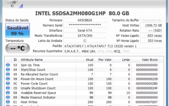 CrystalDiskinfo usage tutorial-What software is CrystalDiskinfo?
Mar 18, 2024 pm 04:50 PM
CrystalDiskInfo is a software used to check computer hardware devices. In this software, we can check our own computer hardware, such as reading speed, transmission mode, interface, etc.! So in addition to these functions, how to use CrystalDiskInfo and what exactly is CrystalDiskInfo? Let me sort it out for you! 1. The Origin of CrystalDiskInfo As one of the three major components of a computer host, a solid-state drive is the storage medium of a computer and is responsible for computer data storage. A good solid-state drive can speed up file reading and affect consumer experience. When consumers receive new devices, they can use third-party software or other SSDs to
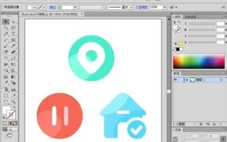 How to set the keyboard increment in Adobe Illustrator CS6 - How to set the keyboard increment in Adobe Illustrator CS6
Mar 04, 2024 pm 06:04 PM
Many users are using the Adobe Illustrator CS6 software in their offices, so do you know how to set the keyboard increment in Adobe Illustrator CS6? Then, the editor will bring you the method of setting the keyboard increment in Adobe Illustrator CS6. Interested users can take a look below. Step 1: Start Adobe Illustrator CS6 software, as shown in the figure below. Step 2: In the menu bar, click the [Edit] → [Preferences] → [General] command in sequence. Step 3: The [Keyboard Increment] dialog box pops up, enter the required number in the [Keyboard Increment] text box, and finally click the [OK] button. Step 4: Use the shortcut key [Ctrl]
 What kind of software is bonjour? Is it useful?
Feb 22, 2024 pm 08:39 PM
Bonjour is a network protocol and software launched by Apple for discovering and configuring network services within a local area network. Its main role is to automatically discover and communicate between devices connected in the same network. Bonjour was first introduced in the MacOSX10.2 version in 2002, and is now installed and enabled by default in Apple's operating system. Since then, Apple has opened up Bonjour's technology to other manufacturers, so many other operating systems and devices can also support Bonjour.
 How to resolve an incompatible software attempt to load with Edge?
Mar 15, 2024 pm 01:34 PM
When we use the Edge browser, sometimes incompatible software attempts to be loaded together, so what is going on? Let this site carefully introduce to users how to solve the problem of trying to load incompatible software with Edge. How to solve an incompatible software trying to load with Edge Solution 1: Search IE in the start menu and access it directly with IE. Solution 2: Note: Modifying the registry may cause system failure, so operate with caution. Modify registry parameters. 1. Enter regedit during operation. 2. Find the path\HKEY_LOCAL_MACHINE\SOFTWARE\Policies\Micros


