
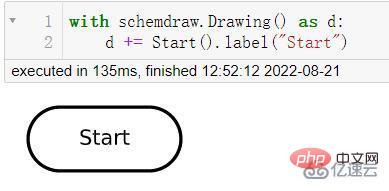
So in the SchemDraw module, there are six elements used to represent the main nodes of the flow chart. The ovals represent the beginning and end of the decision. , the code is as follows:
import schemdraw
from schemdraw.flow import *
with schemdraw.Drawing() as d:
d += Start().label("Start")output
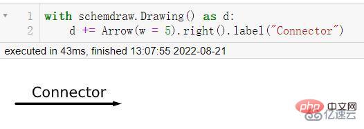
The arrow represents the direction of decision-making and is used to connect each node. The code is as follows:
with schemdraw.Drawing() as d:
d += Arrow(w = 5).right().label("Connector")output
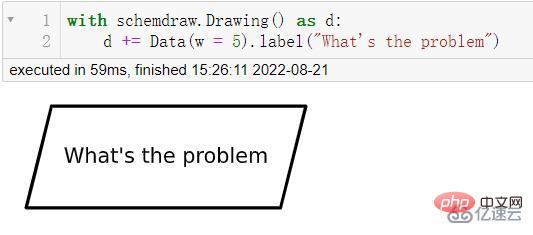
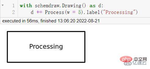
The parallelogram represents the problem you have to deal with and solve, and the rectangle represents the effort you have to make for it. The effort or process, the code is as follows:
with schemdraw.Drawing() as d:
d += Data(w = 5).label("What's the problem")output
with schemdraw.Drawing() as d:
d += Process(w = 5).label("Processing")output
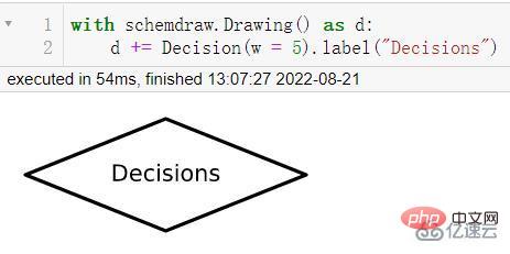
The diamond represents the specific situation of decision-making. The code is as follows:
with schemdraw.Drawing() as d:
d += Decision(w = 5).label("Decisions")output
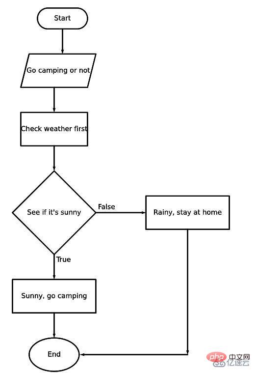
Let’s draw a Simple flow chart, if we are thinking about going camping on the weekend, then since we are going camping, we definitely need to check the weather to see if it is sunny (Sunny), if it is rainy (Rainy) ), don’t go. According to this logic, let’s draw a flow chart. The code is as follows:
import schemdraw
from schemdraw.flow import *
with schemdraw.Drawing() as d:
 d+= Start().label("Start")
 d+= Arrow().down(d.unit/2)
 # 具体是啥问题嘞
 d+= Data(w = 4).label("Go camping or not")
 d+= Arrow().down(d.unit/2)
 # 第一步 查看天气
 d+= Box(w = 4).label("Check weather first")
 d+= Arrow().down(d.unit/2)
 # 是否是晴天
 d+= (decision := Decision(w = 5, h= 5,
S = "True",
 E = "False").label("See if it's sunny"))
 # 如果是真的话
 d+= Arrow().length(d.unit/2)
 d+= (true := Box(w = 5).label("Sunny, go camping"))
 d+= Arrow().length(d.unit/2)
 # 结束
 d+= (end := Ellipse().label("End"))
 # 如果不是晴天的话
 d+= Arrow().right(d.unit).at(decision.E)
 # 那如果是下雨天的话,就不能去露营咯
 d+= (false := Box(w = 5).label("Rainy, stay at home"))
 # 决策的走向
 d+= Arrow().down(d.unit*2.5).at(false.S)
 # 决策的走向
 d+= Arrow().left(d.unit*2.15)
d.save("palindrome flowchart.jpeg", dpi = 300)output
The Networkx module is used to create and process complex graph network structures, generate a variety of random networks and classic networks, analyze network structures and build network models. For example, it can be used in cases of drawing human connections. Go to the networkx module,
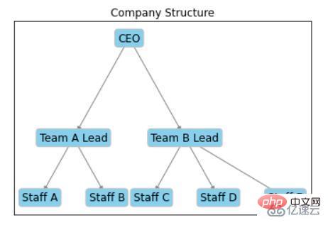
For example, for a company's organizational chart, you can also use this module to draw the company's overall structure simply and intuitively. The code is as follows:
import networkx as nx
import matplotlib.pyplot as plt
import numpy as np
G = nx.DiGraph()
nodes = np.arange(0, 8).tolist()
G.add_nodes_from(nodes)
# 节点连接的信息,哪些节点的是相连接的
G.add_edges_from([(0,1), (0,2),
(1,3), (1, 4),
(2, 5), (2, 6), (2,7)])
# 节点的位置
pos = {0:(10, 10),
1:(7.5, 7.5), 2:(12.5, 7.5),
3:(6, 6), 4:(9, 6),
5:(11, 6), 6:(14, 6), 7:(17, 6)}
# 节点的标记
labels = {0:"CEO",
 1: "Team A Lead",
 2: "Team B Lead",
 3: "Staff A",
 4: "Staff B",
 5: "Staff C",
 6: "Staff D",
 7: "Staff E"}
nx.draw_networkx(G, pos = pos, labels = labels, arrows = True,
node_shape = "s", node_color = "white")
plt.title("Company Structure")
plt.show()output

After seeing this, you may think that the result pointed out is a bit simple. If you want to add some color, the code is as follows:
nx.draw_networkx(G, pos = pos, labels = labels,
bbox = dict(facecolor = "skyblue",
boxstyle = "round", ec = "silver", pad = 0.3),
edge_color = "gray"
 )
plt.title("Company Structure")
plt.show()output
The above is the detailed content of How to draw interesting visualization charts with Python. For more information, please follow other related articles on the PHP Chinese website!


