How to create complex financial charts using Python code?

Introduction
The proliferation of programming and technology applied to finance is inevitable, and growth never seems to decline. One of the most interesting parts of applied programming is the interpretation and visualization of historical or real-time stock data.
Now, for visualizing general data in python, modules like matplotlib, seaborn etc. come into play, but when it comes to visualizing financial data, Plotly will be the first choice as it provides interactive visuals Built-in functions. Here I would like to introduce an unsung hero which is nothing more than a brother library of mplfinance library matplotlib.
We all know how versatile the matplotlib package is and can easily plot any type of data. Even financial charts like candlesticks can be drawn using the matplotlib package, but we have to start from scratch.
Recently, I came to know that there is a separate module called mplfinance dedicated to creating advanced financial visualizations. In this article, we will take a deeper look at this Python library and explore its capabilities for generating different types of charts.
Importing packages
Importing the required packages into our python environment is an essential step. In this article, we need three packages, they are pandas to process data frames, requests to call the API and extract stock data, and mplfinance to create financial charts. For those of you who haven't installed these packages yet, copy this code into your terminal:
1 2 3 |
|
After you finish installing the packages, it's time to import them into our python environment .
1 2 3 |
|
Extract Stock Data
Now, we have imported all the necessary packages. Let’s pull Amazon’s historical stock data using the API endpoint provided by 12data.com[1]. Until then, a note on 12data.com: 12data is one of the leading market data providers with a large number of API endpoints for all types of market data. Interacting with the API provided by Twelve Data is very easy and has one of the best documentation ever. Also, make sure you have an account on 12data.com, only then will you have access to your API key (an important element for extracting data using the API).
Python implementation
1 2 3 4 5 6 7 8 9 10 |
|
Output:
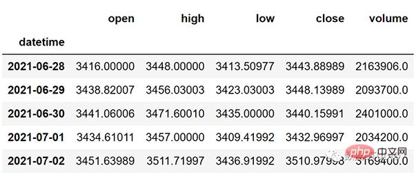
Code Description
The first thing we do is define a function called 'get_historical_data' which takes as parameters the stock symbol ('symbol') and the start date of the historical data ('start_date').
Inside the function, we define the API key and URL and store them into their respective variables.
Next, we use the 'get' function to extract the historical data in JSON format and store it into the 'raw_df' variable. After doing some cleaning and formatting of the raw JSON data, we return it as an empty Pandas DataFrame.
Finally, we call the created function to pull Amazon’s historical data starting from the beginning of 2021 and store it in the "amzn" variable.
OHLC Chart
The OHLC chart is a bar chart that shows the opening, high, low and closing prices for each period.
OHLC charts are useful because they show four major data points over a period of time, with many traders considering the closing price to be the most important. It also helps to show increasing or decreasing momentum. When the opening and closing are far apart, the performance is strong, and when the opening and closing are close, the performance is indecisive or weak.
High and Low show the full price range for the period, helping to assess volatility1[2]. Now to create an OHLC chart using mplfinance, all it takes is one line of code:
1 |
|
In the above code, we first call the plot function and in it we extract the Amazon OHLC The data is sliced into the last 50 readings, the purpose of this is just to make the chart clearer so that the elements are visible. The single line of code above will produce an output that looks like this:
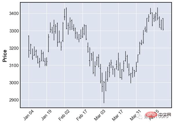
OHLC Chart
Candlestick Chart
Traders use Candlestick charting based on the past The pattern determines possible price movements. Candlesticks are useful when trading because they display four price points (open, close, high, and low) throughout the time period specified by the trader.
The most interesting part of this type of chart is that it also helps traders read sentiment, which is the primary driver of the market itself2[3]. To generate a candlestick chart using mplfinance, we just add another parameter, the type parameter plot of the function and candle is mentioned in it. The code looks like this:
1 |
|
The above code will generate a candlestick chart like this:
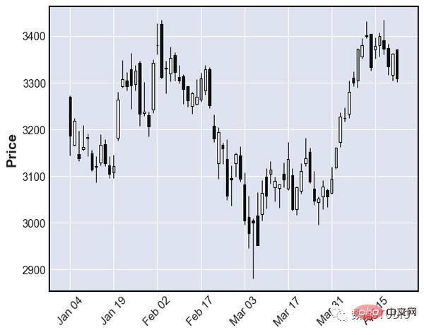
烛台图
砖形图
砖形图( Renko chart)是一种使用价格变动构建的图表,而不是像大多数图表那样同时使用价格和标准化时间间隔。该图表看起来像一系列砖块,当价格移动指定的价格金额时会创建一个新砖块,并且每个块都与前一个砖块成 45 度角(向上或向下)。Renko 图表的主要用途是过滤掉噪音并帮助交易者更清楚地看到趋势,因为所有小于框大小的运动都被过滤掉 3[4] 。
据我所知,mplfinance 是唯一提供 Renko 图表的 Python 库,也是我们接下来要看到的,这就是为什么这个包在金融可视化方面具有强大优势的原因。现在要创建一个 Renko,我们只需要在函数renko的type参数中指定plot。Renko 图表的代码如下所示:
1 |
|
我们还可以向plot函数添加一个额外的参数,该参数是根据renko_params我们的需要和其他类似类型修改砖块大小的参数,但我更喜欢默认的。上面的代码生成了一个看起来像这样的砖形图:
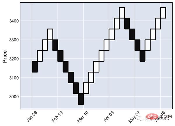
砖形图
点数图
点数图,简称 P&F 图,类似于 Renko 图,它在不考虑时间流逝的情况下绘制资产的价格走势。与其他一些类型的图表(例如烛台)相反,烛台标志着资产在设定的时间段内的变动程度,而 P&F 图表使用由堆叠的 X 或 O 组成的列,每个列代表一定数量的价格变动。X 代表价格上涨,而 O 代表价格下跌。当价格反转反转量 4[5] 时,会在 O 之后形成新的 X 列或在 X 之后形成新的 O 列。
支持点数图的函数在其他地方找不到,只能在 mplfinance 库中找到,而且它还使我们可以通过仅pnf在函数的type参数中指定来创建图表的过程更容易plot。代码如下所示:
1 |
|
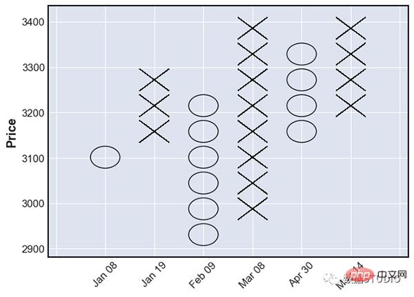
点数图
添加更多信息
mplfinance 包不仅限于生成不同类型的图表,还使我们能够通过添加简单移动平均线 (SMA) 和交易量等附加指标使这些图表更具洞察力。对于那些不知道这两者的人来说,成交量是交易者在特定时间范围内买卖的股票数量,而简单移动平均线 (SMA) 只不过是特定时间段的平均价格。它是一种技术指标,广泛用于创建交易策略。
用 matplotlib 绘制这些数据需要一千年,而 mplfinance 允许我们只用一行代码就可以完成这项任务。除了type参数之外,我们只需要引入另外两个参数,一个是mav我们必须指定每个 SMA 的回溯期的参数,另一个是volume我们必须提到的参数,True 如果我们想将成交量图添加到我们的图表中,或者False 我们不想。这两个指标的代码如下所示:
1 |
|
可以通过两种方式修改和试验上述代码。第一种方法显然是尝试不同类型的图表。在上述代码中,我们提到我们的图表类型是烛台,但你可以将其更改为 OHLC、Renko 甚至 P&F 图表,并观察每个图表及其两个附加指标的外观。下一个方法是使用mav我们可以添加任意数量的具有不同回顾期的 SMA的参数。上述代码的输出如下所示:
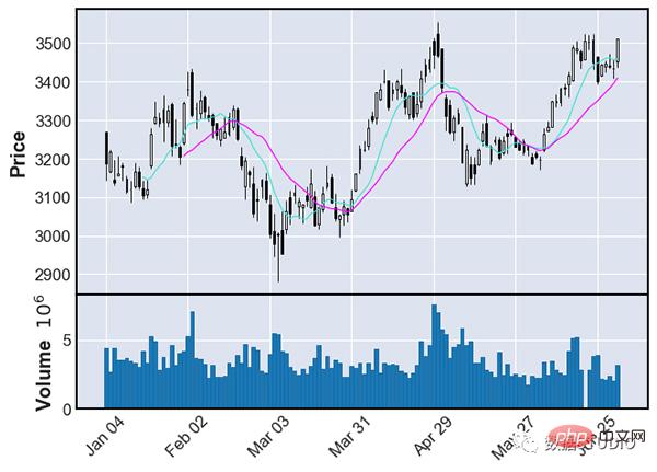
保存图片
如果你想知道如何保存这些财务可视化中的任何一个,只需添加另一个参数,savefig即你只需提及其文件名的参数,其余部分将被处理。假设你想保存上面的图,那么你必须遵循的代码如下所示:
1 2 3 4 5 |
|
这就是你为保存精彩的财务可视化所需要做的全部工作。很容易,对吧?
写在最后
在我看来,与Plotly或Altair等库相比,mplfinance是绘制金融数据最强大的库。本文只是简单介绍了使用mplfinance可以实现的功能,但是这个了不起的库附带了许多新特性。它允许我们添加自定义的技术指标数据,并与实际的图表一起绘制,我们可以自定义整个模板,甚至图表中的每一个元素,添加趋势线,等等。
这个库最好的部分是它的易用性,并帮助我们用一行代码生成高级的财务可视化。虽然像Plotly这样的包有创建这些图表的内置函数,但不可能在一行代码中完成。
mplfinance现在唯一的缺点是它糟糕的文档,这使得人们甚至不知道这个包是关于什么的。文档是一个至关重要的方面,当涉及到开源项目时,文档应该被认为是至关重要的。特别像mplfinance这样的关键和有用的项目必须有清晰文档,对其提供的工具和功能有明确的解释。
到这里,你看完了这篇文章。如果你忘记了图表的代码,不要担心,最后我提供了完整的源代码。你也可以收藏本文,等需要用到的时候再查看。
完整代码
1 2 3 4 5 6 7 8 9 10 11 12 13 14 15 16 17 18 19 20 21 22 23 24 25 26 27 28 29 30 31 32 33 34 |
|
The above is the detailed content of How to create complex financial charts using Python code?. For more information, please follow other related articles on the PHP Chinese website!

Hot AI Tools

Undresser.AI Undress
AI-powered app for creating realistic nude photos

AI Clothes Remover
Online AI tool for removing clothes from photos.

Undress AI Tool
Undress images for free

Clothoff.io
AI clothes remover

AI Hentai Generator
Generate AI Hentai for free.

Hot Article

Hot Tools

Notepad++7.3.1
Easy-to-use and free code editor

SublimeText3 Chinese version
Chinese version, very easy to use

Zend Studio 13.0.1
Powerful PHP integrated development environment

Dreamweaver CS6
Visual web development tools

SublimeText3 Mac version
God-level code editing software (SublimeText3)

Hot Topics
 1376
1376
 52
52
 Do mysql need to pay
Apr 08, 2025 pm 05:36 PM
MySQL has a free community version and a paid enterprise version. The community version can be used and modified for free, but the support is limited and is suitable for applications with low stability requirements and strong technical capabilities. The Enterprise Edition provides comprehensive commercial support for applications that require a stable, reliable, high-performance database and willing to pay for support. Factors considered when choosing a version include application criticality, budgeting, and technical skills. There is no perfect option, only the most suitable option, and you need to choose carefully according to the specific situation.
 How to use mysql after installation
Apr 08, 2025 am 11:48 AM
The article introduces the operation of MySQL database. First, you need to install a MySQL client, such as MySQLWorkbench or command line client. 1. Use the mysql-uroot-p command to connect to the server and log in with the root account password; 2. Use CREATEDATABASE to create a database, and USE select a database; 3. Use CREATETABLE to create a table, define fields and data types; 4. Use INSERTINTO to insert data, query data, update data by UPDATE, and delete data by DELETE. Only by mastering these steps, learning to deal with common problems and optimizing database performance can you use MySQL efficiently.
 Solutions to the service that cannot be started after MySQL installation
Apr 08, 2025 am 11:18 AM
MySQL refused to start? Don’t panic, let’s check it out! Many friends found that the service could not be started after installing MySQL, and they were so anxious! Don’t worry, this article will take you to deal with it calmly and find out the mastermind behind it! After reading it, you can not only solve this problem, but also improve your understanding of MySQL services and your ideas for troubleshooting problems, and become a more powerful database administrator! The MySQL service failed to start, and there are many reasons, ranging from simple configuration errors to complex system problems. Let’s start with the most common aspects. Basic knowledge: A brief description of the service startup process MySQL service startup. Simply put, the operating system loads MySQL-related files and then starts the MySQL daemon. This involves configuration
 MySQL download file is damaged and cannot be installed. Repair solution
Apr 08, 2025 am 11:21 AM
MySQL download file is corrupt, what should I do? Alas, if you download MySQL, you can encounter file corruption. It’s really not easy these days! This article will talk about how to solve this problem so that everyone can avoid detours. After reading it, you can not only repair the damaged MySQL installation package, but also have a deeper understanding of the download and installation process to avoid getting stuck in the future. Let’s first talk about why downloading files is damaged. There are many reasons for this. Network problems are the culprit. Interruption in the download process and instability in the network may lead to file corruption. There is also the problem with the download source itself. The server file itself is broken, and of course it is also broken when you download it. In addition, excessive "passionate" scanning of some antivirus software may also cause file corruption. Diagnostic problem: Determine if the file is really corrupt
 MySQL can't be installed after downloading
Apr 08, 2025 am 11:24 AM
The main reasons for MySQL installation failure are: 1. Permission issues, you need to run as an administrator or use the sudo command; 2. Dependencies are missing, and you need to install relevant development packages; 3. Port conflicts, you need to close the program that occupies port 3306 or modify the configuration file; 4. The installation package is corrupt, you need to download and verify the integrity; 5. The environment variable is incorrectly configured, and the environment variables must be correctly configured according to the operating system. Solve these problems and carefully check each step to successfully install MySQL.
 How to optimize database performance after mysql installation
Apr 08, 2025 am 11:36 AM
MySQL performance optimization needs to start from three aspects: installation configuration, indexing and query optimization, monitoring and tuning. 1. After installation, you need to adjust the my.cnf file according to the server configuration, such as the innodb_buffer_pool_size parameter, and close query_cache_size; 2. Create a suitable index to avoid excessive indexes, and optimize query statements, such as using the EXPLAIN command to analyze the execution plan; 3. Use MySQL's own monitoring tool (SHOWPROCESSLIST, SHOWSTATUS) to monitor the database health, and regularly back up and organize the database. Only by continuously optimizing these steps can the performance of MySQL database be improved.
 How to optimize MySQL performance for high-load applications?
Apr 08, 2025 pm 06:03 PM
MySQL database performance optimization guide In resource-intensive applications, MySQL database plays a crucial role and is responsible for managing massive transactions. However, as the scale of application expands, database performance bottlenecks often become a constraint. This article will explore a series of effective MySQL performance optimization strategies to ensure that your application remains efficient and responsive under high loads. We will combine actual cases to explain in-depth key technologies such as indexing, query optimization, database design and caching. 1. Database architecture design and optimized database architecture is the cornerstone of MySQL performance optimization. Here are some core principles: Selecting the right data type and selecting the smallest data type that meets the needs can not only save storage space, but also improve data processing speed.
 Does mysql need the internet
Apr 08, 2025 pm 02:18 PM
MySQL can run without network connections for basic data storage and management. However, network connection is required for interaction with other systems, remote access, or using advanced features such as replication and clustering. Additionally, security measures (such as firewalls), performance optimization (choose the right network connection), and data backup are critical to connecting to the Internet.


