Microsoft makes context menus less confusing in Windows 11

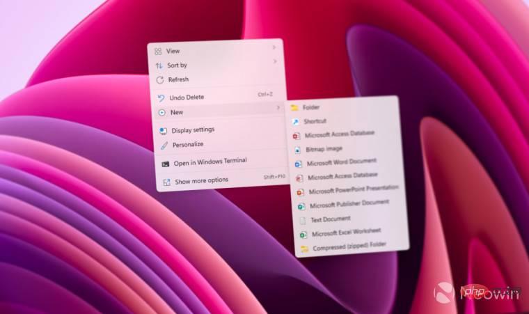
There’s a lot to love about Windows 11. The operating system offers a clean, modern user interface, many productivity enhancements, and performance optimizations. However, Windows 11 is Windows, which means it still suffers from design inconsistencies and weird UX decisions. Context menus are one of those weird quirks of Microsoft that haven't been fixed for over a decade. Luckily, we've taken a small step in the right direction, with the latest Windows 11 preview making context menus less cluttered.
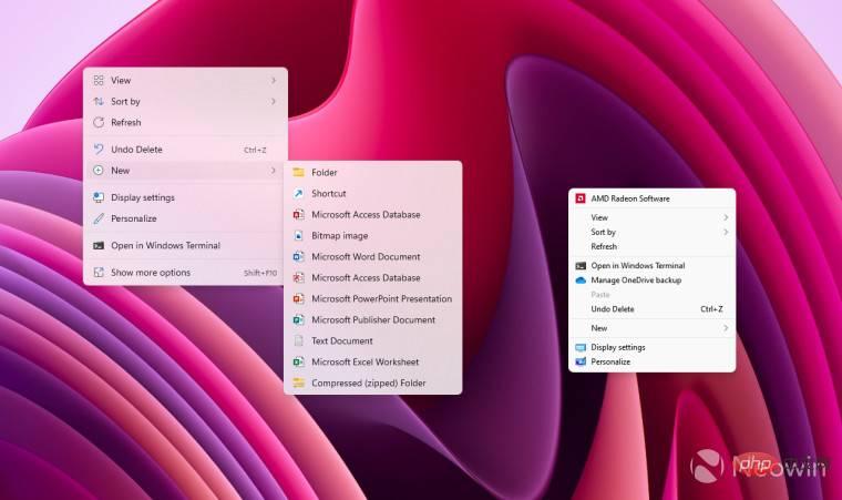
Windows users are well aware that context menus in Windows are very unstable. With just a few clicks, you can discover more than five different visual styles that have little in common. Microsoft tried to solve the problem by introducing modern context menus in Windows 11, but the new solution worsened the problem.
Many applications do not support the new menu, so users need to open two context menus to get the options they want (right-click to open the new menu and select "Show more options" to open the old menu). As an option, Microsoft allows pressing Shift F10 to open the classic menu of the selected file or folder.

In build 22572, Windows 11 still has a menu within a menu, but it’s now much simpler to call the classic variant. Instead of clicking Show More Options or pressing Shift F10, you can hold down the Shift button and right-click anywhere you want to directly open the legacy context menu.
Of course, the "dual-layer" menu is still a compromise, but the latest improvements will make life easier for those who often use the old menu, especially when the F1-F12 keys require pressing the Fn button Laptop and keyboard. Unfortunately, inconsistent design changes are still everywhere. Hopefully, Microsoft will try to mitigate the issue and make Windows 11 more visually appealing in future updates.
The above is the detailed content of Microsoft makes context menus less confusing in Windows 11. For more information, please follow other related articles on the PHP Chinese website!

Hot AI Tools

Undresser.AI Undress
AI-powered app for creating realistic nude photos

AI Clothes Remover
Online AI tool for removing clothes from photos.

Undress AI Tool
Undress images for free

Clothoff.io
AI clothes remover

AI Hentai Generator
Generate AI Hentai for free.

Hot Article

Hot Tools

Notepad++7.3.1
Easy-to-use and free code editor

SublimeText3 Chinese version
Chinese version, very easy to use

Zend Studio 13.0.1
Powerful PHP integrated development environment

Dreamweaver CS6
Visual web development tools

SublimeText3 Mac version
God-level code editing software (SublimeText3)

Hot Topics
 1376
1376
 52
52
 Acer laptop disables secure boot and removes password in Bios
Jun 19, 2024 am 06:49 AM
I repaired an Acer laptop and had to turn off secure boot when entering PE. I recorded how to turn off secure boot and remove the password from Bios. Turn on the computer and when the screen is not on, keep pressing the F2 key to enter the BIOS. On Acer laptops, turn off Secure Boot and press the arrow keys to switch to Boot. If SecureBoot is gray and unclickable, switch to the Security page, select SetSupervisorPassword and press Enter to set the password. Then switch to Boot, SecureBoot can be selected as Disabled, and press F10 to save. Modify and clear the BIOS password on your Acer notebook. Switch to the Security menu and select SetSupervisorPasswo.
 Better performance, COLORFIRE MEOW R16 Snow Shadow White review
Jun 19, 2024 pm 02:18 PM
In March this year, we brought a review of the COLORFIRE MEOWR15 2024 all-in-one gaming laptop. COLORFIRE is a personalized brand specially created for young users under Colorful. MEOWR15 not only has a good-looking and trendy appearance, but also has a high-performance configuration of Ryzen 78845HS+RTX4070. . Recently, the larger MEOWR16 all-round notebook has also been officially launched. It is equipped with Ryzen 97845HX processor + RTX4070 and a 230W power adapter, which has better performance release. The lowest initial price of the 618 is only 6,999 yuan. Next, I will bring you the hands-on experience of this new product. The exterior design I received is COLORFIREMEO in Snow Shadow White color.
 Lenovo ThinkPad T14p AI 2024 notebook released: Core Ultra, optional RTX 4050 independent graphics, starting from 7,499 yuan
Apr 19, 2024 pm 03:43 PM
According to news from this site on April 18, Lenovo today launched the ThinkPad T14pAI2024 notebook, equipped with Core Ultra5125H and Ultra9185H processors, optional RTX4050 independent graphics card, priced from 7,499 yuan: Core display version Ultra5125H/32+1T/2.5K90Hz: 7,499 yuan Ultra9185H/ 32+1T/3K120Hz: 9,499 yuan for independent graphics version Ultra5125H/RTX4050/16+1T/2.5K90Hz: 9,999 yuan Ultra5125H/RTX4050/32+1T/3K120Hz: 10,999 yuan Ultra7155H/RTX4
 Why won't my laptop start up after pressing the power button?
Mar 10, 2024 am 09:31 AM
There could be several reasons why your Windows laptop won't boot. Memory failure, dead battery, faulty power button, or hardware issues are all common causes. Here are some solutions to help you resolve this issue. Laptop won't turn on after pressing the power button If your Windows laptop still won't turn on after pressing the power button, here are some steps you can take to resolve the issue: Is your laptop fully charged? Perform a hard reset to clean your laptop Reseat the memory Transparent CMOS type battery Take your laptop for repair. 1] Is your laptop fully charged? The first thing to do is to check if your laptop is fully charged. Laptop won't start if battery is drained
 Lenovo ThinkBook 16p 2024 notebook starts pre-sale: i9-14900HX + RTX 4060, 3.2K 165Hz screen
Apr 11, 2024 pm 12:52 PM
According to news from this site on April 11, Lenovo ThinkBook 16p2024 laptop is now available for pre-sale, equipped with up to Core i9-14900HX processor and RTX4060 graphics card. There are three configurations available: i7-14650HX/RTX4060/16GB/1TB/3.2K165Hzi7-14650HX /RTX4060/32GB/1TB/3.2K165Hzi9-14900HX/RTX4060/32GB/1TB/3.2K165Hz Lenovo ThinkBook16p2024 notebook debuted at CES2024, equipped with 14th generation Intel Core HX processor and RTX4060 independent graphics card
 Expected to be launched in July, ASUS TUF A16, ROG Magic 16 Air and other new Ryzen AI 300 notebooks have passed 3C certification
Jun 15, 2024 pm 06:03 PM
According to news from this site on June 15, a number of new notebook computers released by ASUS at Computex 2024 Taipei International Computer Show using AMD Ryzen AI300 series "StrixPoint" processors have now passed 3C certification. The TUFGamingA16 (FA608) certification information shows that the TUFGamingA16 game should belong to the Tianxuan series in China, and the original 240W (20V12A) power adapter is produced by Quanta. ROG Magic 16Air (GA605) certification information confirms that the Magic 16Air (overseas known as Zephyrus G16) gaming laptop comes with an original 200W (20V10A) power adapter produced by Quanta. ProArt 162024 (H760
 Lenovo ThinkBook 16+ 2024 Core Ultra 9 version will be available at the end of April: 32GB+1TB, up to RTX4060 optional
Apr 16, 2024 pm 12:30 PM
According to news from this site on April 15, Lenovo announced today that the ThinkBook 16+ 2024 Core Ultra9 version notebook will be available at the end of April, with optional integrated display/RTX4060 version. The price information of the relevant notebook version is still unknown. According to reports, the relevant version of the notebook is equipped with a 16-core 22-thread Core Ultra9185H processor, built-in 32GB RAM and 1TB PCIe4.0 SSD, with optional integrated graphics card or RTX4060. In terms of screen, the relevant notebooks come standard with a 3.2K 165Hz IPS screen, with a maximum brightness of 430 nits, covering 100% sRGB and 100% P3 color gamut, supporting color gamut switching, supporting Dolby Vision, and factory color calibration certified by X-Rite.
 Honor MagicBook Art 14 notebook starts pre-sale: starting from 7,999 yuan, integrating multiple innovations and breakthroughs
Jul 16, 2024 pm 07:58 PM
According to news from this website on July 12, the Honor Magic flagship new product launch conference was held in Shenzhen, launching the new high-end flagship thin and light notebook Honor MagicBook Art14, which is "lighter, thinner and more AI", as well as the thin and light folding flagship Honor MagicV3, Honor MagicVs3, and Honor tablet MagicPad2 and other new products in the flagship family. As Honor’s first high-end flagship thin and light notebook, Honor MagicBook Art14 combines product features such as extreme thinness and lightness, smart eyes, eye-protecting screen, audio-visual experience, and efficient and powerful AI capabilities. Honor MagicBook Art 14 starts at 7,999 yuan, and will be available for pre-sale through all channels at 16:18 on July 12. It will be officially sold for the first time at 10:00 on July 26. Honor C


