Concept: It's past time to charge your iPhone's lock screen
Redesigned Clock
The clock at the top of the lock screen has remained virtually unchanged since Apple switched to the San Francisco font with iOS 9 in 2015. It's still digital and doesn't have any visual effects. Personally, I'm a fan of the minimalist aesthetic, but it has no personality. This is even more apparent when you look at the watch faces designed by the same team for the Apple Watch. They have more capabilities.
There's a lot they could do here, but I'll come up with two designs. An impeccably simple new analog clock. It can float above your notifications and change colors based on your wallpaper. The digital clock can be switched to San Francisco Rounded to give it a subtle new look, while the date below it can be fully capsized by increasing the kerning. These have a better modern aesthetic to them.

Customizable Shortcuts
This is something people have been clamoring for for a long time. However, I think there is a very Apple-like solution that minimizes clutter and customization. Apple doesn't like to let users truly customize their devices, so I doubt the company will allow users to use these shortcuts to launch third-party apps from the lock screen. What I can see them doing, though, is letting you swap out the camera and flashlight shortcuts for other Control Center modules.
I would also recommend that they add the ability to display four shortcuts on the lock screen instead of two. Two is very limited for power users who might want quick access to certain features on their iPhone. In the example below, you can see shortcuts to the Apple TV remote, Low Power Mode, AirPlay, Focus Mode, Fitness Ring, HomeKit, and Timer.

Active Widgets
Widgets on the iPhone home screen are great, but they can be used in more places. What if notifications could display widgets for proactive alerts? If a weather app notifies you that it's about to start raining, it gives you quick access to the hourly forecast widget. When you get reminders for calendar events, your iPhone shows more of your day's meetings.
These widgets can be embedded within the notification module on the lock screen along with other widgets. Developers don't need to change their designs. They fit in perfectly.

Always-On Display Mode
One feature missing from iOS is an always-on display mode. Android devices have had it for years, but it's finally time for Apple to match it. They have stunning displays in their latest iPhones with variable refresh rates. There are rumors that the iPhone 13 series will have an always-on display, but that hasn't happened yet.
The iPhone’s always-on display really only needs to show the time, date, battery, network light, and lock status. Apple could add notifications here, but the way iOS handles notifications may force your device to constantly need to update its display. This may be a drained battery.

The above is the detailed content of Concept: It's past time to charge your iPhone's lock screen. For more information, please follow other related articles on the PHP Chinese website!

Hot AI Tools

Undresser.AI Undress
AI-powered app for creating realistic nude photos

AI Clothes Remover
Online AI tool for removing clothes from photos.

Undress AI Tool
Undress images for free

Clothoff.io
AI clothes remover

AI Hentai Generator
Generate AI Hentai for free.

Hot Article

Hot Tools

Notepad++7.3.1
Easy-to-use and free code editor

SublimeText3 Chinese version
Chinese version, very easy to use

Zend Studio 13.0.1
Powerful PHP integrated development environment

Dreamweaver CS6
Visual web development tools

SublimeText3 Mac version
God-level code editing software (SublimeText3)

Hot Topics
 1378
1378
 52
52
 iPhone 16 Pro and iPhone 16 Pro Max official with new cameras, A18 Pro SoC and larger screens
Sep 10, 2024 am 06:50 AM
Apple has finally lifted the covers off its new high-end iPhone models. The iPhone 16 Pro and iPhone 16 Pro Max now come with larger screens compared to their last-gen counterparts (6.3-in on the Pro, 6.9-in on Pro Max). They get an enhanced Apple A1
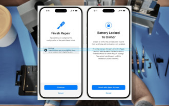 iPhone parts Activation Lock spotted in iOS 18 RC — may be Apple\'s latest blow to right to repair sold under the guise of user protection
Sep 14, 2024 am 06:29 AM
Earlier this year, Apple announced that it would be expanding its Activation Lock feature to iPhone components. This effectively links individual iPhone components, like the battery, display, FaceID assembly, and camera hardware to an iCloud account,
 iPhone parts Activation Lock may be Apple\'s latest blow to right to repair sold under the guise of user protection
Sep 13, 2024 pm 06:17 PM
Earlier this year, Apple announced that it would be expanding its Activation Lock feature to iPhone components. This effectively links individual iPhone components, like the battery, display, FaceID assembly, and camera hardware to an iCloud account,
 Gate.io trading platform official app download and installation address
Feb 13, 2025 pm 07:33 PM
This article details the steps to register and download the latest app on the official website of Gate.io. First, the registration process is introduced, including filling in the registration information, verifying the email/mobile phone number, and completing the registration. Secondly, it explains how to download the Gate.io App on iOS devices and Android devices. Finally, security tips are emphasized, such as verifying the authenticity of the official website, enabling two-step verification, and being alert to phishing risks to ensure the safety of user accounts and assets.
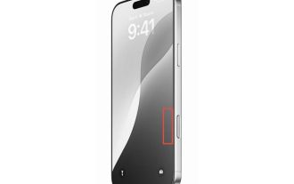 Multiple iPhone 16 Pro users report touchscreen freezing issues, possibly linked to palm rejection sensitivity
Sep 23, 2024 pm 06:18 PM
If you've already gotten your hands on a device from the Apple's iPhone 16 lineup — more specifically, the 16 Pro/Pro Max — chances are you've recently faced some kind of issue with the touchscreen. The silver lining is that you're not alone—reports
 Anbi app official download v2.96.2 latest version installation Anbi official Android version
Mar 04, 2025 pm 01:06 PM
Binance App official installation steps: Android needs to visit the official website to find the download link, choose the Android version to download and install; iOS search for "Binance" on the App Store. All should pay attention to the agreement through official channels.
 How to solve the problem of 'Undefined array key 'sign'' error when calling Alipay EasySDK using PHP?
Mar 31, 2025 pm 11:51 PM
Problem Description When calling Alipay EasySDK using PHP, after filling in the parameters according to the official code, an error message was reported during operation: "Undefined...
 Download link of Ouyi iOS version installation package
Feb 21, 2025 pm 07:42 PM
Ouyi is a world-leading cryptocurrency exchange with its official iOS app that provides users with a convenient and secure digital asset management experience. Users can download the Ouyi iOS version installation package for free through the download link provided in this article, and enjoy the following main functions: Convenient trading platform: Users can easily buy and sell hundreds of cryptocurrencies on the Ouyi iOS app, including Bitcoin and Ethereum. and Dogecoin. Safe and reliable storage: Ouyi adopts advanced security technology to provide users with safe and reliable digital asset storage. 2FA, biometric authentication and other security measures ensure that user assets are not infringed. Real-time market data: Ouyi iOS app provides real-time market data and charts, allowing users to grasp encryption at any time


