

Use Python to draw cool gif animations that amaze everyone


In a previous article, the editor shared how to use gif## in Python #Module to makegifformat charts, is awesome, use Python to draw dynamic visualization charts, and save them in gif format. Today I will introduce it to you. A new method of making
format charts, calling the relevant modules of matplotlib, the steps and methods are also quite simple and easy to understand. .
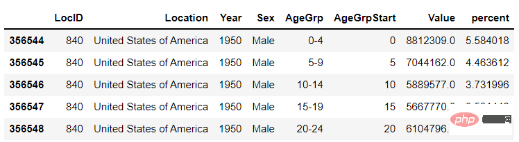
The data set we used this time is the data set that comes with the
bokehmodule, through The following line of code can directly download <div class="code" style="position:relative; padding:0px; margin:0px;"><pre class='brush:php;toolbar:false;'>import bokeh
bokeh.sampledata.download()
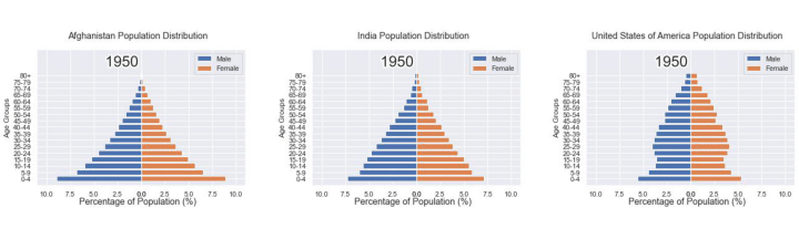
</pre><div class="contentsignin">Copy after login</div></div> and then import the data set to be used later. We selected the data on the proportion of the population of different age groups in the specified country from 1950 to the present
from bokeh.sampledata.population import data
import numpy as np

data = filter_loc('United States of America')
data.head()
output
 ##First draw several static charts
We can draw several static charts first, and then draw these Just combine several charts into one animation in the format of It's very simple. We want to filter the data based on the year, and then draw a chart based on the filtered data. The charts are different for each year
import seaborn as sns
import matplotlib.pyplot as plt
import matplotlib.patheffects as fx

# 绘制图表的函数
def make_plot(year):

    # 根据年份来筛选出数据
    df = data[data.Year == year]

    # 制作图表
    fig, (ax1, ax2) = plt.subplots(1, 2, sharey = True)
    ax1.invert_xaxis()
    fig.subplots_adjust(wspace = 0)

    ax1.barh(df[df.Sex == 'Male'].AgeGrp, df[df.Sex == 'Male'].percent, label = 'Male')
    ax2.barh(df[df.Sex == 'Female'].AgeGrp, df[df.Sex == 'Female'].percent, label = 'Female', color = 'C1')

    country = df.Location.iloc[0]
    if country == 'United States of America': country == 'US'

    fig.suptitle(f'......')
    fig.supxlabel('......')
    fig.legend(bbox_to_anchor = (0.9, 0.88), loc = 'upper right')
    ax1.set_ylabel('Age Groups')

    return fig
output
gif
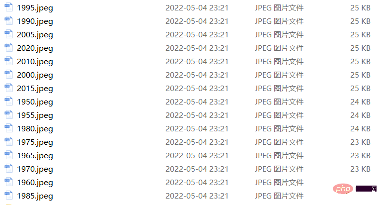
format. The code is as followsyears = [i for i in set(data.Year) if i < 2022]
years.sort()
for year in years:
fig = make_plot(year)
fig.savefig(f'{year}.jpeg',bbox_inches = 'tight')
 output
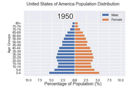
 Maybe after seeing this, some people will find the method mentioned above a little troublesome. After all, we Dozens of static charts need to be generated first. If the computer disk space is a little tight, or there is no such place to store these dozens of charts. So you will wonder if it can be done in one step. Of course it is possible. For example, if we plan to draw the distribution of population proportions at different ages from 1950 to 2020, the first step is to draw the distribution of population proportions at different ages in 1950, which is the starting year. Chart, the code is as follows
import matplotlib.animation as animation
fig, ax = plt.subplots()
ims = []

for year in years:
    im = ax.imshow(plt.imread(f'{year}.jpeg'), animated = True)
    ims.append([im])

ani = animation.ArtistAnimation(fig, ims, interval=600)
ani.save('us_population.gif')
output
Then we customize a function to draw the chart, where the parameter is the year, the purpose is to filter out the phase by year Corresponding data and draw corresponding chartsdef run(year):
# 通过年份来筛选出数据
df = data[data.Year == year]
# 针对不同地性别来绘制
total_pop = df.Value.sum()
df['percent'] = df.Value / total_pop * 100
male.remove()
y_pos = [i for i in range(len(df[df.Sex == 'Male']))]
male.patches = ax1.barh(y_pos, df[df.Sex == 'Male'].percent, label = 'Male',
color = 'C0', tick_label = df[df.Sex == 'Male'].AgeGrp)
female.remove()
female.patches = ax2.barh(y_pos, df[df.Sex == 'Female'].percent, label = 'Female',
color = 'C1', tick_label = df[df.Sex == 'Female'].AgeGrp)
text.set_text(year)
return male#, female
然后我们调用animation.FuncAnimation()方法,
ani = animation.FuncAnimation(fig, run, years, blit = True, repeat = True,
                              interval = 600)
ani.save('文件名.gif')
output
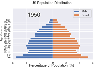
这样就可以一步到位生成gif格式的图表,避免生成数十张繁多地静态图片了。
将若干张<span style="color: #2b2b2b;">gif</span>动图放置在一张大图当中
最后我们可以将若干张gif动图放置在一张大的图表当中,代码如下
import matplotlib.animation as animation

# 创建一个新的画布
fig, (ax, ax2, ax3) = plt.subplots(1, 3, figsize = (10, 3))

ims = []
for year in years:
    im = ax.imshow(plt.imread(f'文件1{year}.jpeg'), animated = True)
    im2 = ax2.imshow(plt.imread(f'文件2{year}.jpeg'), animated = True)
    im3 = ax3.imshow(plt.imread(f'文件3{year}.jpeg'), animated = True)
    ims.append([im, im2, im3])

ani = animation.ArtistAnimation(fig, ims, interval=600)
ani.save('comparison.gif')
output
The above is the detailed content of Use Python to draw cool gif animations that amaze everyone. For more information, please follow other related articles on the PHP Chinese website!

Hot AI Tools

Undresser.AI Undress
AI-powered app for creating realistic nude photos

AI Clothes Remover
Online AI tool for removing clothes from photos.

Undress AI Tool
Undress images for free

Clothoff.io
AI clothes remover

Video Face Swap
Swap faces in any video effortlessly with our completely free AI face swap tool!

Hot Article
Hot Tools

Notepad++7.3.1
Easy-to-use and free code editor

SublimeText3 Chinese version
Chinese version, very easy to use

Zend Studio 13.0.1
Powerful PHP integrated development environment

Dreamweaver CS6
Visual web development tools

SublimeText3 Mac version
God-level code editing software (SublimeText3)
Hot Topics
 1386
1386
 52
52

 Can vs code run in Windows 8
Apr 15, 2025 pm 07:24 PM
Can vs code run in Windows 8
Apr 15, 2025 pm 07:24 PM
VS Code can run on Windows 8, but the experience may not be great. First make sure the system has been updated to the latest patch, then download the VS Code installation package that matches the system architecture and install it as prompted. After installation, be aware that some extensions may be incompatible with Windows 8 and need to look for alternative extensions or use newer Windows systems in a virtual machine. Install the necessary extensions to check whether they work properly. Although VS Code is feasible on Windows 8, it is recommended to upgrade to a newer Windows system for a better development experience and security.
 How to run programs in terminal vscode
Apr 15, 2025 pm 06:42 PM
How to run programs in terminal vscode
Apr 15, 2025 pm 06:42 PM
In VS Code, you can run the program in the terminal through the following steps: Prepare the code and open the integrated terminal to ensure that the code directory is consistent with the terminal working directory. Select the run command according to the programming language (such as Python's python your_file_name.py) to check whether it runs successfully and resolve errors. Use the debugger to improve debugging efficiency.
 Can visual studio code be used in python
Apr 15, 2025 pm 08:18 PM
Can visual studio code be used in python
Apr 15, 2025 pm 08:18 PM
VS Code can be used to write Python and provides many features that make it an ideal tool for developing Python applications. It allows users to: install Python extensions to get functions such as code completion, syntax highlighting, and debugging. Use the debugger to track code step by step, find and fix errors. Integrate Git for version control. Use code formatting tools to maintain code consistency. Use the Linting tool to spot potential problems ahead of time.
 Is the vscode extension malicious?
Apr 15, 2025 pm 07:57 PM
Is the vscode extension malicious?
Apr 15, 2025 pm 07:57 PM
VS Code extensions pose malicious risks, such as hiding malicious code, exploiting vulnerabilities, and masturbating as legitimate extensions. Methods to identify malicious extensions include: checking publishers, reading comments, checking code, and installing with caution. Security measures also include: security awareness, good habits, regular updates and antivirus software.
 Python: Automation, Scripting, and Task Management
Apr 16, 2025 am 12:14 AM
Python: Automation, Scripting, and Task Management
Apr 16, 2025 am 12:14 AM
Python excels in automation, scripting, and task management. 1) Automation: File backup is realized through standard libraries such as os and shutil. 2) Script writing: Use the psutil library to monitor system resources. 3) Task management: Use the schedule library to schedule tasks. Python's ease of use and rich library support makes it the preferred tool in these areas.
 What is vscode What is vscode for?
Apr 15, 2025 pm 06:45 PM
What is vscode What is vscode for?
Apr 15, 2025 pm 06:45 PM
VS Code is the full name Visual Studio Code, which is a free and open source cross-platform code editor and development environment developed by Microsoft. It supports a wide range of programming languages and provides syntax highlighting, code automatic completion, code snippets and smart prompts to improve development efficiency. Through a rich extension ecosystem, users can add extensions to specific needs and languages, such as debuggers, code formatting tools, and Git integrations. VS Code also includes an intuitive debugger that helps quickly find and resolve bugs in your code.
 Python vs. JavaScript: The Learning Curve and Ease of Use
Apr 16, 2025 am 12:12 AM
Python vs. JavaScript: The Learning Curve and Ease of Use
Apr 16, 2025 am 12:12 AM
Python is more suitable for beginners, with a smooth learning curve and concise syntax; JavaScript is suitable for front-end development, with a steep learning curve and flexible syntax. 1. Python syntax is intuitive and suitable for data science and back-end development. 2. JavaScript is flexible and widely used in front-end and server-side programming.
 Golang vs. Python: Concurrency and Multithreading
Apr 17, 2025 am 12:20 AM
Golang vs. Python: Concurrency and Multithreading
Apr 17, 2025 am 12:20 AM
Golang is more suitable for high concurrency tasks, while Python has more advantages in flexibility. 1.Golang efficiently handles concurrency through goroutine and channel. 2. Python relies on threading and asyncio, which is affected by GIL, but provides multiple concurrency methods. The choice should be based on specific needs.
