 Common Problem
 Microsoft says Windows 11 Start menu is built around feedback, and users disagree
Microsoft says Windows 11 Start menu is built around feedback, and users disagree
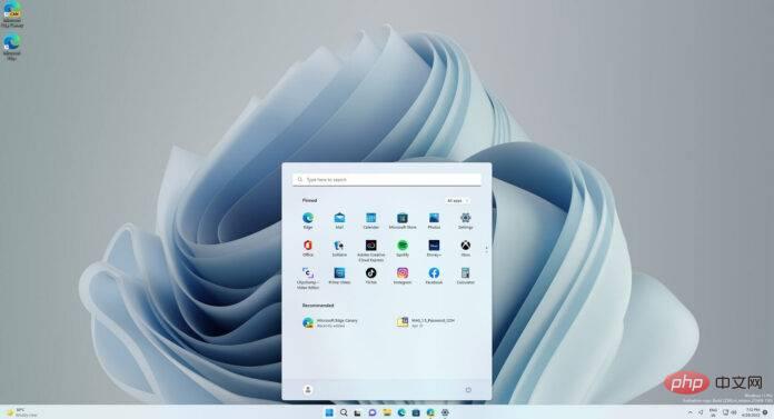
Windows 11 has been out for a while now and it has received mixed reviews, with many people giving the operating system a bad thumbs up. So why do people get upset? The main reason is the lack of features and changes that many consider unnecessary.
Another problem with Windows 11 is that the snappy interactive Start menu is gone, replaced by a static Start like Windows 10X and Android. The interface isn't the same as the Windows 7 Start menu or Windows 10, and it doesn't have any personalization features.
Windows 11’s Start menu interface is a simple collection of randomly pinned icons by default, and there is a “Recommended” activities list that contains your recent activities related to files or documents. There are two small buttons "All Apps" and "More" that take you to an alphabetical list of apps.
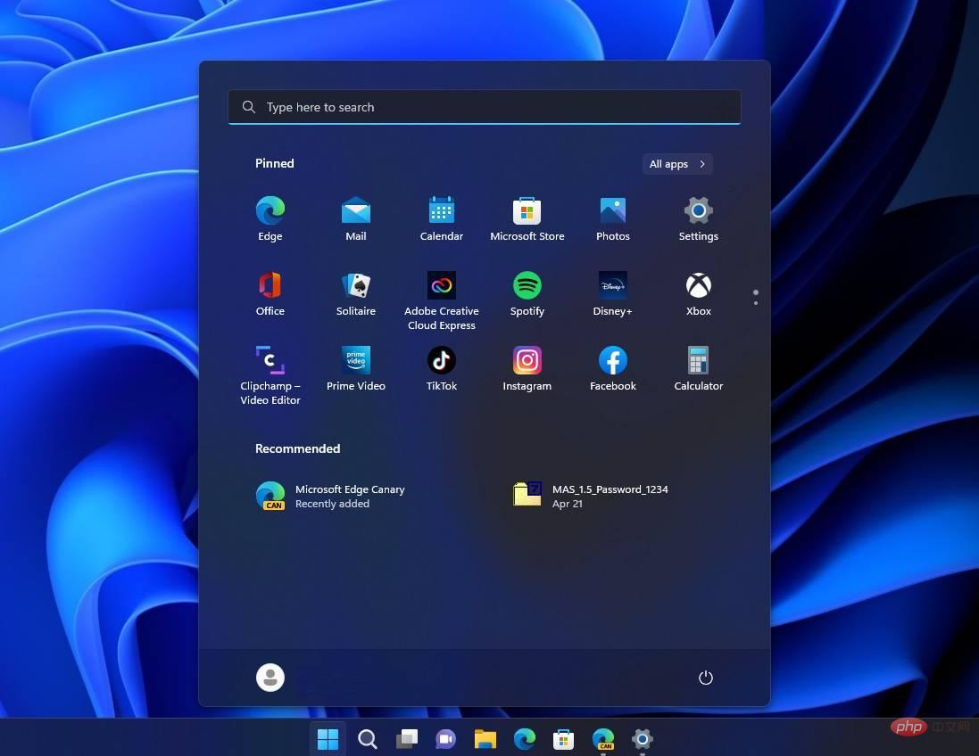
The search box at the top of the Start menu opens the Search panel. You can change the order of the icons, add or remove apps, and that's it. According to Microsoft officials, Windows 11 won't let you change the size and alignment of Start because it would interrupt the "flow" of the interface.
Microsoft has now started sending emails to Windows 11 Insiders currently in the Release, Test, and Development channels to remind them that the Start menu is built around user feedback.
The email titled "How we built Start" states that "Windows 11 Start is built with you in mind. We rely on your feedback to guide us forward" and includes a link to a video posted a year ago , but today most people are aware of it thanks to Microsoft's newsletter.
"The process of designing [Start Menu] is informed by research. Understanding it is a challenge. You have a design problem. There's always a blind spot there. It's really easy to design something you like, But that doesn’t necessarily mean it will work for everyone,” a Microsoft official said.
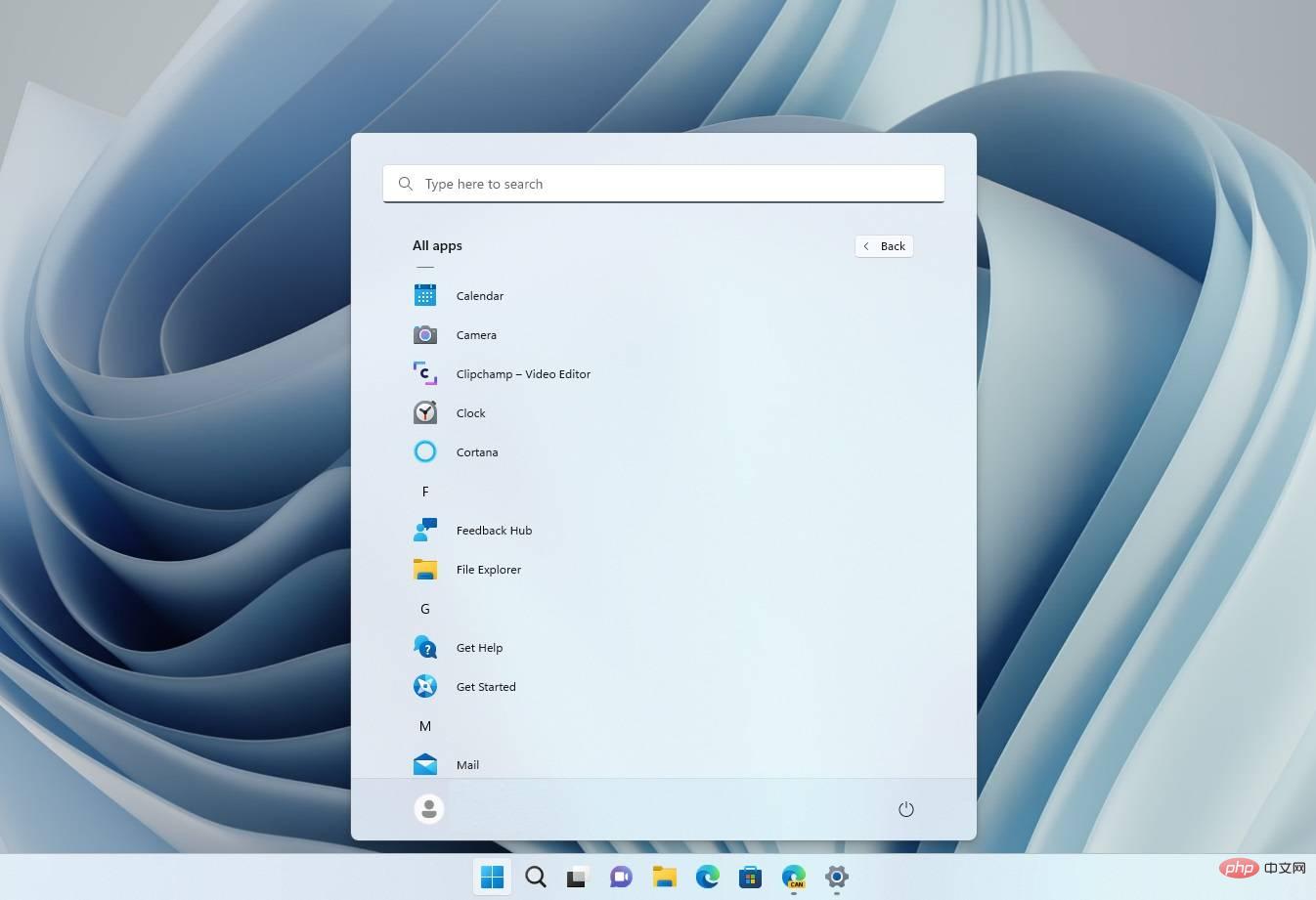
Microsoft said it listened to the feedback and provided feedback on "Should the start be left or center aligned?", "Should there be a search box and the start?", "Should the start be left or center aligned?" A lot of research has been done on issues such as "Have a Full Application". List? ”
After thinking about these issues, Microsoft said it brought it all together to create a familiar Start experience through the search bar, documents and your apps.
"Microsoft designers create designs that match what we're already thinking about, which gives us confidence that we're on the right track and building something people will actually love," Microsoft said.
Users Disagree With Microsoft's Statement on Start Menu
End users disagree, however. Most people in the comments section criticized the company for creating a dull Start menu without any customization options.
“The Windows 10 Start menu is incredible because it has so many customization possibilities. Resize and group icons, set width and height as needed, and choose how many icons to have in the menu, which speeds up my workflow. It sucks that the W11 start menu is so limited,” one user commented.
Another user echoed the above argument, adding that consumers just want “the ability to personalize.”
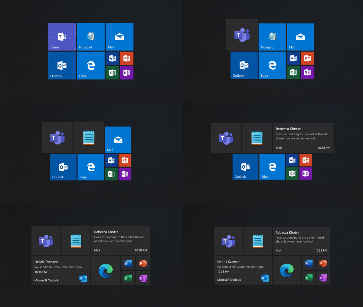
“Windows 10’s Start isn’t the best, but at least you can personalize it more and organize it however you want. Now that you have an app drawer that looks like a mobile device, you can only pin apps. What's the point of making an entire menu for a widget? ”, one frustrated Windows 11 user explained the problem.
“Give us more choices, stop removing them and change things that users want or don’t want”.
Windows 11 isn't ready for everyone, but is that a problem?
I personally don't like that Microsoft has chosen to get rid of the tile-based Start menu. The Windows 10 Start menu gives you more control over what you do in that menu It's actually pretty cool to see.
Meanwhile, Windows 11 is still in development and isn't for everyone.
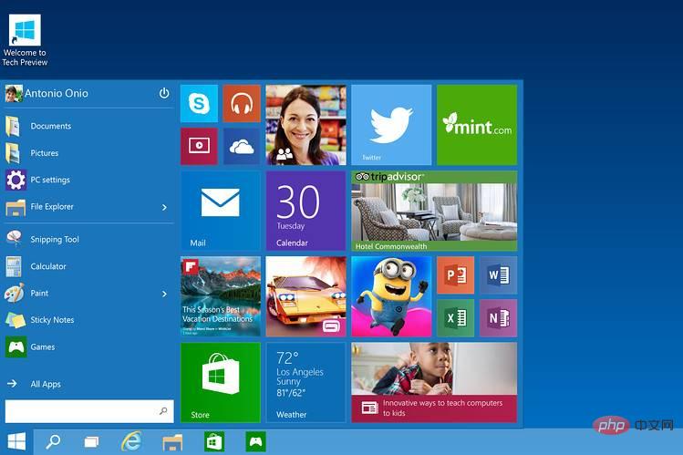
The initial version of Windows 10 also looked completely different and unfinished, but it ended up getting better.
The new operating system does have many good things, such as WinUI. Microsoft hopes integrating WinUI will eventually win back disgruntled users and spur faster development of the interface in the coming years.
The above is the detailed content of Microsoft says Windows 11 Start menu is built around feedback, and users disagree. For more information, please follow other related articles on the PHP Chinese website!

Hot AI Tools

Undresser.AI Undress
AI-powered app for creating realistic nude photos

AI Clothes Remover
Online AI tool for removing clothes from photos.

Undress AI Tool
Undress images for free

Clothoff.io
AI clothes remover

Video Face Swap
Swap faces in any video effortlessly with our completely free AI face swap tool!

Hot Article

Hot Tools

Notepad++7.3.1
Easy-to-use and free code editor

SublimeText3 Chinese version
Chinese version, very easy to use

Zend Studio 13.0.1
Powerful PHP integrated development environment

Dreamweaver CS6
Visual web development tools

SublimeText3 Mac version
God-level code editing software (SublimeText3)

Hot Topics
 1386
1386
 52
52
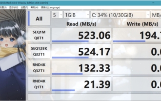 What software is crystaldiskmark? -How to use crystaldiskmark?
Mar 18, 2024 pm 02:58 PM
CrystalDiskMark is a small HDD benchmark tool for hard drives that quickly measures sequential and random read/write speeds. Next, let the editor introduce CrystalDiskMark to you and how to use crystaldiskmark~ 1. Introduction to CrystalDiskMark CrystalDiskMark is a widely used disk performance testing tool used to evaluate the read and write speed and performance of mechanical hard drives and solid-state drives (SSD). Random I/O performance. It is a free Windows application and provides a user-friendly interface and various test modes to evaluate different aspects of hard drive performance and is widely used in hardware reviews
 What to do if WPS Office cannot open the PPT file - What to do if WPS Office cannot open the PPT file
Mar 04, 2024 am 11:40 AM
Recently, many friends have asked me what to do if WPSOffice cannot open PPT files. Next, let us learn how to solve the problem of WPSOffice not being able to open PPT files. I hope it can help everyone. 1. First open WPSOffice and enter the homepage, as shown in the figure below. 2. Then enter the keyword "document repair" in the search bar above, and then click to open the document repair tool, as shown in the figure below. 3. Then import the PPT file for repair, as shown in the figure below.
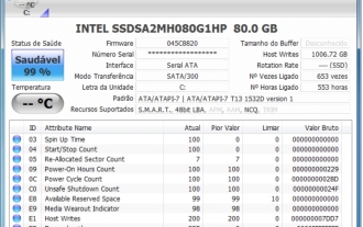 CrystalDiskinfo usage tutorial-What software is CrystalDiskinfo?
Mar 18, 2024 pm 04:50 PM
CrystalDiskInfo is a software used to check computer hardware devices. In this software, we can check our own computer hardware, such as reading speed, transmission mode, interface, etc.! So in addition to these functions, how to use CrystalDiskInfo and what exactly is CrystalDiskInfo? Let me sort it out for you! 1. The Origin of CrystalDiskInfo As one of the three major components of a computer host, a solid-state drive is the storage medium of a computer and is responsible for computer data storage. A good solid-state drive can speed up file reading and affect consumer experience. When consumers receive new devices, they can use third-party software or other SSDs to
 How to set the keyboard increment in Adobe Illustrator CS6 - How to set the keyboard increment in Adobe Illustrator CS6
Mar 04, 2024 pm 06:04 PM
Many users are using the Adobe Illustrator CS6 software in their offices, so do you know how to set the keyboard increment in Adobe Illustrator CS6? Then, the editor will bring you the method of setting the keyboard increment in Adobe Illustrator CS6. Interested users can take a look below. Step 1: Start Adobe Illustrator CS6 software, as shown in the figure below. Step 2: In the menu bar, click the [Edit] → [Preferences] → [General] command in sequence. Step 3: The [Keyboard Increment] dialog box pops up, enter the required number in the [Keyboard Increment] text box, and finally click the [OK] button. Step 4: Use the shortcut key [Ctrl]
 What kind of software is bonjour? Is it useful?
Feb 22, 2024 pm 08:39 PM
Bonjour is a network protocol and software launched by Apple for discovering and configuring network services within a local area network. Its main role is to automatically discover and communicate between devices connected in the same network. Bonjour was first introduced in the MacOSX10.2 version in 2002, and is now installed and enabled by default in Apple's operating system. Since then, Apple has opened up Bonjour's technology to other manufacturers, so many other operating systems and devices can also support Bonjour.
 How to resolve an incompatible software attempt to load with Edge?
Mar 15, 2024 pm 01:34 PM
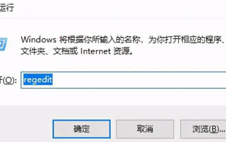
When we use the Edge browser, sometimes incompatible software attempts to be loaded together, so what is going on? Let this site carefully introduce to users how to solve the problem of trying to load incompatible software with Edge. How to solve an incompatible software trying to load with Edge Solution 1: Search IE in the start menu and access it directly with IE. Solution 2: Note: Modifying the registry may cause system failure, so operate with caution. Modify registry parameters. 1. Enter regedit during operation. 2. Find the path\HKEY_LOCAL_MACHINE\SOFTWARE\Policies\Micros
 How to delete recently opened files in Adobe Reader XI - How to delete recently opened files in Adobe Reader XI
Mar 04, 2024 am 11:13 AM
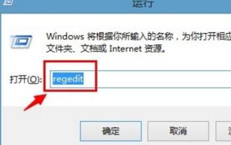
Recently, many friends have asked me how to delete recently opened files in Adobe Reader XI. Next, let us learn how to delete recently opened files in Adobe Reader XI. I hope it can help everyone. Step 1: First, use the "win+R" shortcut key to open the run, enter "regedit", and press Enter to open it, as shown in the picture. Step 2: After entering the new interface, click "HKEY_CURRENT_USERSoftwareAdobeAcrobatReader11.0AVGeneralcRecentFiles" on the left, select "c1", right-click and select the "Delete" option, as shown in the figure. Step 3: Then pop up
 What software is photoshopcs5? -photoshopcs5 usage tutorial
Mar 19, 2024 am 09:04 AM
PhotoshopCS is the abbreviation of Photoshop Creative Suite. It is a software produced by Adobe and is widely used in graphic design and image processing. As a novice learning PS, let me explain to you today what software photoshopcs5 is and how to use photoshopcs5. 1. What software is photoshop cs5? Adobe Photoshop CS5 Extended is ideal for professionals in film, video and multimedia fields, graphic and web designers who use 3D and animation, and professionals in engineering and scientific fields. Render a 3D image and merge it into a 2D composite image. Edit videos easily


